

PROJECT
The development of a brand’s identity, positioning, voice, visual style, and customer experience to create recognition, build trust, and differentiate it from competitors.

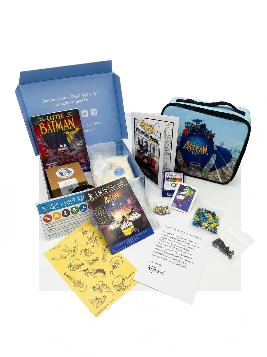
We built a hands-on BatFam influencer kit with I’m The Chef Too!, turning recipe cards, stickers, coloring pages, and keepsakes into a family baking and play moment.
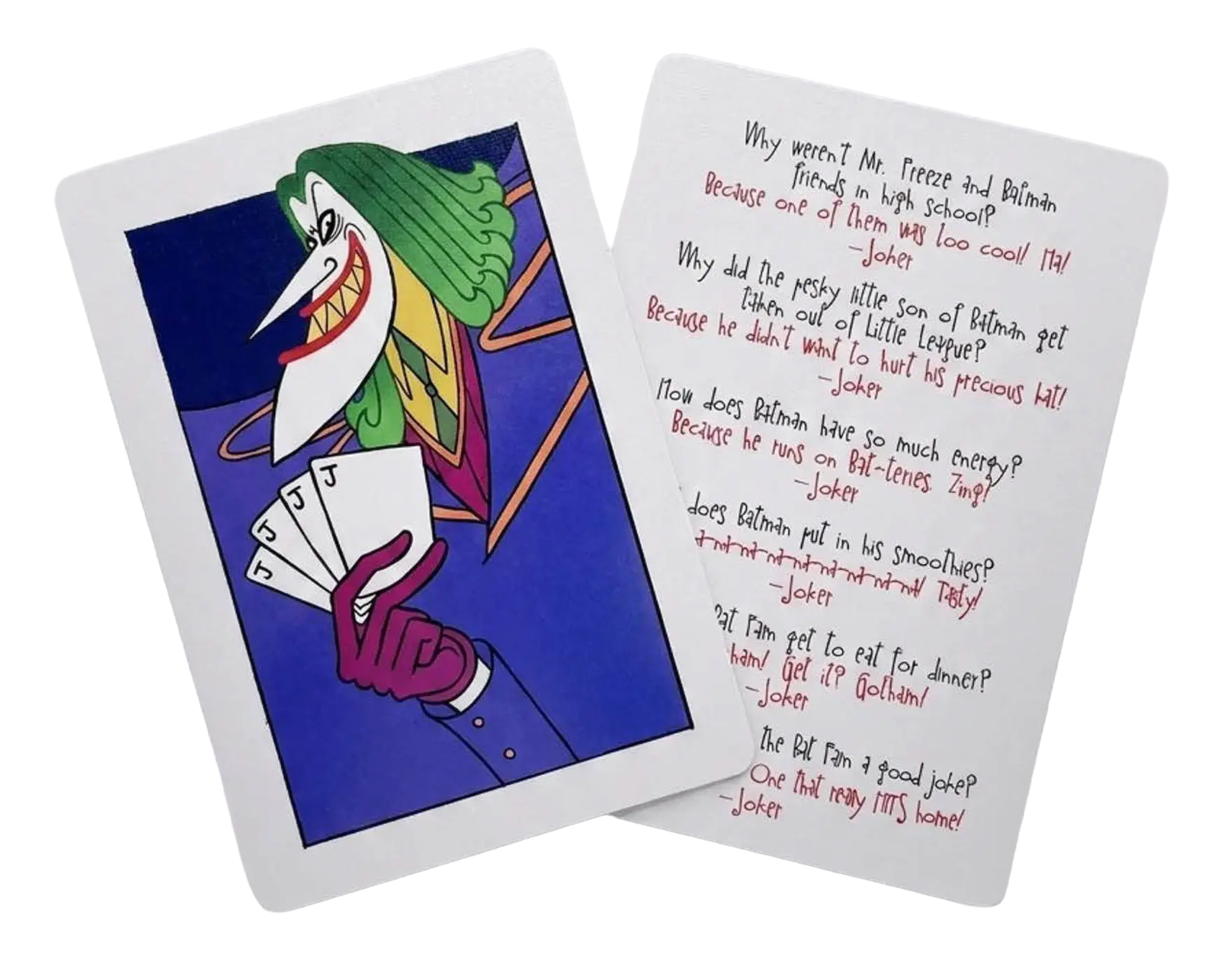
A little Gotham humor for the lunchbox. We created a set of Joker-themed joke cards that gave the Bat-Fam activity kit one more playful surprise for families to discover and share.
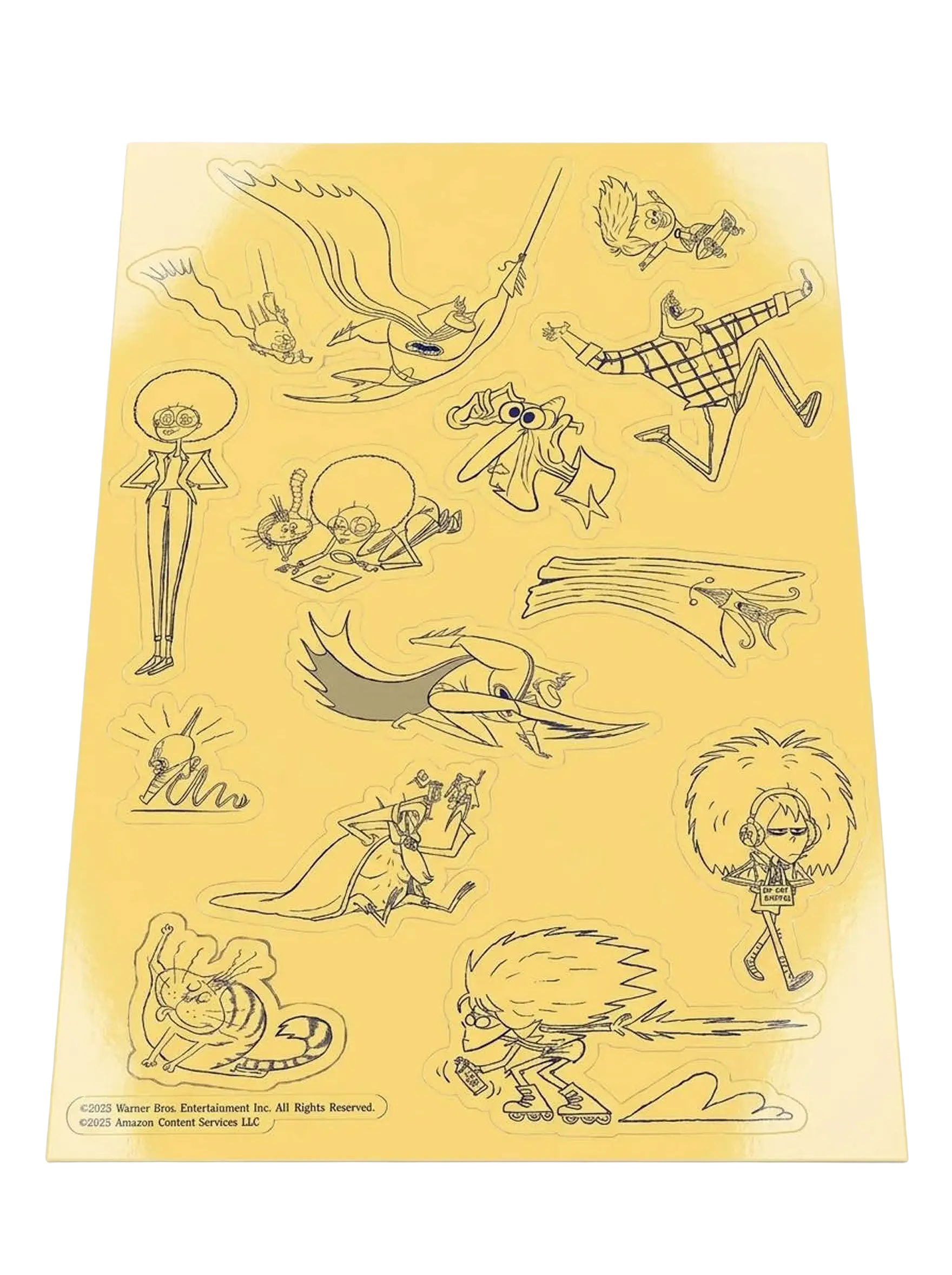
A custom sticker sheet turned some of Bat-Fam’s strangest, funniest characters and poses into little pieces fans could peel off and take with them.
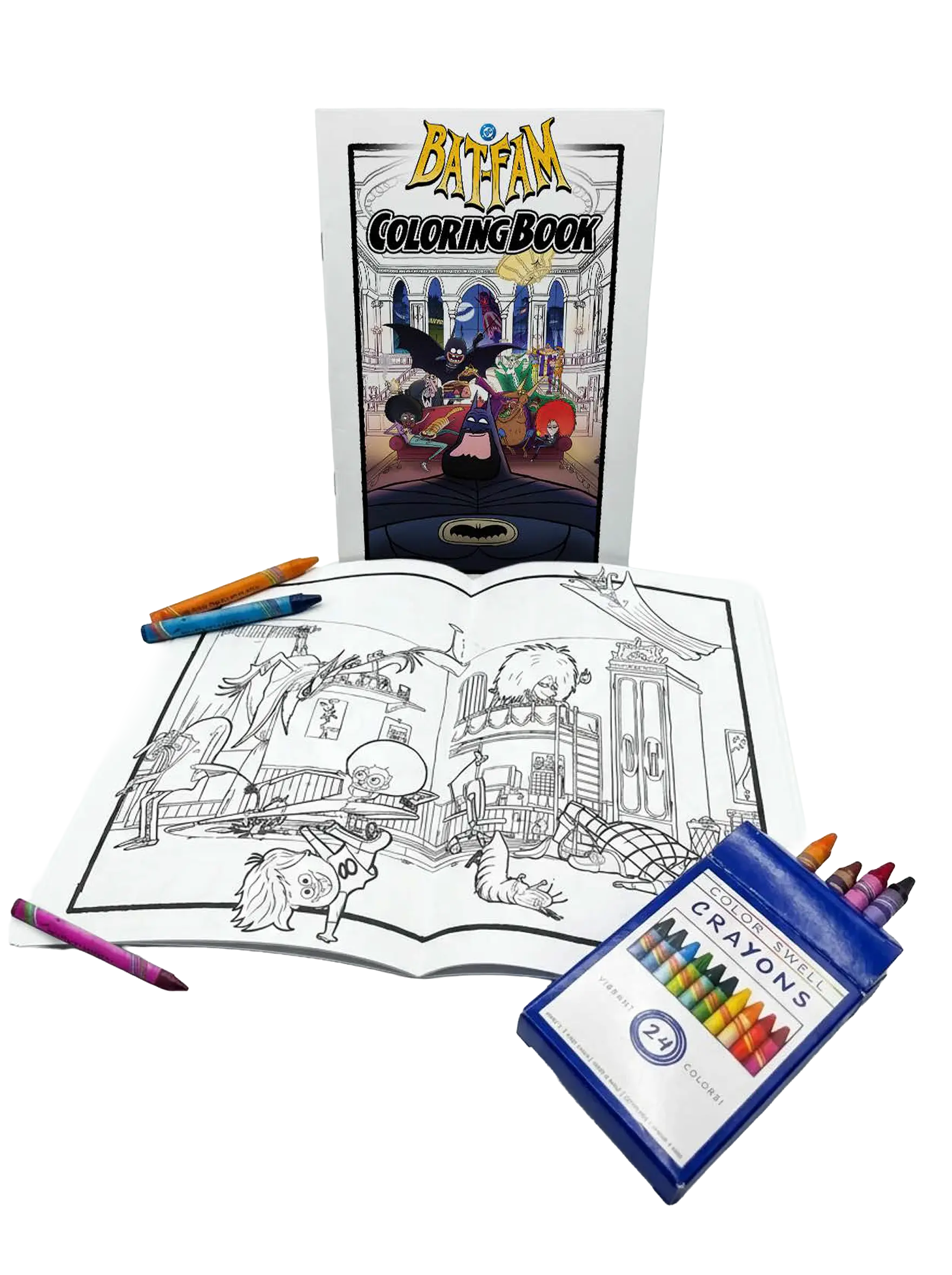
We turned Bat-Fam into something fans could literally make their own, pairing a custom coloring book with crayons for a hands-on activity built around the show’s chaotic little corner of Gotham.
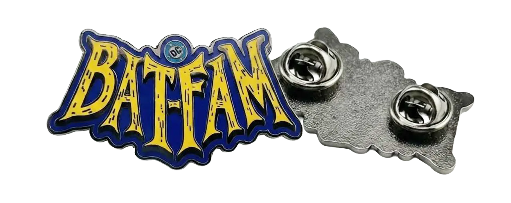
A custom Bat-Fam enamel pin gave fans a small piece of the series they could actually wear, carrying the show’s bold yellow, blue, and black identity beyond the screen.
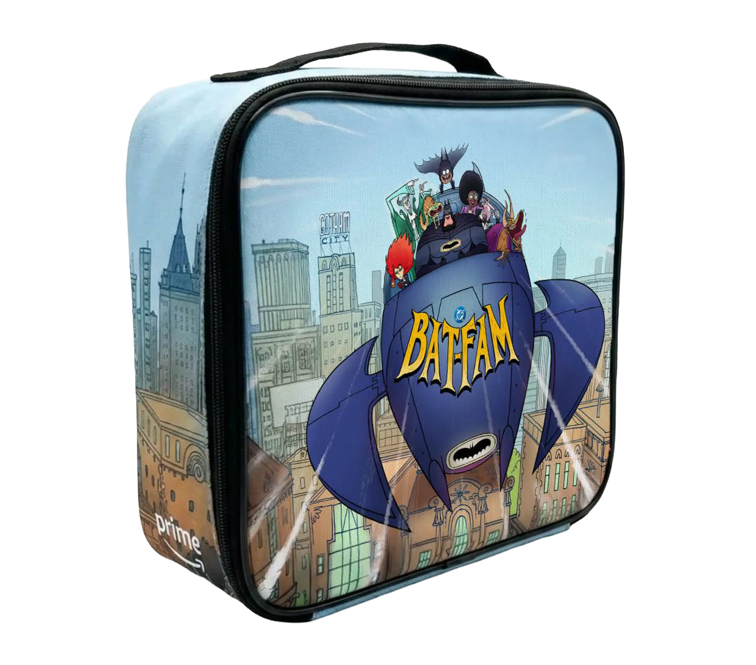
We put the whole Bat‑Fam in a kid-sized Batboat on a glossy lunch box as a tactile keepsake for the influencer kit we made with I’m The Chef Too!.