
PROJECT
The creative process of developing original campaign ideas, content themes, visual directions, and audience experiences that bring a brand strategy to life.
We made this choose-your-own-adventure Story to put viewers in the middle of a Jungle Cruise escape, asking them to pick between swimming with the skipper or swinging with the doctor.

We shaped this carousel around the feeling of moving deeper into the jungle, using each card to hold a different piece of the expedition’s scale, mystery, and playful danger.
We made Proxima’s appetite a playful Instagram Story prompt, asking audiences to slide a steak her way before this very large jaguar gets any hungrier.
We made escape a quick audience decision, asking viewers to choose whether they’d outrun the danger or try to outsmart it.
We made this Which Way? Story video put viewers in the middle of a split-second jungle escape, asking them to choose whether to swim with the skipper or swing with the doctor.
We made the river journey playable, asking Instagram viewers to choose whether to follow the skipper or the doctor before the jungle showed them what came next.
We framed the jungle’s five threats as a playful survival guide, pairing supplied film footage with field-guide-style cards that keep the danger in step with Jungle Cruise’s sense of fun.
We gave George’s intimate encounters room to simmer, using close, candlelit moments to make the social edit feel as uneasy as it is seductive.
We cut together Hedda’s poised public presence and intimate confrontations to let the tension underneath her world do the talking.
Ruth E. Carter opens up her personal archive, using costumes from across her career to reveal how research, fabric, history, and character come together through wardrobe.
Ruth E. Carter breaks down Rudy Ray Moore’s fearless wardrobe | from platform shoes and patchwork denim to the bold colors and silhouettes that made Dolemite impossible to ignore.
Da’Vine Joy Randolph reflects on Queen Bee’s return to the screen | using the character to explore the complicated history, strength, sexuality, and visibility of Black women in Blaxploitation cinema.
David Walker looks beyond the label “Blaxploitation” to explore the movement’s contradictions, independence, and lasting influence on generations of Black filmmakers and storytellers.
Stephane Dunn examines the bold women of Blaxploitation and the complicated legacy of characters who brought strength, sexuality, attitude, and agency to the screen.
Michael Jai White explores the connection between kung fu, Black audiences, and the larger-than-life action language that became part of Dolemite’s unmistakable appeal.
Costume designer Ruth E. Carter breaks down the fearless style of the 1970s and the fashion language that helped make Rudy Ray Moore and Dolemite impossible to ignore.
Dr. Novotny Lawrence helps set the stage for Rudy Ray Moore’s story, unpacking the history and cultural conditions that shaped Dolemite and its lasting place in Black popular culture.
We used Rudy Ray Moore’s story alongside Rocky to give modern audiences cultural context for his perseverance, independence, and lasting significance within Black entertainment history.
We reframed Rudy Ray Moore’s many rejections as part of a larger cultural story about self-determination, resilience, and building your own lane when the industry refuses to make space for you.
We cut a 30-second vertical supercut that highlights quick comedic beats from Rumi’s scenes and formats them for Instagram.
We collected the show’s recurring “inshallah” moments into a quick character-driven supercut, giving fans a compact joke that plays across very different situations.
We cut Rumi’s most chaotic moments into a quick character reel that lets the reactions around him carry the joke.
We cut Mona’s run for class president into a vertical character moment that lets the family’s hopes, nerves, and generational perspective carry the joke.
We cut Rumi’s family growing pains into a vertical character moment, letting the joke land before the family’s affection sneaks back in.
We cut Lamby’s sweetest and most unhinged moments into a vertical fan-cam that gives this animated character a social-native spotlight.
We framed the streaming announcement as a suspicious early-internet pop-up, letting the series’ own satirical world deliver the call to watch.
We cut together a quick social supercut around the recurring “inshallah” line, letting the show’s character comedy carry the hook.
We framed code-switching as a candid conversation with #1 Happy Family USA’s creative voices, pairing their perspective with footage from the series to give the topic room to land.
We paired Ramy Youssef and Timothy Simons in the recording booth with their animated counterparts, letting fans see how the performances carry straight into the show’s comedy.
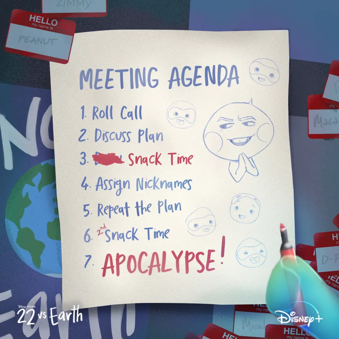
We made a faux 'team agenda' social tile that puts 22’s scheming front and center with hand-lettered copy and quick doodles.
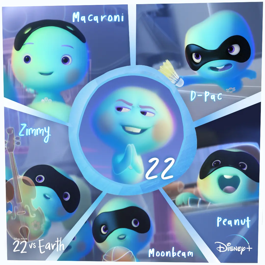
We made a square character grid that puts 22 in a central circular window with the five recruits named around her, so personality and names read fast on mobile.
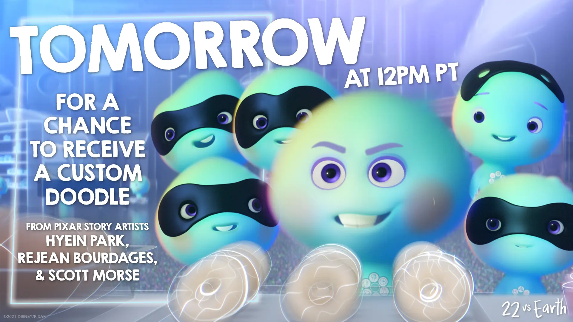
We built this Doodle on Demand promo tile to read fast on mobile, centering 22 and the new souls with oversized 'TOMORROW' type and story-artist credits to drive the timed giveaway.
We edited a 15-second square Now Streaming clip that opens on a neon, hand-lettered "What is the meaning of life?" and pulls back to reveal 22 and the small souls before resolving on the 22 vs Earth title card.
We cut a quick introduction to 22’s anti-Earth rebellion, letting the short’s escalating comedy land before directing viewers to stream it on Disney+.
We framed 22’s resistance to Earth as the joke, pairing her defiant energy with a clean Disney+ prompt once the short was streaming.
We framed 22’s rebellion as a tiny, determined operation, then landed the joke with a direct invitation to stream the short on Disney+.
We reframed a portrait 'live' feed for social, timing the cuts so shock beats land while the on-screen chat and @ShortestBlockbusters watermark stay readable.
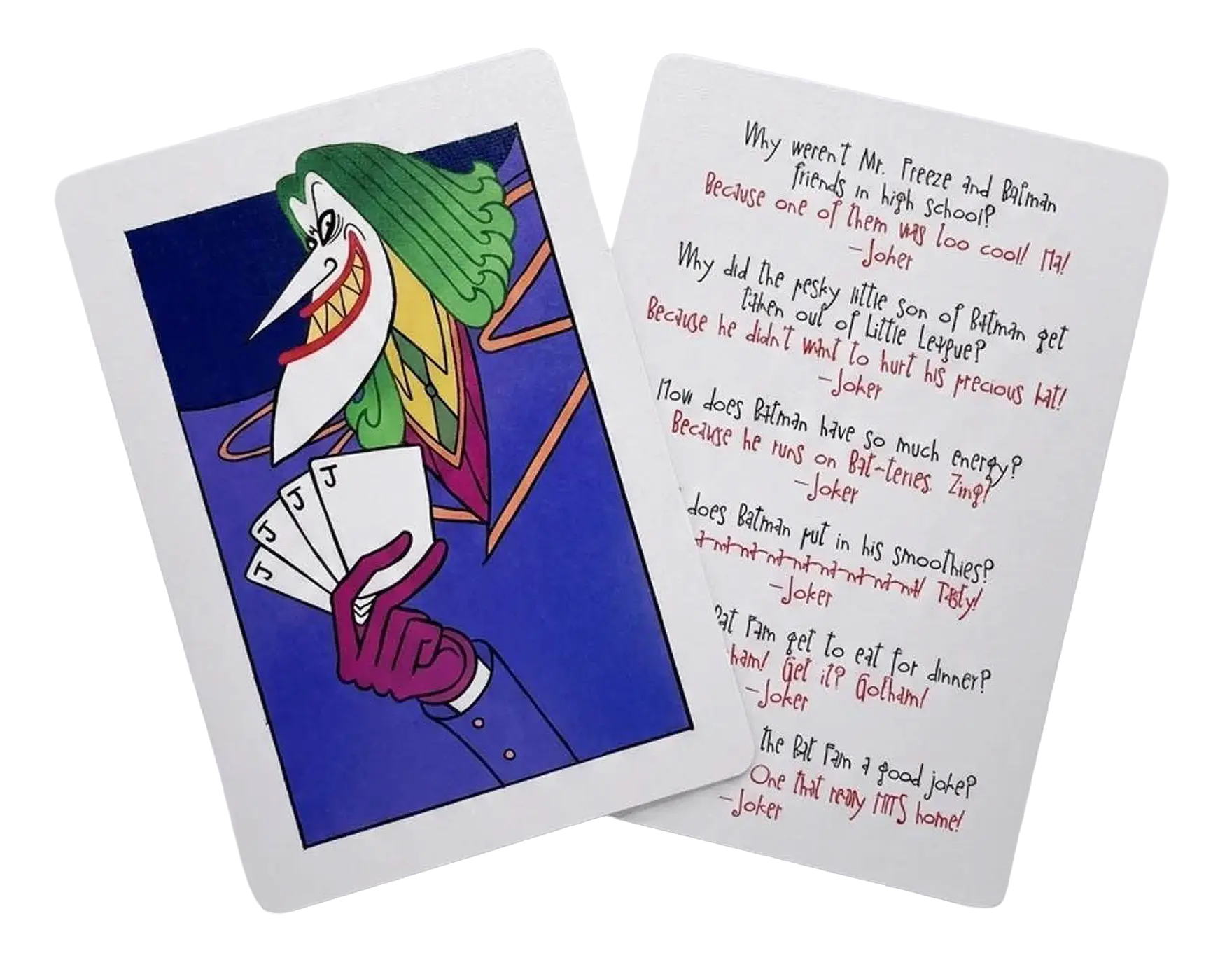
A little Gotham humor for the lunchbox. We created a set of Joker-themed joke cards that gave the Bat-Fam activity kit one more playful surprise for families to discover and share.
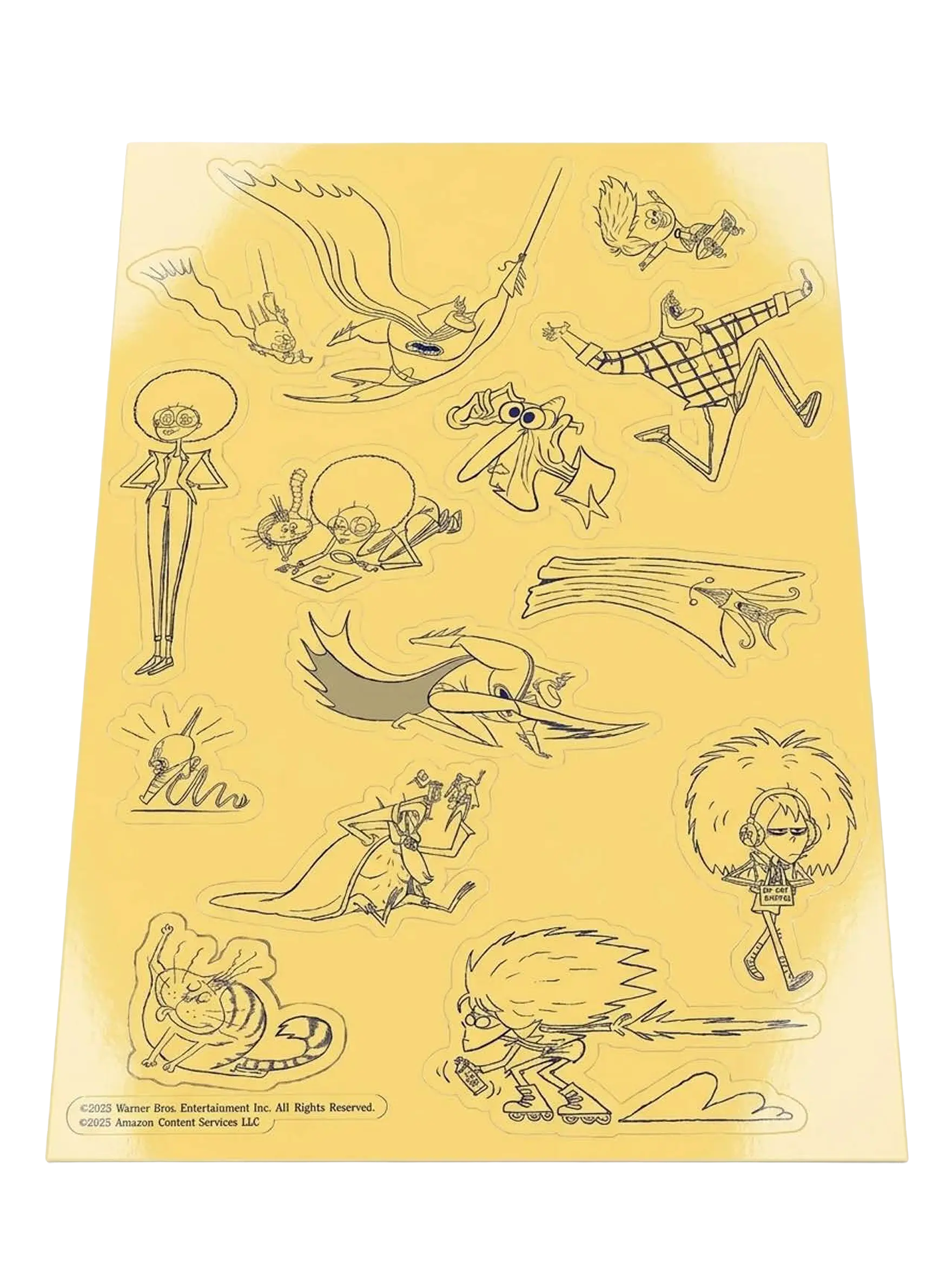
A custom sticker sheet turned some of Bat-Fam’s strangest, funniest characters and poses into little pieces fans could peel off and take with them.
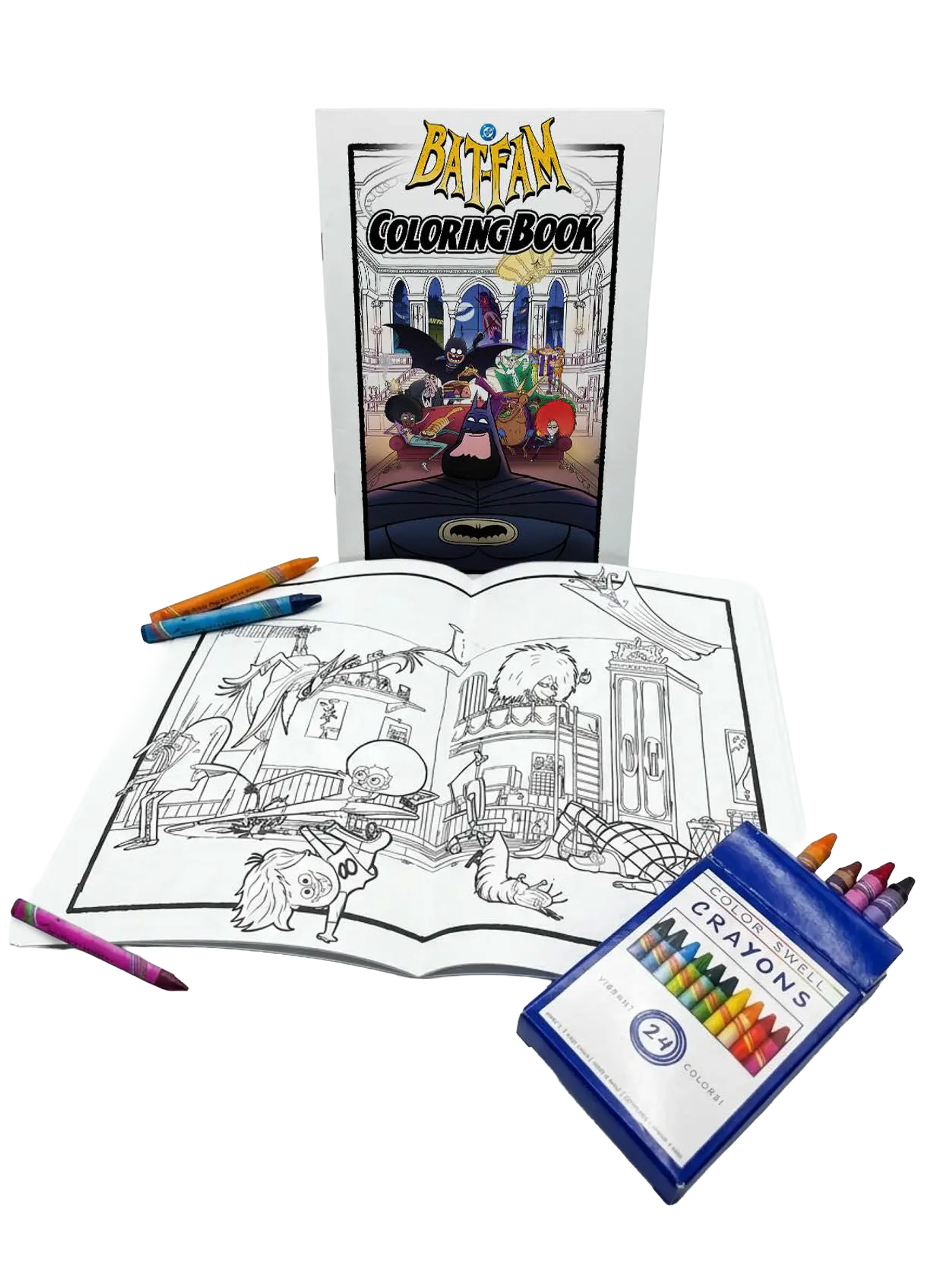
We turned Bat-Fam into something fans could literally make their own, pairing a custom coloring book with crayons for a hands-on activity built around the show’s chaotic little corner of Gotham.
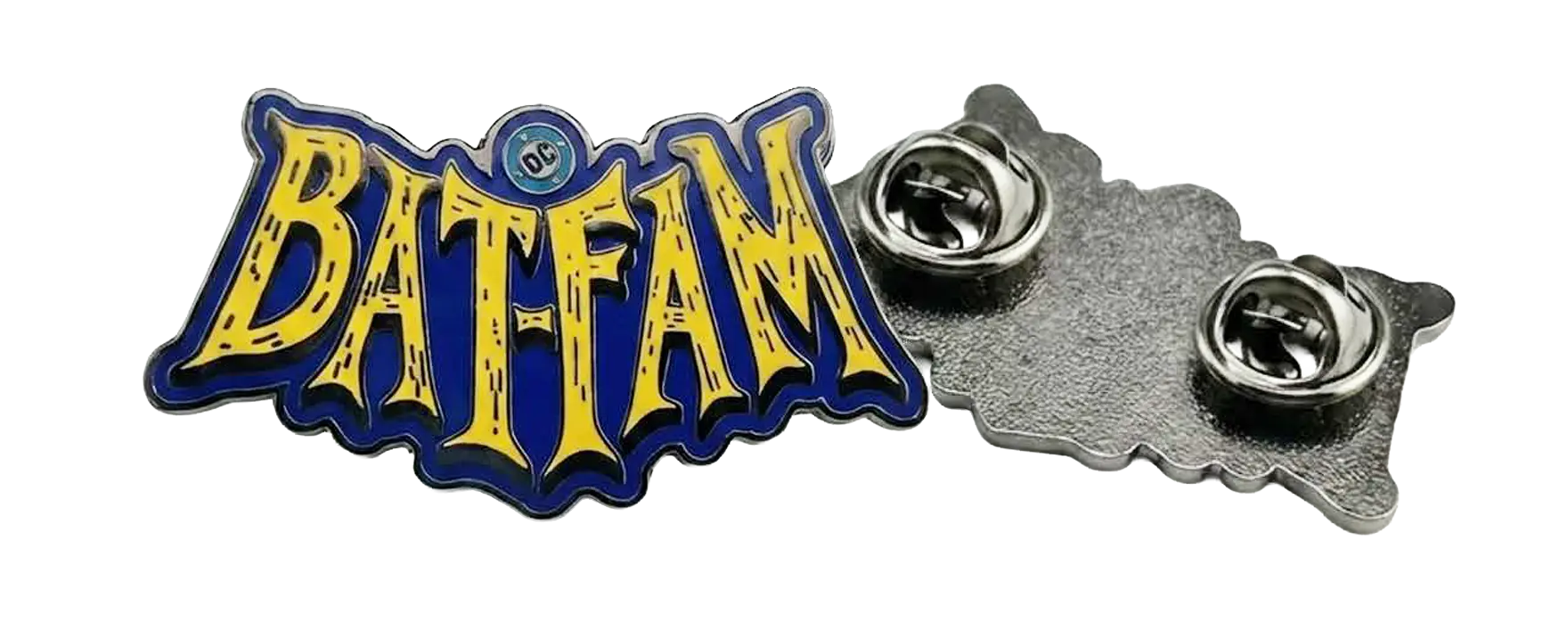
A custom Bat-Fam enamel pin gave fans a small piece of the series they could actually wear, carrying the show’s bold yellow, blue, and black identity beyond the screen.
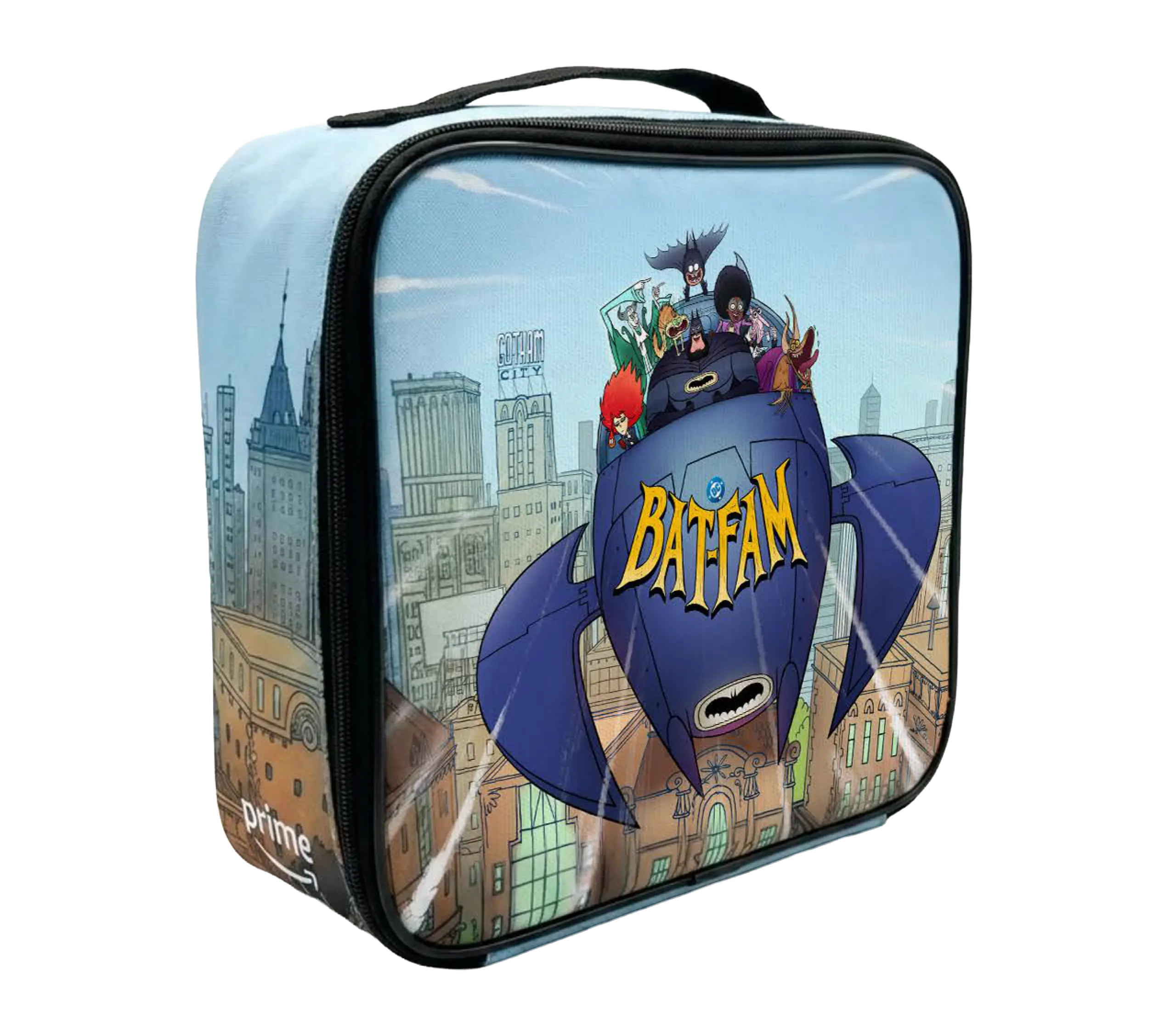
We put the whole Bat‑Fam in a kid-sized Batboat on a glossy lunch box as a tactile keepsake for the influencer kit we made with I’m The Chef Too!.
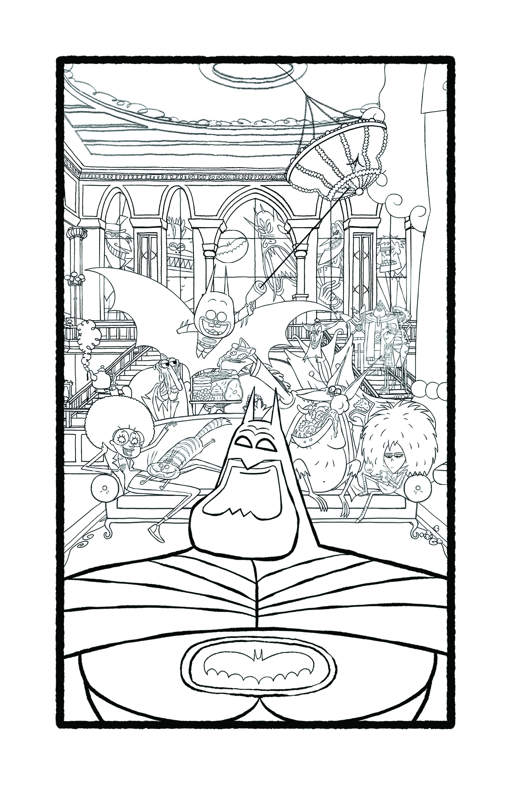
We made a hand-drawn Bat-Fam coloring page that puts Batman front and center while the household's playful chaos fills Wayne Manor.
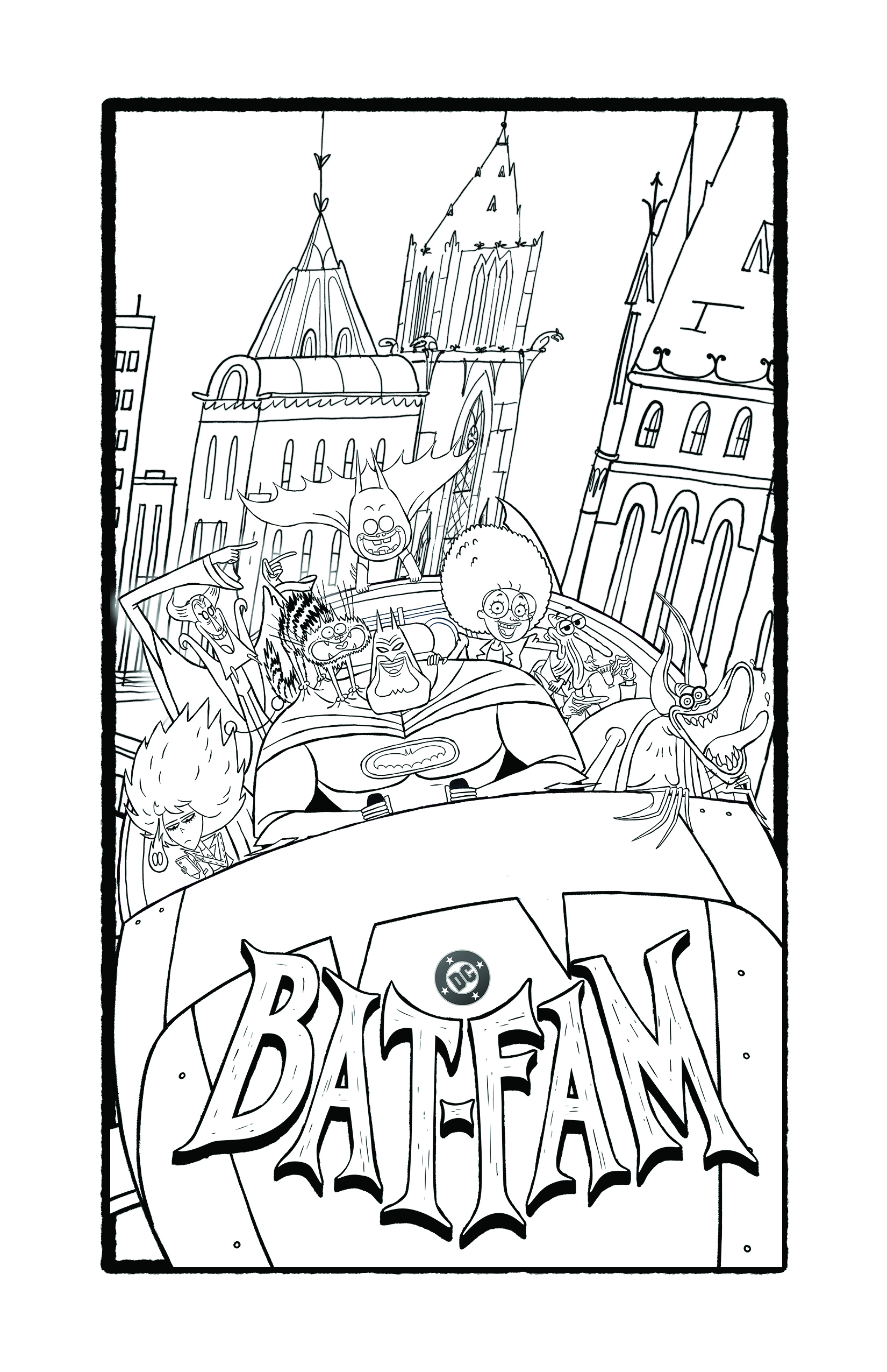
We made this high-contrast coloring page with Batman front-and-center and the whole Bat‑Fam piled in a car so families could color, laugh, and riff together.
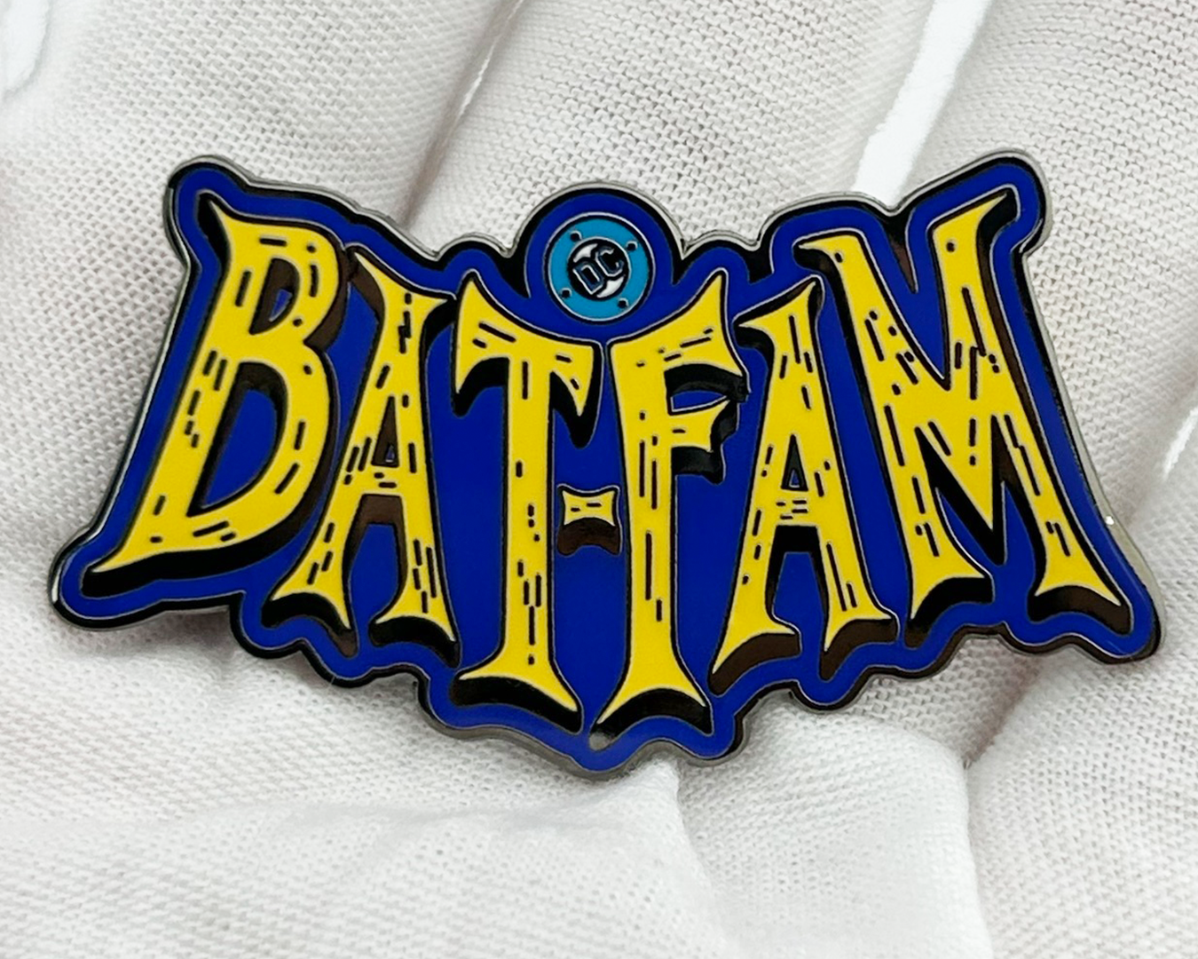
We included this glossy Bat-Fam enamel pin as a tactile keepsake in the hands-on influencer kit we built with I’m The Chef Too!, so families could tuck a little piece of the household away before pressing play.
We made the final day feel like a quick blast of Guardian energy, moving from Star-Lord in action to the whole team and a clear pre-order reminder.
We put fans in Star-Lord’s seat, using the team’s back-and-forth to turn a familiar Guardian disagreement into a choice between Rocket and Gamora.
Ruth E. Carter traces the visual language of Blaxploitation fashion, showing how urban style, denim, Afros, bold silhouettes, and powerful women helped define an era.
From pencil sketch to finished performance | Ruth E. Carter’s original costume illustration transforms into the final look worn on screen in Dolemite Is My Name.
We gave audiences a crash course in the original Dolemite, breaking Rudy Ray Moore’s cult classic down in under 60 seconds to connect the new film back to the character that started it all.
Method acting gets the Cinemagical Realities treatment in a playful breakdown of how performers use imagination, empathy, and different acting techniques to make a performance feel real.
Lighting can make someone inviting, mysterious, or downright terrifying | this episode demonstrated how dramatically a performance can change depending on how a scene is lit.
The camera might not actually add ten pounds | but the wrong lens definitely changes things. This episode used exaggerated framing to show how focal length reshapes what we see.
Warm, cold, happy, sad | Cinemagical Realities used color theory and a few dramatic lighting changes to show how color can completely shift the emotion of a scene.
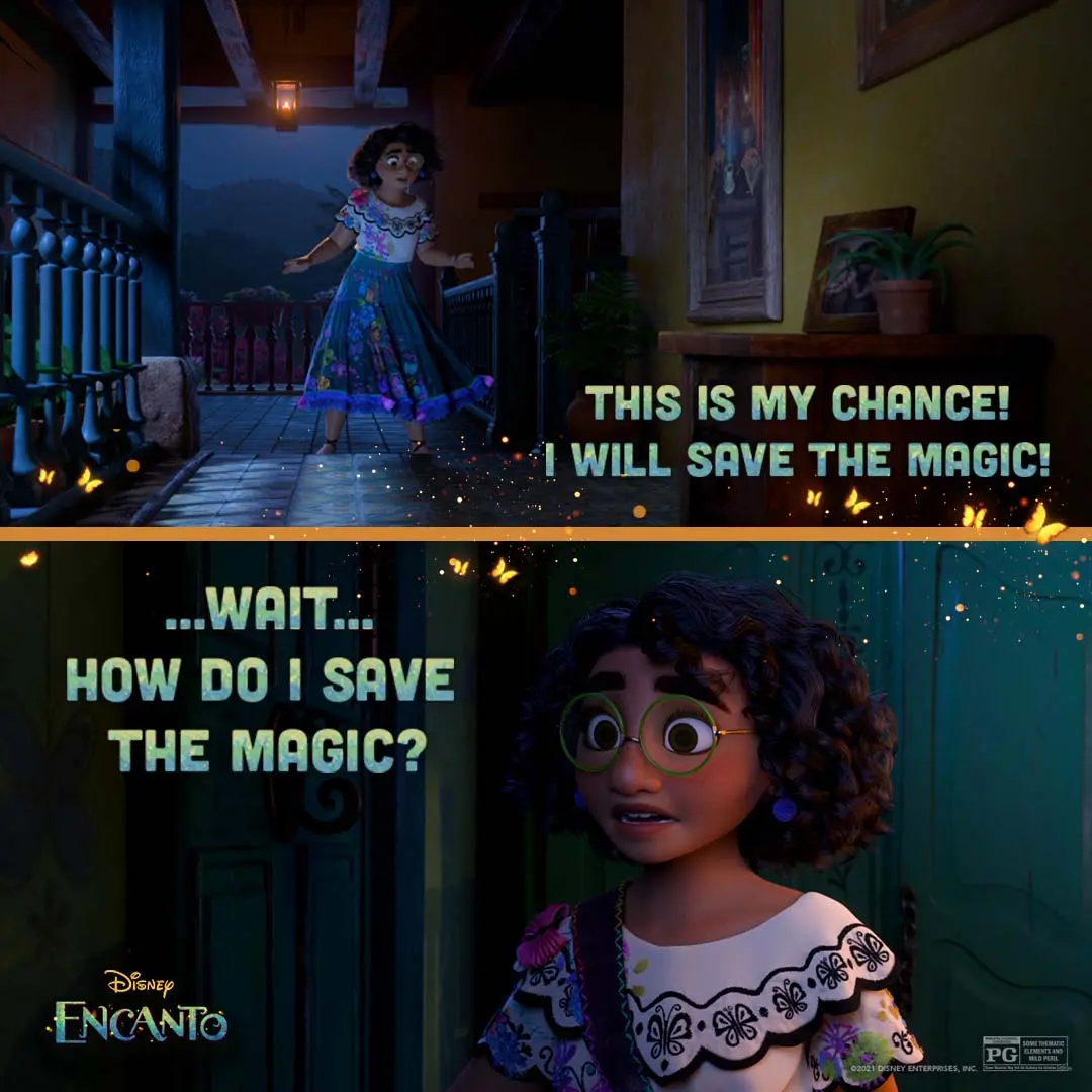
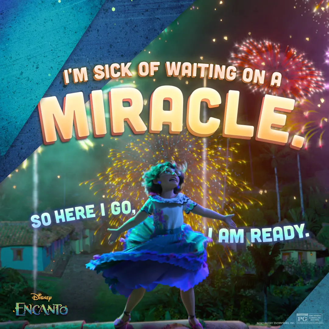
We made a split-panel social graphic that moves from Mirabel’s brave step to a close-up of her doubt, using warm sparks and bold type to carry the emotional shift.
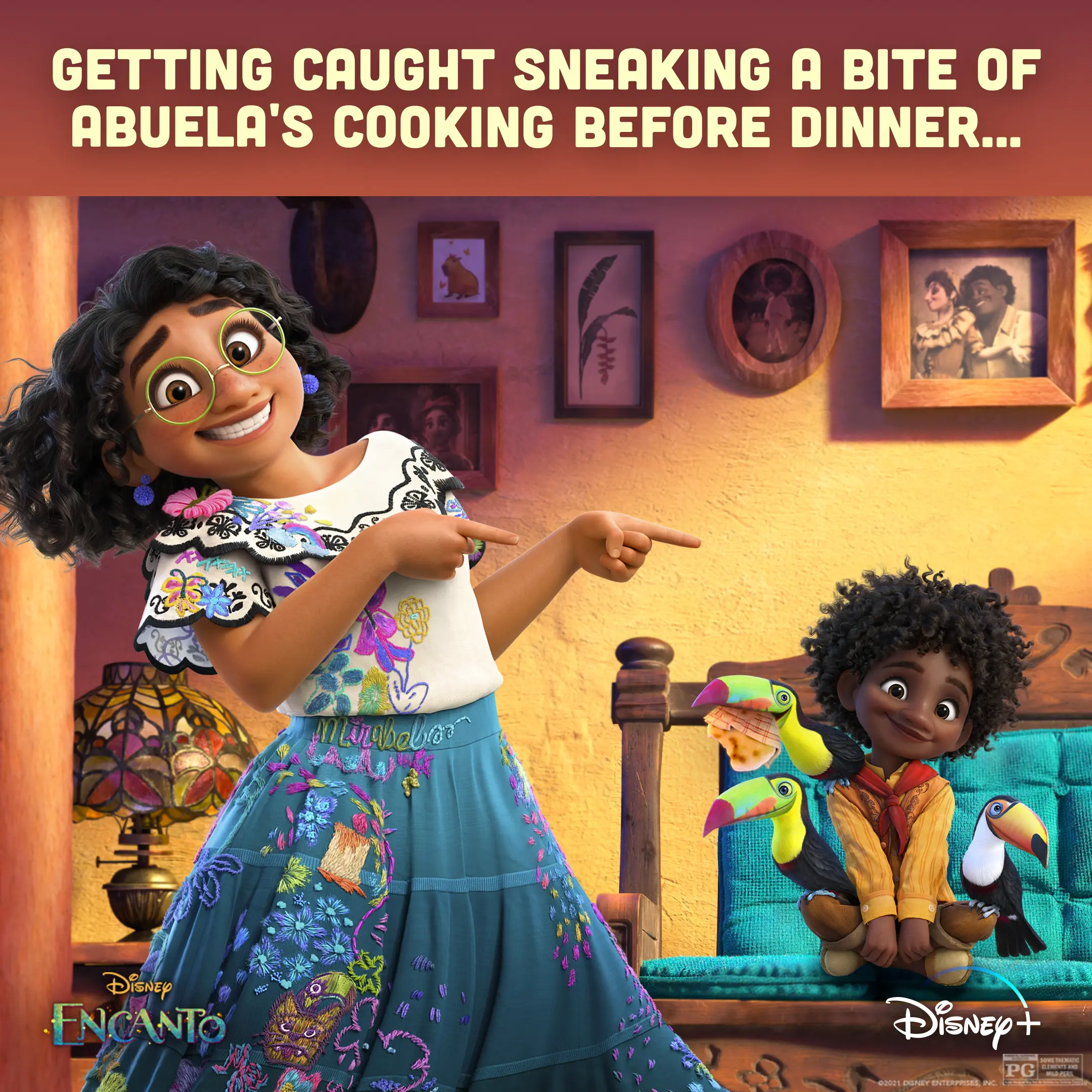
We staged Mirabel pointing at Antonio and the toucans to play up a guilty, funny moment around Abuela’s cooking.
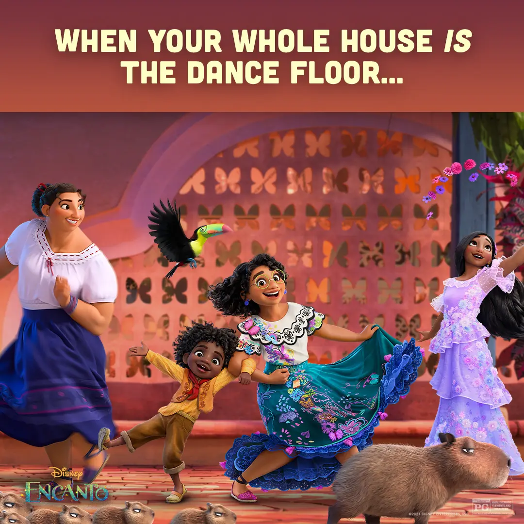
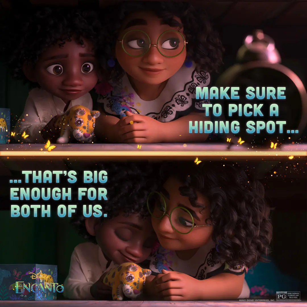
We staged this under-the-bed two-panel to put Mirabel’s warmth next to Antonio’s quiet wonder.
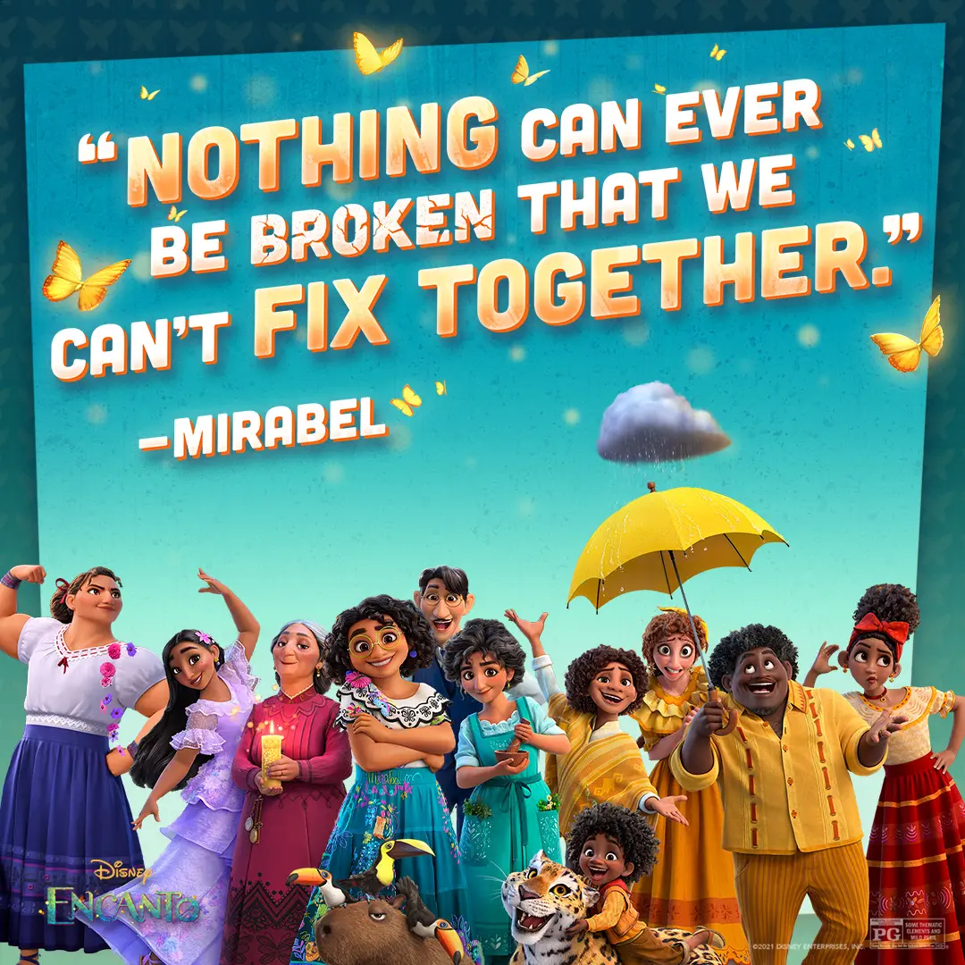
We put the Madrigals front and center and designed the quote lockup to read like a warm, stubborn family promise.
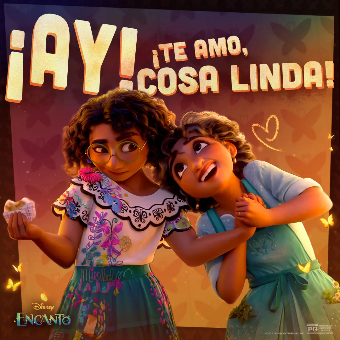
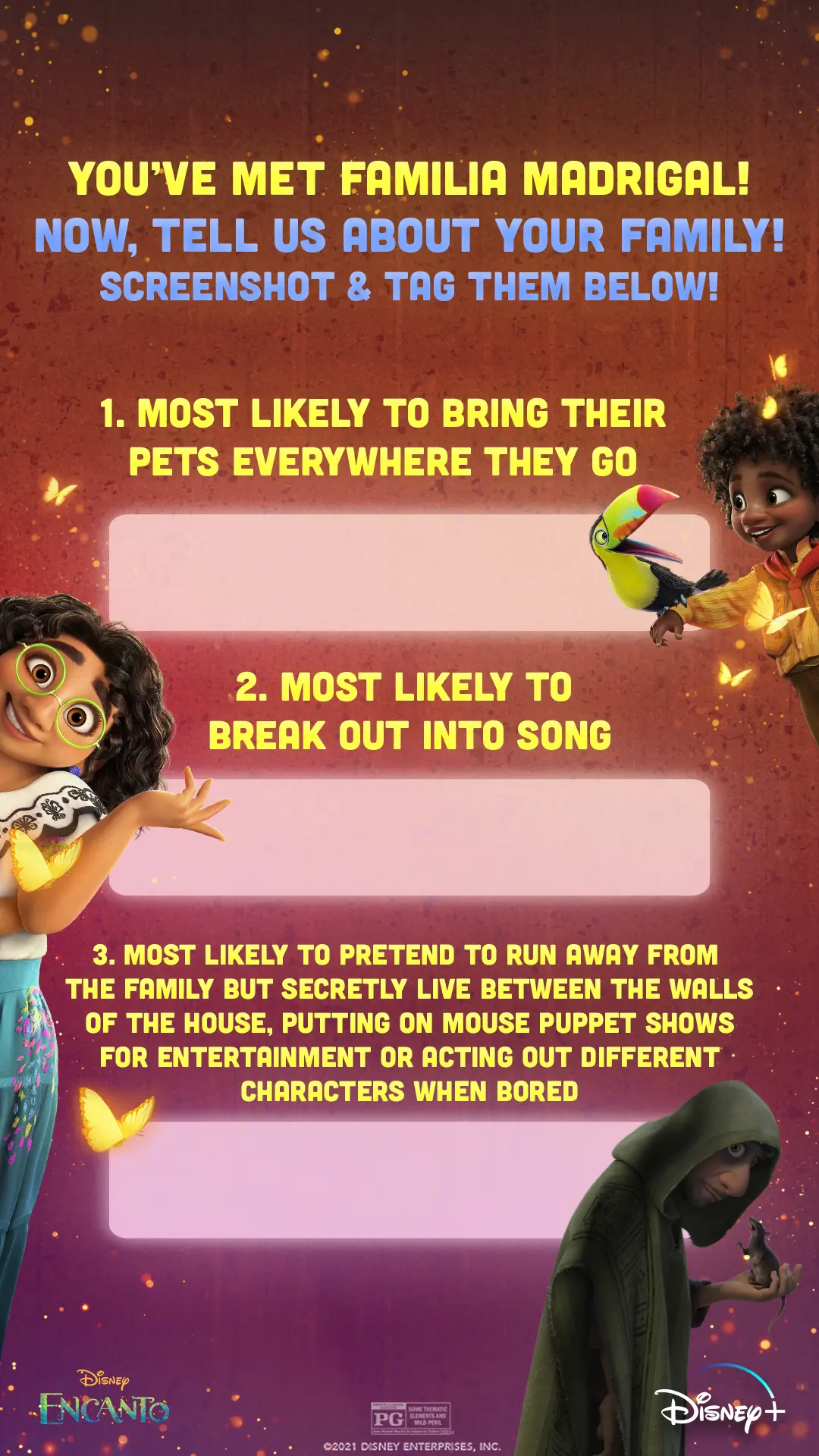
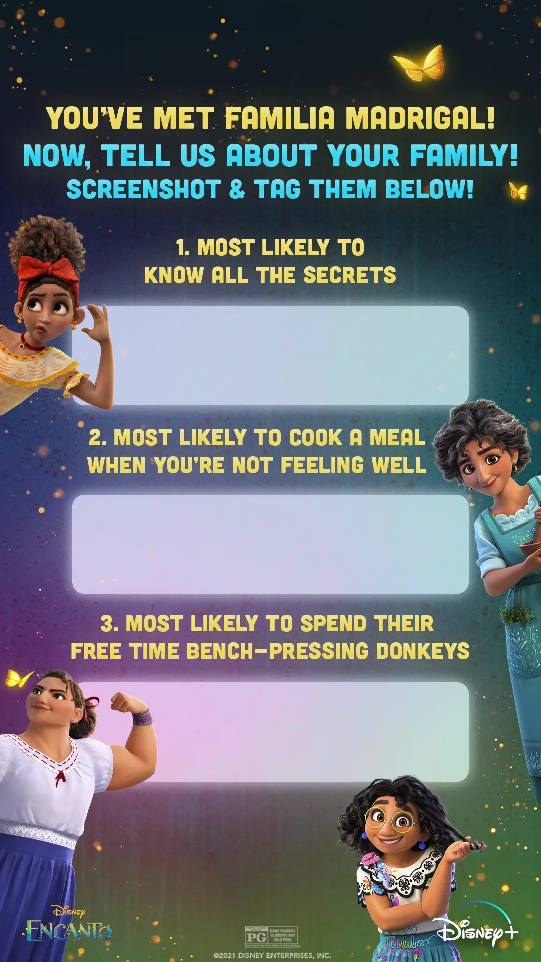
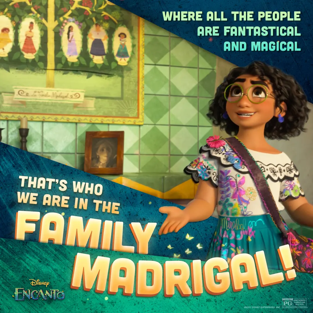
We paired Mirabel's portrait with bold lyric overlays to celebrate the Madrigal family and the film's musical voice.
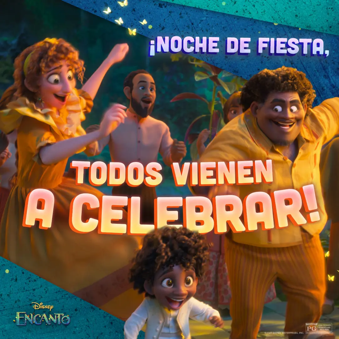
We made this social-first graphic to highlight the Madrigals' party energy and sync with the film's music-led celebration.
We animated a quiet cafecito on sunlit tiles to ground Encanto's warmth in an everyday ritual.
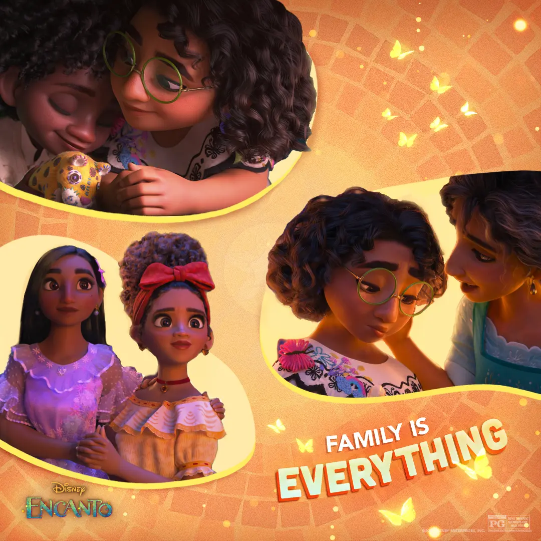
We designed a warm, tile-backed collage that keeps Mirabel at the emotional center while threading small family moments and butterflies through the composition.
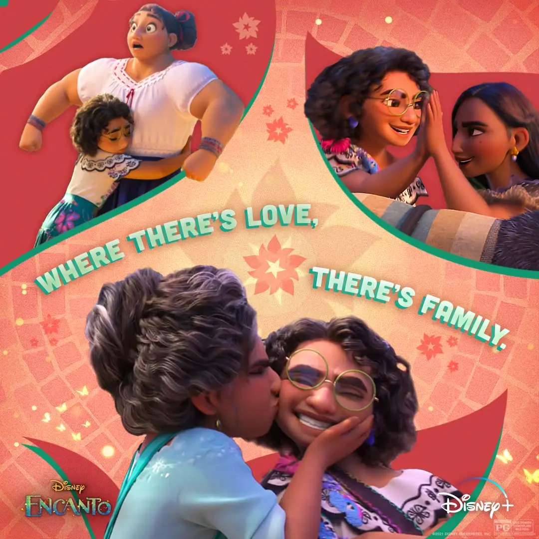
We pulled three intimate Madrigal moments into one social piece so the feed reads like a family album about care, pressure, and the small ways love holds you up.
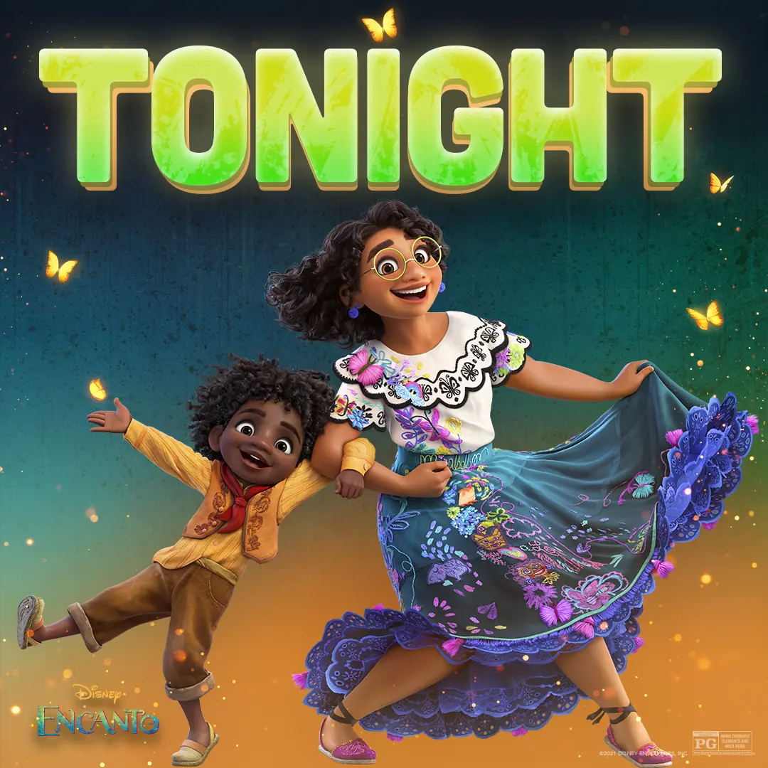
We paired Mirabel and Antonio beneath a bold 'TONIGHT' graphic to give the social countdown a warm, playful energy.
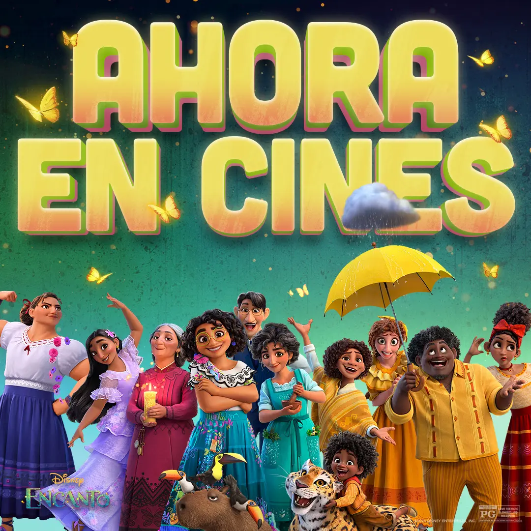
We made a Spanish-language poster that places the Madrigal family beneath bold 'AHORA EN CINES' type, using butterflies, a tiny rain cloud, and bright color to signal the film's magical, family-forward world.
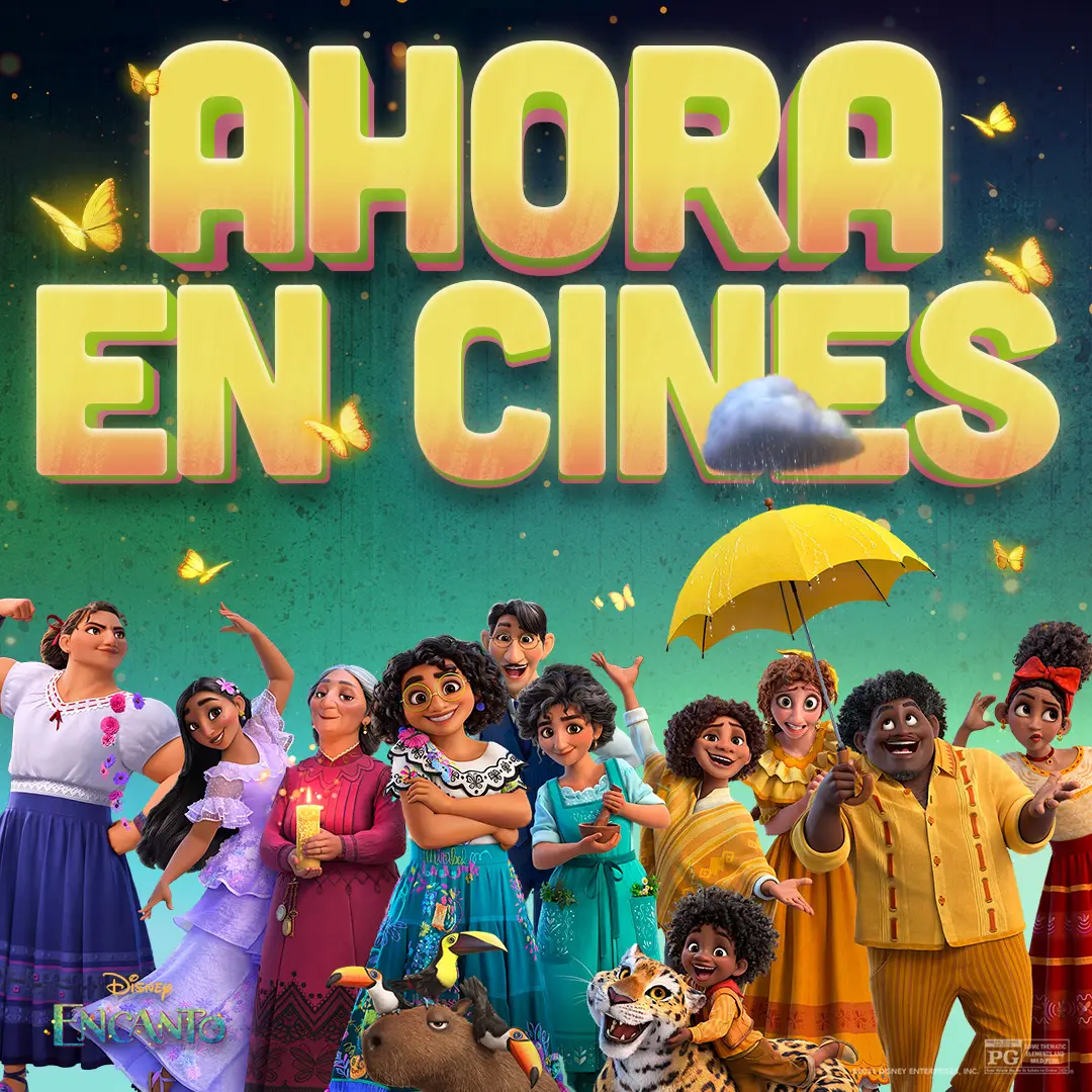
We built a social-first banner that plants the Madrigals beneath bold 'AHORA EN CINES' lettering, using butterflies, saturated color, and a tiny rain cloud to wink at the film’s magic and family tension.
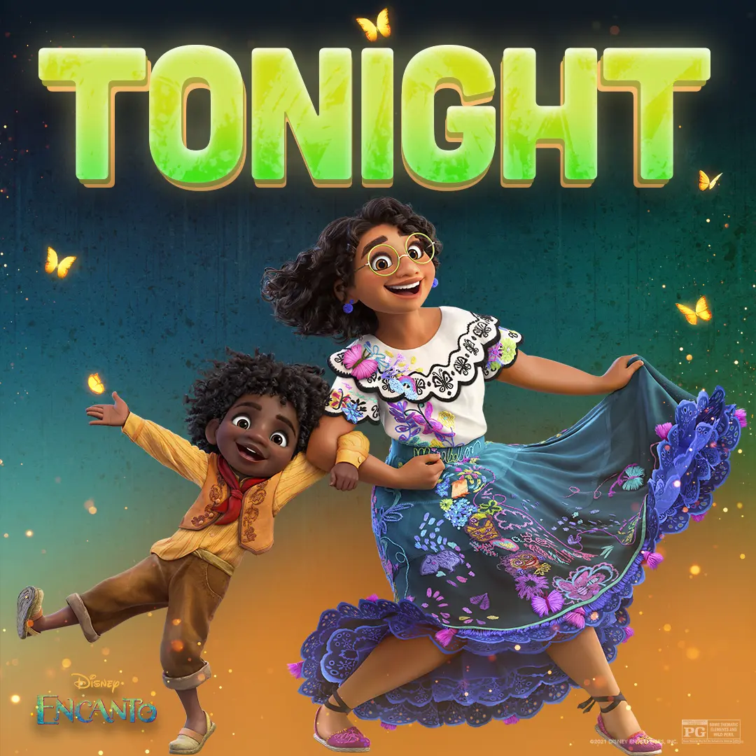
We put Mirabel and Antonio mid-dance beneath the bold 'TONIGHT' headline to make the film's warmth and family magic feel immediate.
We cut a one-minute social edit that pairs warm, lived-in character moments with clear, readable captions and simple interview name straps to keep the work calm and accessible.
We built the Prime Video social campaign for As We See It alongside autistic and neurodivergent collaborators, shaping voice, pacing, visuals, and accessibility across posts.
We made a 17-second animated recipe called “Violetini,” using calm pastels, rounded callouts, and steady pacing developed alongside autistic and neurodivergent collaborators.

We paired John’s candid moment with a bold, intimate quote to lean into the show's awkward mix of surveillance and domestic curiosity.
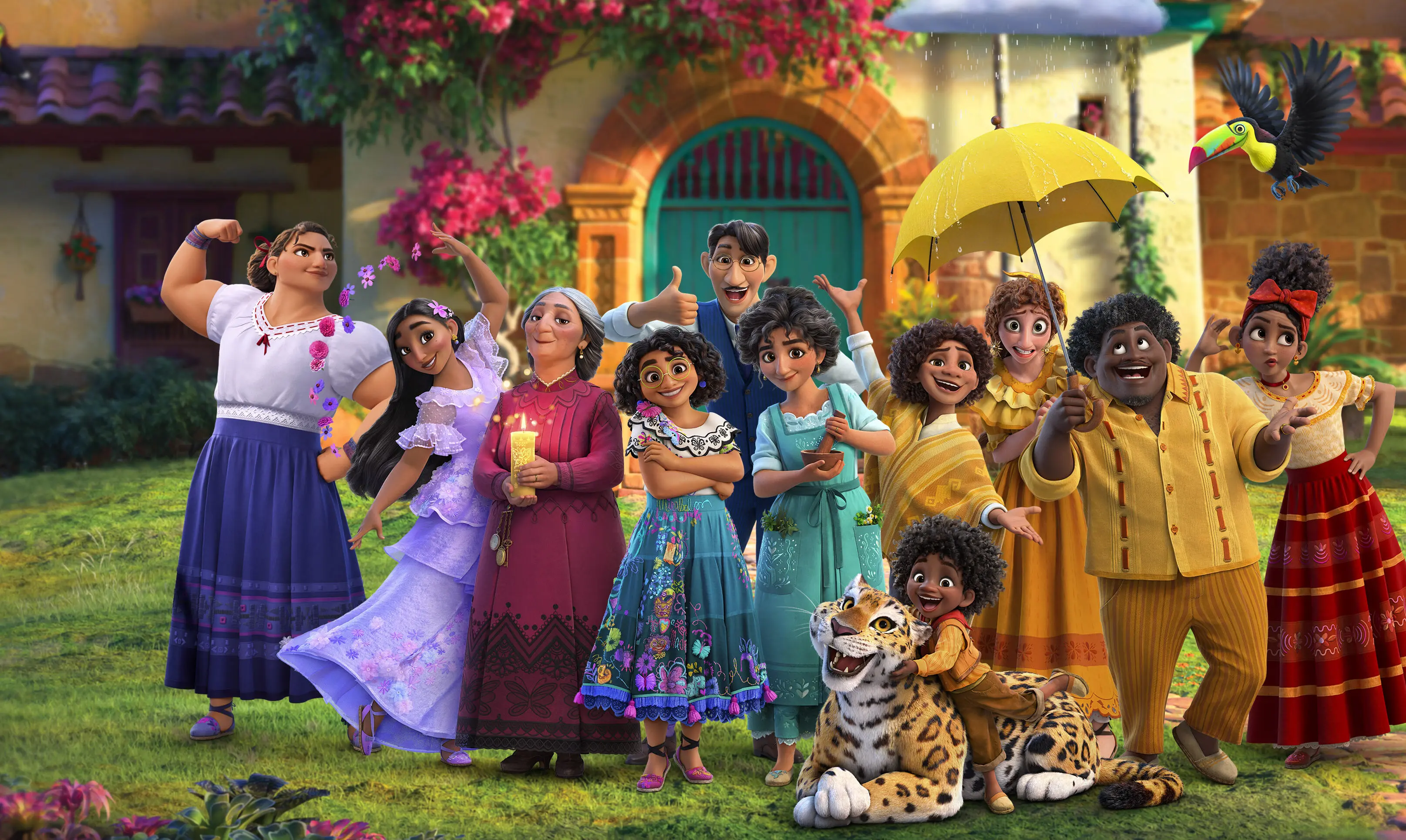
We framed the Madrigals together in front of Casita so the family and their gifts read instantly for social audiences.
We gave an awkwardly honest exchange room to breathe, revealing each line in clear, measured beats that let the emotional turn land.
We paired Violet’s hopeful read of a workplace conversation with clear, paced graphic captions that let the sweetness and uncertainty of the moment sit together.
We extended Violet’s birthday scenario into a tap-through choice prompt, letting viewers consider the social moment and its possible outcomes at a comfortable pace.
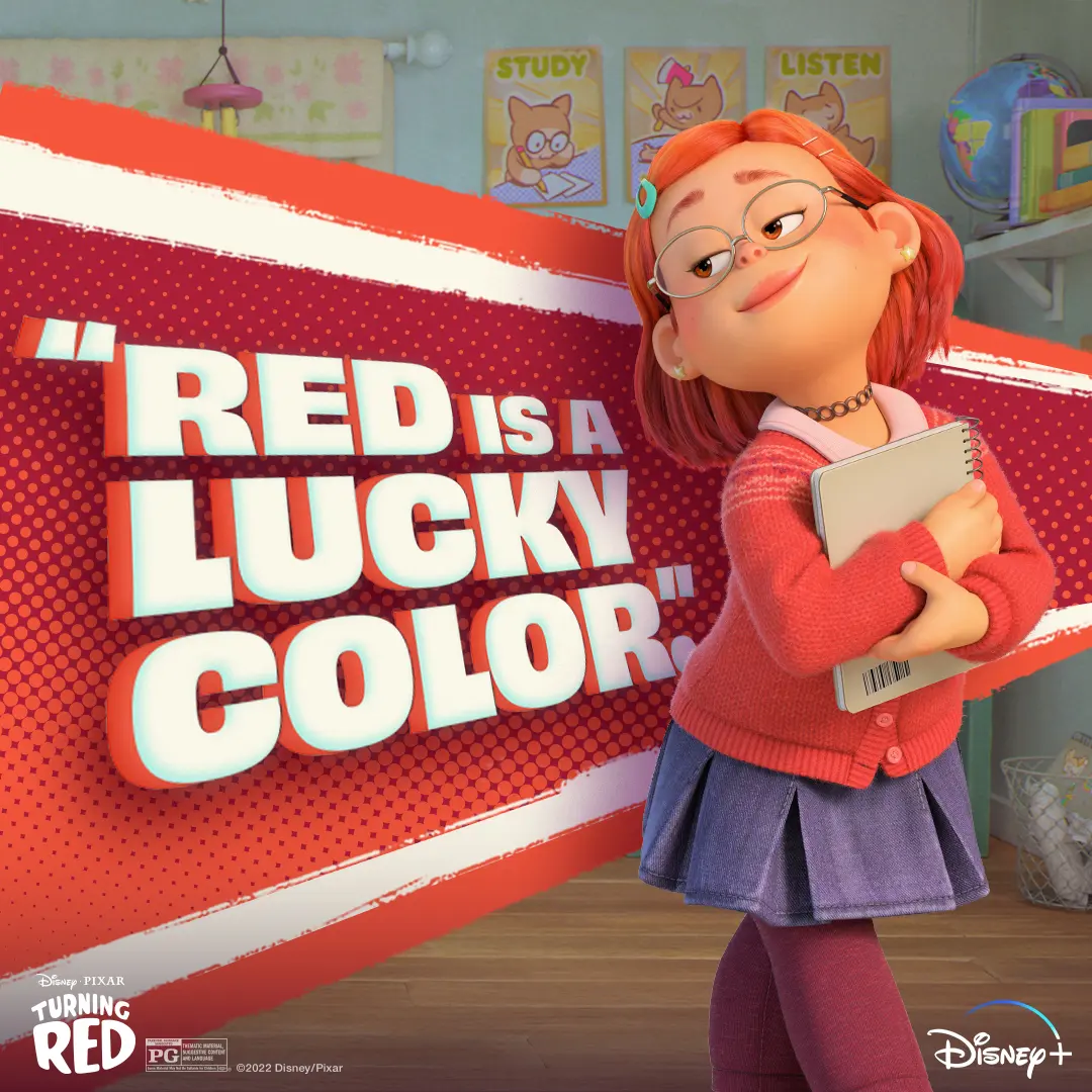
We paired Mei's cozy early-2000s look with a bold, comic-style 'Red is a Lucky Color' graphic to give fans a warm, confident social asset to study or chill with.
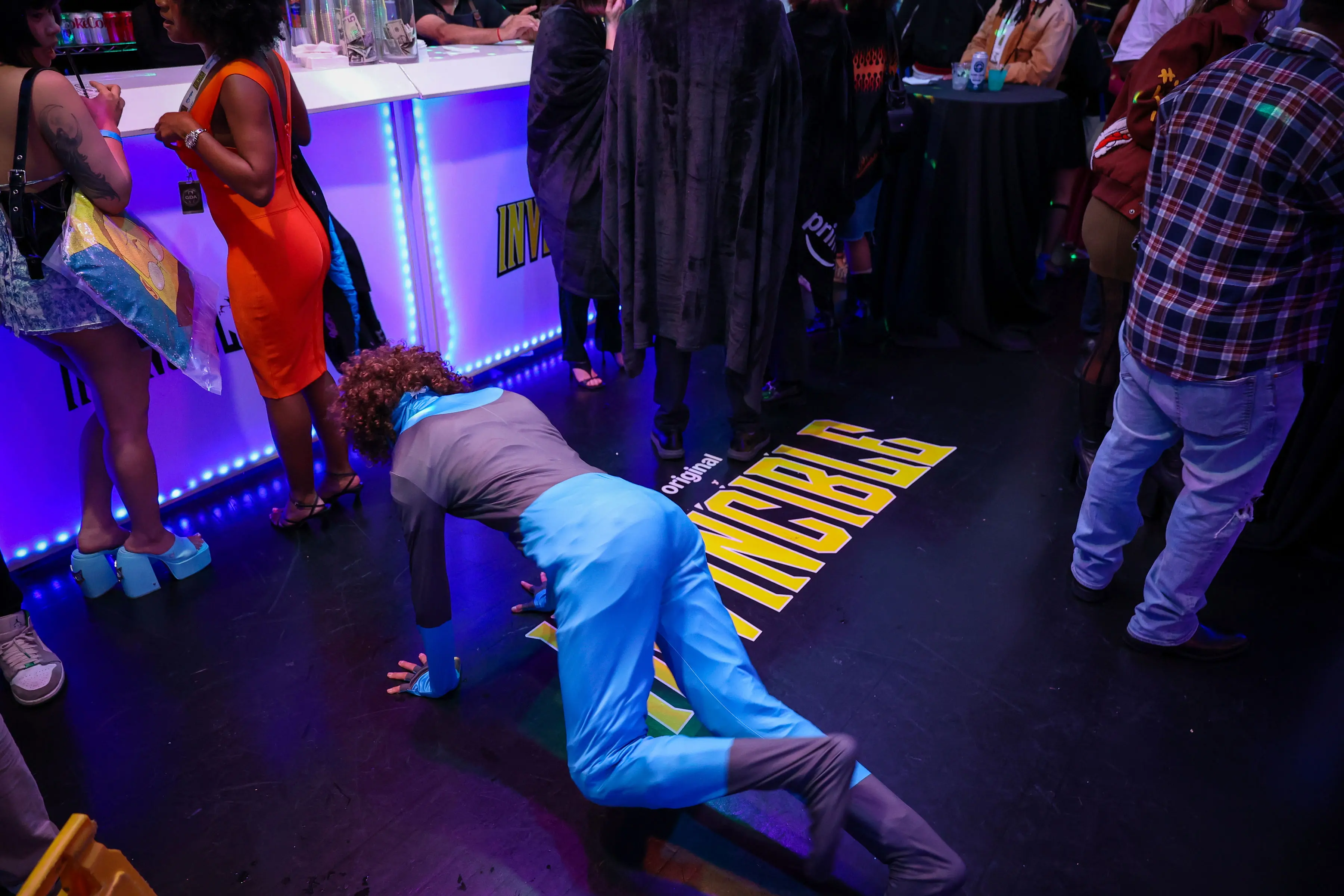
We placed a decal of the Invincible title treatment in front of the bar on the dance floor for a subtle branding moment and this creator understood the assignment.
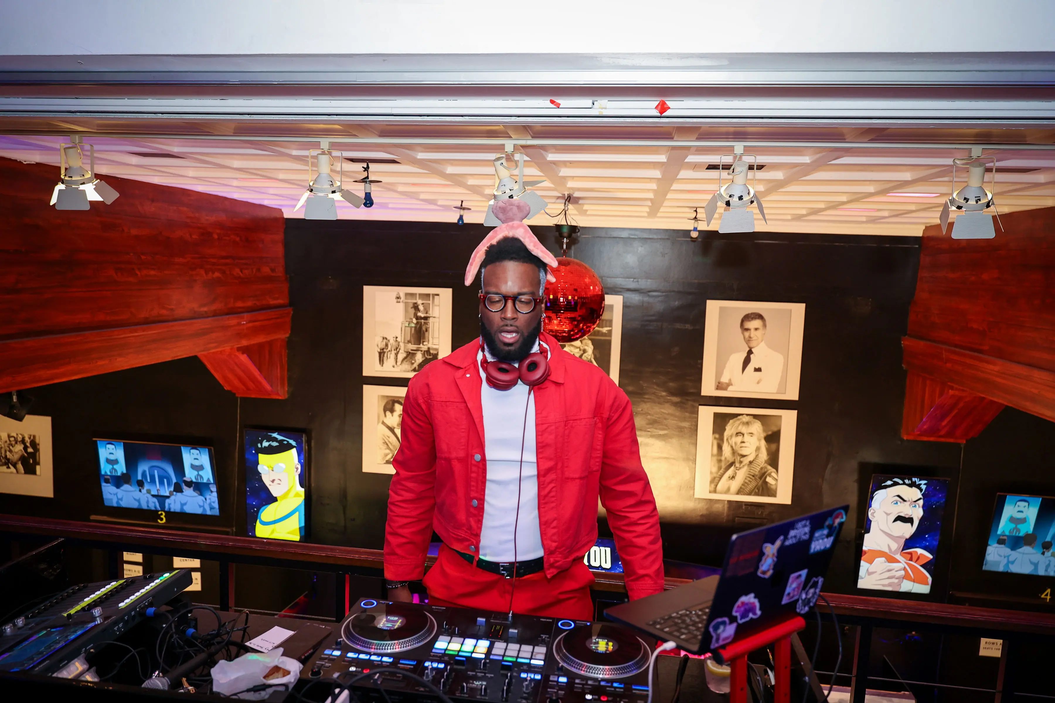
We built a mezzanine DJ booth dressed in show-forward red and framed it with animated character screens so creators had a high-energy photo moment between screenings.
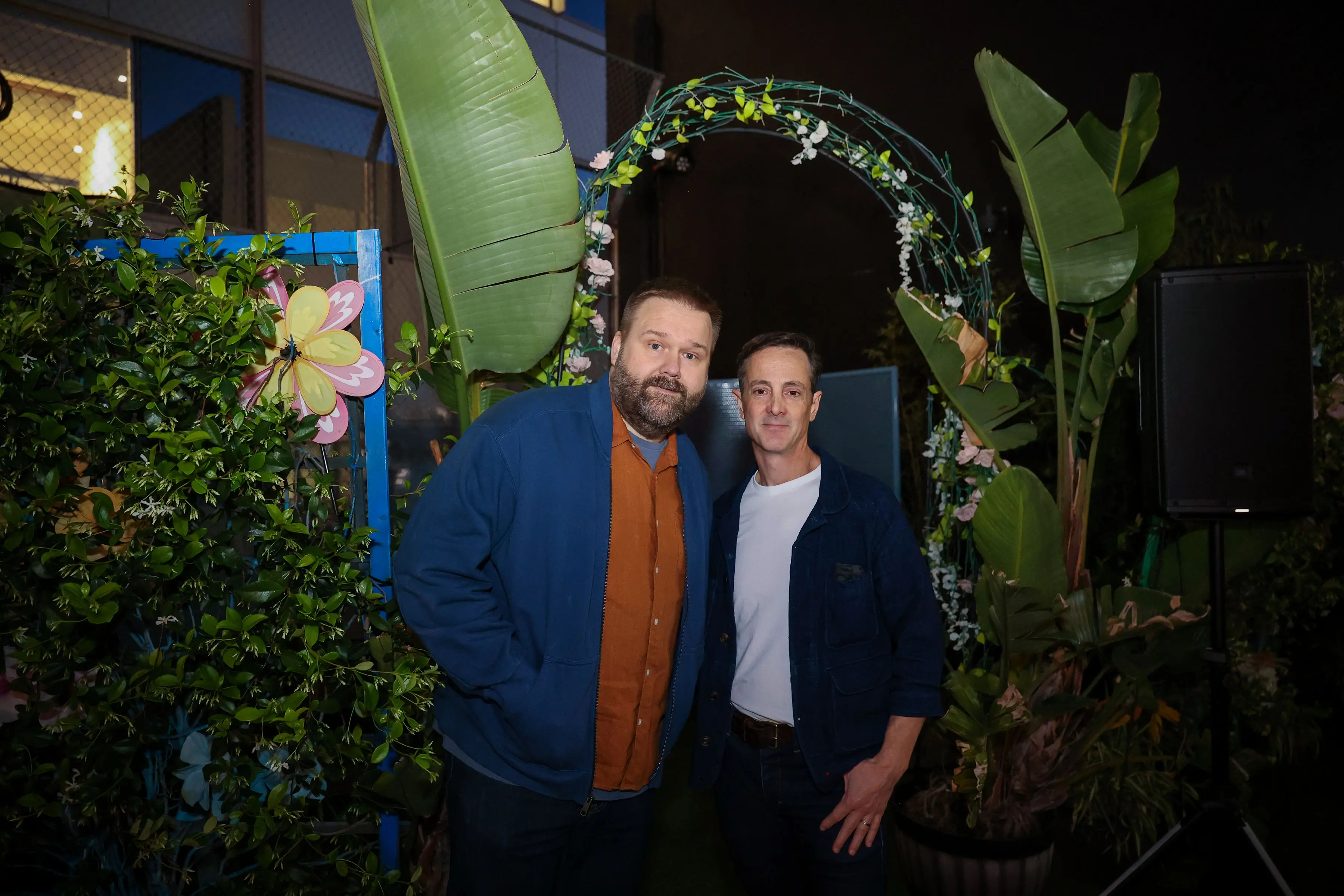
We designed the floral-arch photo moment so creators could grab a quick on-brand portrait framed by practical lighting and tropical foliage.
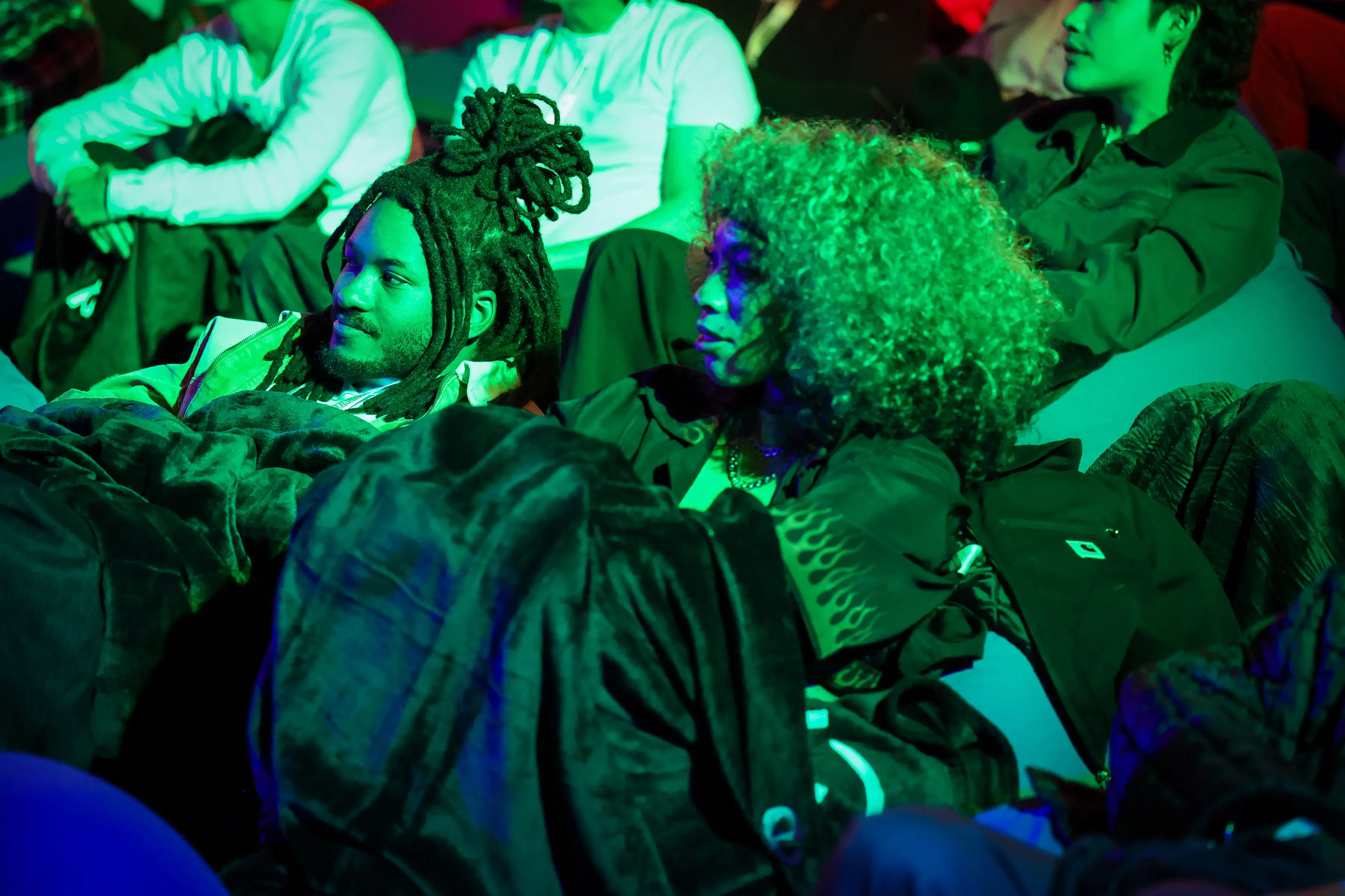
We kept the creator lounge low and tactile, with blankets, beanbags, and punchy color so creators could settle in, record reactions, and make quick content between screening beats.
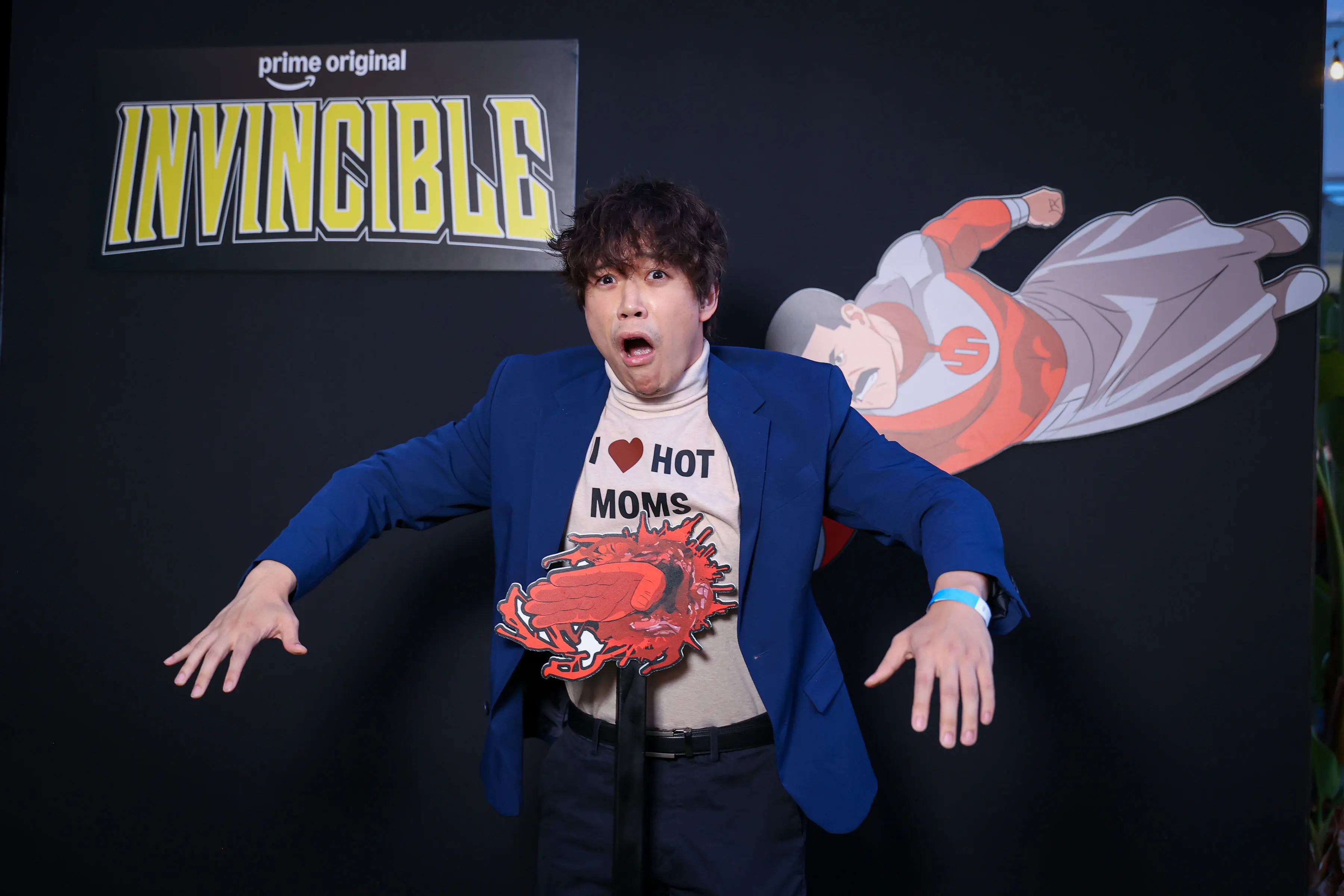
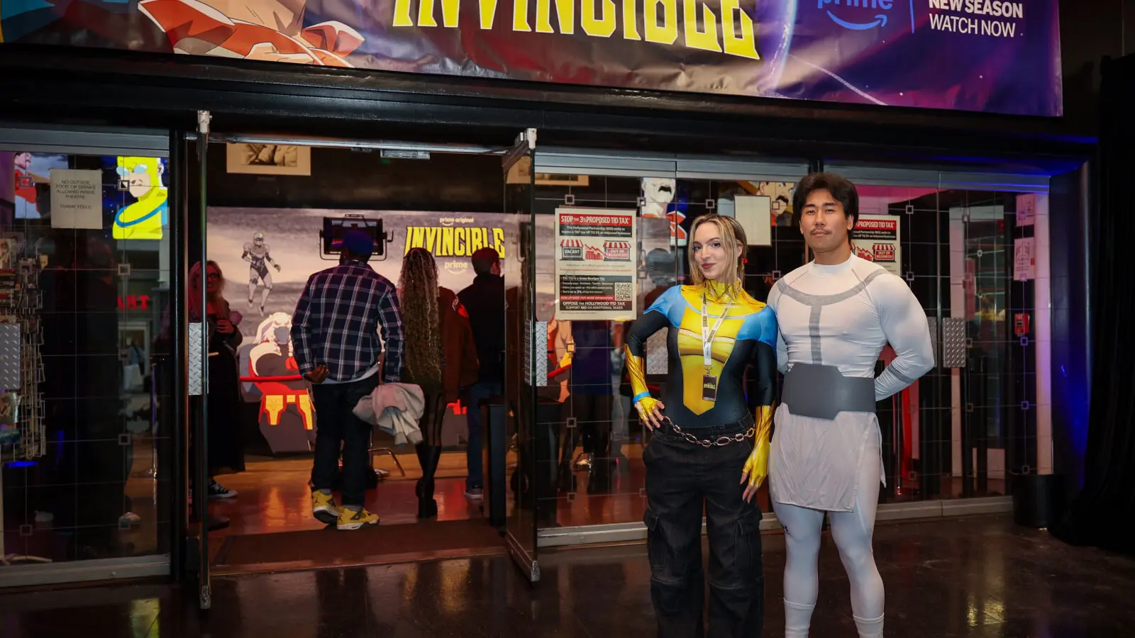
We ran an interactive photo moment at the Invincible screening, pairing the black branded wall with a blood-splatter prop so creators could lean into the show's violent spectacle.
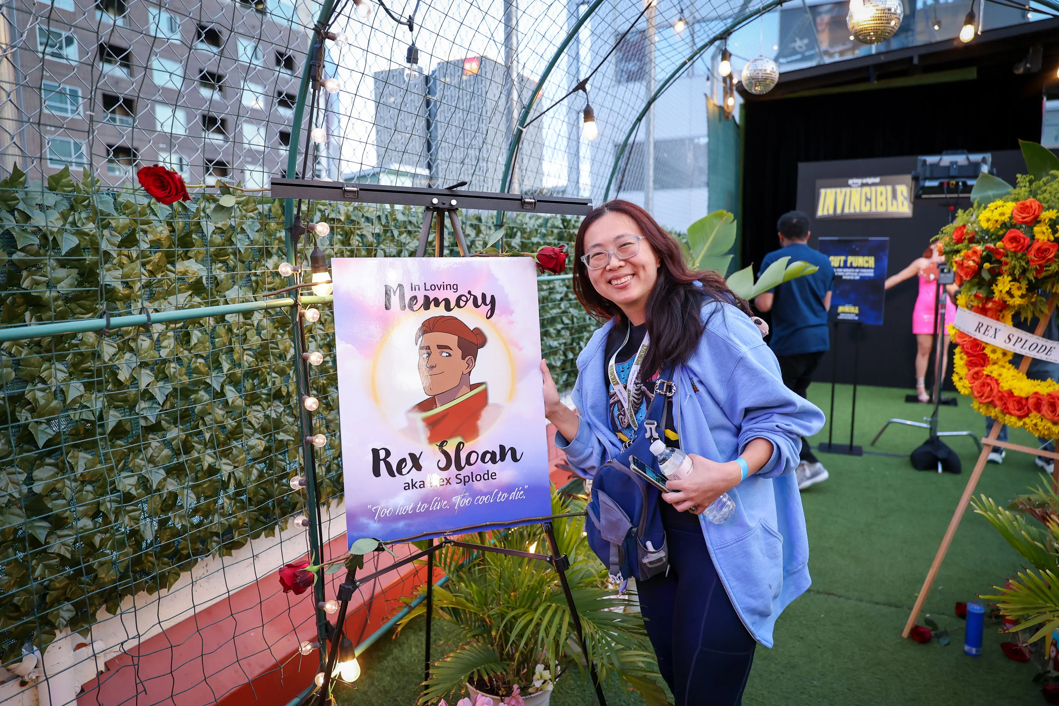
We built this memorial photo moment, with an illuminated easel, illustrated Rex Splode portrait, and wreath, to give creators a tactile, slightly ceremonial way into Season 4’s darker world.
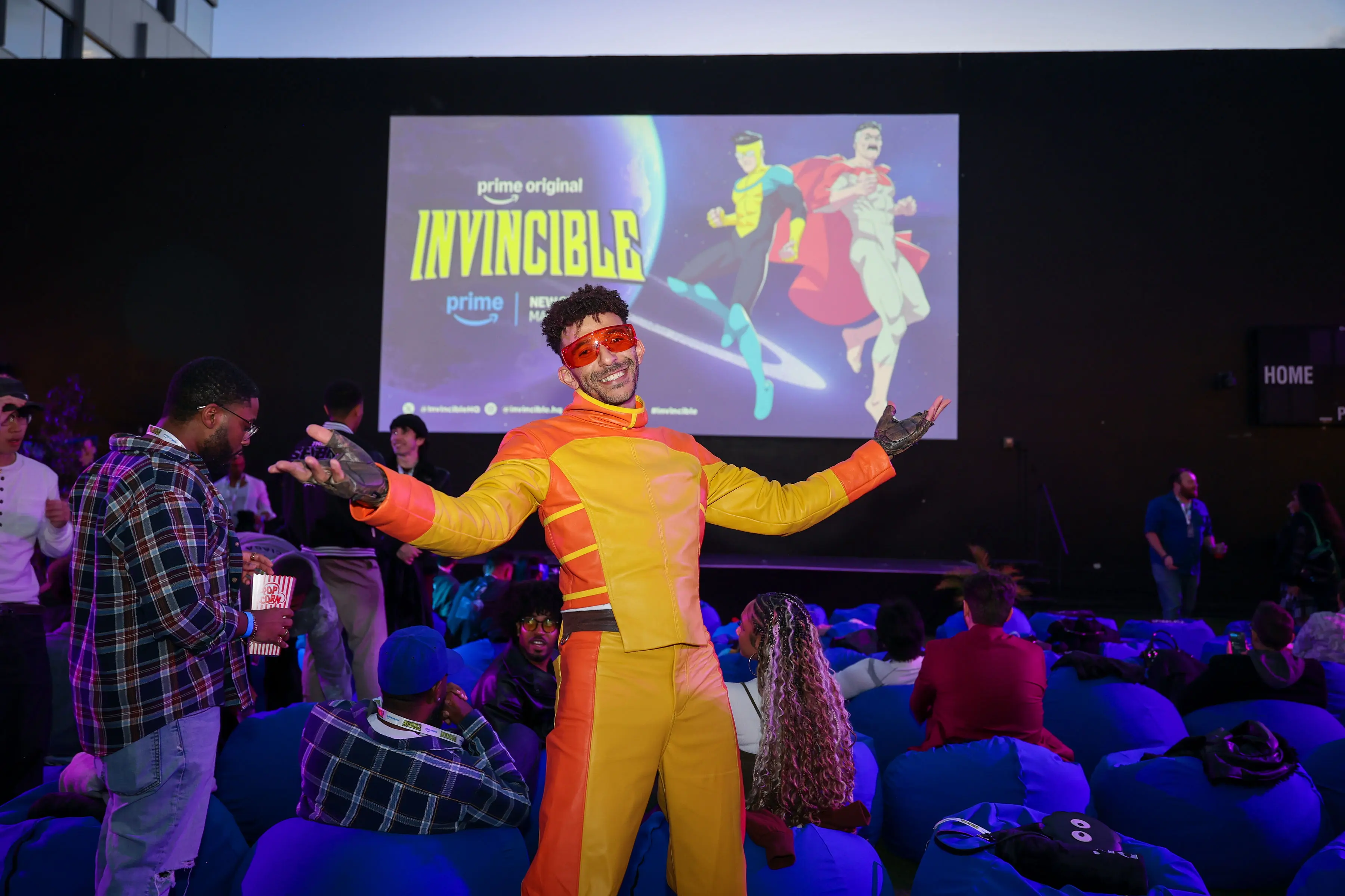
We made the creator screening feel like it belonged inside Invincible’s world, giving guests like Khleo Thomas as Rex Splode room to bring the show’s comic-book energy into the room.