
360 social media marketing, audio visual creative, branding services, capabilities, creative services, cultural consulting, creative design services, digital creative services, motion graphics animation, marketing strategy, social media video production

Strong Black Lead

We built Strong Black Lead’s social identity, giving Netflix a consistent way to surface Black stories, talent, and title recommendations without flattening their range.

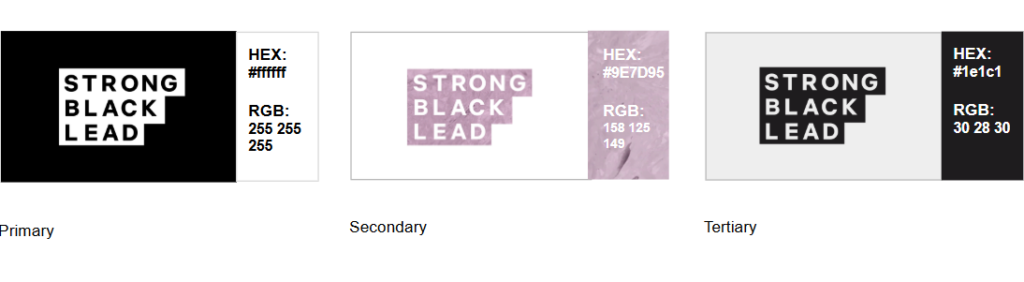
Strong Black Lead wordmark in bold black lettering, arranged across three rows within a stepped rectangular silhouette on a dark gray background.

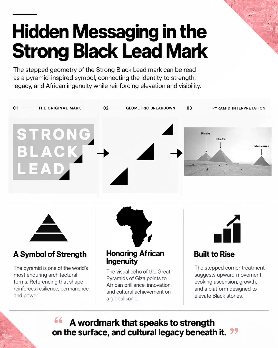
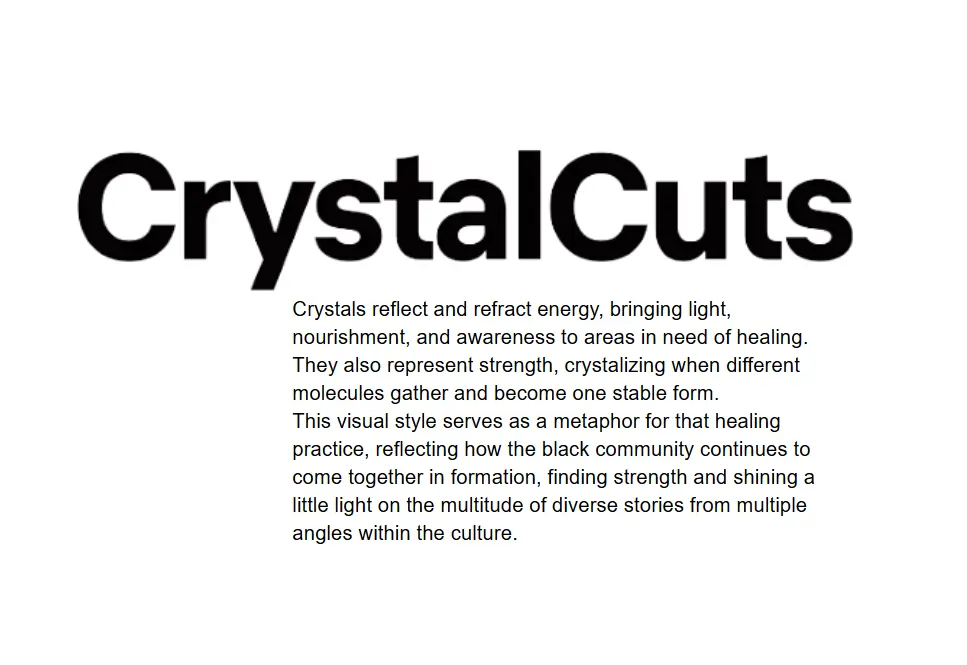
We developed the logo and visual identity for Netflix’s Strong Black Lead, creating a flexible social design system built around our CrystalCuts concept. Inspired by the way crystals gather, strengthen, reflect, and refract light, the system became a metaphor for the breadth of Black stories and perspectives. We extended that idea across the logo, color palette, custom typography, textures, motion, social templates, memes, video treatments, and brand guidelines, giving Strong Black Lead a distinct identity that could evolve across different voices, talent, and cultural moments.


The Concept

The CrystalCuts concept began with a need for range. We developed a system that could hold many Black stories, voices, and tones without prescribing one aesthetic for all of them. The stepped mark and color standards created the consistency needed for fast-moving publishing, while apparel and podcast applications tested whether Strong Black Lead could stay clear and connected beyond the social feed.
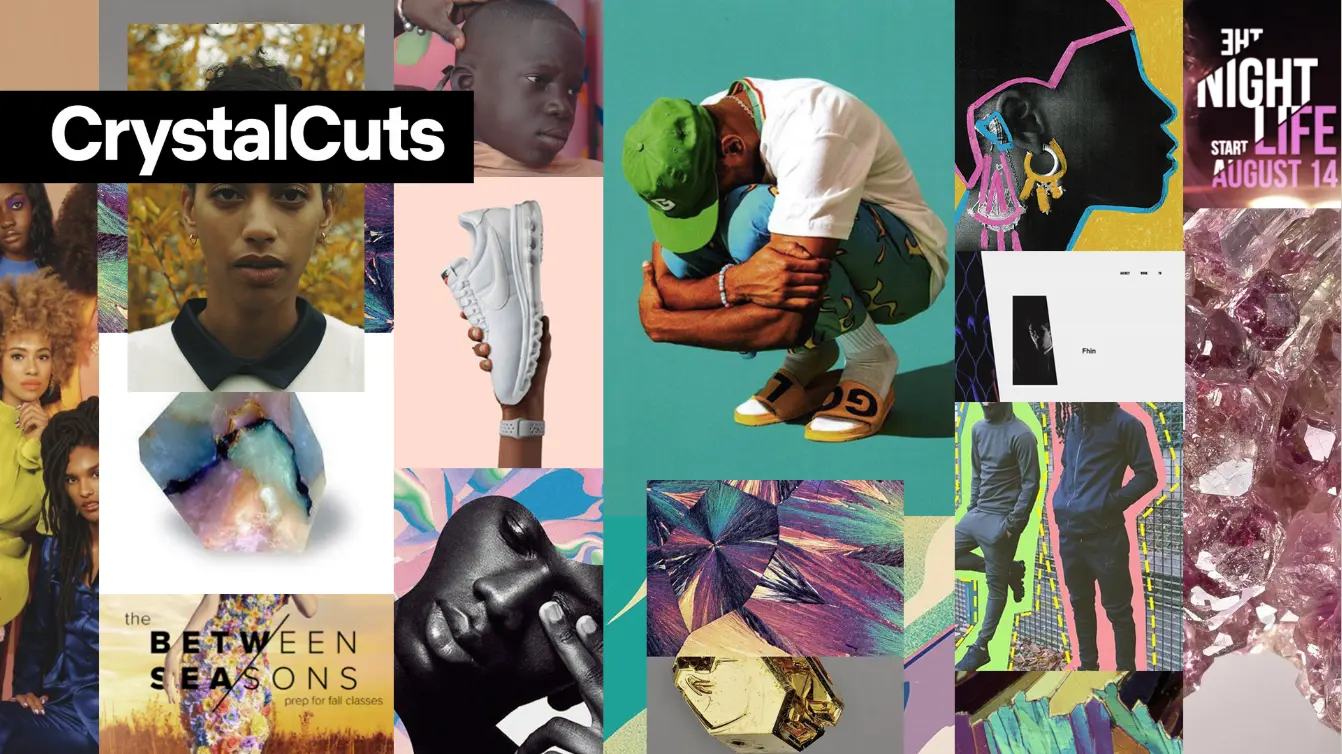
CrystalCuts mood board combining Black talent photography, colorful editorial imagery, product photography, graphic silhouettes, and crystal textures beneath a bold CrystalCuts title treatment.
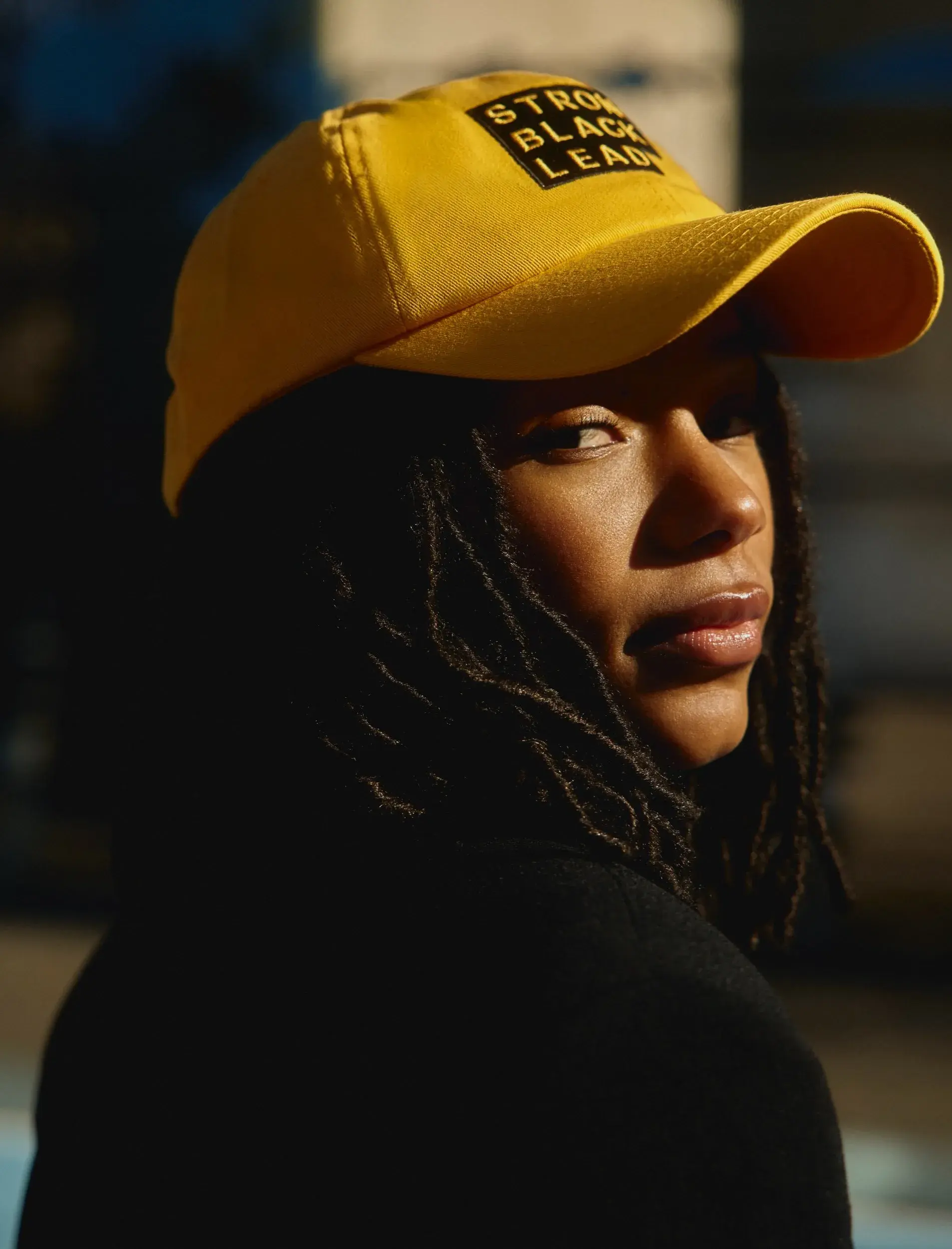
Portrait of a person wearing a yellow cap embroidered with the stepped Strong Black Lead logo in black and white.
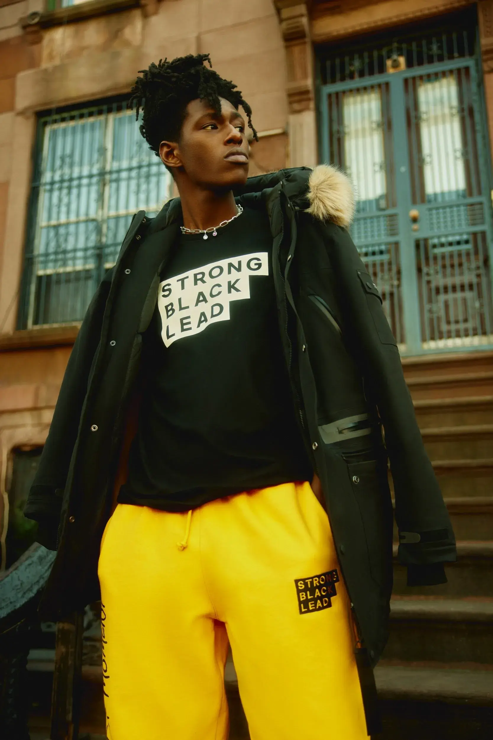
A person stands outside a brownstone wearing a black Strong Black Lead sweatshirt and yellow sweatpants, both featuring the stepped Strong Black Lead logo.
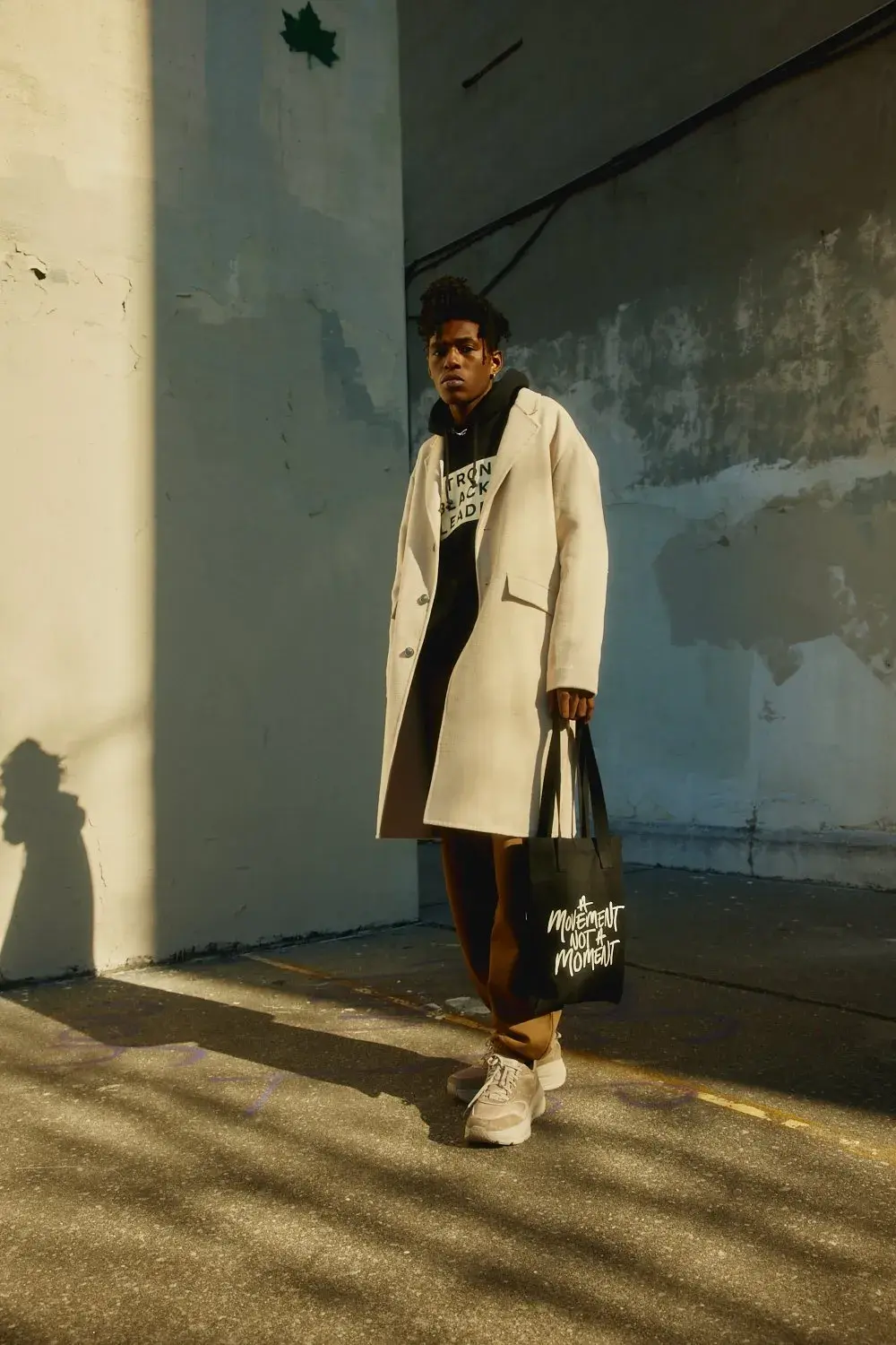
A person wears a light coat over a Strong Black Lead sweatshirt and carries a black tote reading “A Movement Not A Moment” beside a sunlit concrete wall.
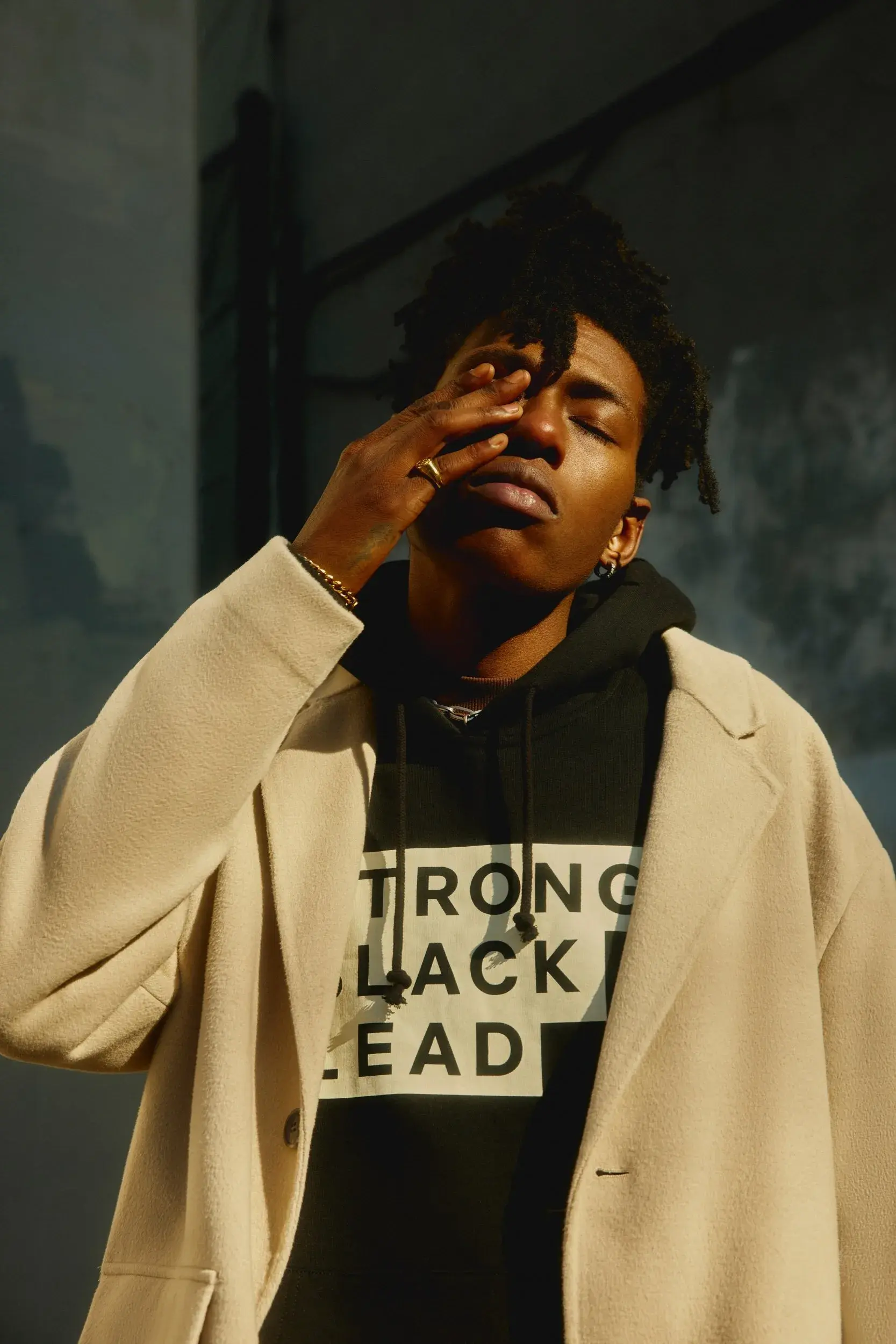
A person in a light coat wears a black hoodie featuring the stepped Strong Black Lead logo in a sunlit portrait.
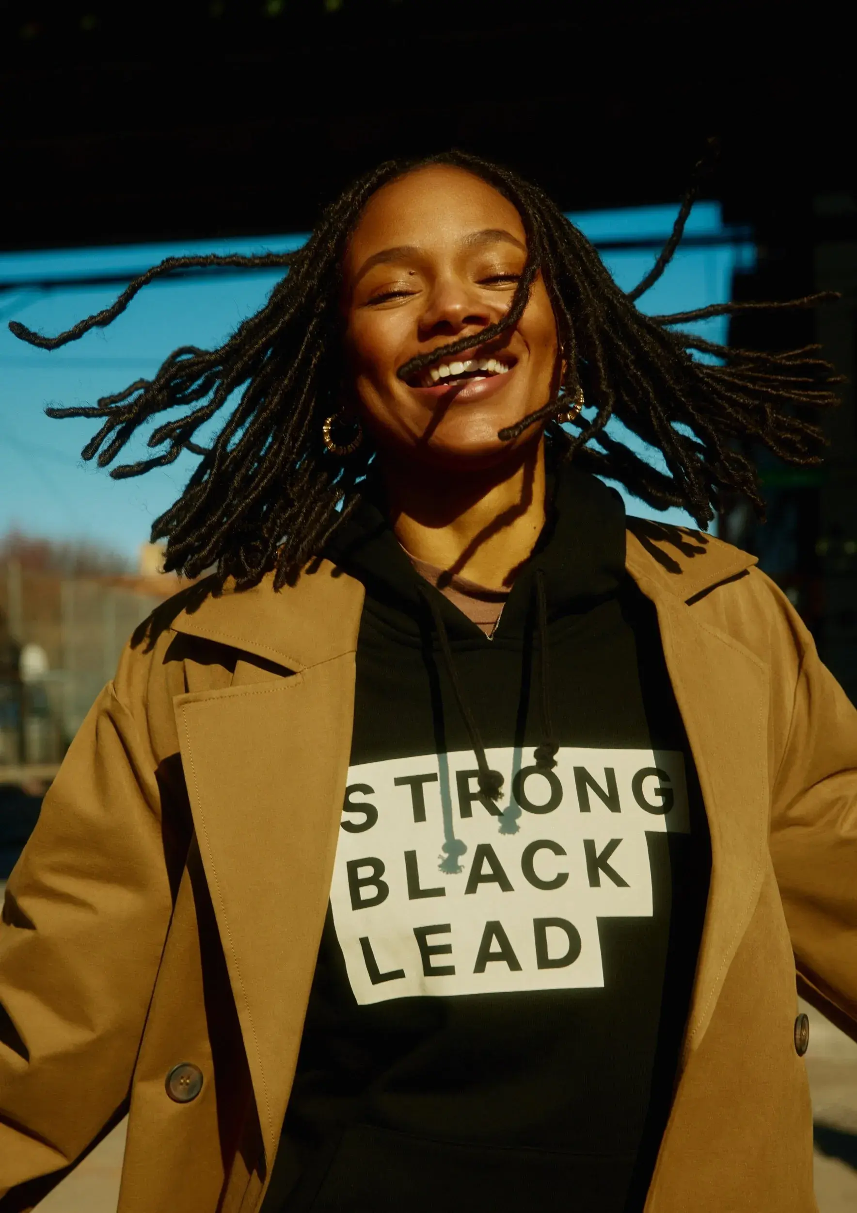
A smiling woman outdoors wears a tan coat over a black hoodie featuring the stacked Strong Black Lead wordmark.
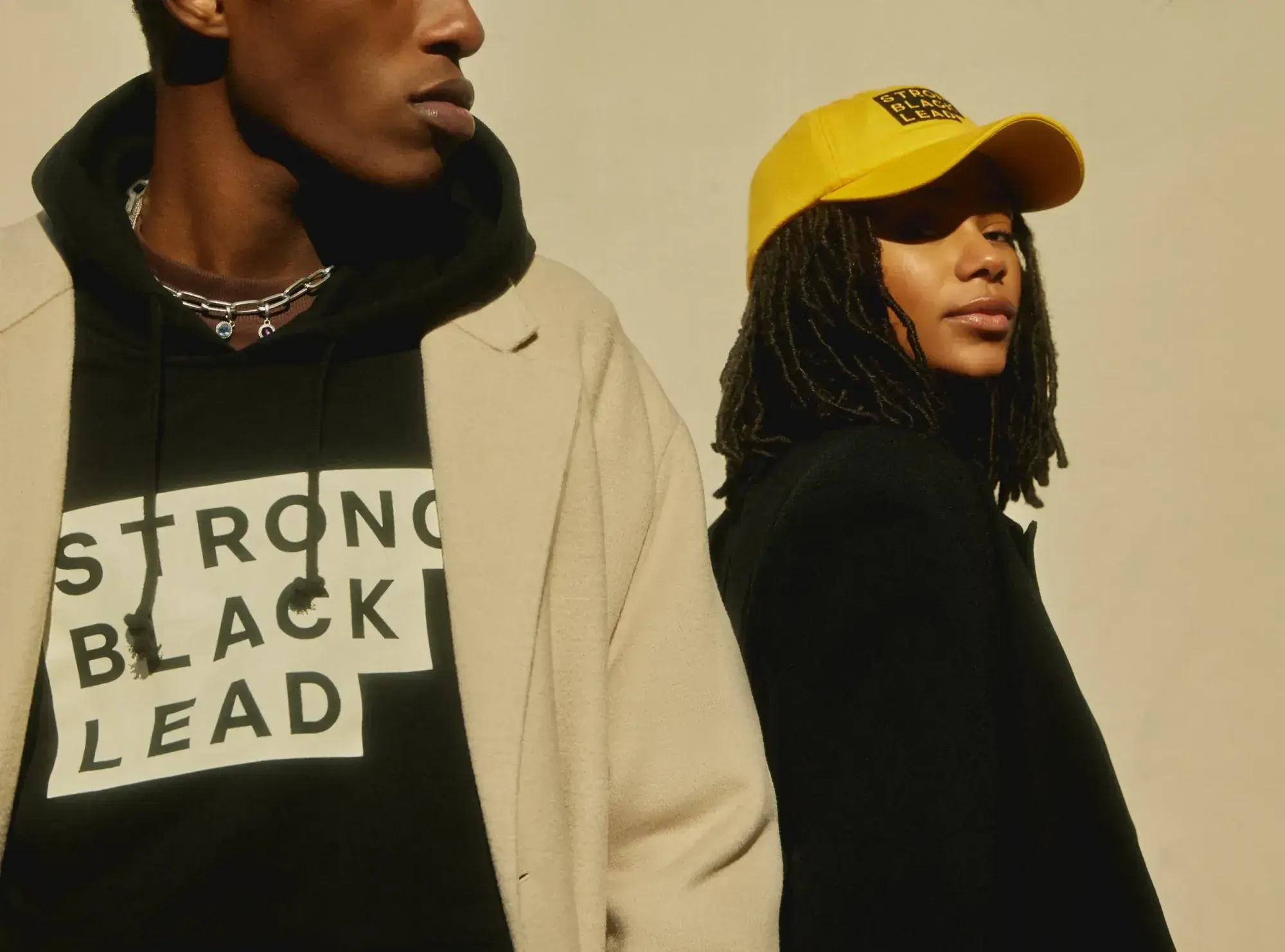
Two people model Strong Black Lead apparel, including a black hoodie with the stepped logo and a yellow cap with a small branded patch.
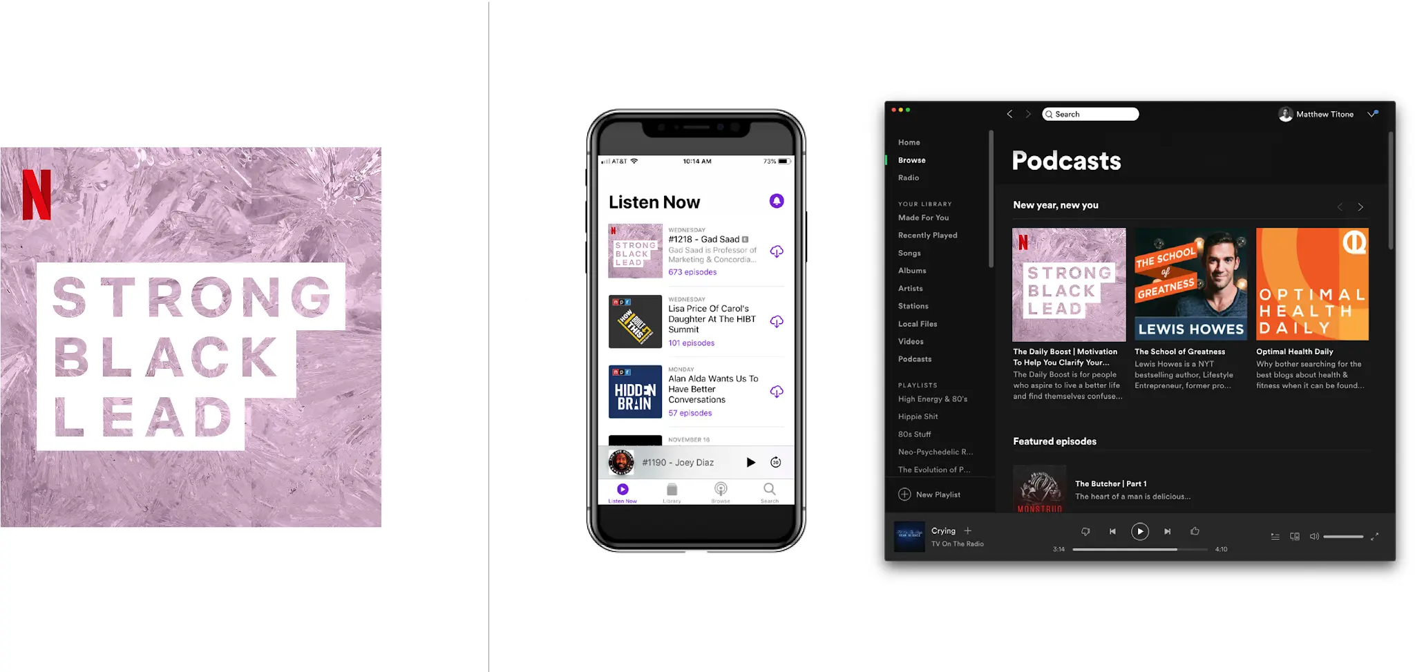
Strong Black Lead podcast artwork with a lavender CrystalCuts texture appears alongside mobile and desktop audio-platform mockups.

End Cards

This toolkit balanced recognizable branding with the quick, feeling-first rhythms of social conversation. We used the compact stepped mark as a concise Strong Black Lead identifier, while reaction-based examples showed how the system could make room for personality-led posting without placing a heavy treatment over every moment. Explorations of the mark’s geometry remained concept work, not final brand guidance.
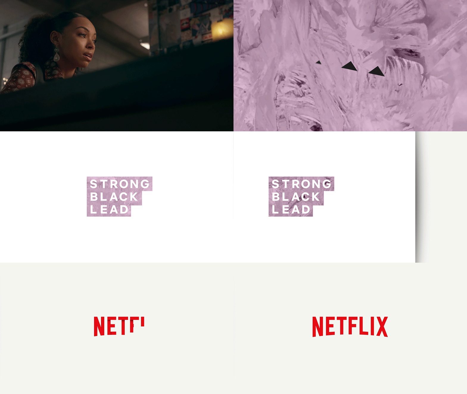
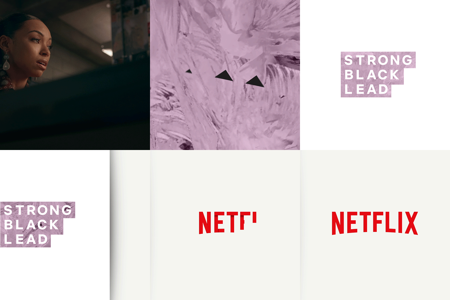
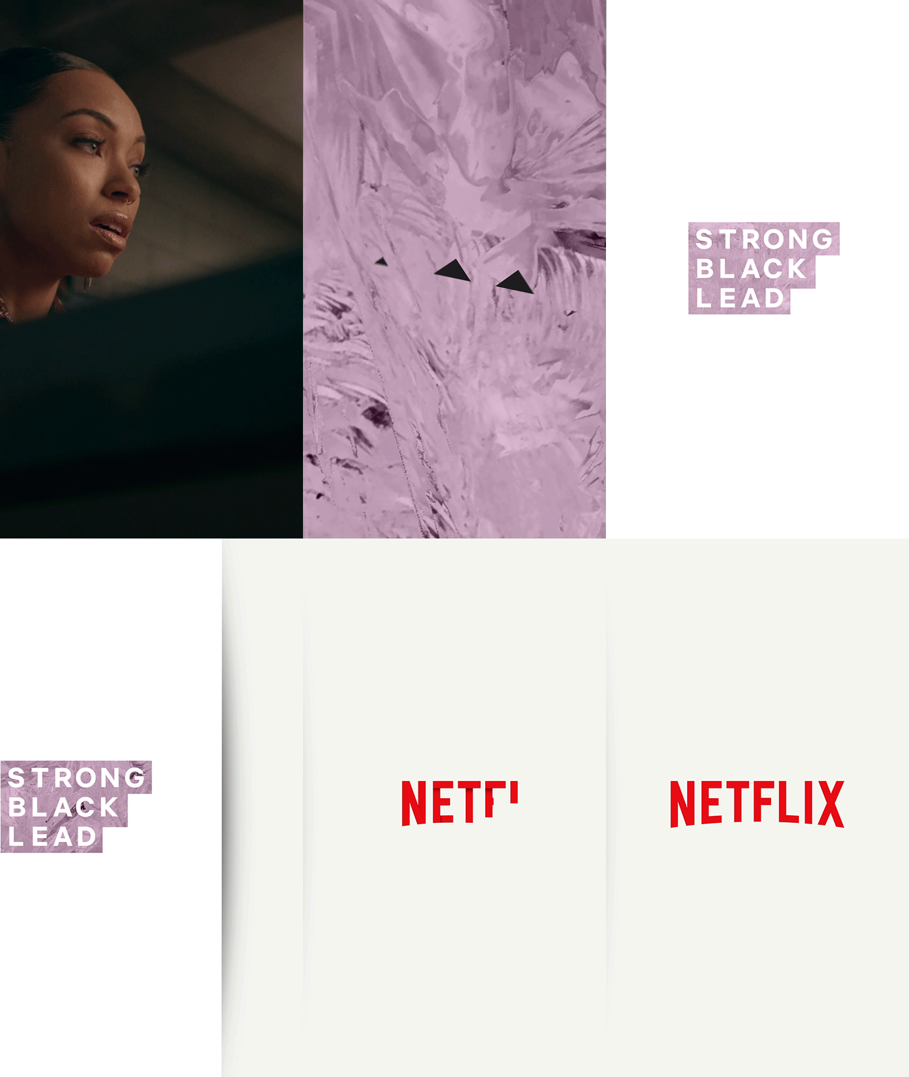
A woman in patterned clothing and dangling earrings looks toward an unseen screen in a dim room with photos and a glowing lamp behind her.
A close-up GIF of a woman wearing drop earrings as she looks to the side in a dimly lit interior.
Close-up GIF of a woman looking offscreen with a quiet, contemplative expression in a dimly lit interior.
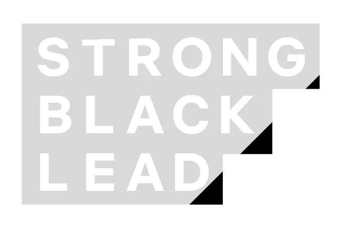
Strong Black Lead wordmark in white stepped lettering within a light gray rectangular field, with black corner cuts shaping the mark’s compact silhouette.

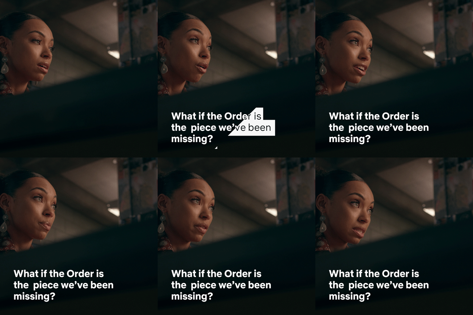
We treated motion and editorial treatments as a test of the system’s restraint. Strong Black Lead needed to support quick social rhythms and emotionally varied character moments without competing with the expression or stakes already present in the footage. These examples showed how the broader identity could keep the human feeling at the center.
Animated close-up of a woman with long dark hair, a pearl necklace, and layered neutral clothing speaking while seated indoors.
Close-up of a woman with pulled-back hair and dangling earrings looking tearful in a dimly lit interior.

We established a fixed upper-left burn-in position so viewers could recognize Strong Black Lead consistently across square, vertical, and horizontal video. The guidance also clarified how Netflix branding could sit in the lower-right when both appeared together, protecting a clear hierarchy while keeping attention on the footage.
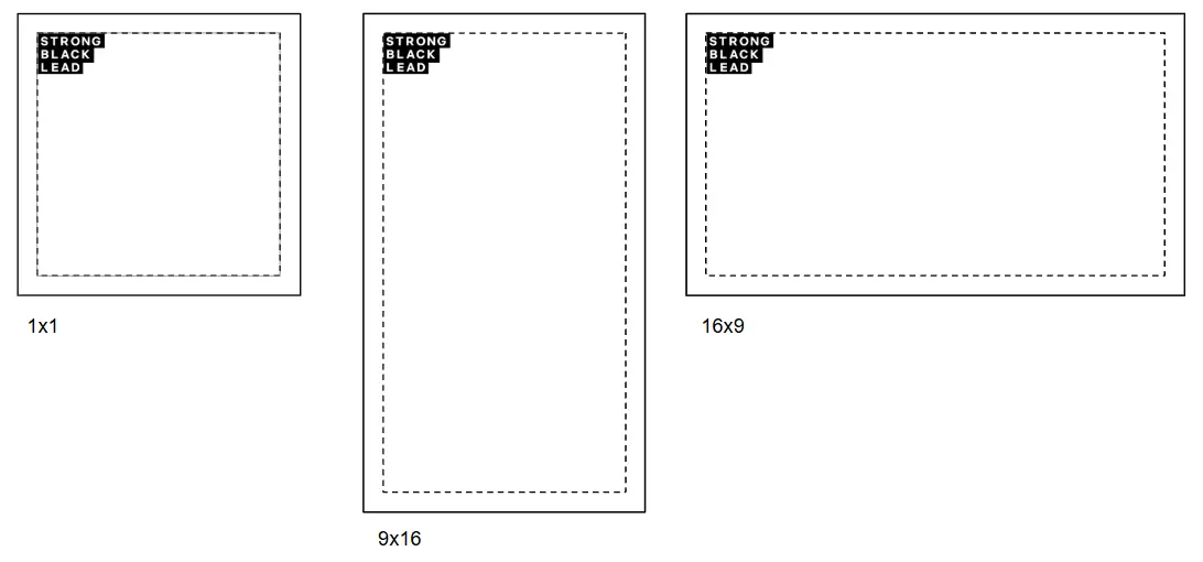
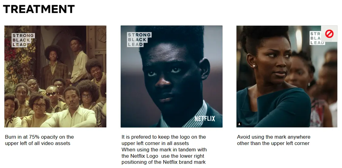
Strong Black Lead treatment slide showing approved upper-left logo burn-ins on two video stills and an incorrect upper-right placement marked with a red symbol.

In Use


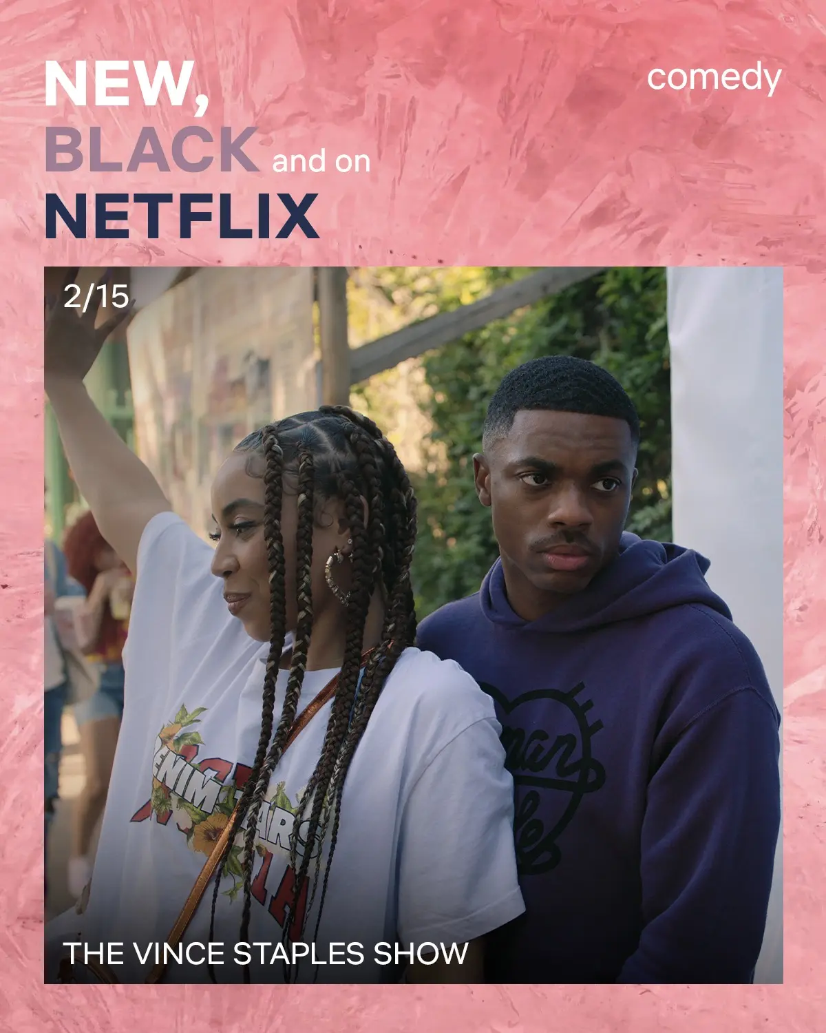
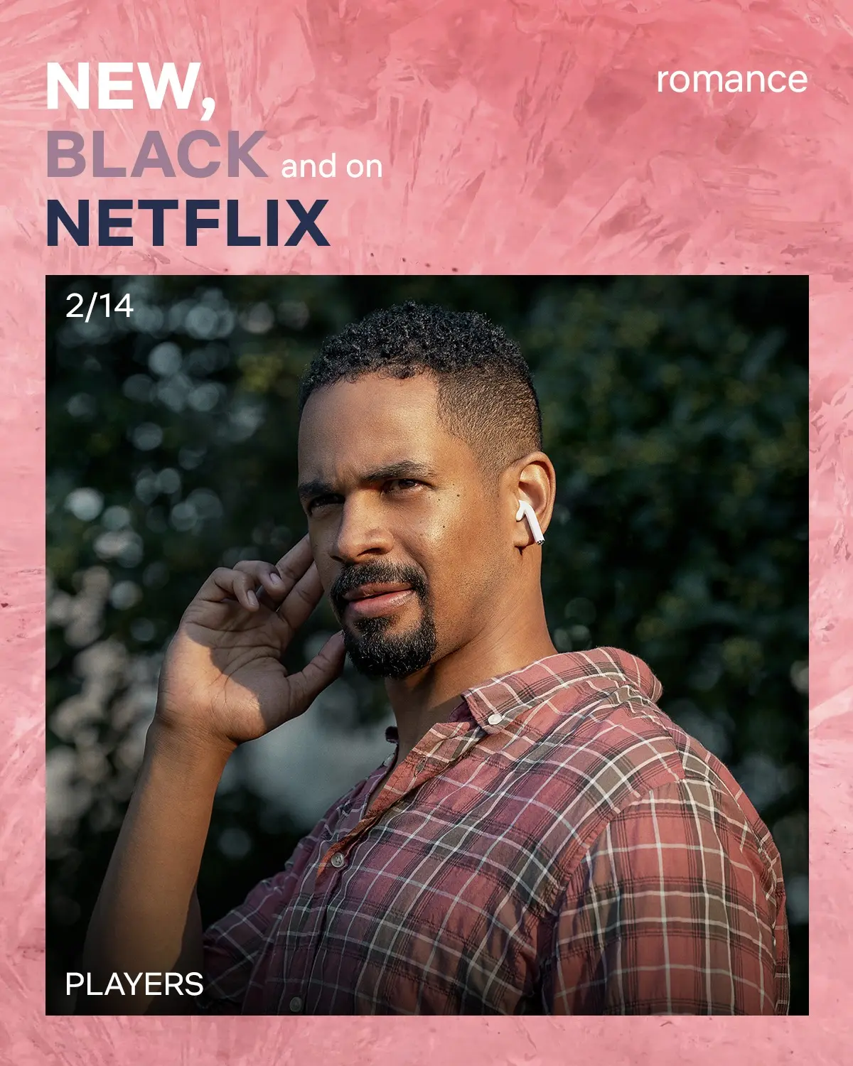
We turned the identity into repeatable social formats that made title discovery easier and kept talent at the center. “New, Black and on Netflix” gave viewers a fast read on what was available, along with title and genre cues, while talent-led posts used the Strong Black Lead mark lightly enough to identify the channel without crowding the moment.
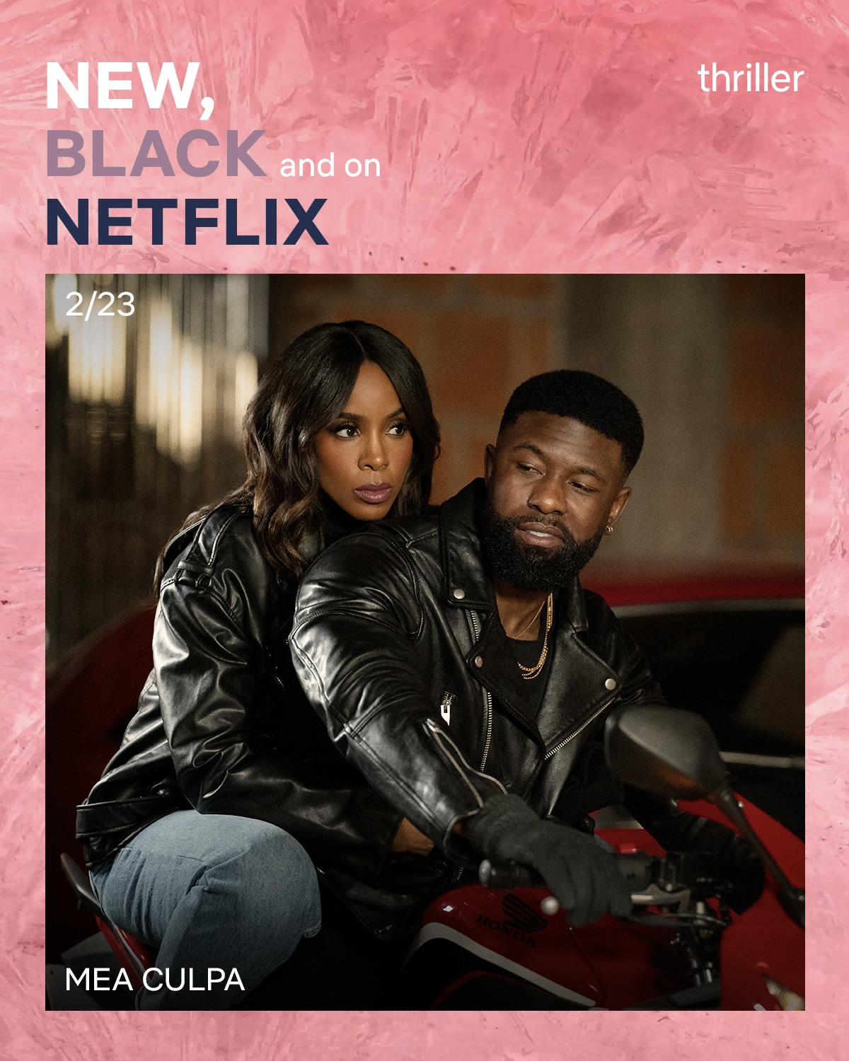
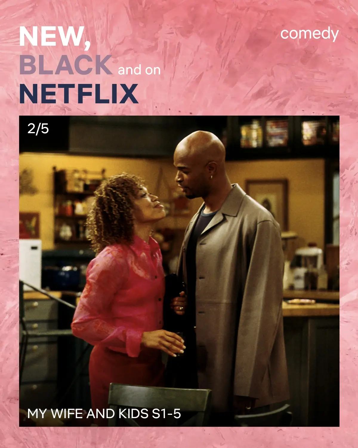
Strong Black Lead social graphic promotes My Wife and Kids seasons 1–5 as a comedy, framing a still of two performers with “New, Black and on Netflix” copy.
Strong Black Lead carousel graphic promoting Mike Epps: Ready to Sell Out, framed by a pink CrystalCuts texture with New, Black and on Netflix typography.


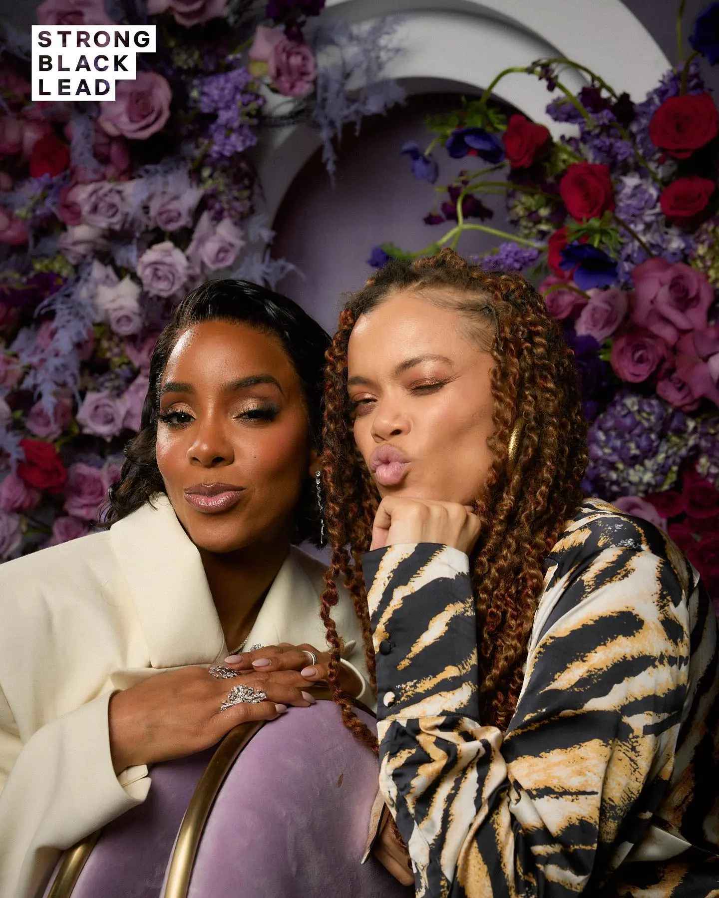
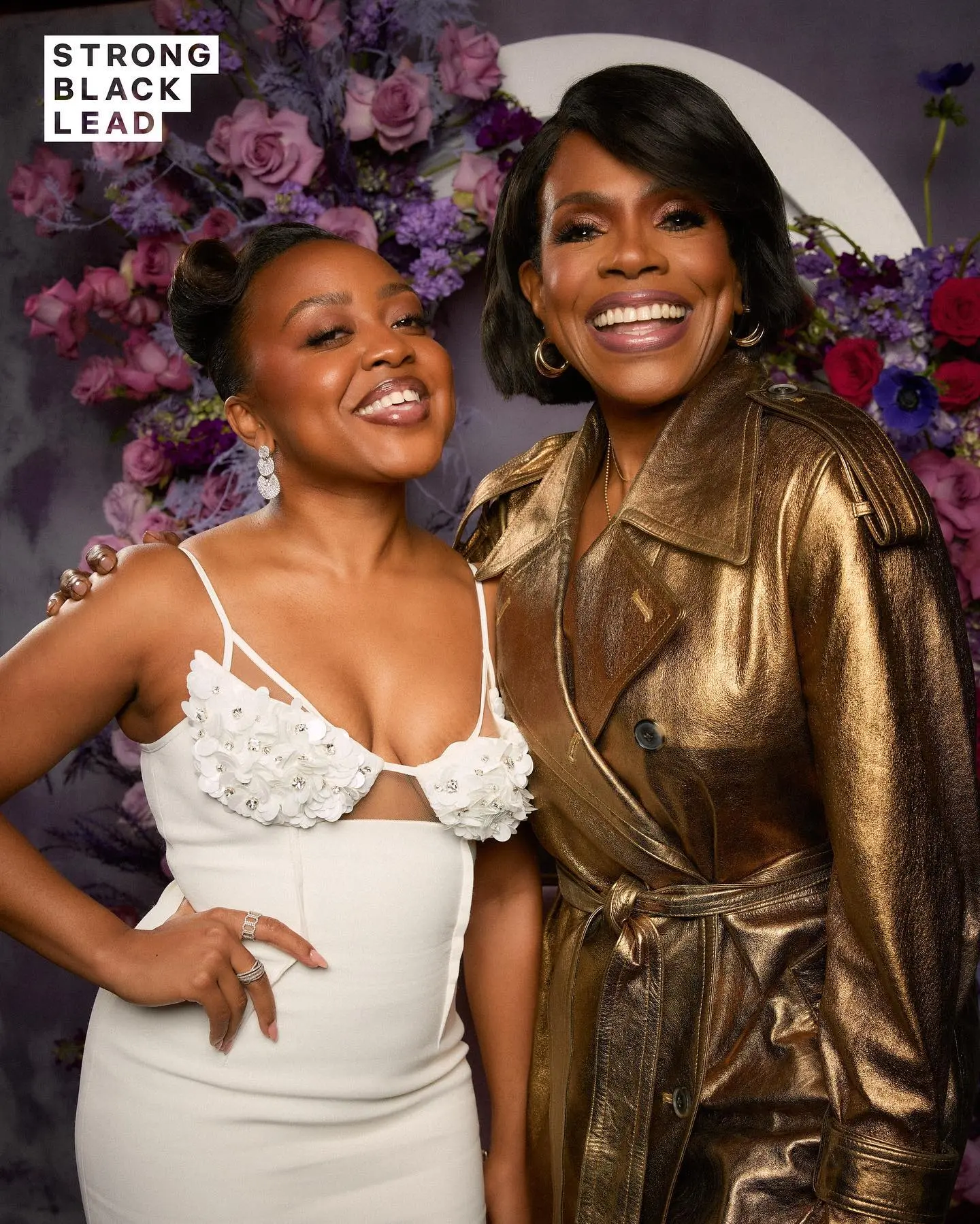
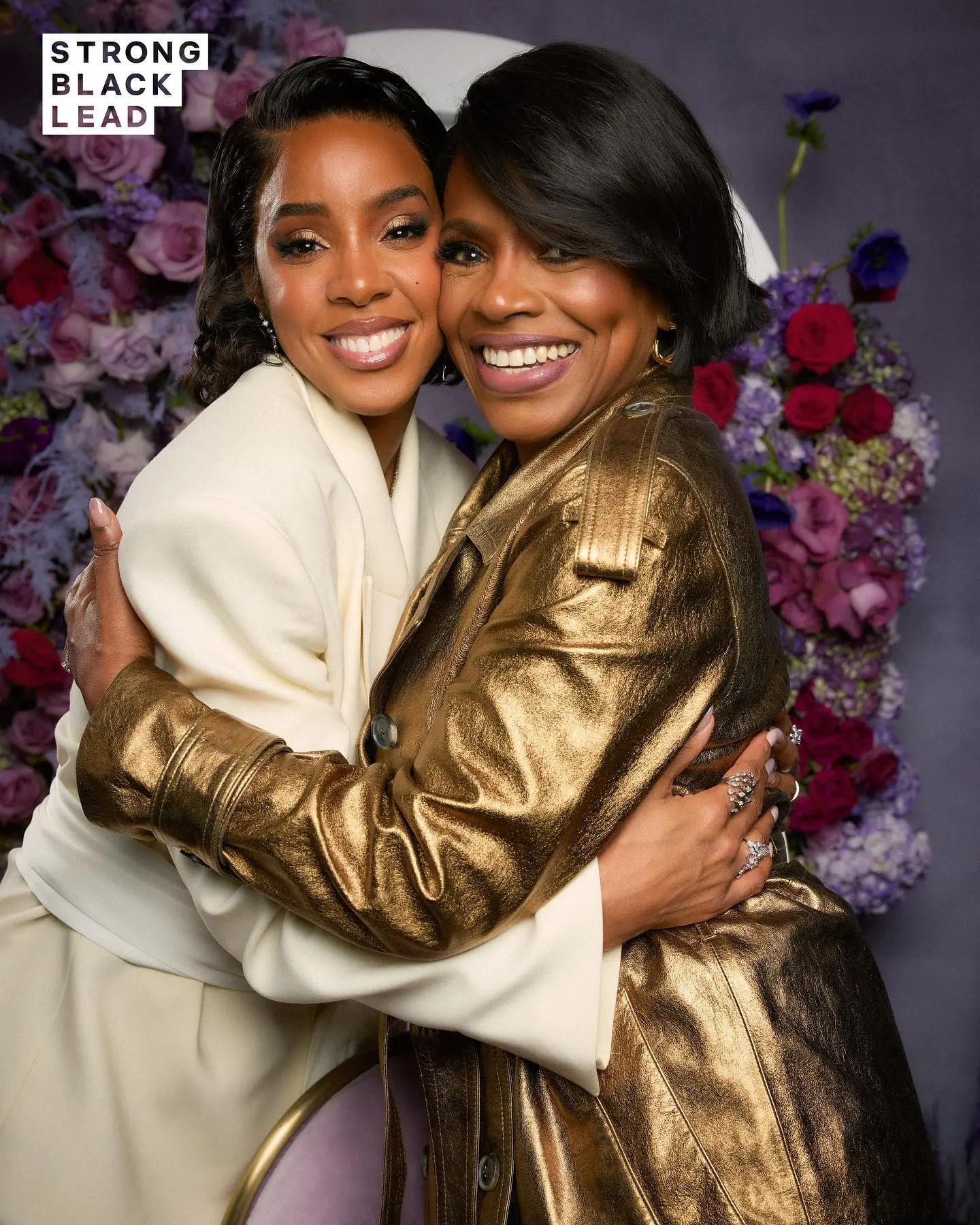
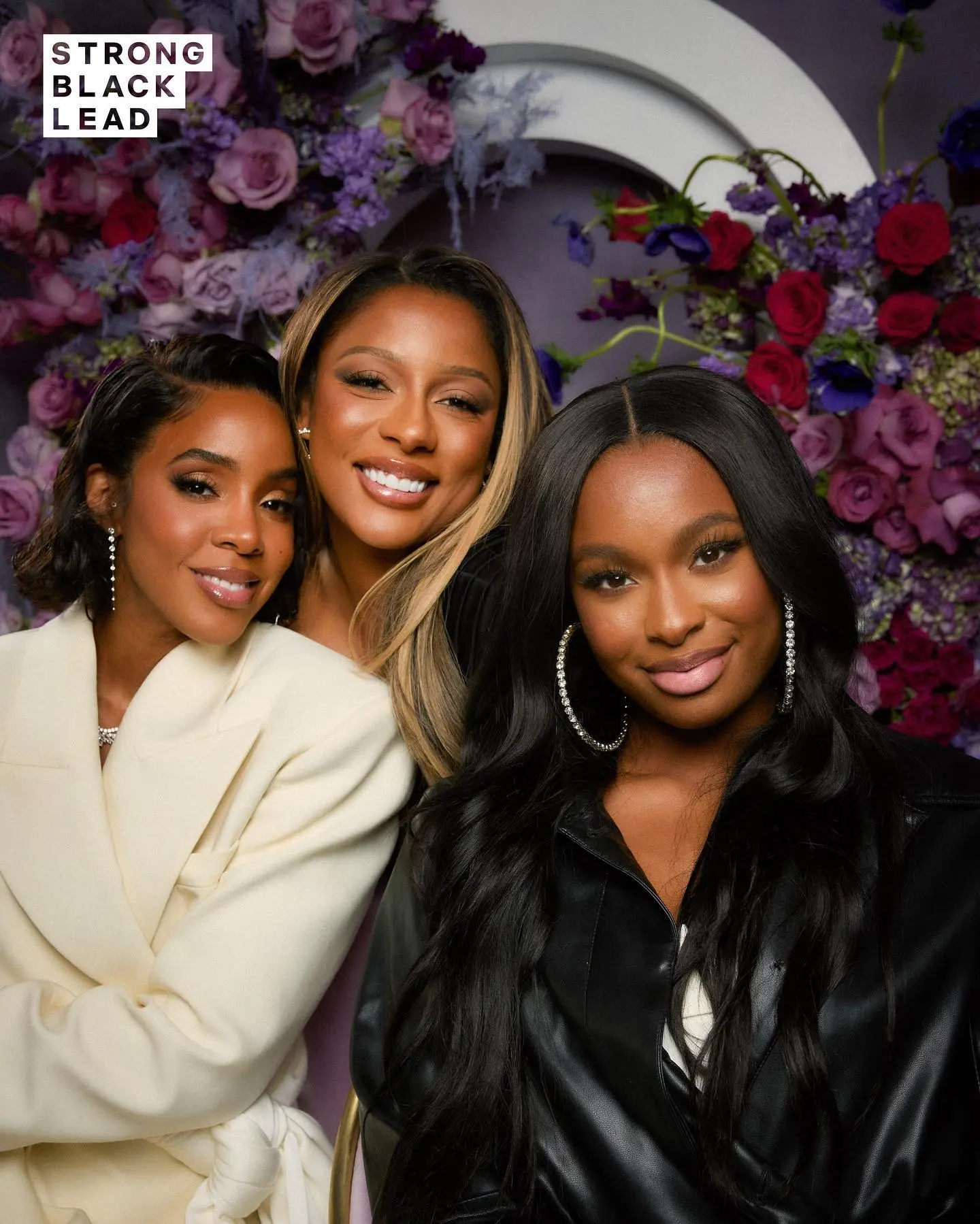
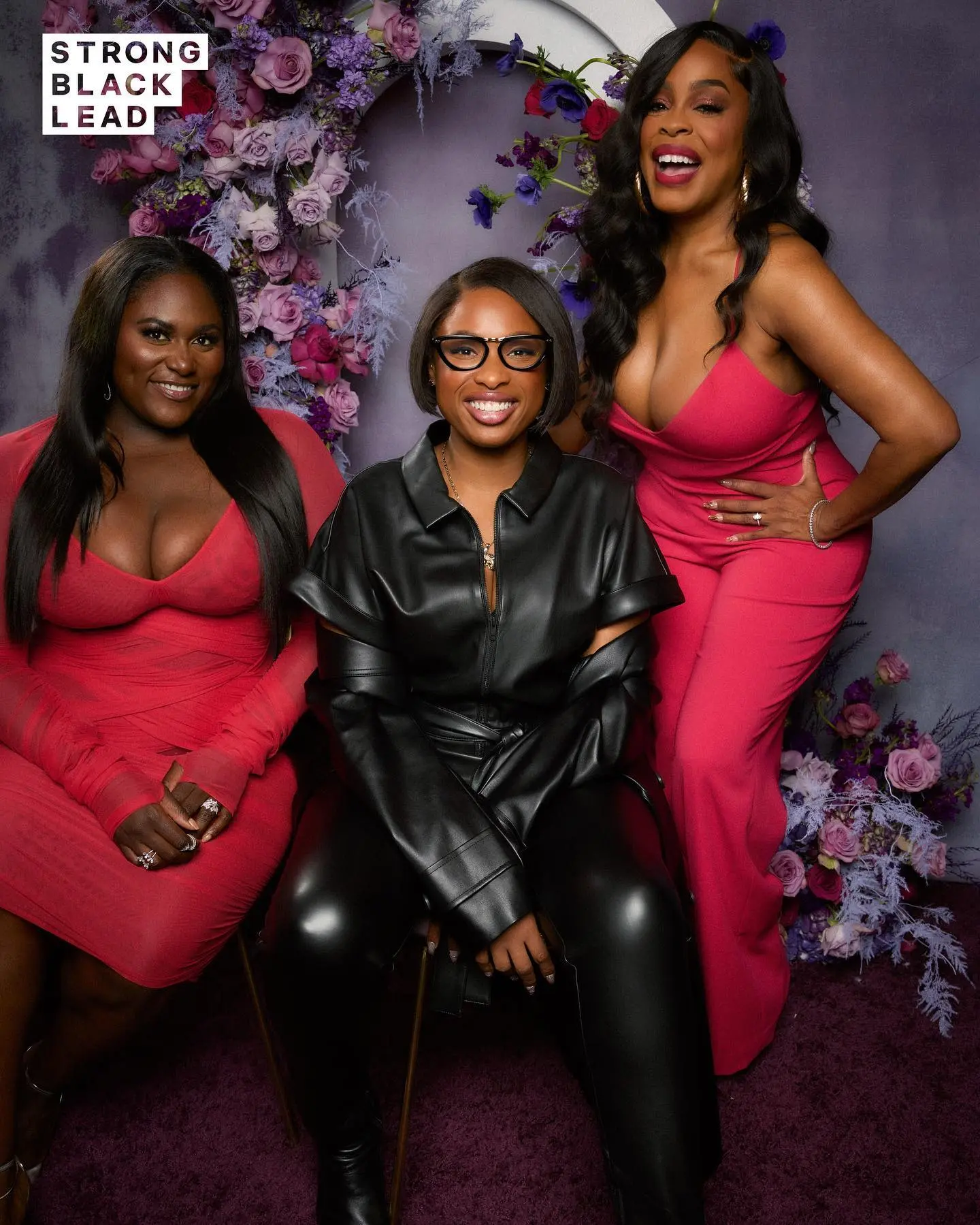
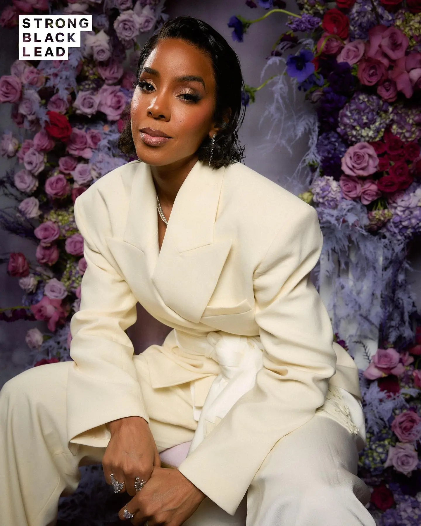
Three women pose before an arch filled with purple and red flowers, with the Strong Black Lead logo placed in the upper-left corner.

Ready to create something amazing?

Lets Work Together

Get In Touch