
How do you make a fintech company feel human without sacrificing credibility?
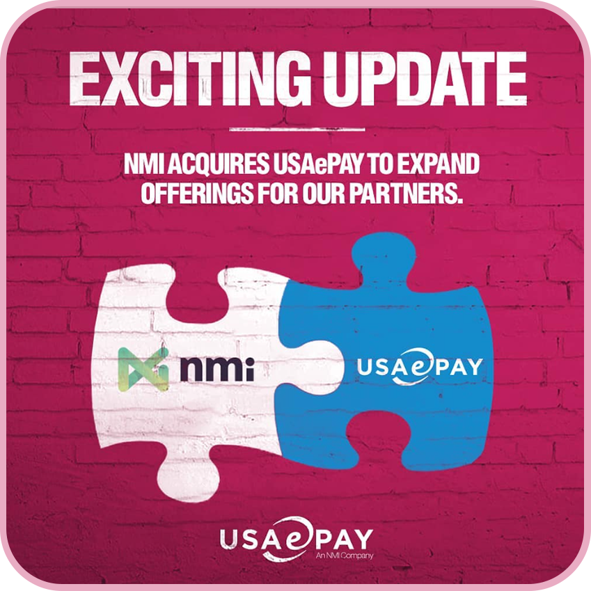
Helped transform USAePay’s social presence into a brand that better reflected who they were, reinforcing the innovative culture behind the company before its acquisition by NMI.
USAePay came to us looking to increase its visibility within the fintech space, with LinkedIn serving as one of its primary channels for reaching partners, businesses, and the broader payments industry.
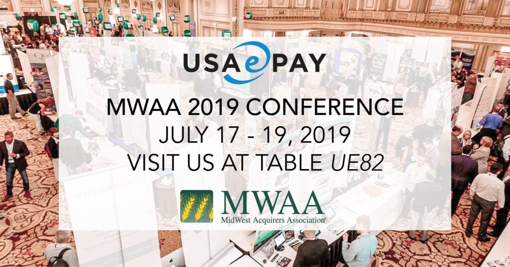
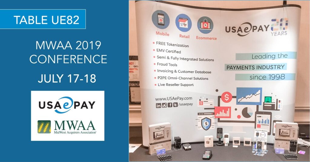
We started with an audit of the creative already representing the company online. The information was there—product features, conference announcements, industry education—but visually, much of it followed the conventions of traditional B2B fintech. Blue templates, product screenshots, corporate graphics. It communicated what USAePay did, but not much about who they were.
And once we met the team in person, that disconnect became impossible to ignore.
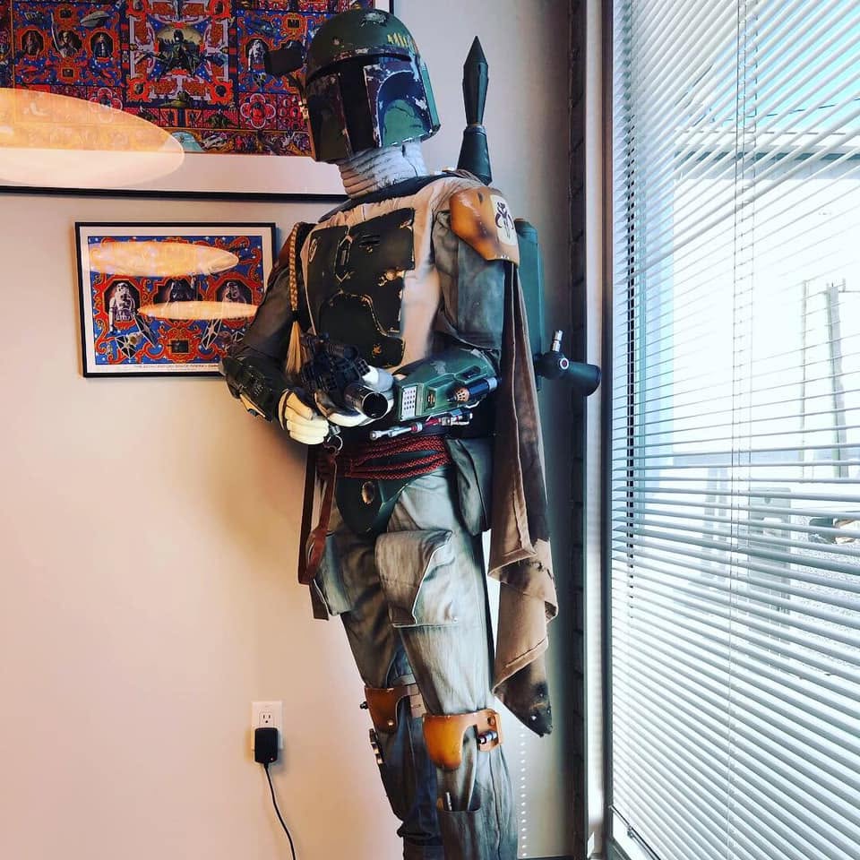
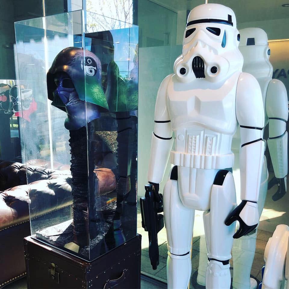
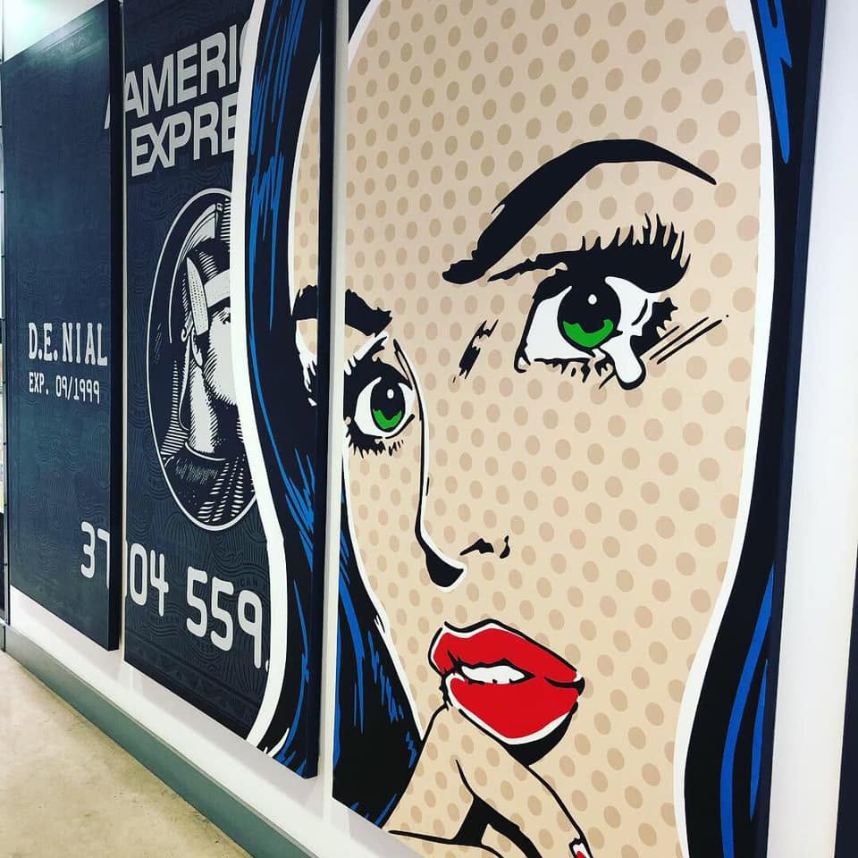
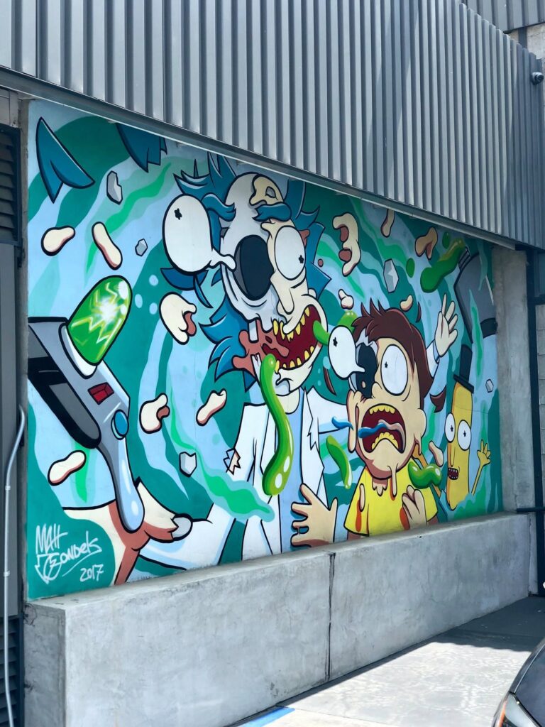
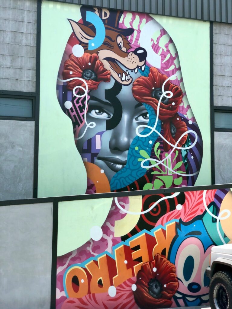
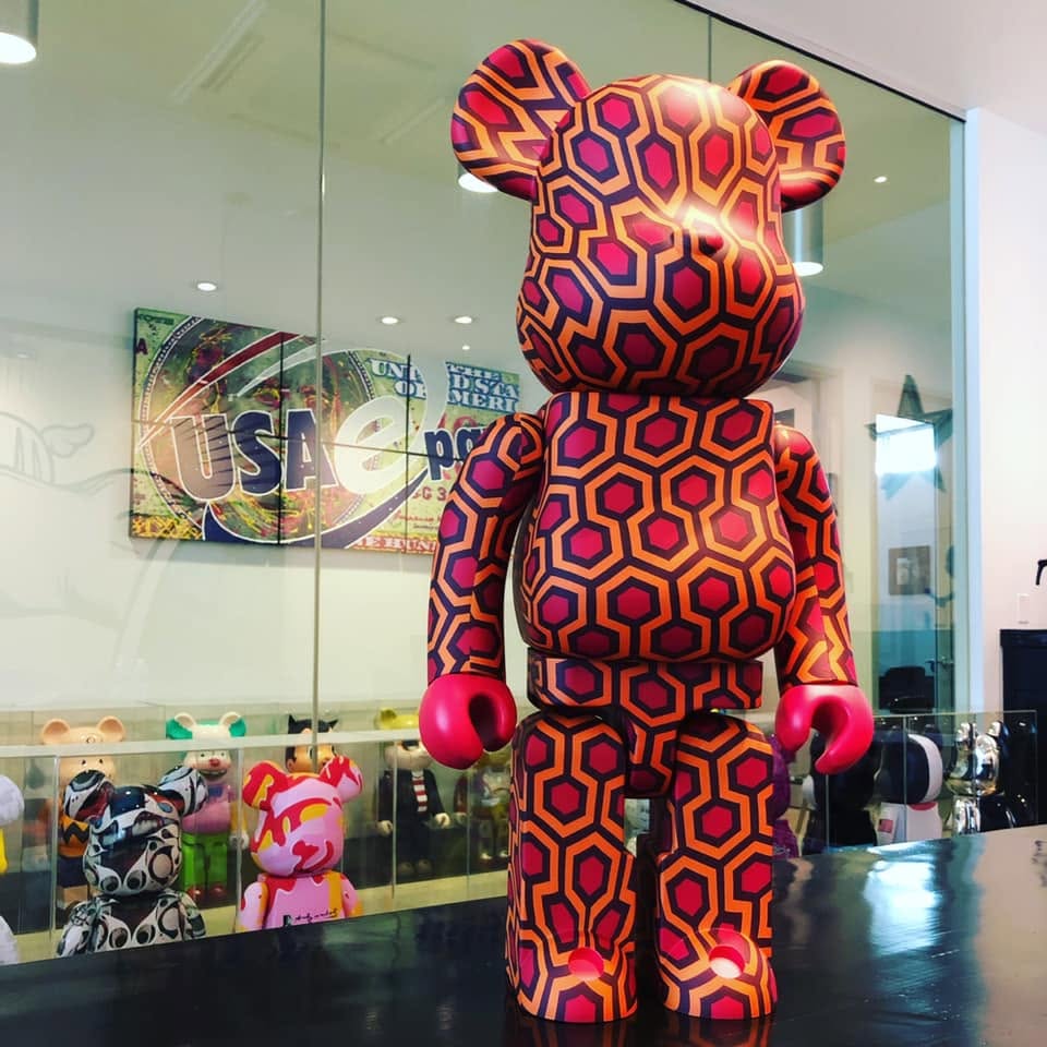
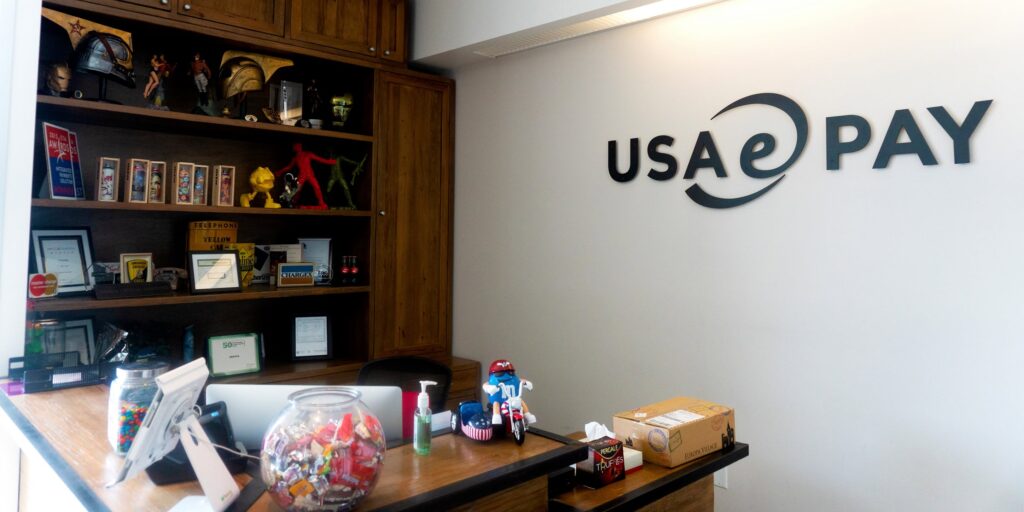
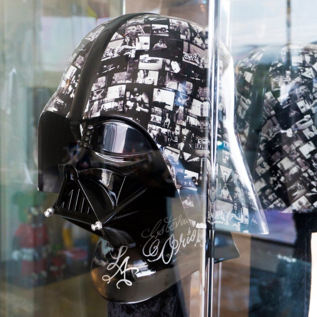
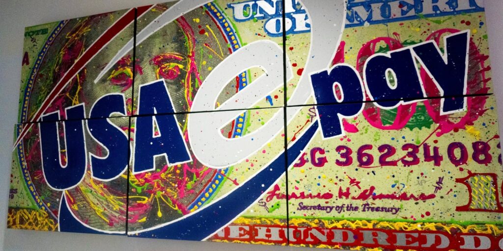
A visit to USAePay’s office gave us a completely different picture of the company.
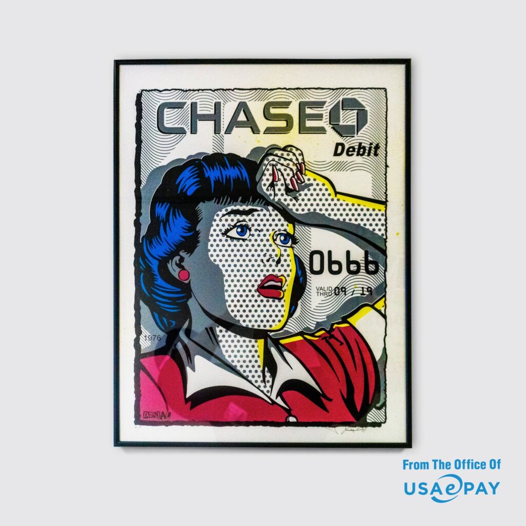
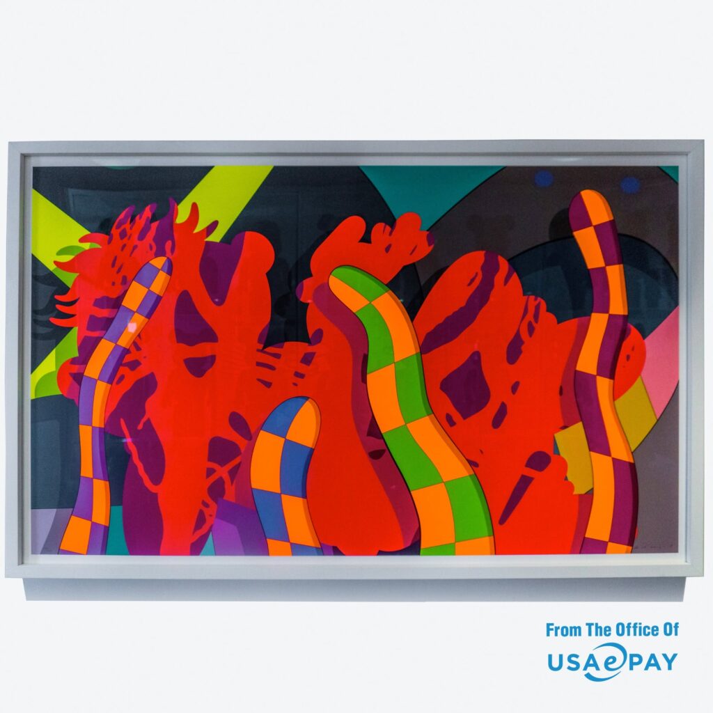
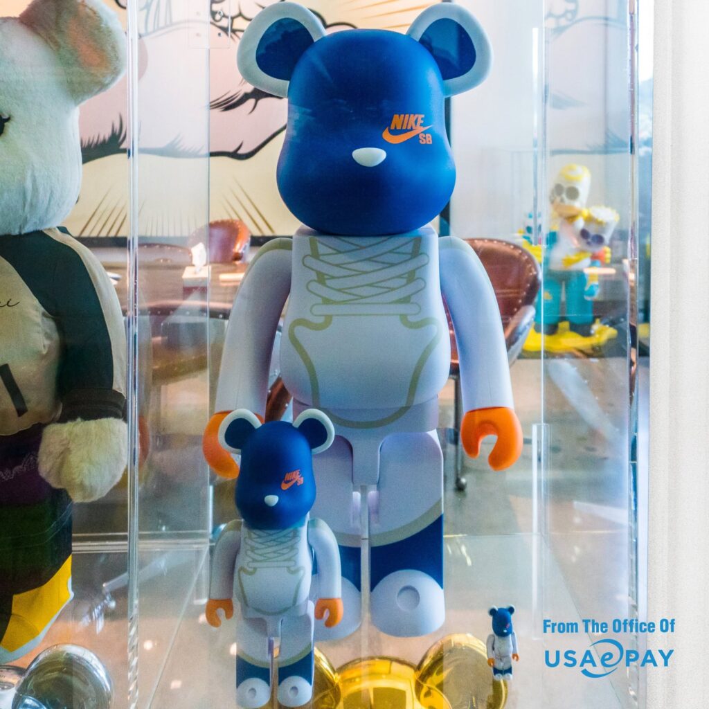
The space was filled with vibrant artwork, murals, pop-culture collectibles, custom pieces, street-art influences, and the kind of visual personality we weren’t seeing anywhere in their digital presence. This wasn’t decoration someone had picked out of a catalog. It felt genuinely connected to the people who worked there.
That became our creative starting point.
Rather than inventing a new personality for USAePay, we proposed bringing the personality that already existed inside the building into the way the company showed up online. The goal was to make fintech feel a little less institutional and make USAePay feel a lot more like itself.
That thinking ultimately grew into an Agency of Record relationship.
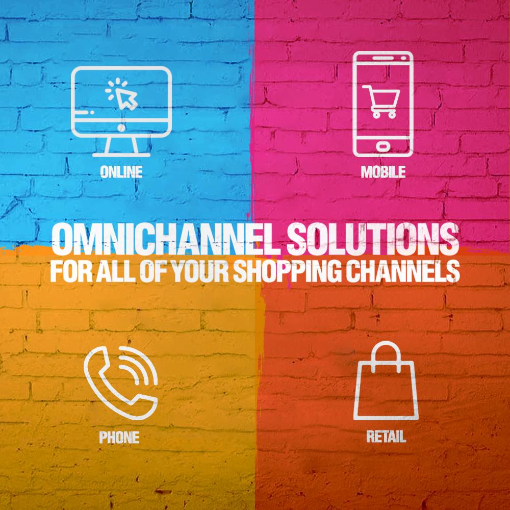
From there, we rebuilt USAePay’s social presence around a much more expressive visual system.
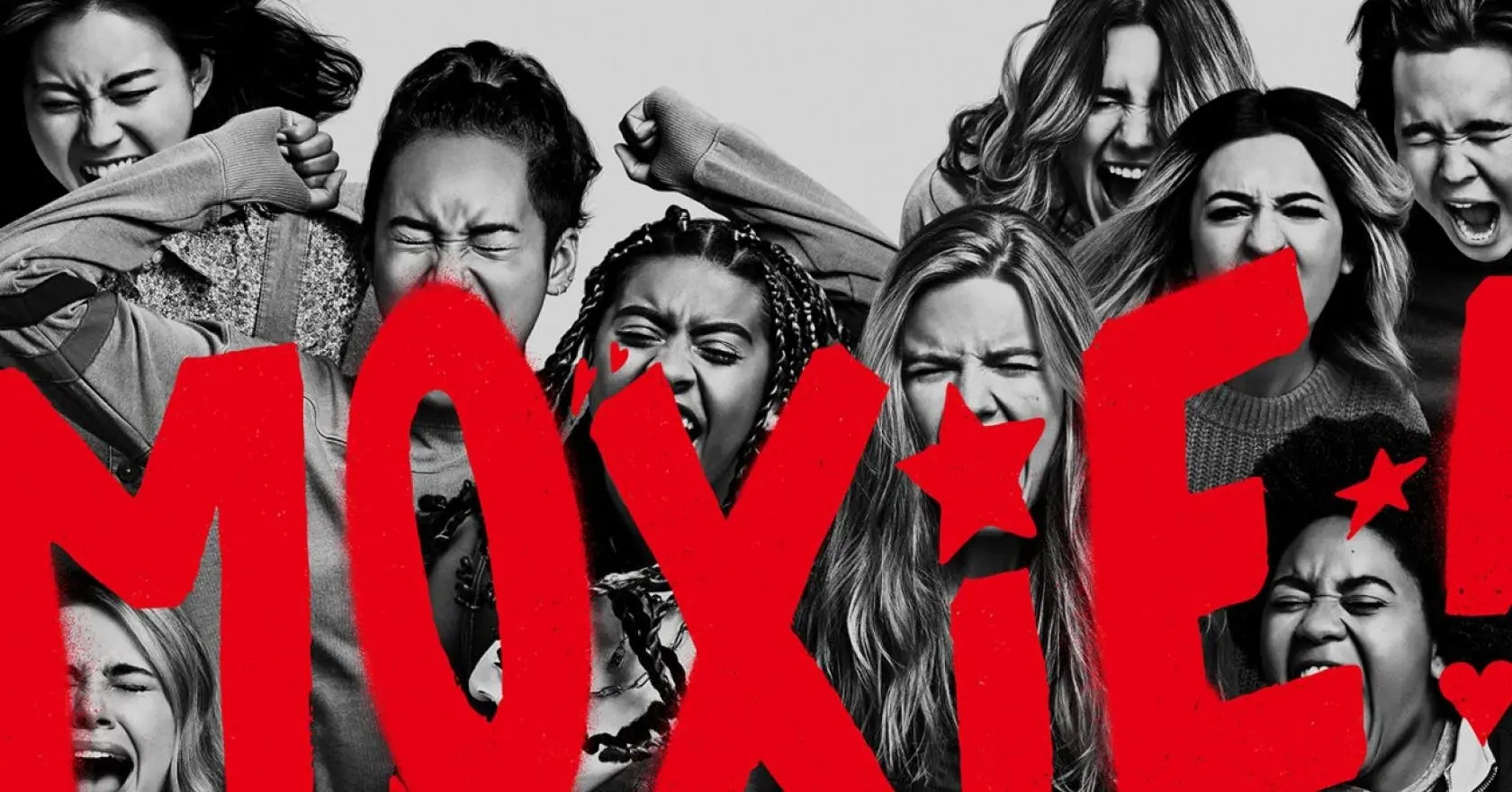
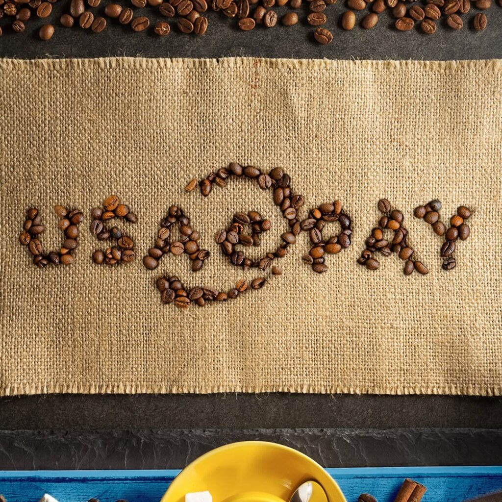
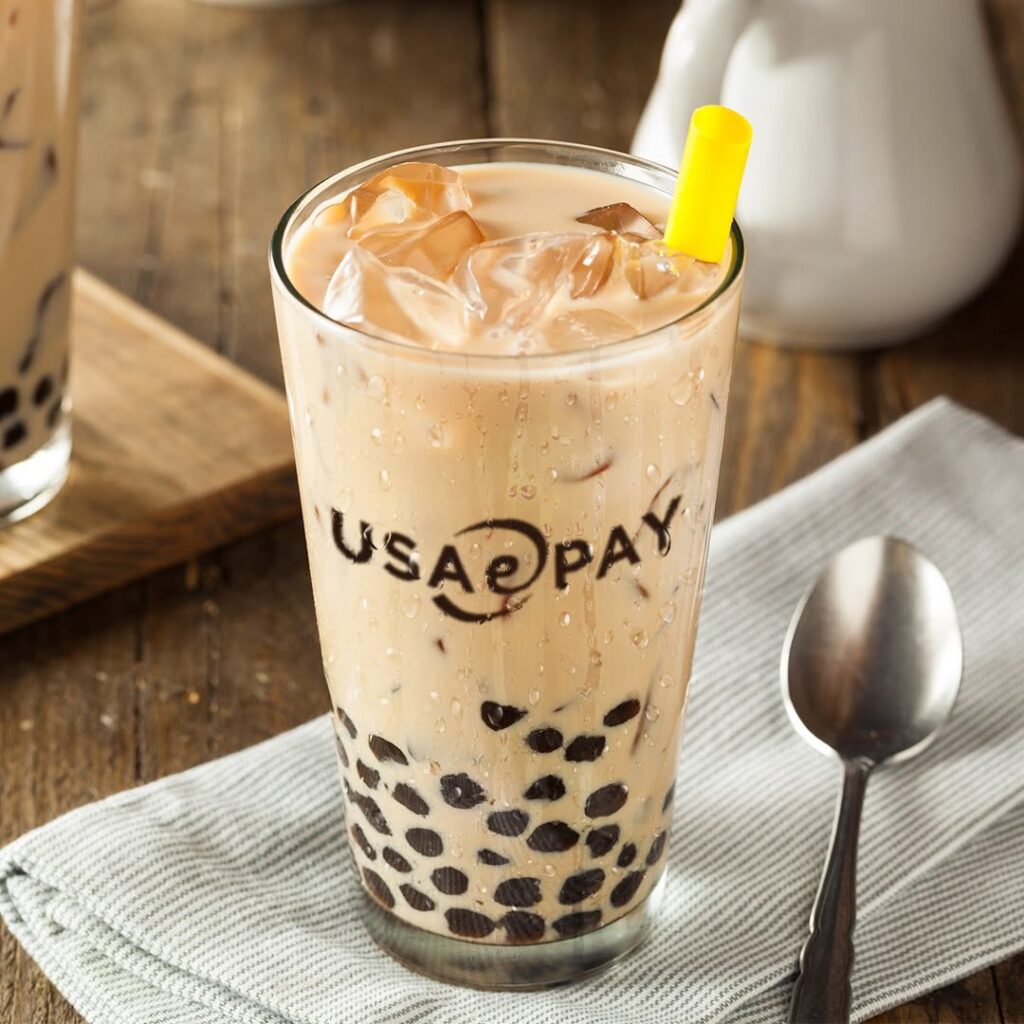
We leaned into bright, saturated color, tactile textures, street-art references, photography, illustration, collage, and unexpected environments for the USAePay mark. Some posts were intentionally simple brand-awareness exercises—put the logo somewhere beautiful, strange, tactile, or memorable and let it live.
Other posts allowed us to make the payments industry itself more interesting.
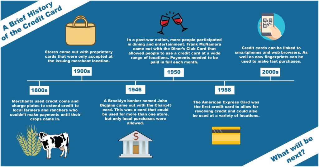
We created educational content around the history and evolution of payment technology—from early cash registers and charge cards to magnetic stripes, EMV chips, and modern payment systems. Instead of treating fintech education like a white paper squeezed into an Instagram post, we treated each subject like a piece of editorial design.
The result was a feed that could educate one day, promote a product the next, and simply make someone stop scrolling the day after that—while still feeling like the same brand.
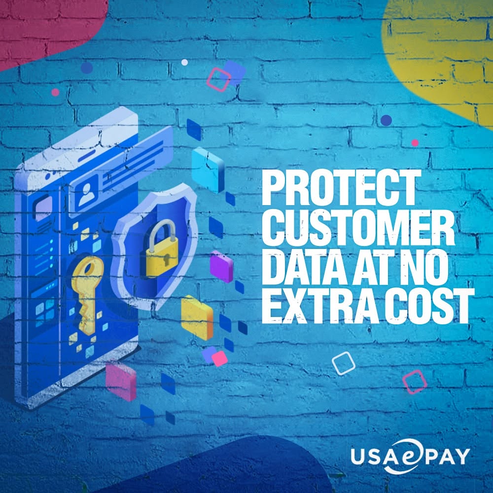
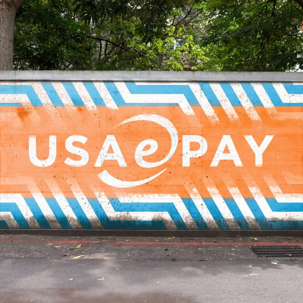
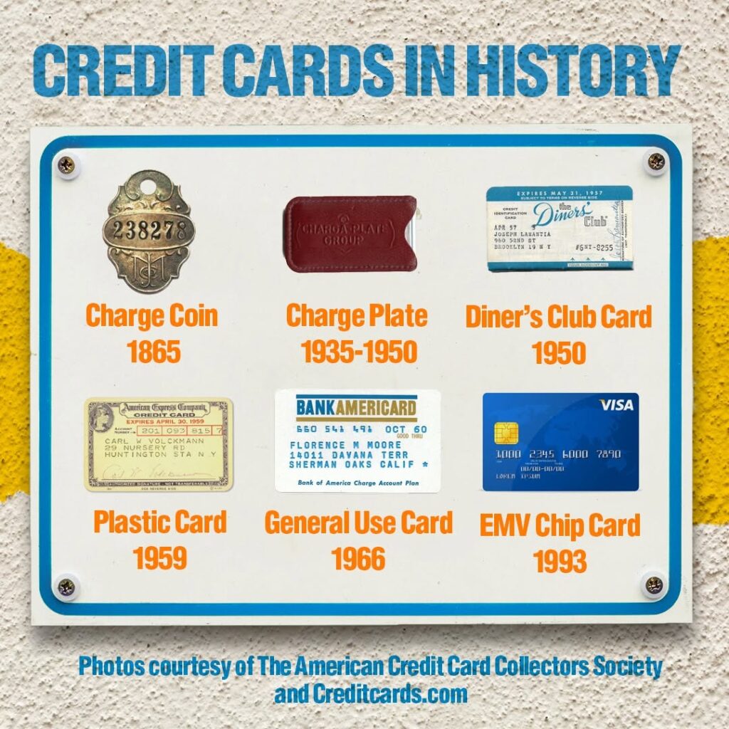
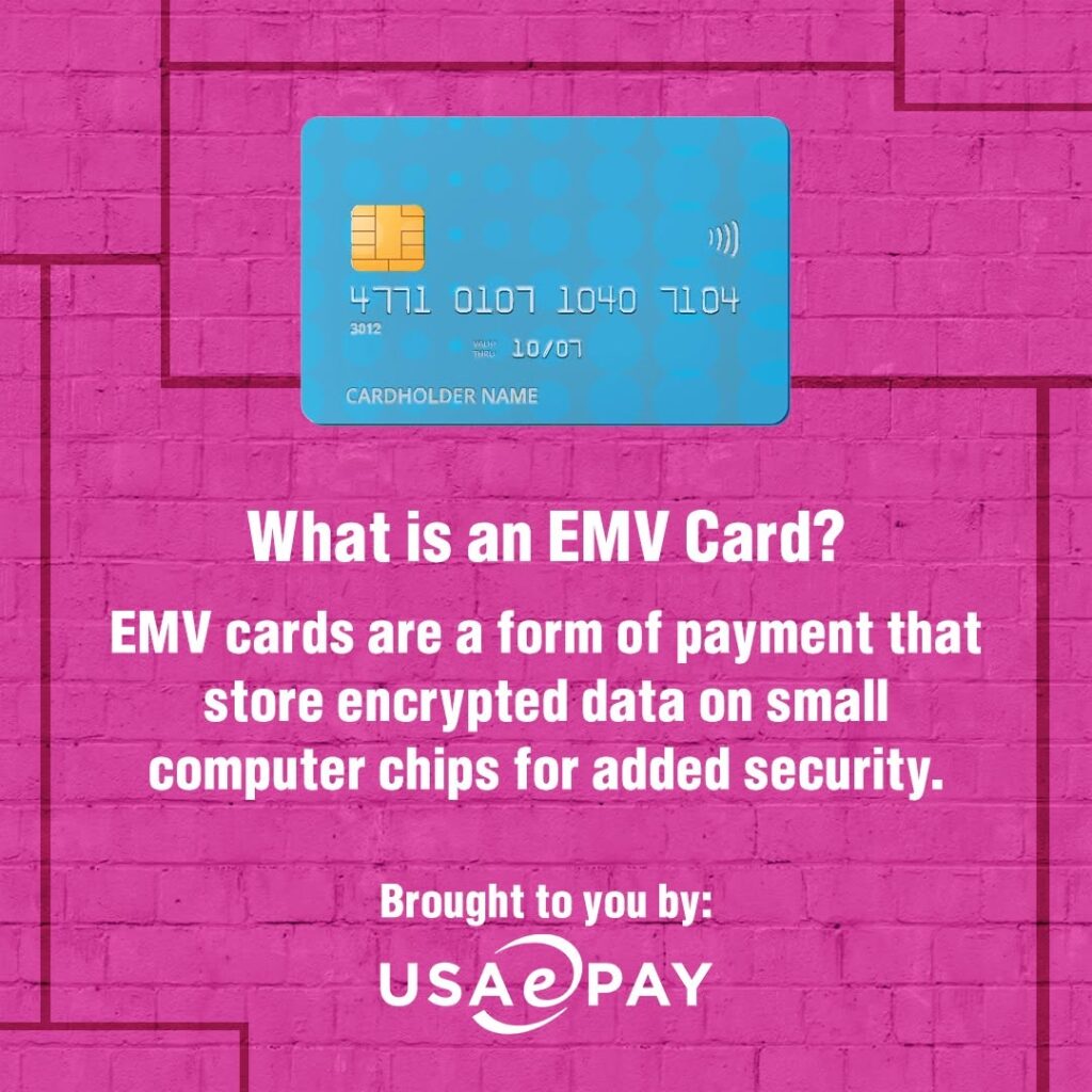
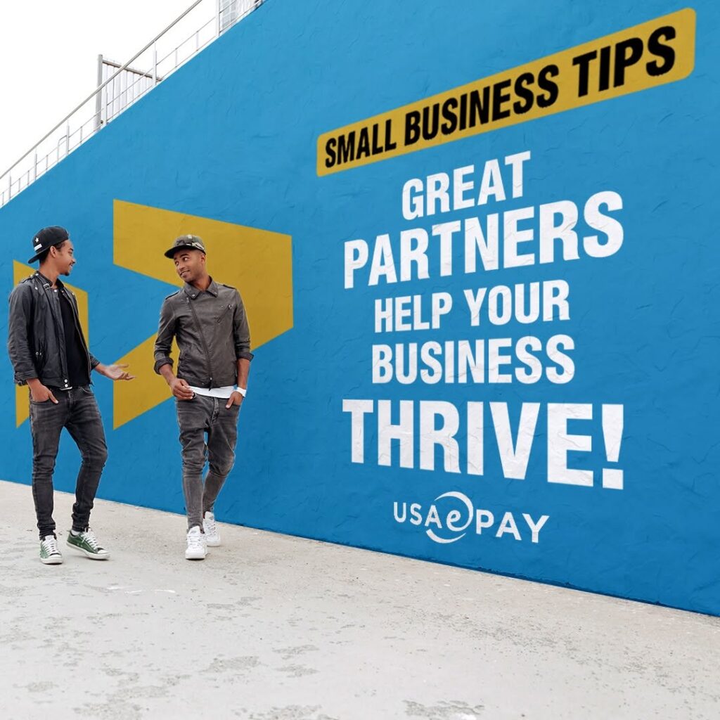
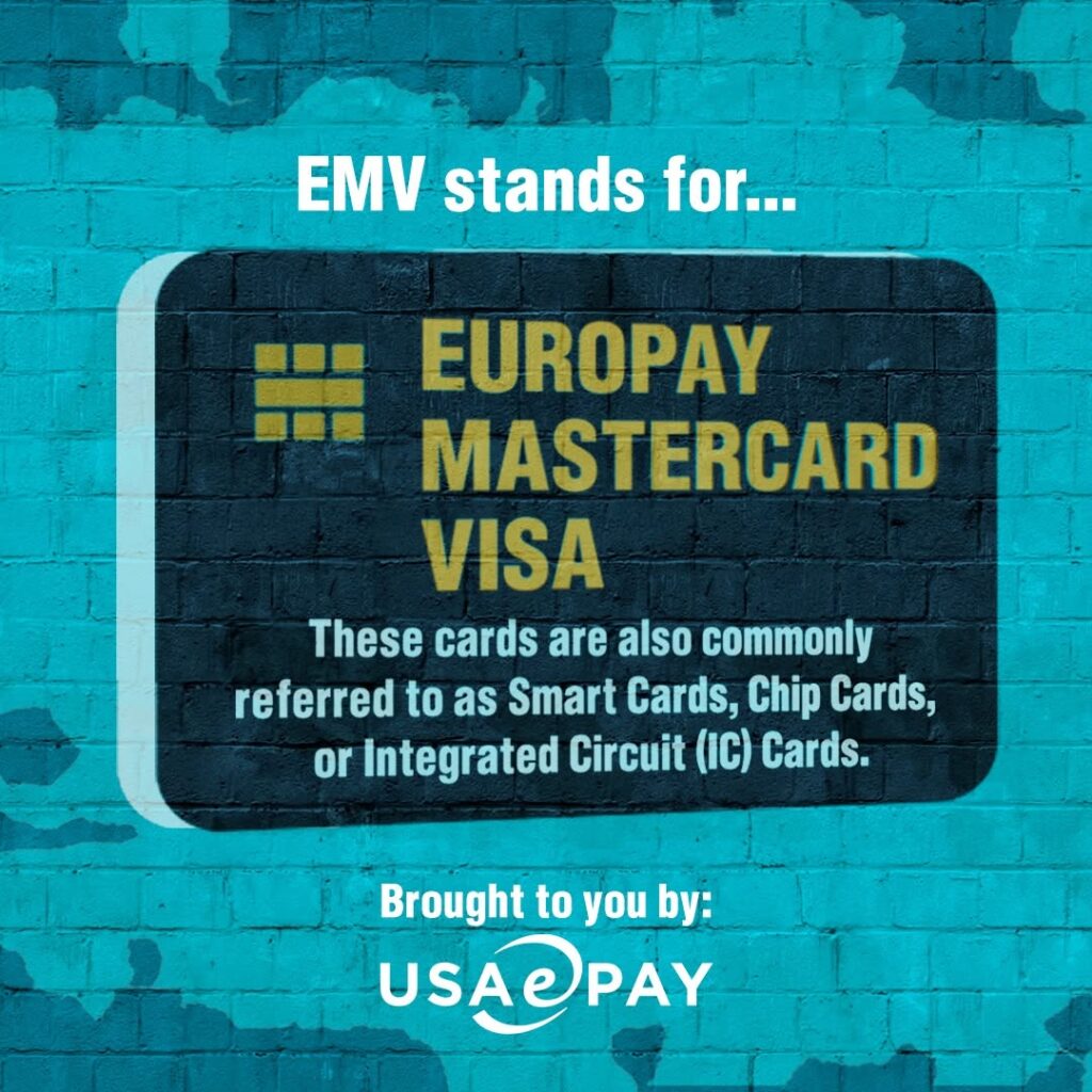
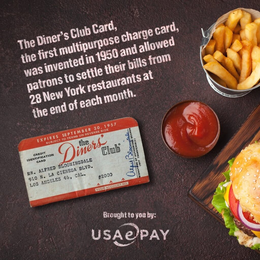
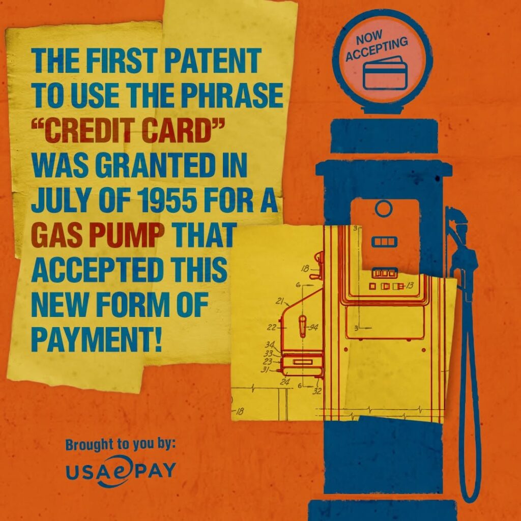
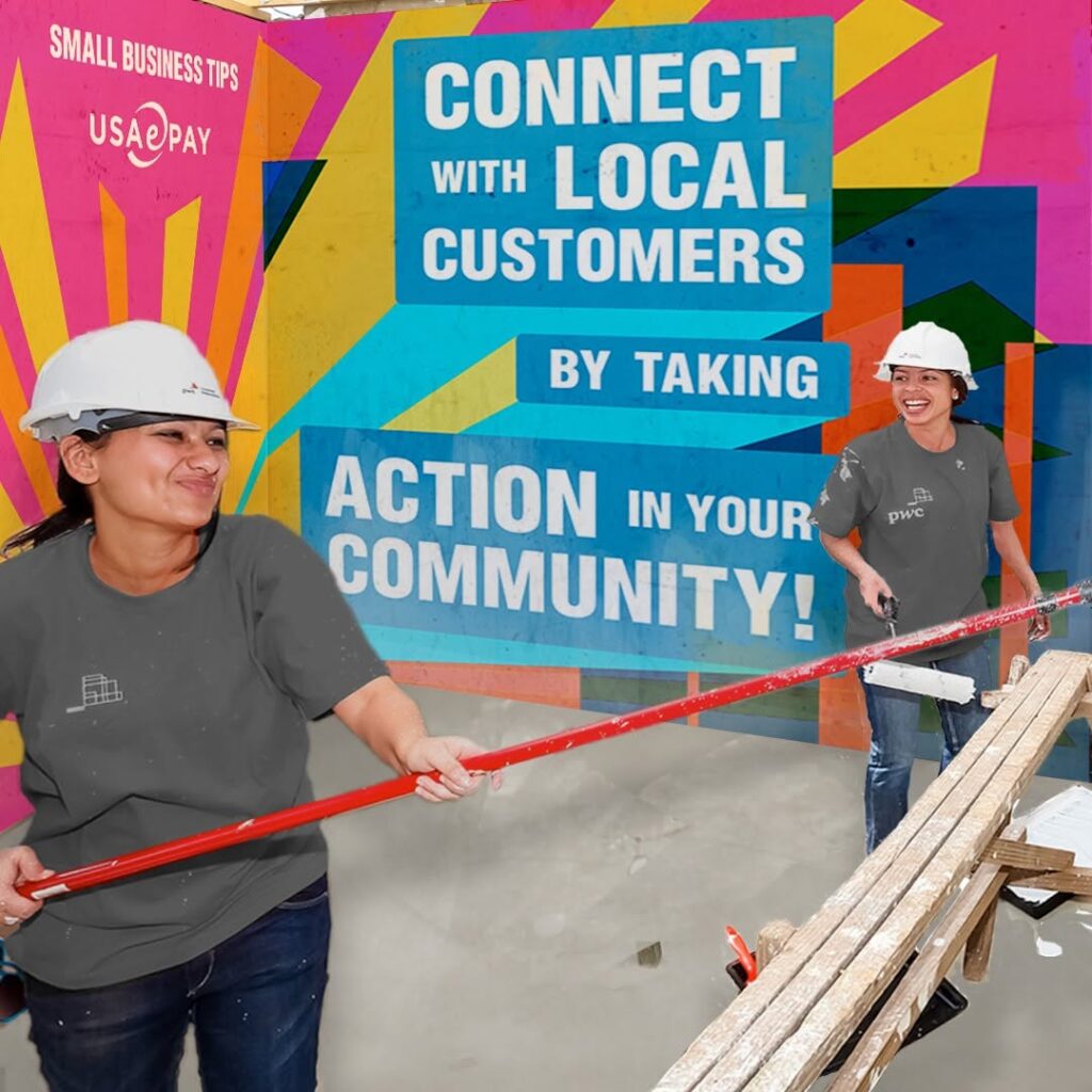
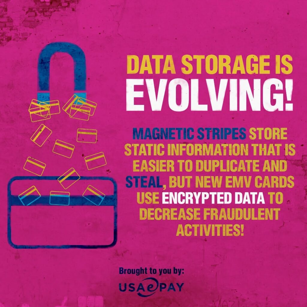
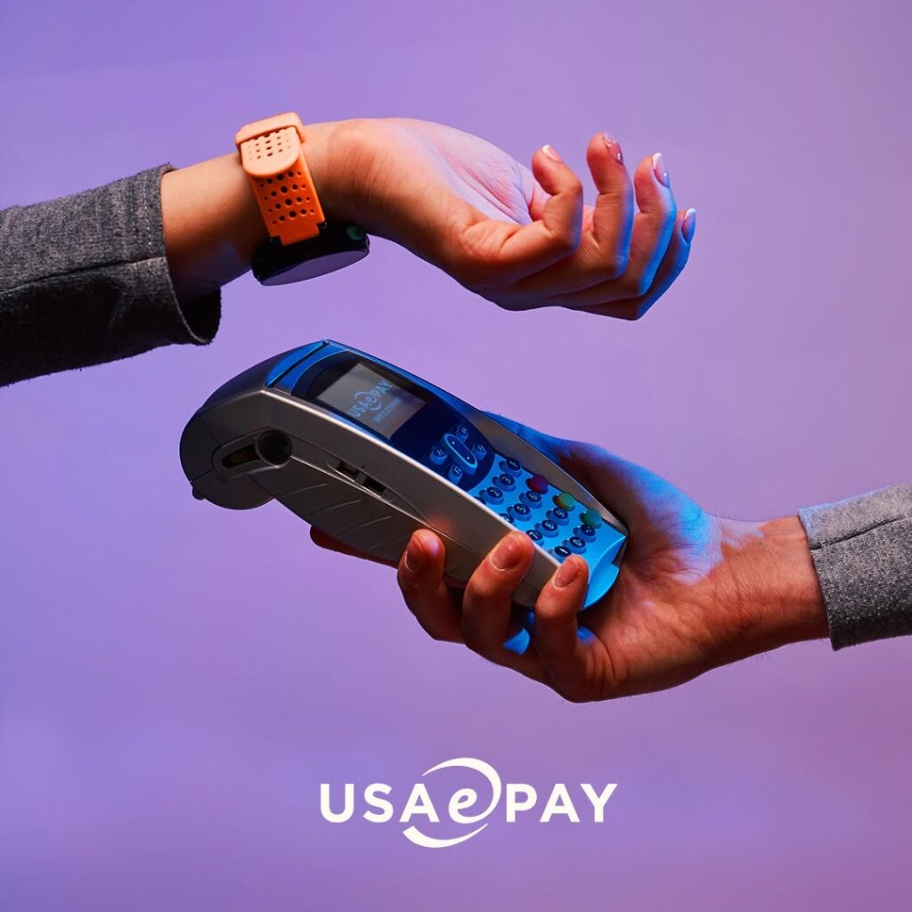
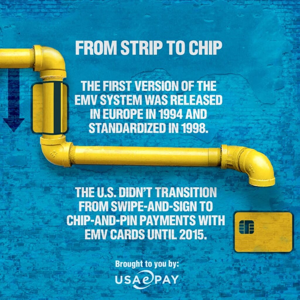
What started as a LinkedIn and social creative assignment became a broader repositioning of how USAePay presented itself to the world.
The company still needed to communicate security, technology, payments expertise, and reliability. Our job wasn’t to replace any of that. It was to give those qualities a more distinctive face—one with enough confidence and personality to stand apart in a category where brands can quickly start looking interchangeable.
During our relationship, USAePay entered an important new chapter that culminated in its acquisition by NMI. We can’t draw a straight line between a social facelift and an acquisition, but we do believe the work helped USAePay present a more confident, differentiated and contemporary version of itself during a pivotal moment for the company.
Sometimes a rebrand starts with a new logo.
This one started by paying attention to the art on the walls.