
PROJECT
The creative process of developing original campaign ideas, content themes, visual directions, and audience experiences that bring a brand strategy to life.
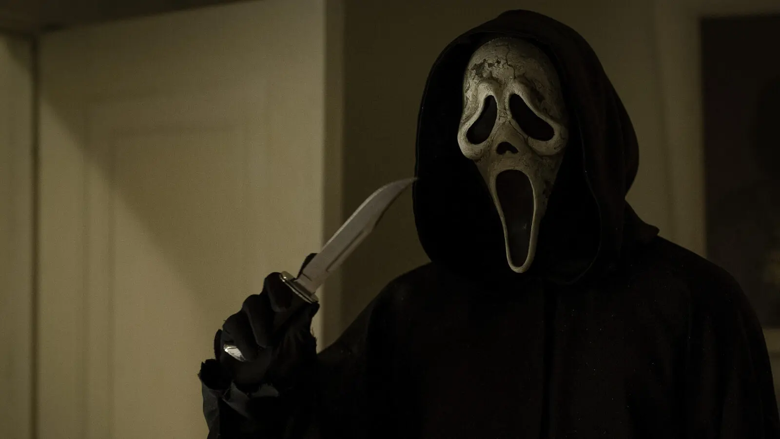
We made this choose-your-own-adventure Story to put viewers in the middle of a Jungle Cruise escape, asking them to pick between swimming with the skipper or swinging with the doctor.

We shaped this carousel around the feeling of moving deeper into the jungle, using each card to hold a different piece of the expedition’s scale, mystery, and playful danger.
We made Proxima’s appetite a playful Instagram Story prompt, asking audiences to slide a steak her way before this very large jaguar gets any hungrier.
We made escape a quick audience decision, asking viewers to choose whether they’d outrun the danger or try to outsmart it.
We made this Which Way? Story video put viewers in the middle of a split-second jungle escape, asking them to choose whether to swim with the skipper or swing with the doctor.
We made the river journey playable, asking Instagram viewers to choose whether to follow the skipper or the doctor before the jungle showed them what came next.
We framed the jungle’s five threats as a playful survival guide, pairing supplied film footage with field-guide-style cards that keep the danger in step with Jungle Cruise’s sense of fun.
We gave George’s intimate encounters room to simmer, using close, candlelit moments to make the social edit feel as uneasy as it is seductive.
We cut together Hedda’s poised public presence and intimate confrontations to let the tension underneath her world do the talking.
Ruth E. Carter opens up her personal archive, using costumes from across her career to reveal how research, fabric, history, and character come together through wardrobe.
Ruth E. Carter breaks down Rudy Ray Moore’s fearless wardrobe | from platform shoes and patchwork denim to the bold colors and silhouettes that made Dolemite impossible to ignore.
We gave Queen Bee a focused social spotlight, pairing an on-camera reflection with archival clips to place her bold, vulnerable presence in the Blaxploitation moment that shaped Dolemite Is My Name.
We promoted an episode of There’s Something About Dolemite with David Walker, framing the conversation in the bold, hand-built poster language that runs through the campaign.
We gave the audience response its own spotlight, layering real-time praise over film moments to let the excitement around Eddie Murphy and the ensemble speak in the language of the feed.
We framed Dolemite’s name as a quick call-and-response, cutting the film’s scrappy production energy into a social-ready rallying cry.
We gave the podcast episode a 1970s promo treatment that made its music conversation feel right at home in Dolemite Is My Name’s loud, handmade world.
We promoted a podcast conversation with Stephanie Dunn by giving the episode the same loud, handmade showmanship that runs through Dolemite Is My Name.
We gave this podcast episode promo the loud, handmade feel of a 1970s exploitation one-sheet, making the platform callout feel like part of the showmanship.
We gave episode two of the companion podcast a poster-like social identity, using ’70s-inspired type and shifting panels to spotlight its fashion conversation with Ruth E. Carter.
We introduced the first episode of There’s Something About Dolemite with a poster-inspired social spot that made the podcast feel like part of Rudy Ray Moore’s loud, self-made world.
We paired Rudy Ray Moore’s self-made path with Rocky’s underdog story, giving the campaign a quick, familiar way to frame what it means to bet on your own idea.
We framed every closed door around Rudy Ray Moore as fuel for the self-made conviction that carries him toward the marquee.
We cut together Rumi’s sharpest, most unpredictable moments into a fast character spot made for the social scroll.
We cut together a quick run of #1 Happy Family USA moments around “inshallah,” letting the phrase become its own character-driven joke for social.
We cut Mona’s class-president ambitions against her family’s reaction, finding the specific kind of first-gen humor that lands because the stakes are both real and ridiculous.
We gave Rumi’s family-pressure moments a fast, vertical social edit that lets the tension build, then lands on a little grace.
We framed the now-streaming announcement as a retro anti-piracy pop-up, using the throwback computer-world joke to make the call to watch feel native to the show.
We shaped a recurring “inshallah” into a quick character supercut, letting the phrase land differently across the show’s everyday tension, family friction, and sideways humor.
We kept this talent question grounded in a real cultural conversation, giving the cast room to speak to the ideas living underneath #1 Happy Family USA.
We paired recording-booth footage with the finished animation to show how the cast’s performances carry into the show’s offbeat character moments.
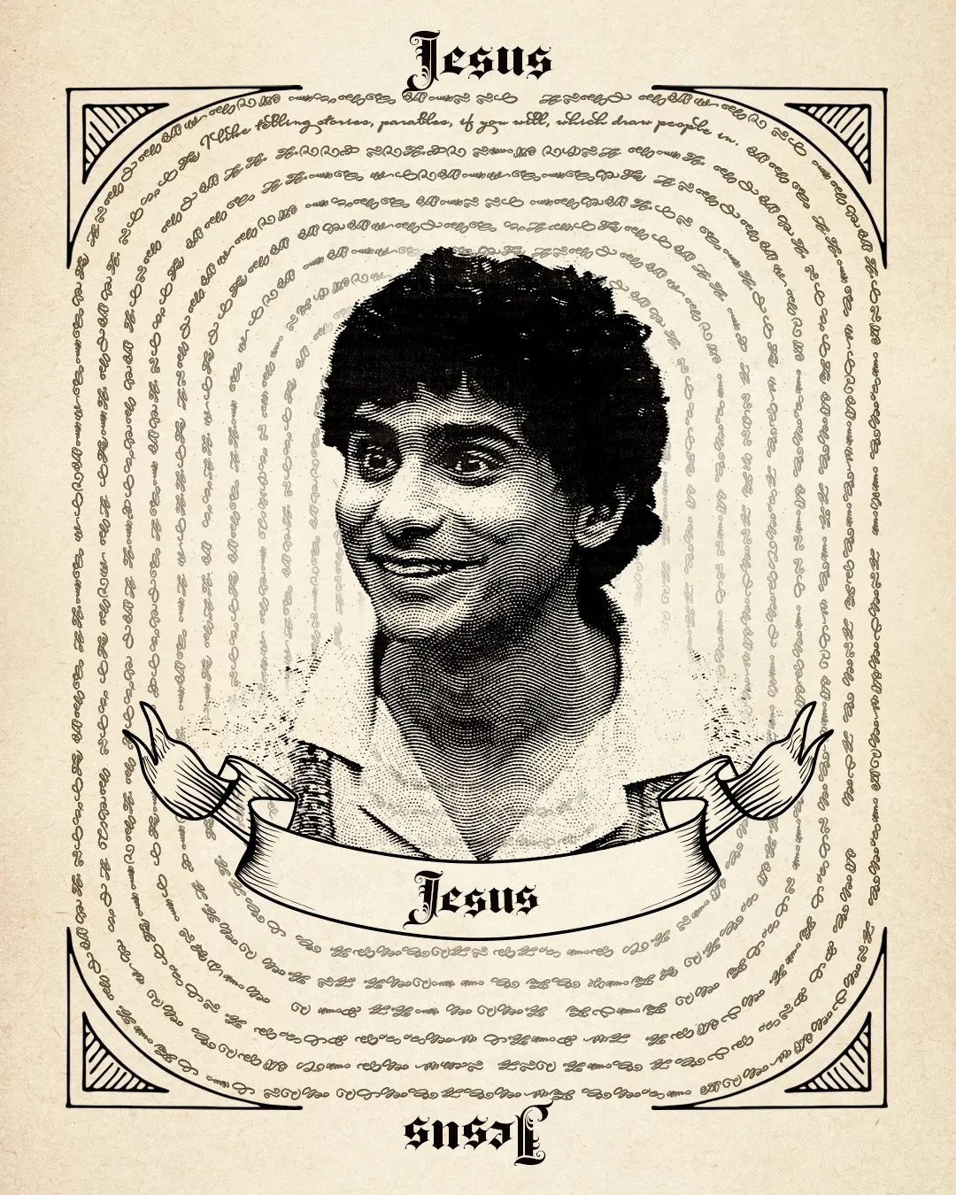
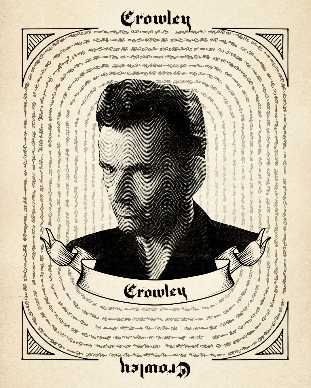


We made a faux 'team agenda' social tile that puts 22’s scheming front and center with hand-lettered copy and quick doodles.

We made a square character grid that puts 22 in a central circular window with the five recruits named around her, so personality and names read fast on mobile.
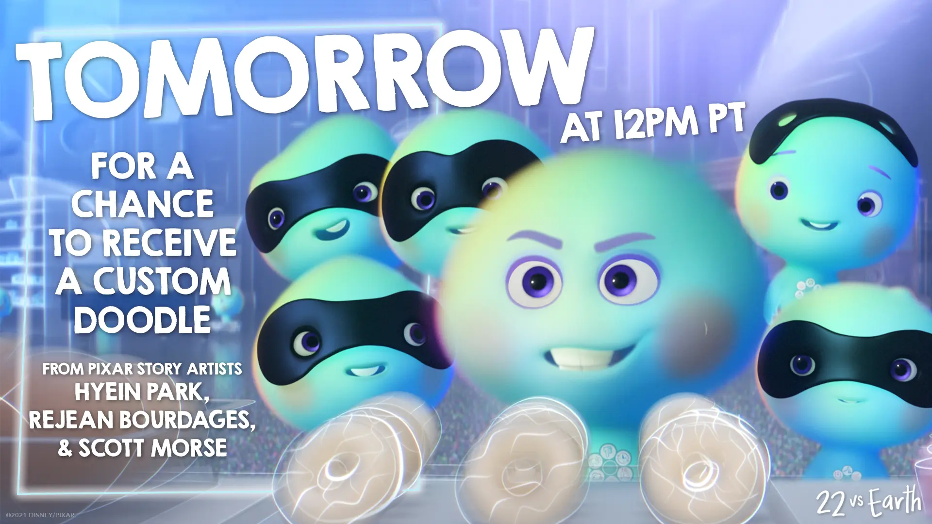
We built this Doodle on Demand promo tile to read fast on mobile, centering 22 and the new souls with oversized 'TOMORROW' type and story-artist credits to drive the timed giveaway.
We used 22’s blunt take on life’s biggest question to give the short’s Now Streaming message a quick, character-first laugh.
We treated 22’s rebellion like a tiny recruitment drive, cutting her crew’s anti-Earth energy into a quick tease that lands on a clear Disney+ Now Streaming invitation.
We framed 22’s refusal to go to Earth as the joke, then gave the short’s Disney+ arrival a clean, character-led sendoff.
We let 22’s rebellion set the tone, cutting her crew’s growing confidence into a quick reminder that the original short is now streaming on Disney+.
We framed the destruction through a live-stream interface, putting viewers inside the kind of unfolding emergency people would instinctively watch, comment on, and share in real time.
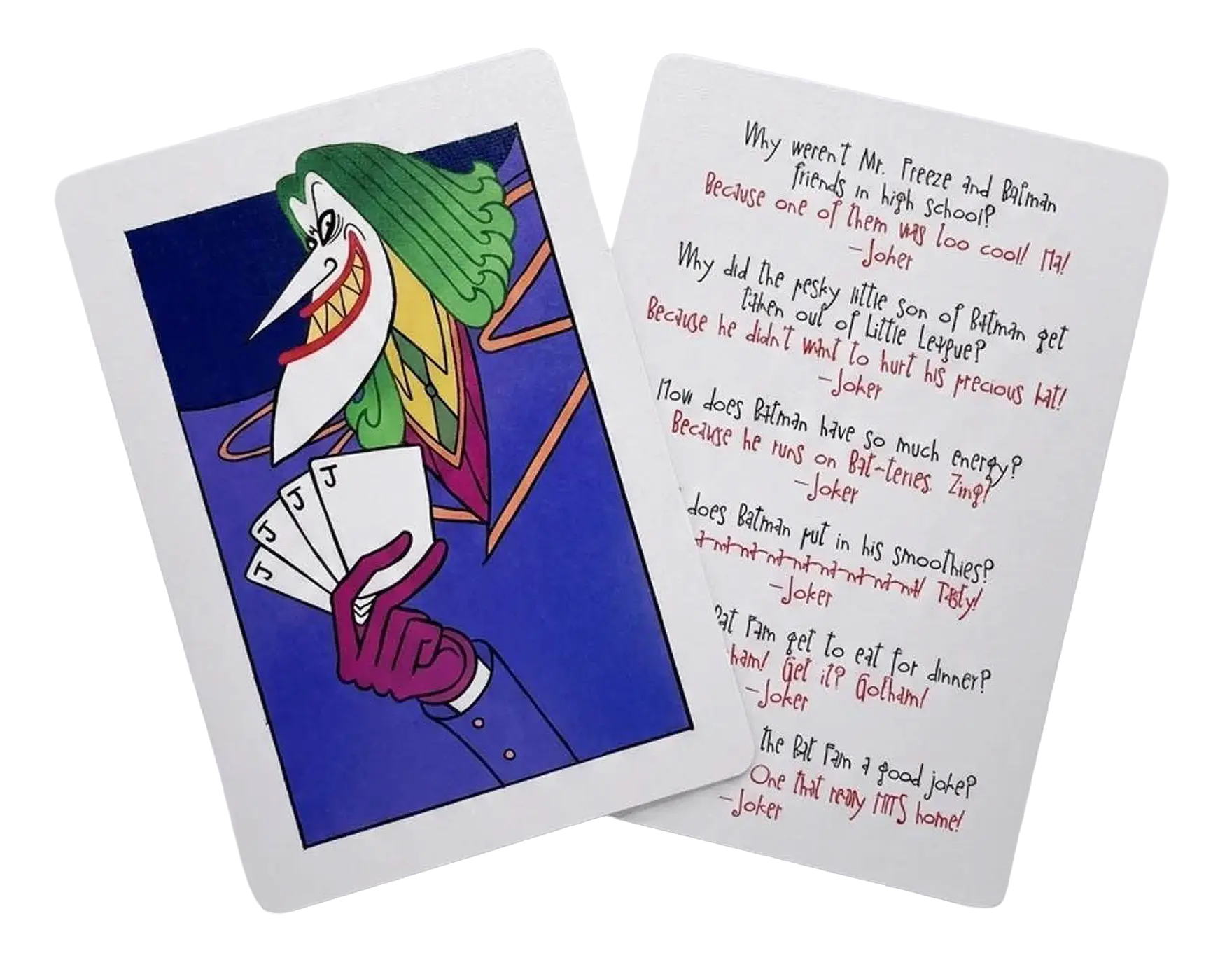
A little Gotham humor for the lunchbox. We created a set of Joker-themed joke cards that gave the Bat-Fam activity kit one more playful surprise for families to discover and share.
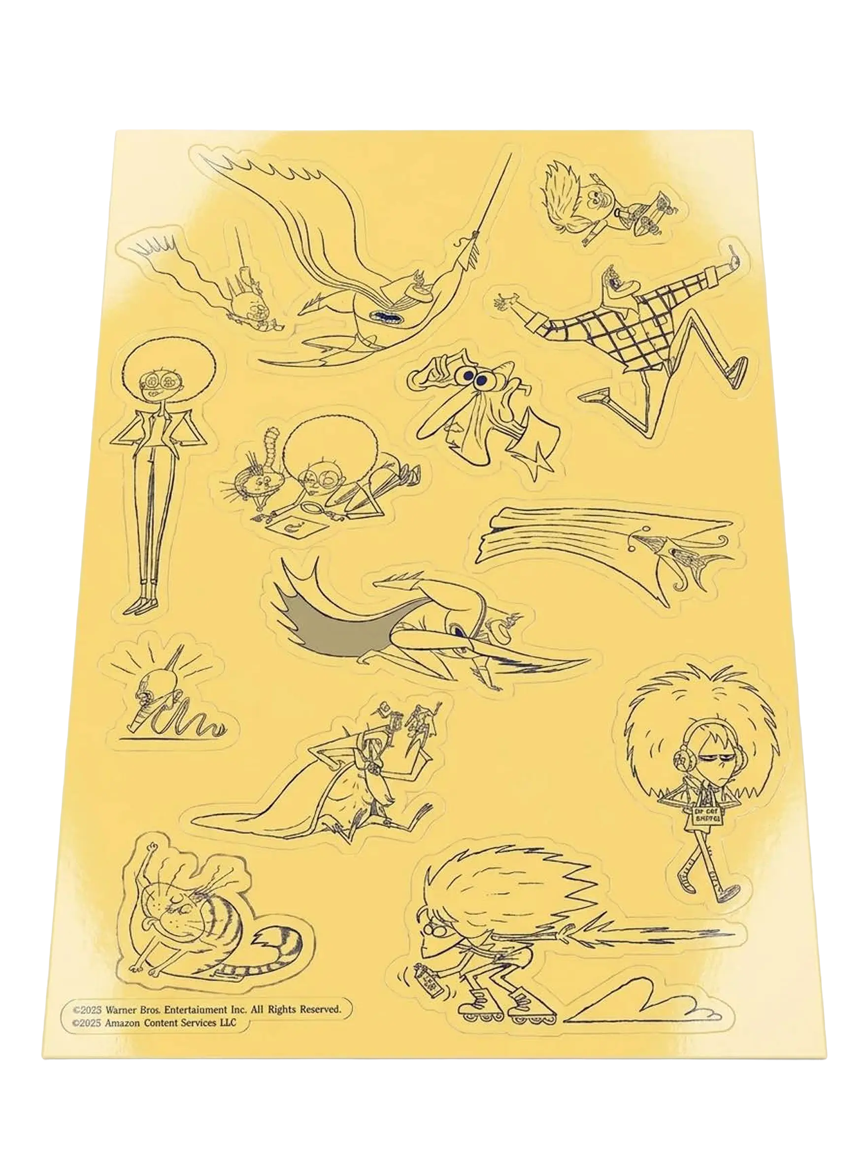
A custom sticker sheet turned some of Bat-Fam’s strangest, funniest characters and poses into little pieces fans could peel off and take with them.
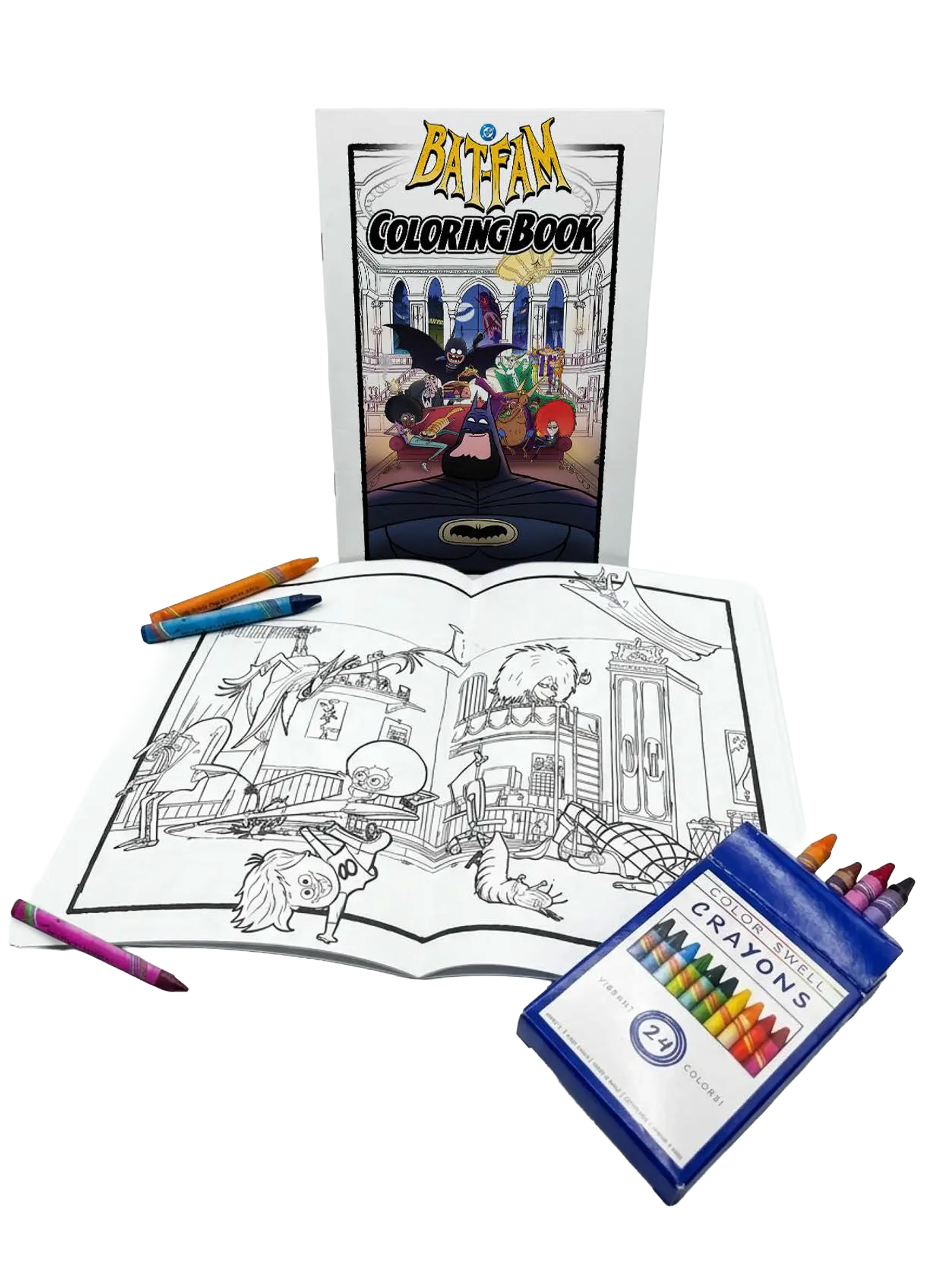
We turned Bat-Fam into something fans could literally make their own, pairing a custom coloring book with crayons for a hands-on activity built around the show’s chaotic little corner of Gotham.
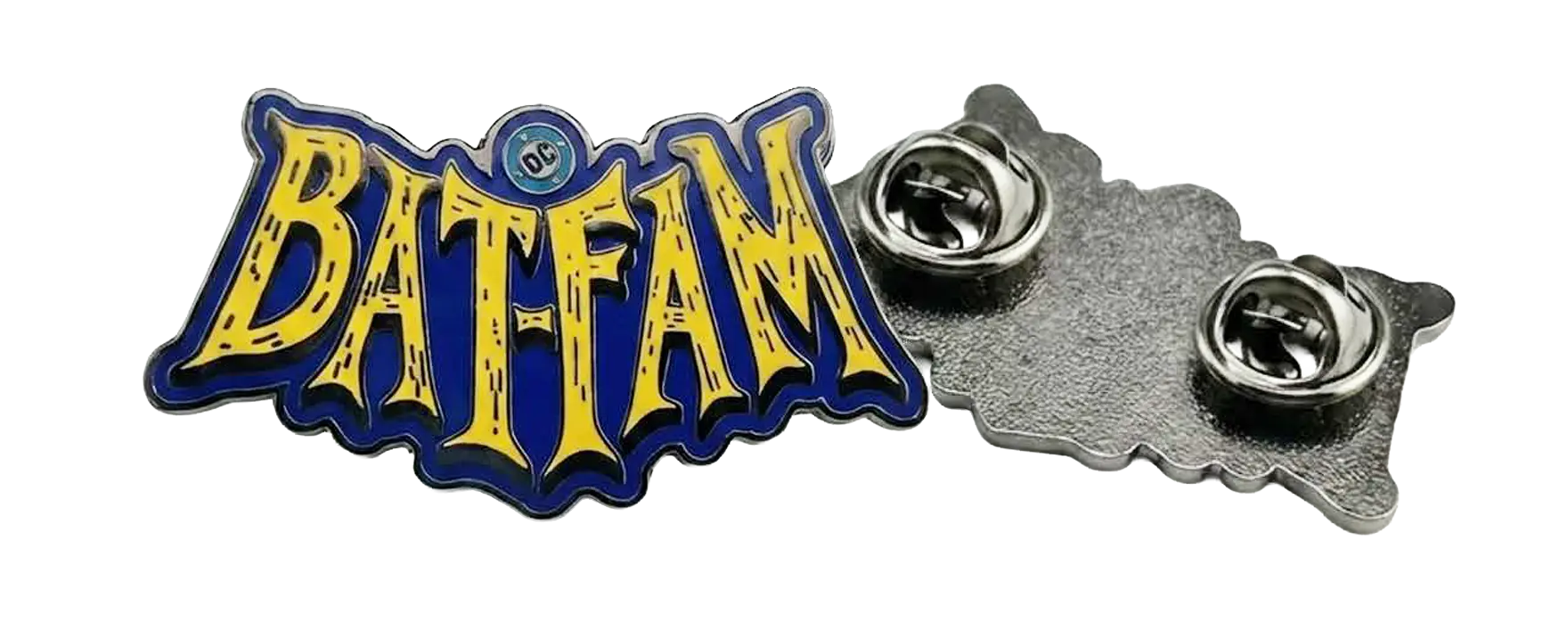
A custom Bat-Fam enamel pin gave fans a small piece of the series they could actually wear, carrying the show’s bold yellow, blue, and black identity beyond the screen.
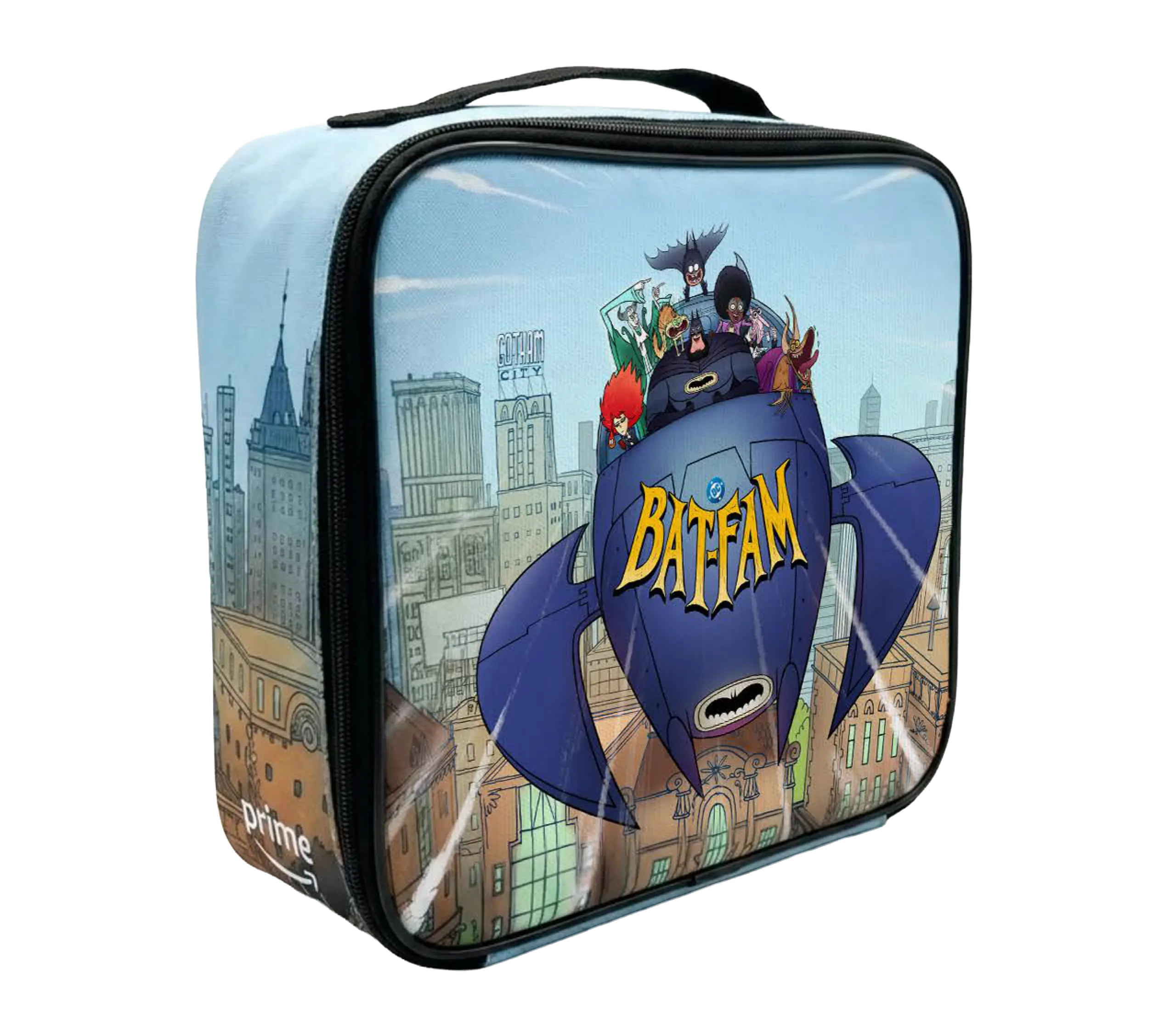
We put the whole Bat‑Fam in a kid-sized Batboat on a glossy lunch box as a tactile keepsake for the influencer kit we made with I’m The Chef Too!.
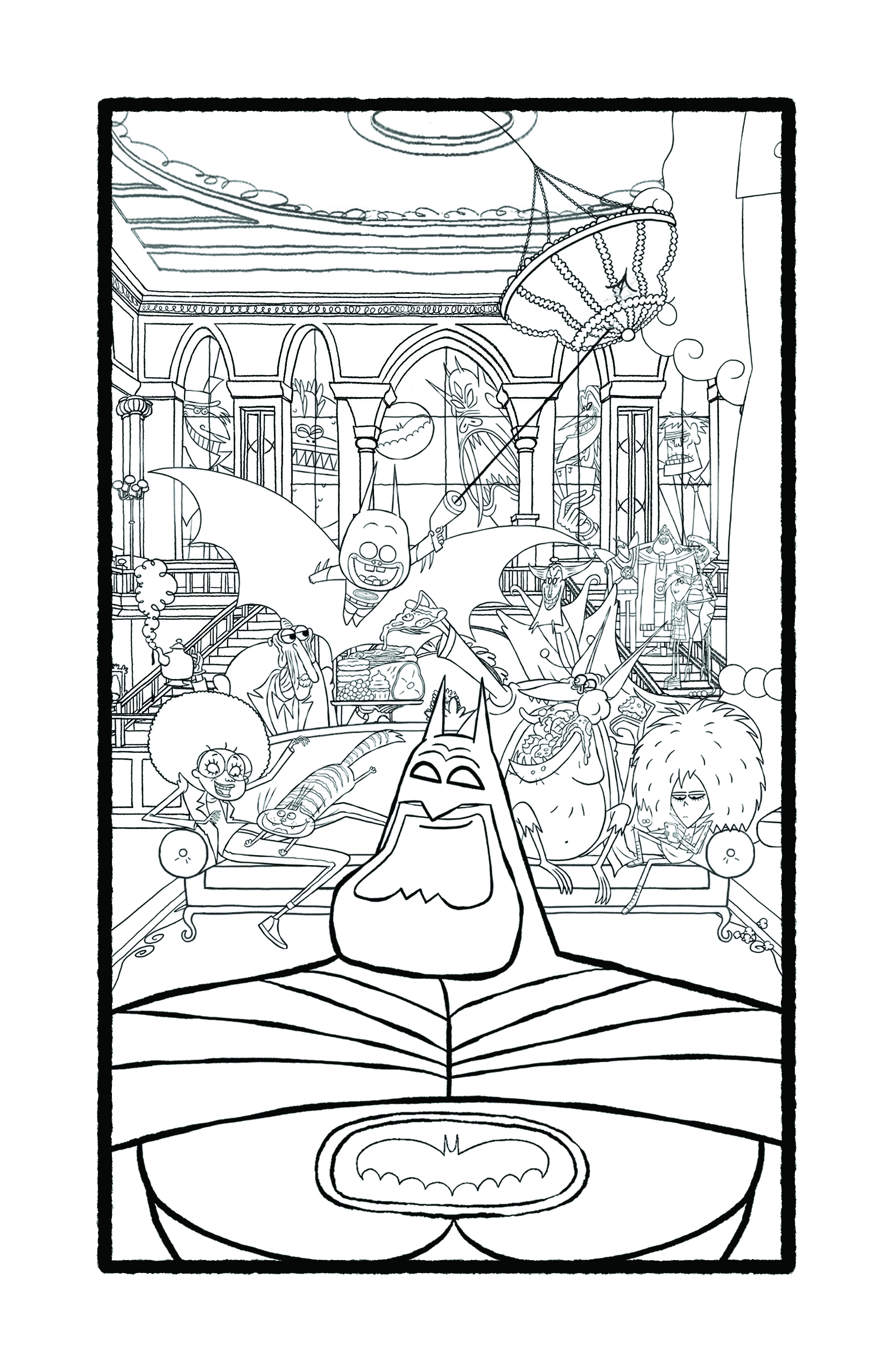
We made a hand-drawn Bat-Fam coloring page that puts Batman front and center while the household's playful chaos fills Wayne Manor.
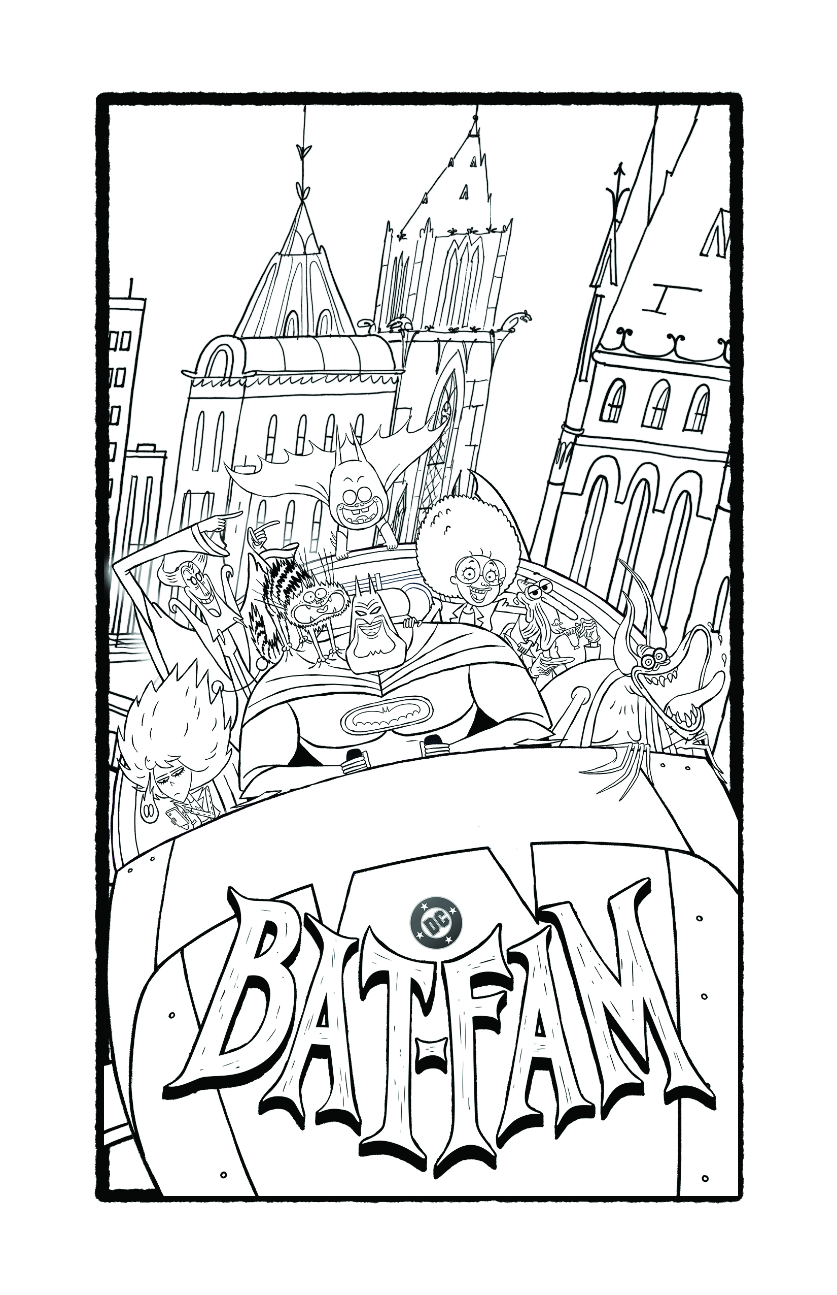
We made this high-contrast coloring page with Batman front-and-center and the whole Bat‑Fam piled in a car so families could color, laugh, and riff together.
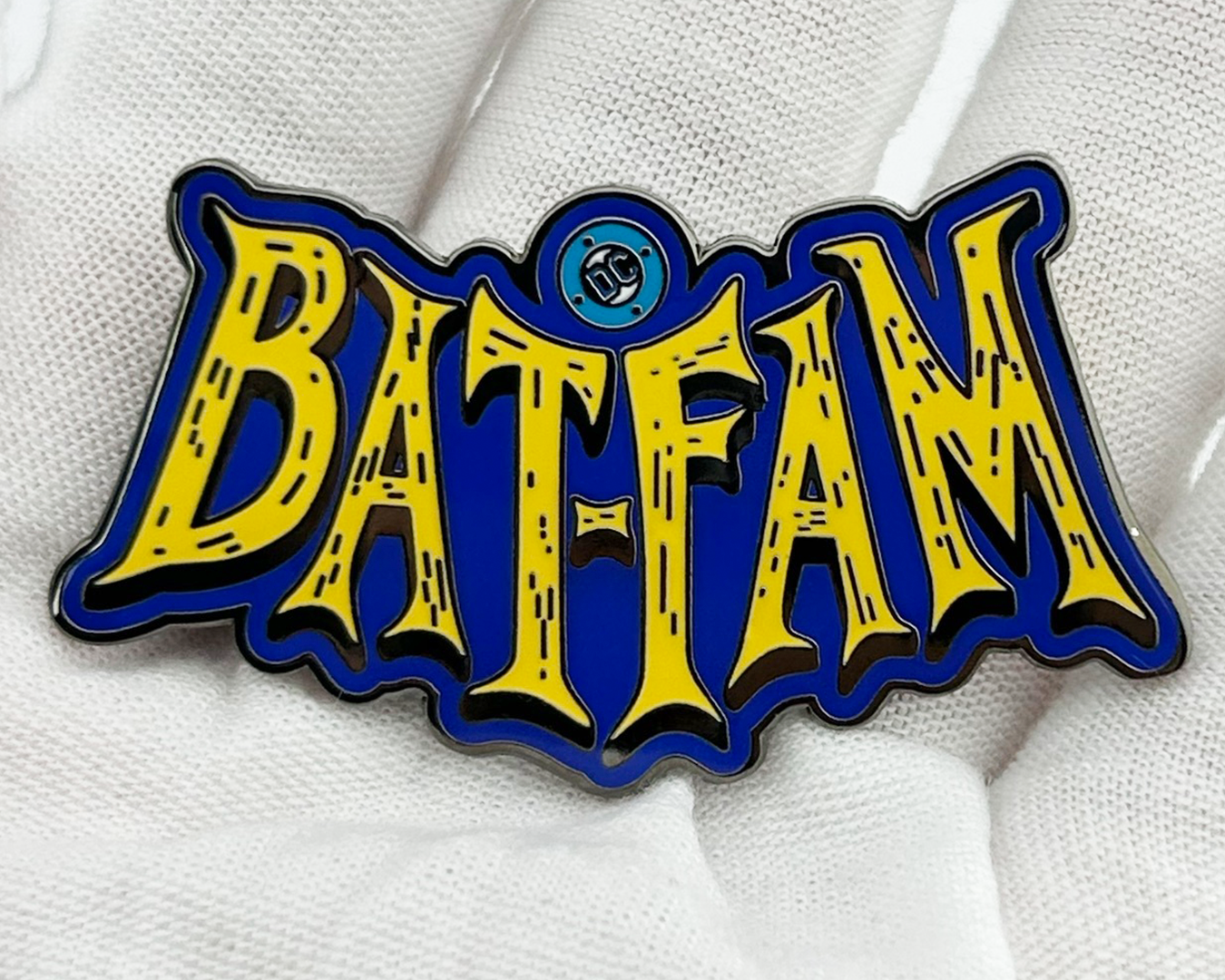
We included this glossy Bat-Fam enamel pin as a tactile keepsake in the hands-on influencer kit we built with I’m The Chef Too!, so families could tuck a little piece of the household away before pressing play.
We made the final day feel like a quick blast of Guardian energy, moving from Star-Lord in action to the whole team and a clear pre-order reminder.
We gave D’Urville Martin his own sharp, stylized moment, using a shifting split-screen treatment to match the campaign’s love for big personality and 1970s showmanship.
We shaped Jerry Jones’ frustrated reaction into a quick social loop, giving the campaign a character-driven beat with the same theatrical edge as Rudy Ray Moore’s world.
We gave this knowing reaction moment a clean, repeatable loop, using the campaign’s angled color treatment to keep the joke moving in the feed.
We shaped Rudy Ray Moore’s proud, skyward look into a quick social reaction loop, letting Eddie Murphy’s performance carry the humor while the graphic treatment keeps it rooted in the campaign’s 1970s showmanship.
We paired a costume-focused interview with film and archival imagery to ground Dolemite Is My Name in the style, influence, and expressive freedom of 1970s Black cinema.
We paired cast reflections with scenes from the film to show how its characters carry the familiar texture of people audiences already know.
We gave audiences a crash course in the original Dolemite, breaking Rudy Ray Moore’s cult classic down in under 60 seconds to connect the new film back to the character that started it all.
Method acting gets the Cinemagical Realities treatment in a playful breakdown of how performers use imagination, empathy, and different acting techniques to make a performance feel real.
The camera might not actually add ten pounds | but the wrong lens definitely changes things. This episode used exaggerated framing to show how focal length reshapes what we see.
Warm, cold, happy, sad | Cinemagical Realities used color theory and a few dramatic lighting changes to show how color can completely shift the emotion of a scene.
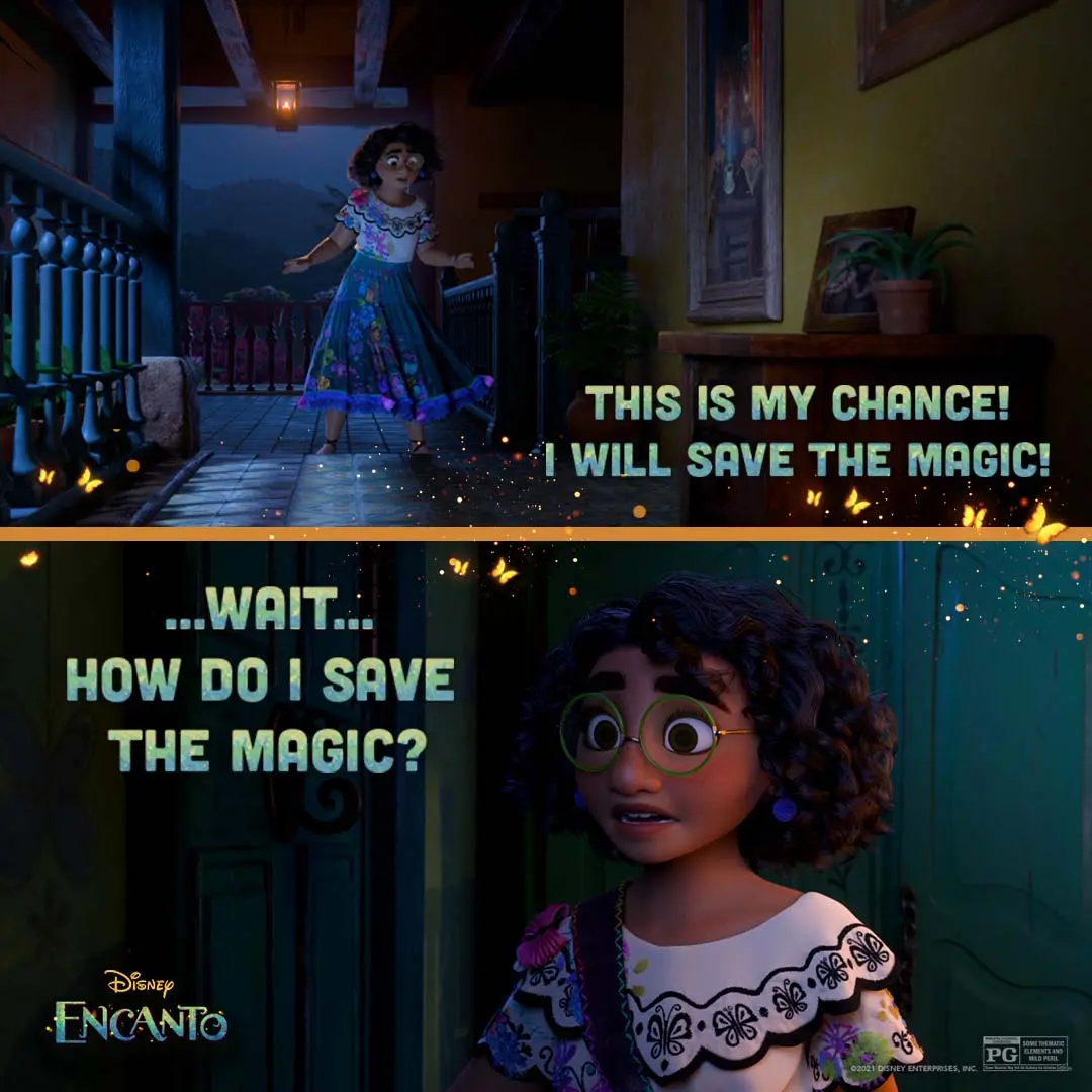
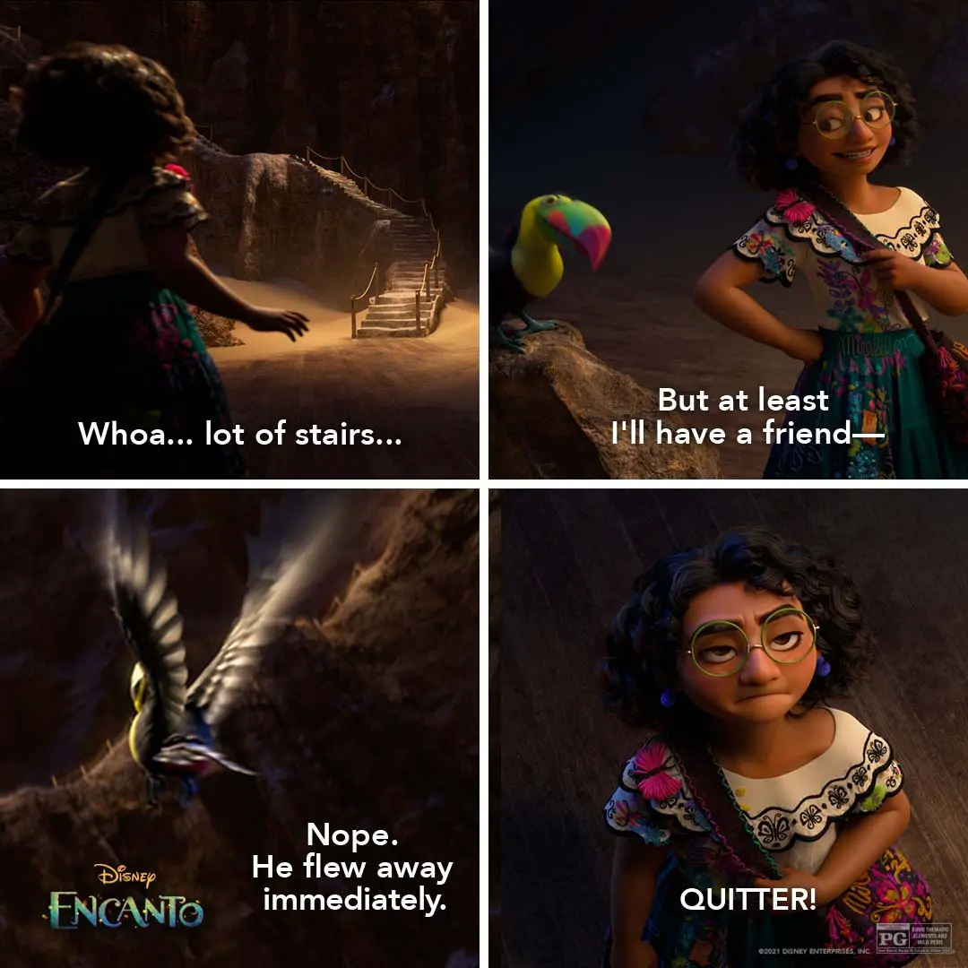
We made a split-panel social graphic that moves from Mirabel’s brave step to a close-up of her doubt, using warm sparks and bold type to carry the emotional shift.
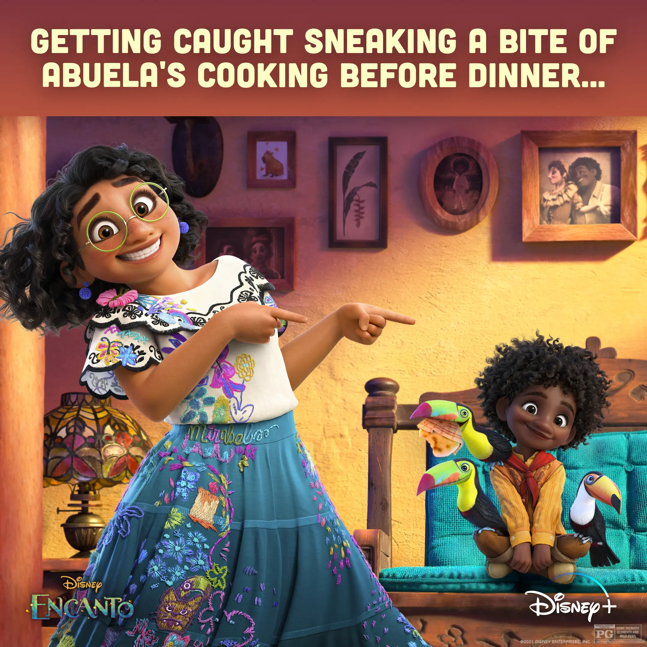
We staged Mirabel pointing at Antonio and the toucans to play up a guilty, funny moment around Abuela’s cooking.
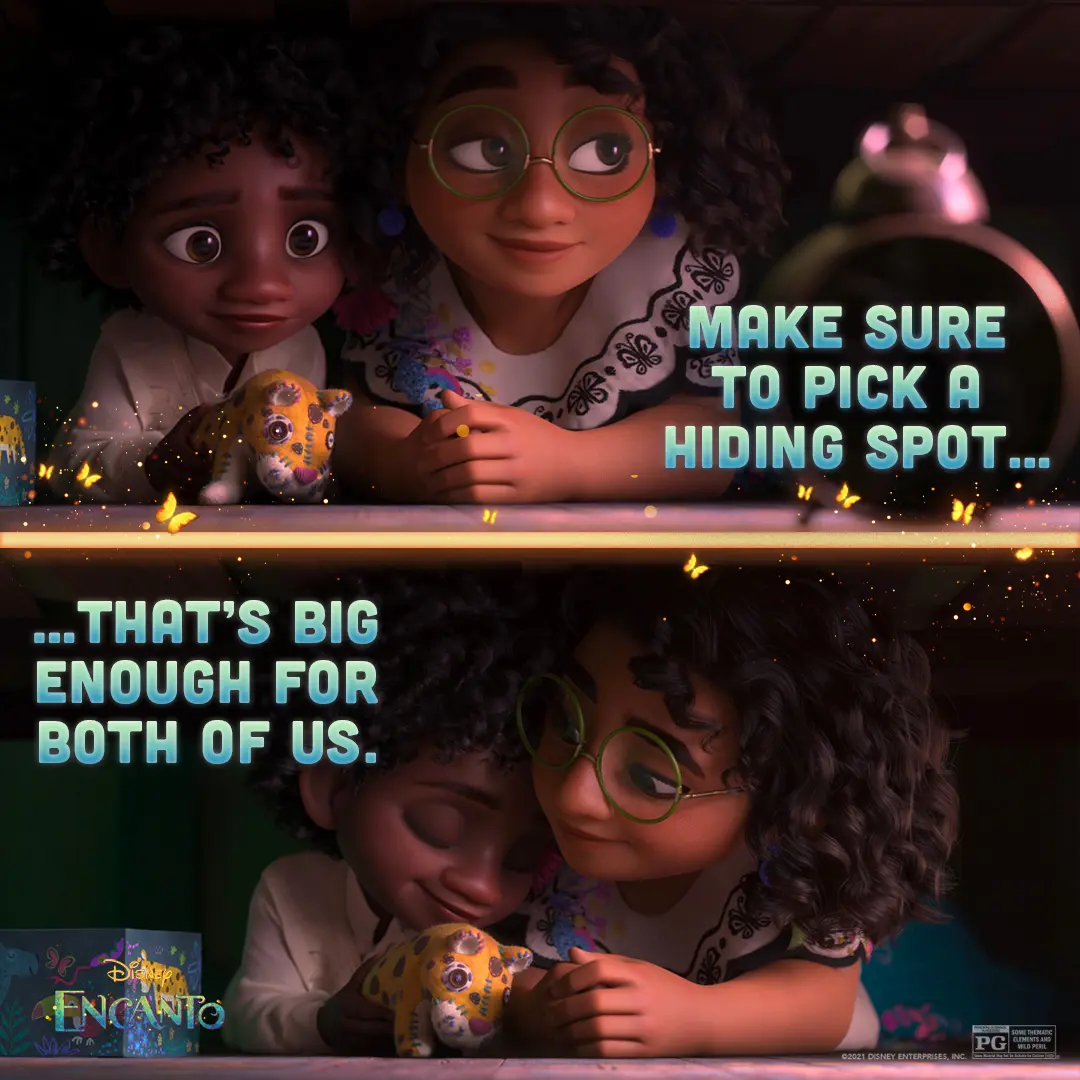
We staged this under-the-bed two-panel to put Mirabel’s warmth next to Antonio’s quiet wonder.
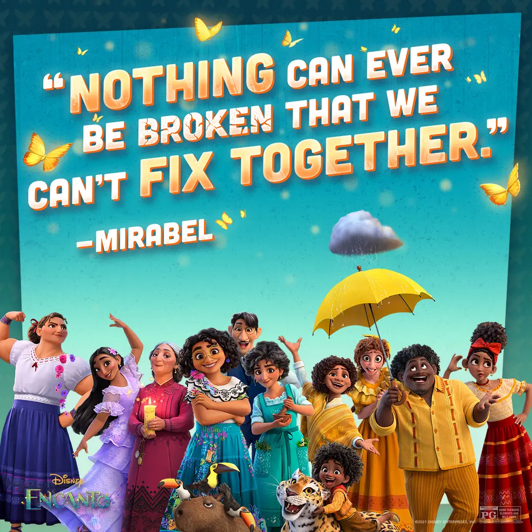
We put the Madrigals front and center and designed the quote lockup to read like a warm, stubborn family promise.
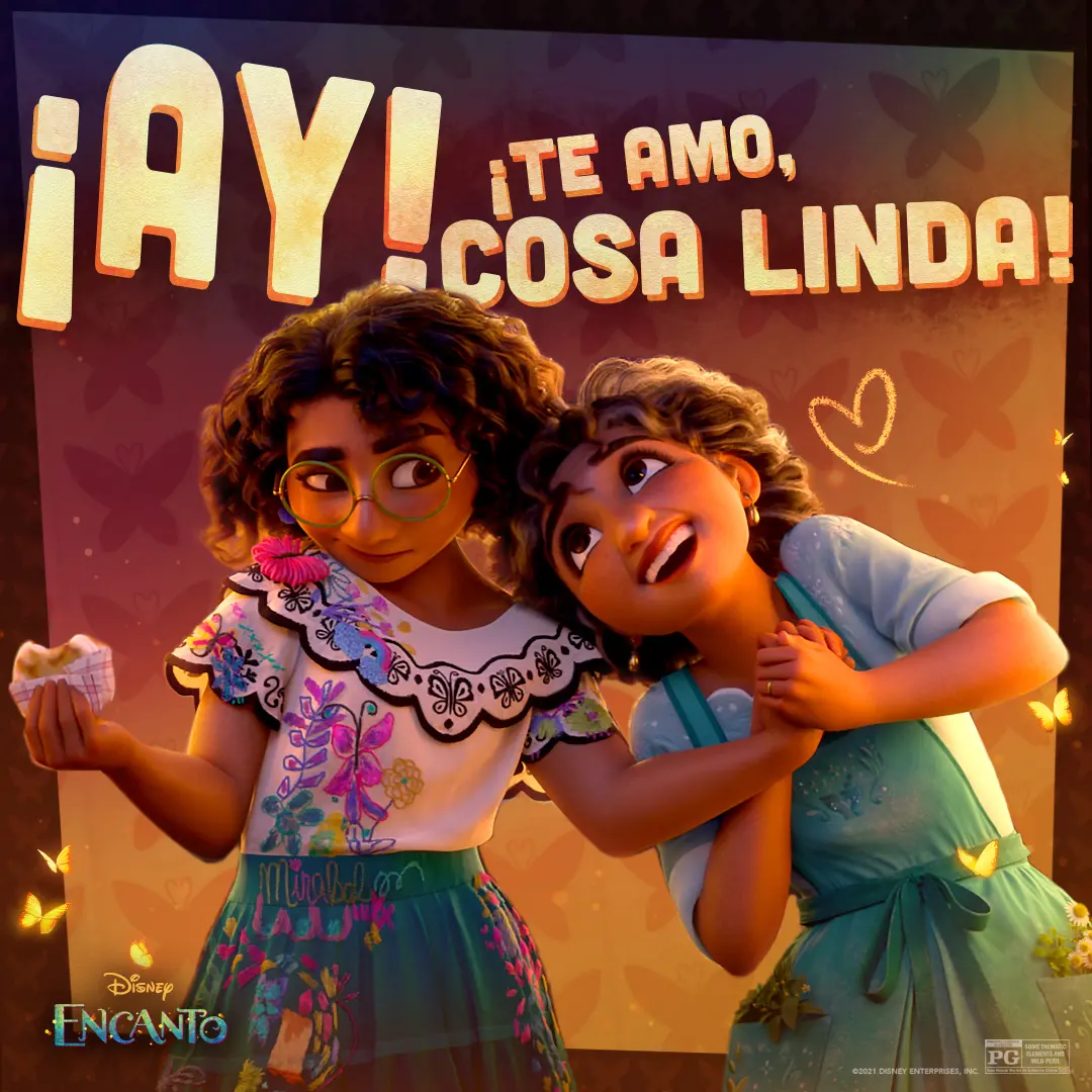
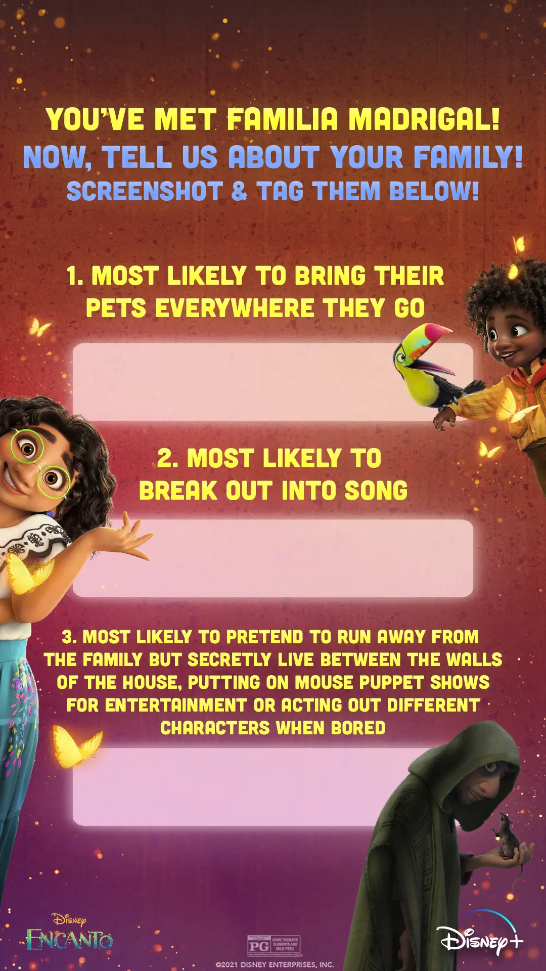
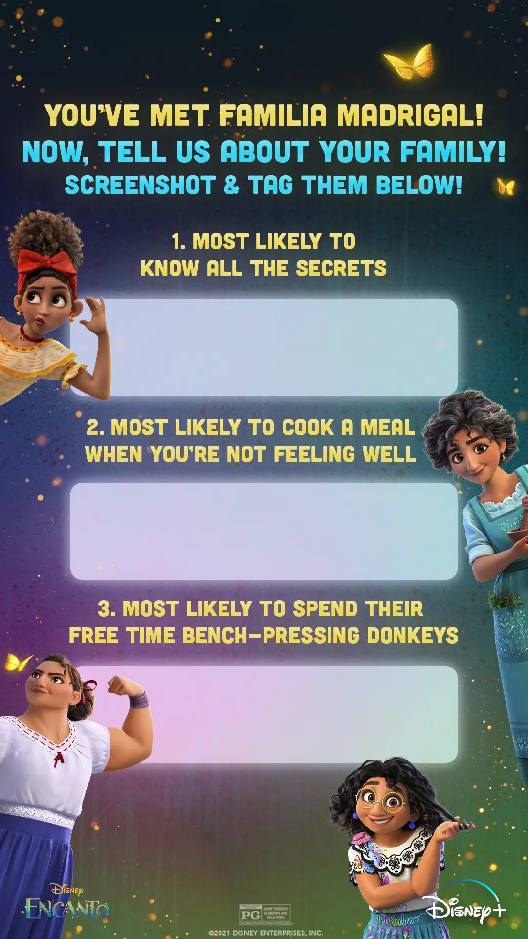
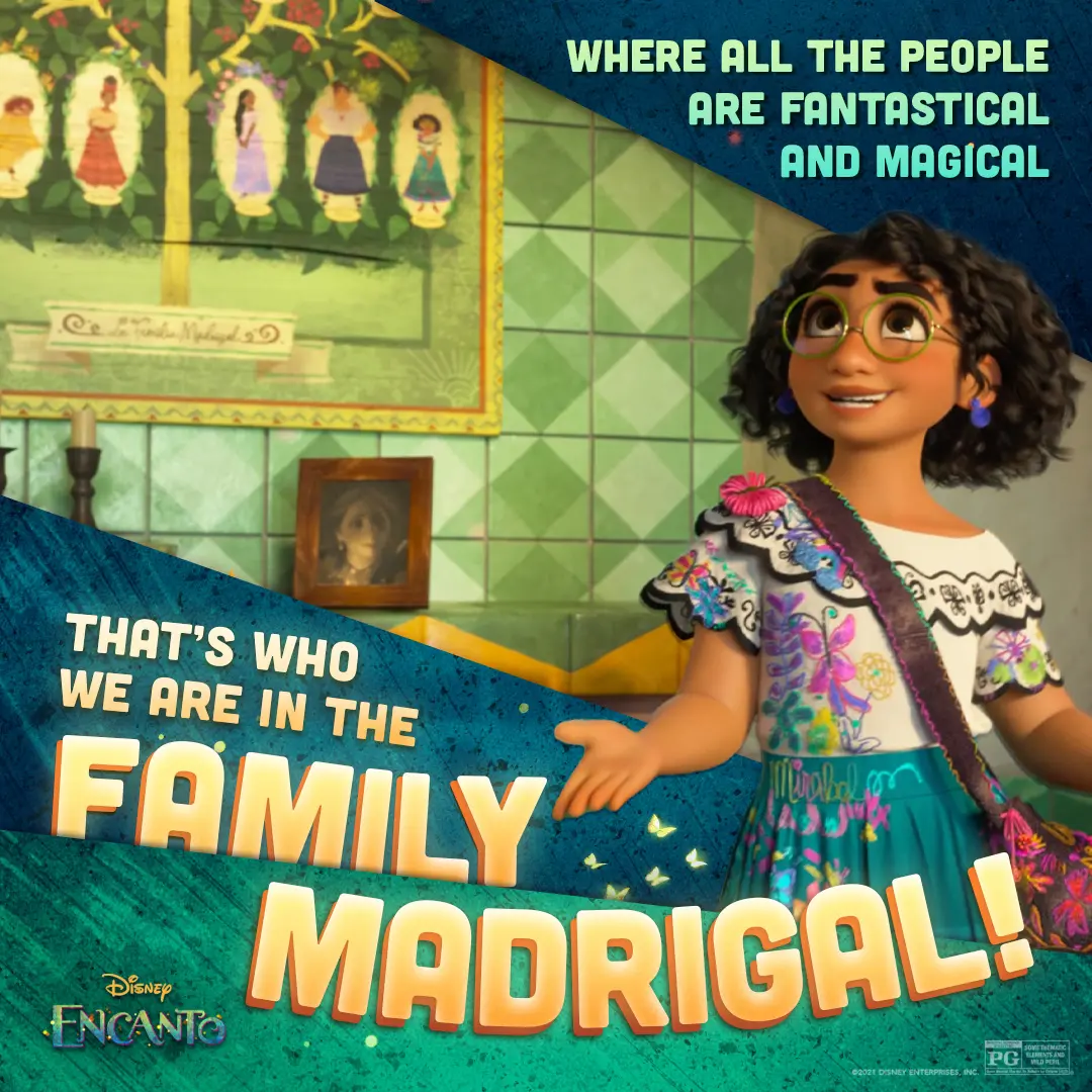
We paired Mirabel's portrait with bold lyric overlays to celebrate the Madrigal family and the film's musical voice.
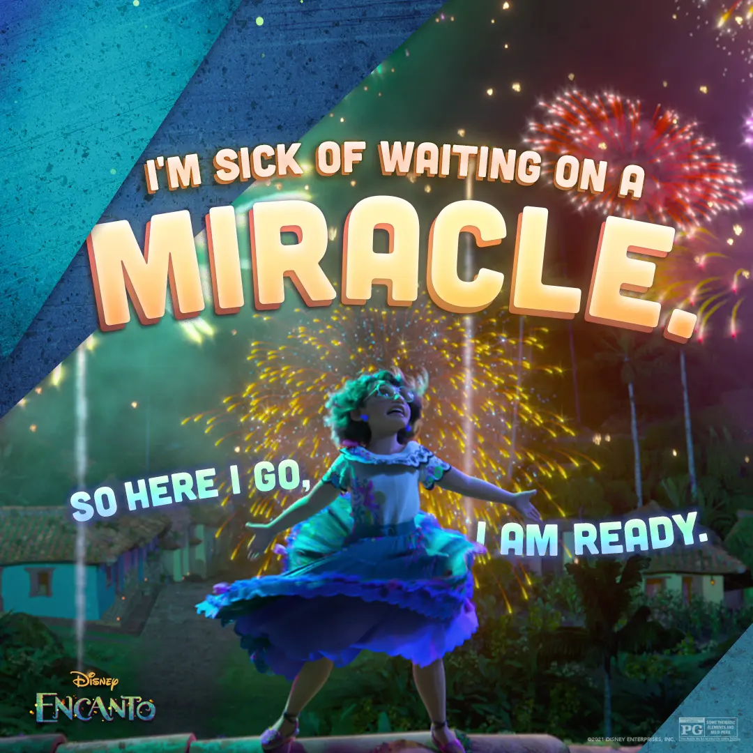
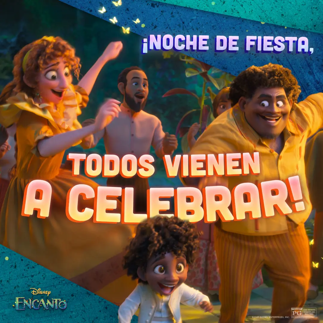
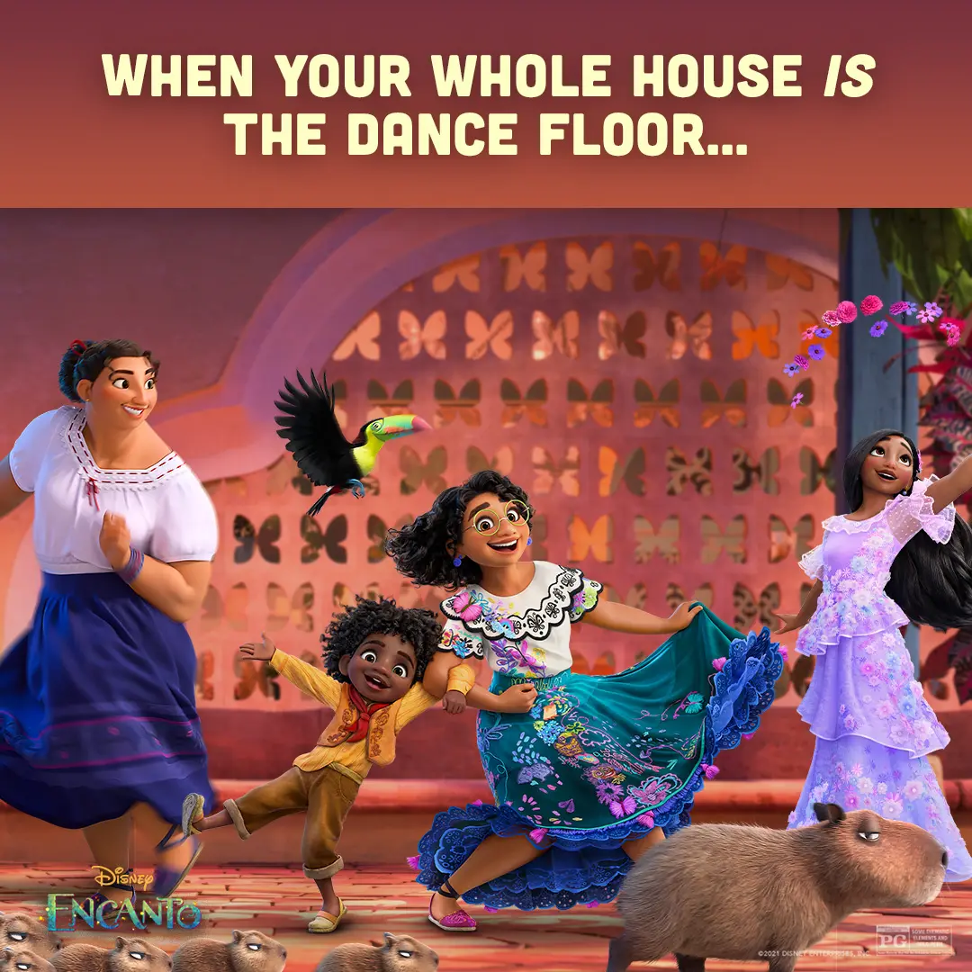
We made this social-first graphic to highlight the Madrigals' party energy and sync with the film's music-led celebration.
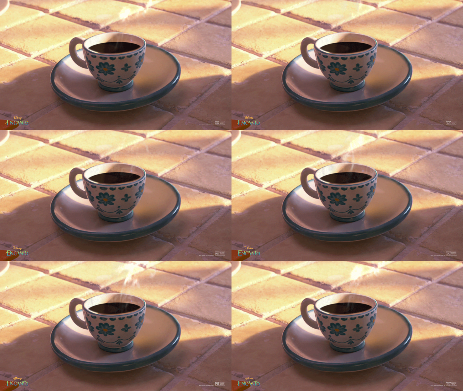
We animated a quiet cafecito on sunlit tiles to ground Encanto's warmth in an everyday ritual.
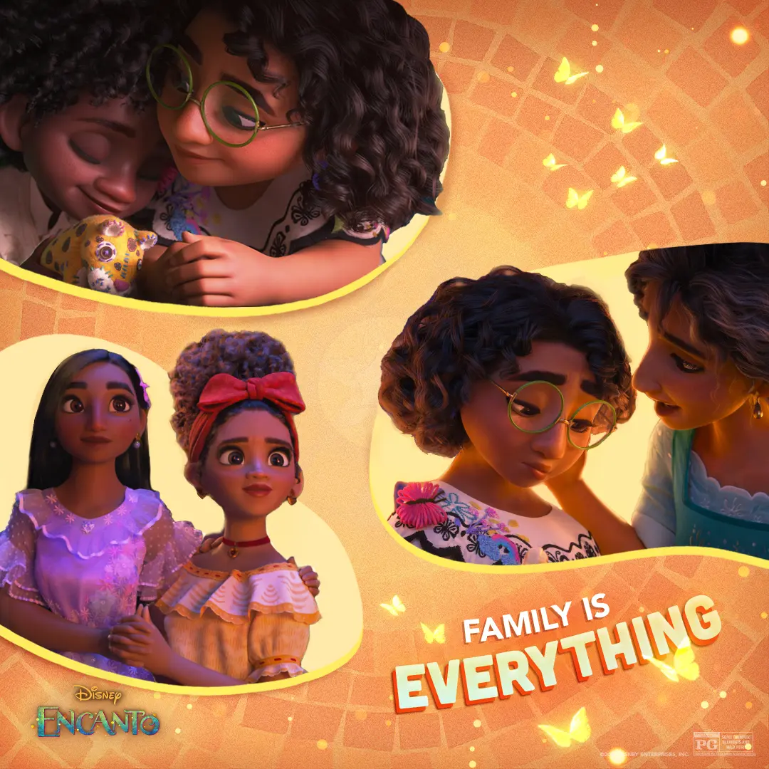
We designed a warm, tile-backed collage that keeps Mirabel at the emotional center while threading small family moments and butterflies through the composition.
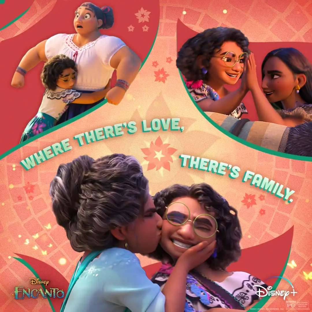
We pulled three intimate Madrigal moments into one social piece so the feed reads like a family album about care, pressure, and the small ways love holds you up.
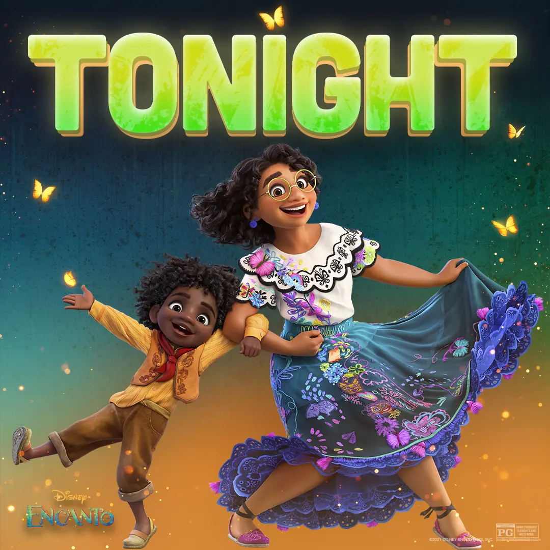
We paired Mirabel and Antonio beneath a bold 'TONIGHT' graphic to give the social countdown a warm, playful energy.
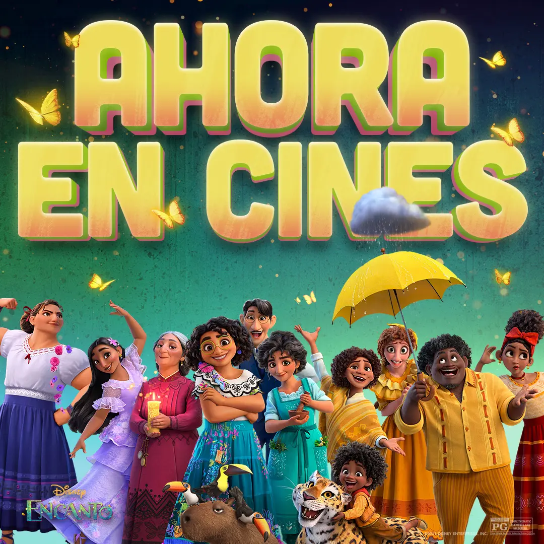
We made a Spanish-language poster that places the Madrigal family beneath bold 'AHORA EN CINES' type, using butterflies, a tiny rain cloud, and bright color to signal the film's magical, family-forward world.
We shaped this cast-and-creator featurette around authenticity, pairing candid interviews with scenes and behind-the-scenes footage to keep the conversation rooted in the people making the series.
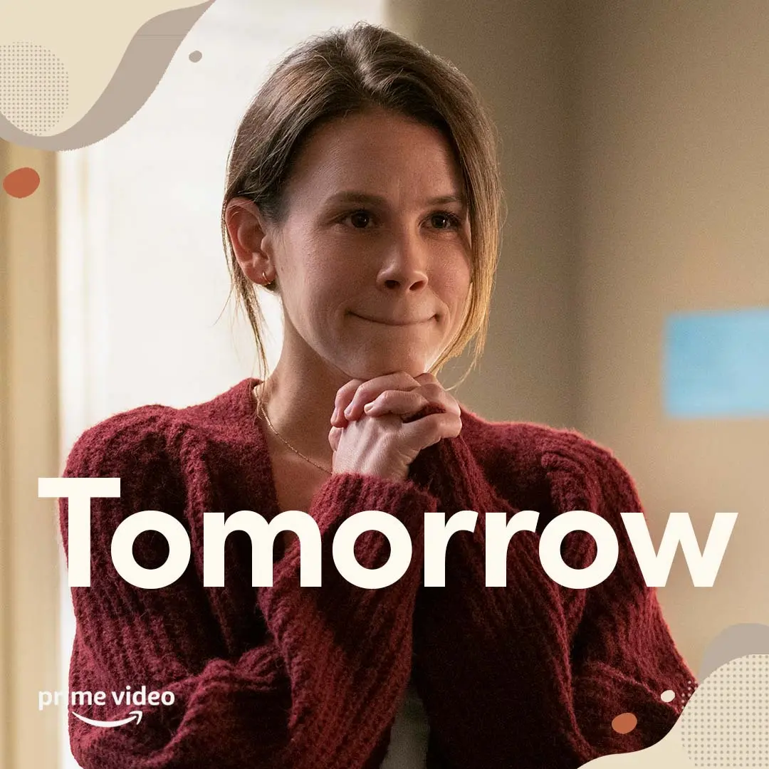
We paired a quiet close-up of Mandy with oversized, highly readable type and warm, low-clutter textures to create a calm countdown card for the campaign.
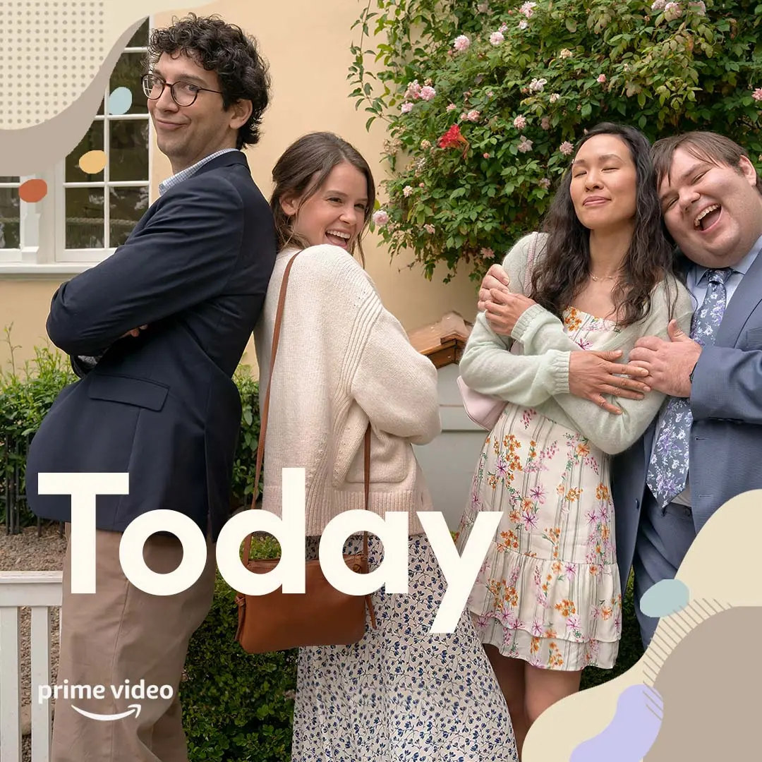
We paired a candid cast moment with roomy "Today" type and the Prime Video lockup so a countdown card reads fast and stays calm in busy feeds.
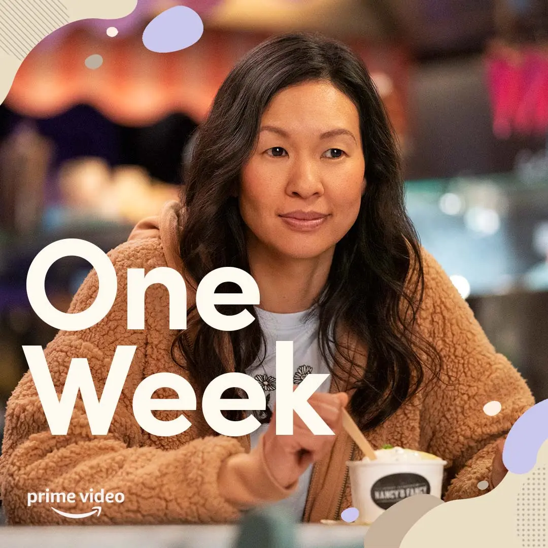
We paired a close, warm portrait of Violet with oversized, single-weight type reading "One Week" and soft graphic shapes so the countdown reads calmly and clearly in feeds.
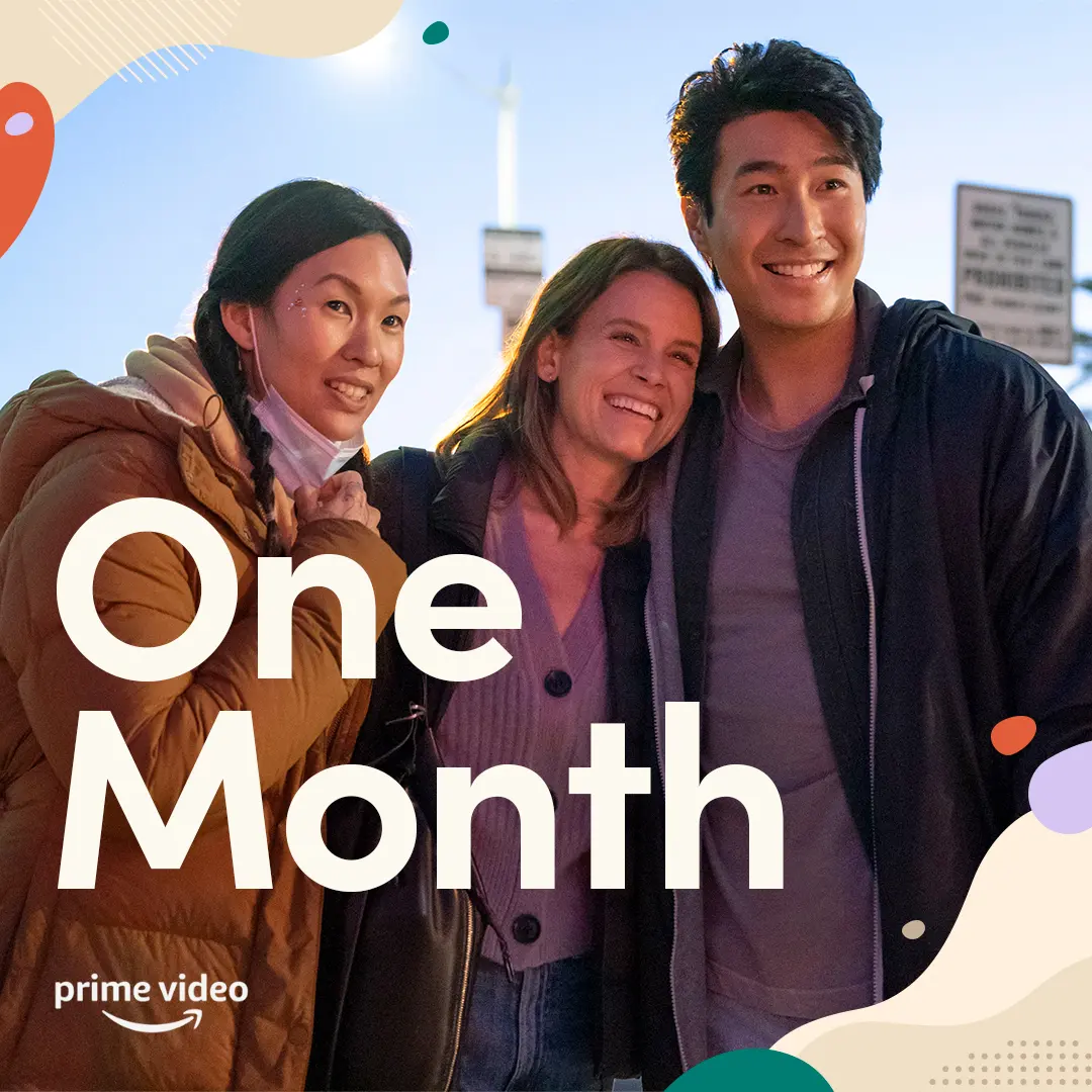
We marked the one-month countdown with a warm, uncluttered social post that kept the series’ sense of friendship front and center.
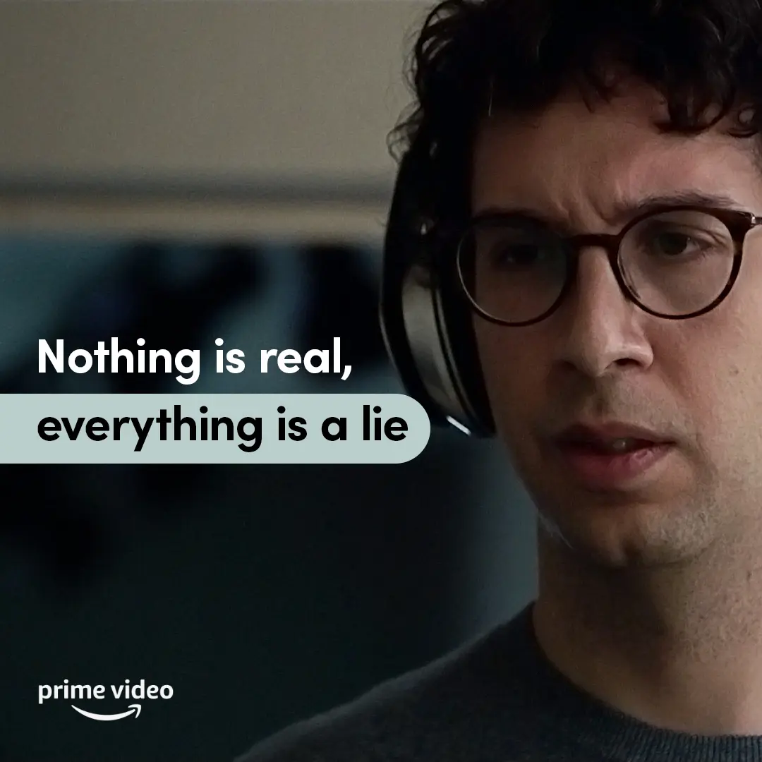
We paired a tight close-up of Jack with a muted teal callout and a single readable type voice so the line lands calm, legible, and feed-friendly.
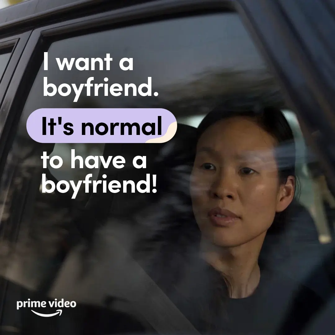
We made space for a direct, everyday desire, using clear type and a quiet character moment to affirm that dating belongs in the full picture of independence.
We made this illustrated recipe animation to give Violet’s point of view a playful, easy-to-follow social format, with each step paced clearly from pour to blend.

We used a simple illustrated head and personal-interest icons to make room for individuality within As We See It’s calm, accessible social language.
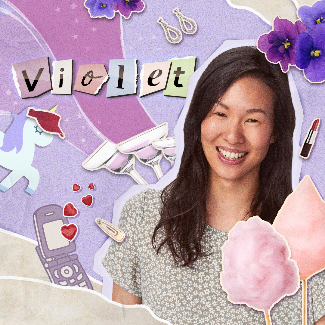
We introduced Violet through a hand-cut collage of personal details, keeping the character spotlight warm, specific, and easy to take in.
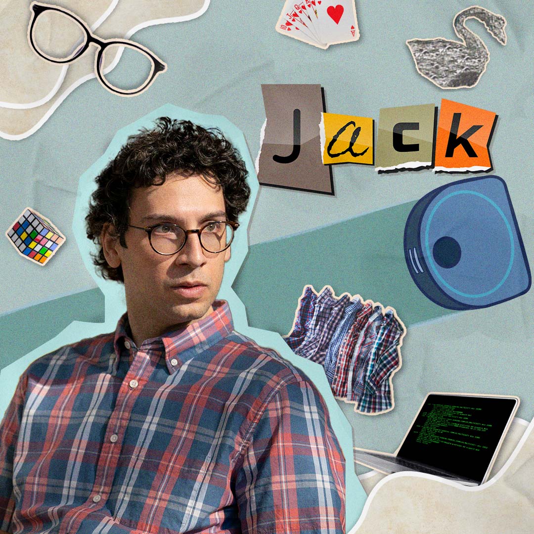
We framed Jack through a collage of personal details, giving audiences a character-led entry point that felt specific, open, and easy to take in.
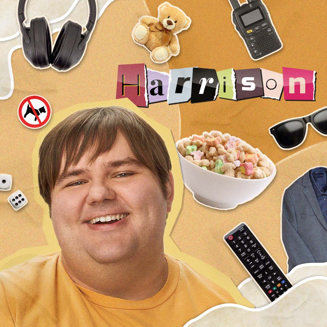
We introduced Harrison through a warm cut-paper collage that lets personality lead, keeping the character asset clear, playful, and easy to take in.
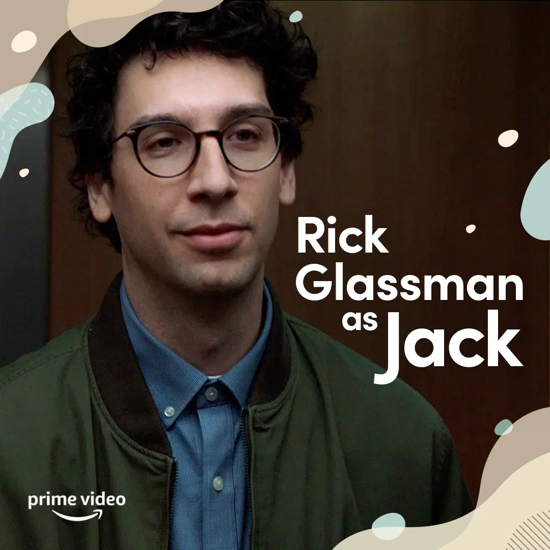
We introduced Rick Glassman as Jack with a clear, spacious cast card that kept the focus on character and made the information easy to take in.
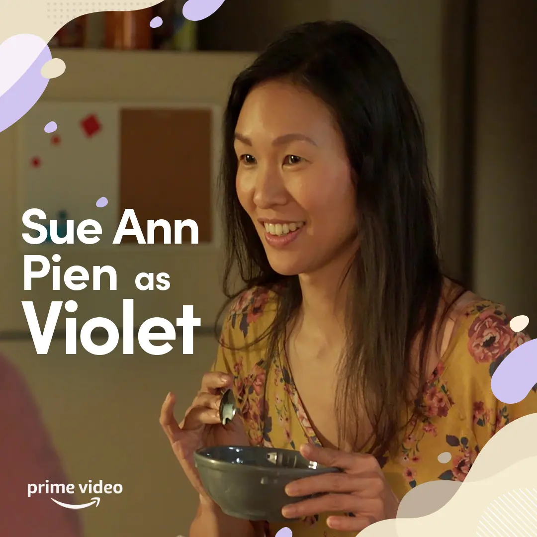
We introduced Violet through a warm, everyday moment and clear cast identification, keeping the social post easy to read and grounded in her life as a roommate.
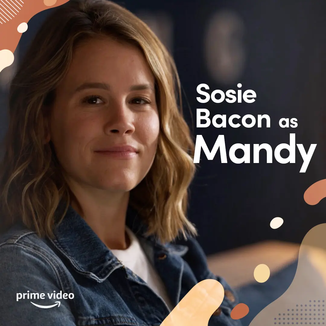
We introduced Sosie Bacon’s Mandy with a calm, direct portrait and clear type, extending the campaign’s welcoming visual language to an important part of the roommates’ support system.
We animated the series key art with a measured reveal that introduced Jack, Harrison, and Violet in the calm, welcoming visual language shaped alongside autistic and neurodivergent collaborators.

We framed the Madrigals together in front of Casita so the family and their gifts read instantly for social audiences.
We gave Mei’s red panda form a quick, squishy solo-dance moment built for the playful, repeatable energy of short-form social.
We gave Mei’s red panda energy a quick, playful solo moment built for the kind of scroll where a little chaos can carry the whole joke.
We gave Turning Red’s aunties a playful anatomy lesson, using their unmistakable style and confidence to turn a familiar family archetype into a quick social joke.
We gave an intimate exchange room to land, using progressive on-screen copy and a brief typing pause to let the scene’s emotional rhythm hold the scroll.
We used clear graphic captions to hold Violet’s hopeful read of a workplace exchange, letting the post stay close to the specificity of her point of view.
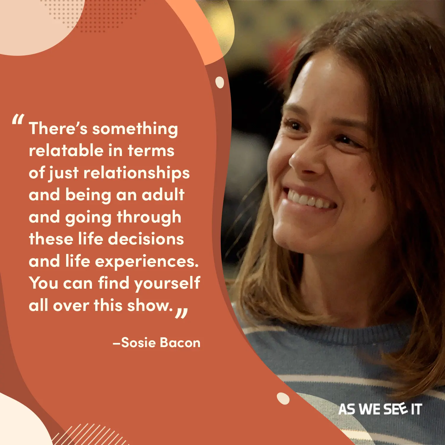
We paired a warm terracotta quote field with a candid, smiling portrait of Mandy so the line reads like someone you’d want to sit and listen to.
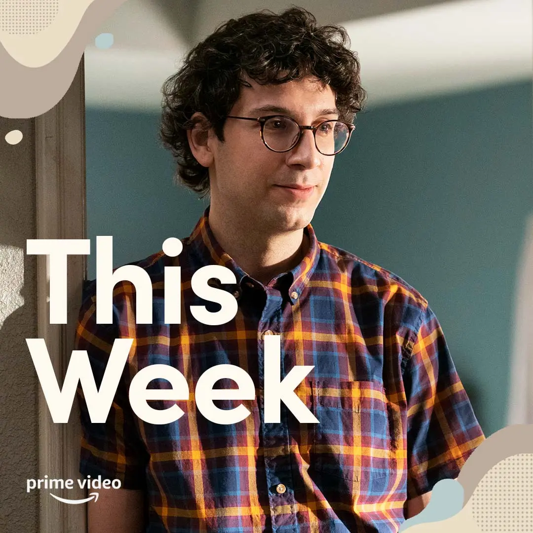
We layered a calm portrait of Jack with restrained type and soft, rounded graphics so the 'This Week' countdown reads clearly and comfortably in feeds.
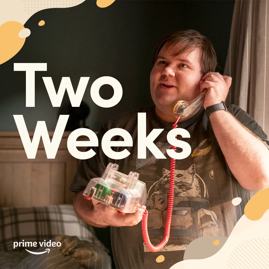
We framed Jack in a warm, low-contrast moment and layered oversized 'Two Weeks' type so the countdown reads instantly on mobile without visual clutter.
We made this tap-through moment put viewers inside Violet’s birthday-party dilemma, using a clear choice and calm pacing to let the scene unfold on its own terms.
We framed Harrison’s choice as a tap-through prompt, inviting viewers to consider different ways of navigating an unfamiliar moment at their own pace.
We framed Lofi Mei as a comforting extension of Turning Red, showing how a 30-minute study loop gave fans a softer way to spend time with Mei and her friends.
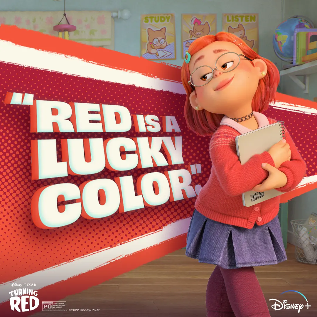
We paired Mei's cozy early-2000s look with a bold, comic-style 'Red is a Lucky Color' graphic to give fans a warm, confident social asset to study or chill with.
We gave the impossible instruction to “just breathe” a Turning Red-sized payoff, letting Mei’s attempt at staying composed spiral into the kind of emotional release fans recognize immediately.
We shaped this TikTok-ready edit around Mei and her friends moving through every big feeling together, giving the film’s friendship circle a quick, playful way to meet fans in the scroll.
We brought obi Arisukwu into Invincible’s animated world through a live custom-illustration moment that gave the creator experience a personal, shareable payoff.

We placed a decal of the Invincible title treatment in front of the bar on the dance floor for a subtle branding moment and this creator understood the assignment.

We built a mezzanine DJ booth dressed in show-forward red and framed it with animated character screens so creators had a high-energy photo moment between screenings.

We designed the floral-arch photo moment so creators could grab a quick on-brand portrait framed by practical lighting and tropical foliage.

We kept the creator lounge low and tactile, with blankets, beanbags, and punchy color so creators could settle in, record reactions, and make quick content between screening beats.

We ran an interactive photo moment at the Invincible screening, pairing the black branded wall with a blood-splatter prop so creators could lean into the show's violent spectacle.

We built this memorial photo moment, with an illuminated easel, illustrated Rex Splode portrait, and wreath, to give creators a tactile, slightly ceremonial way into Season 4’s darker world.

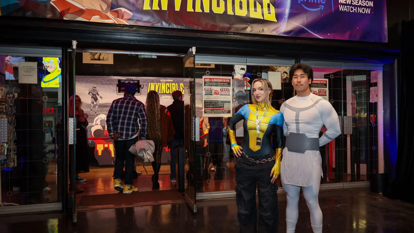
We treated the entrance as the first beat of the screening, using branded signage to bring creators into Invincible’s comic-book world before they stepped inside.
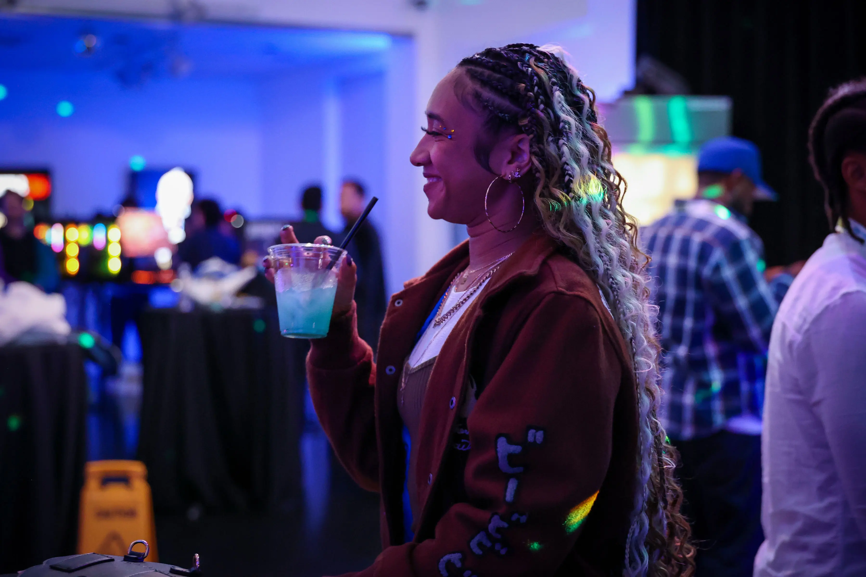
We made room for creators to settle into Invincible’s world together, letting the screening experience carry from the big set pieces into the social energy around the room.
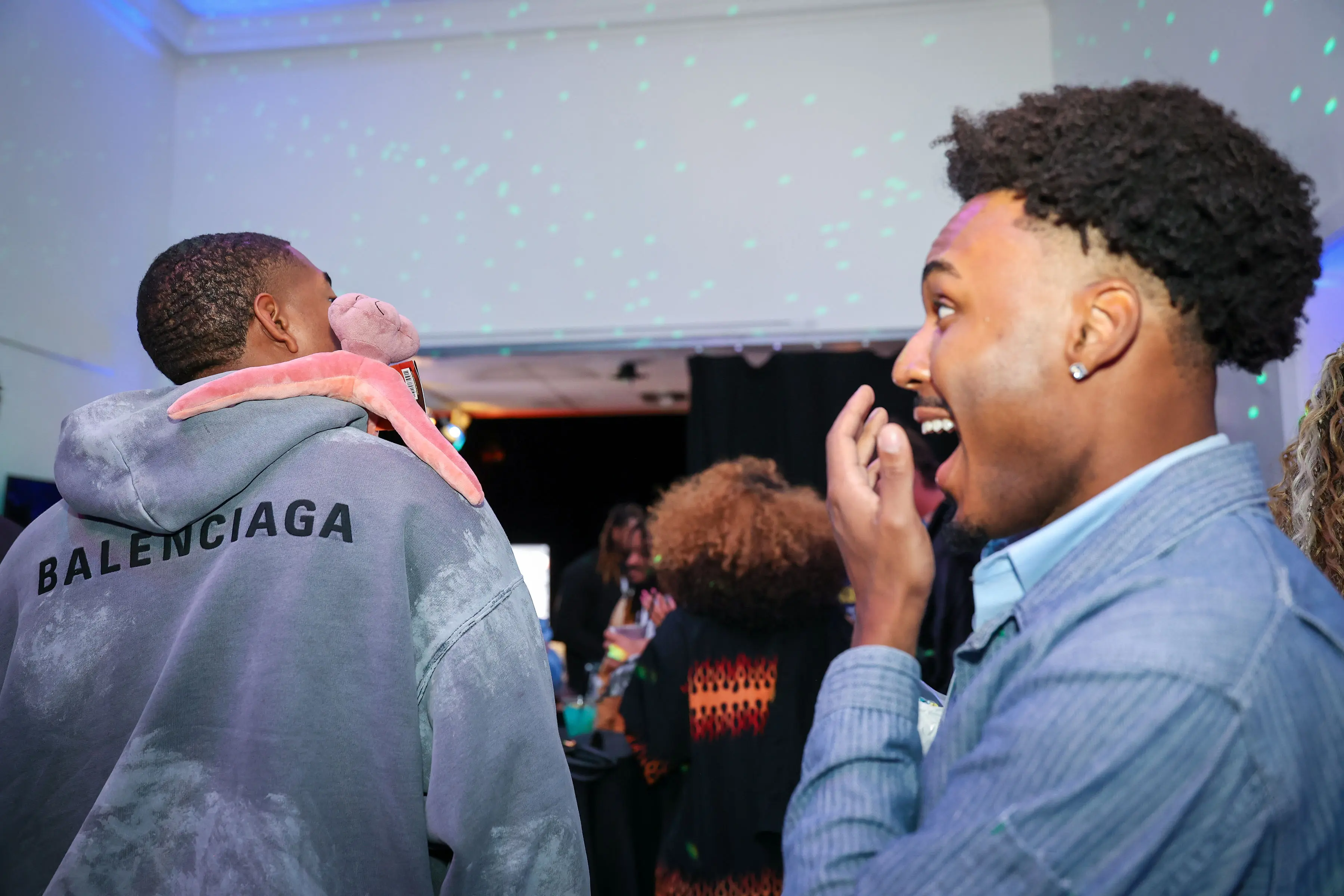
We staged low, comic-book–inspired lighting and quick, grab-and-go photo moments so guests could make shareable reactions, like this surprised laugh beside a Balenciaga hoodie and plush prop.
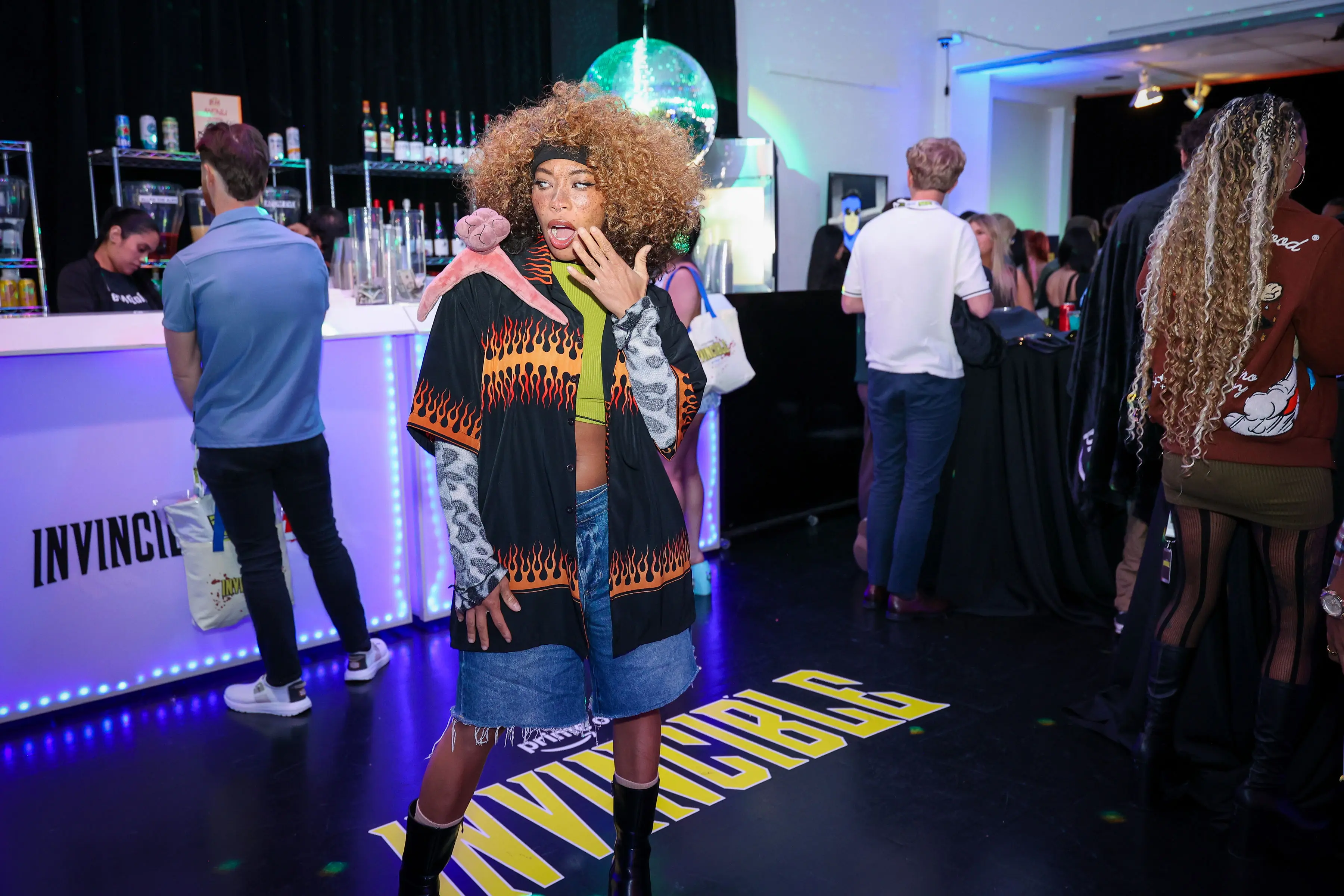
We let the bar double as a playful social moment, giving @kieraplease a plush sequid and a little room to bring the night’s offbeat Invincible energy to life.
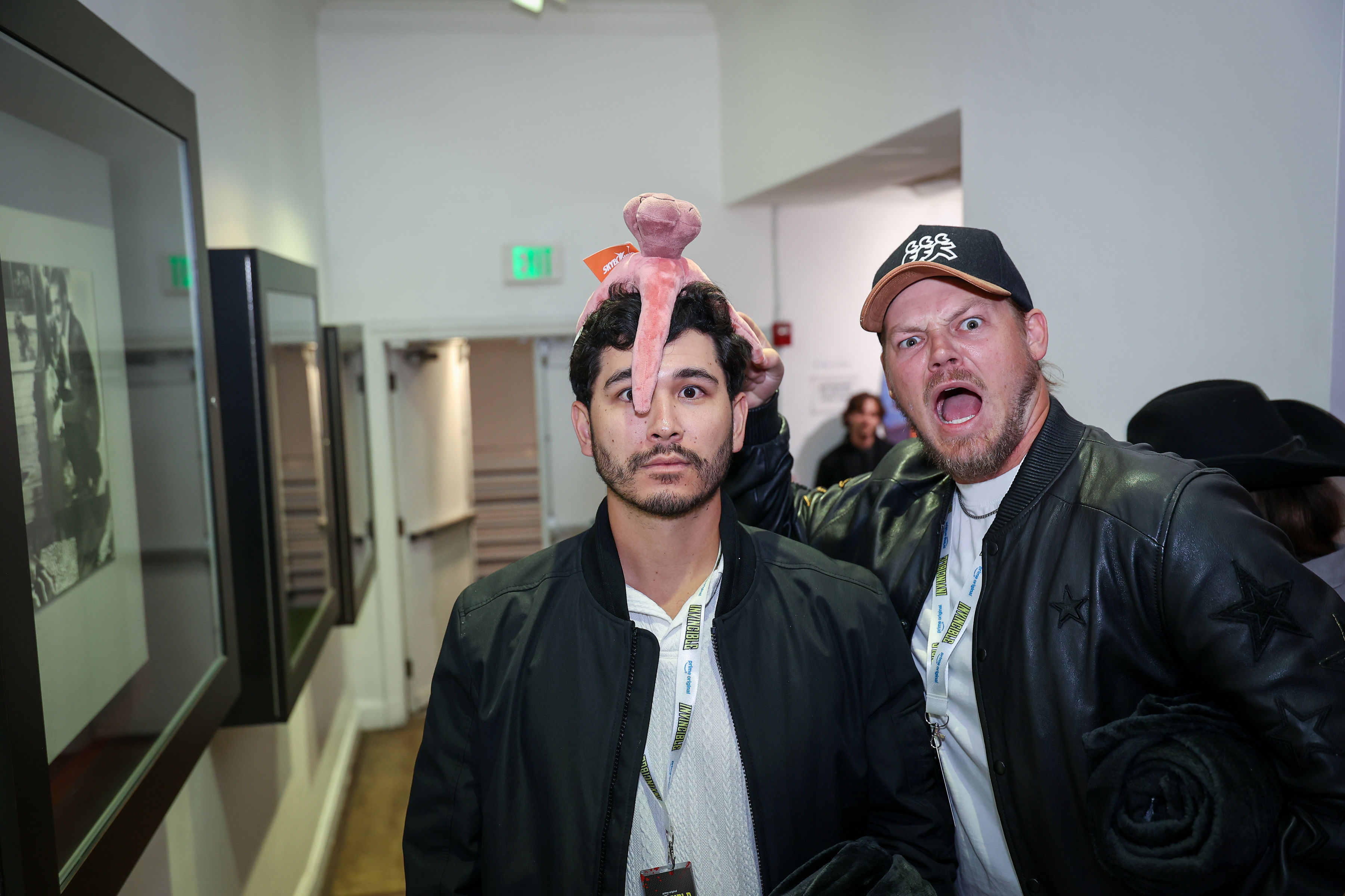
We designed tactile giveaways and clean sightlines at the creator screening, so a guest balancing a pink plush on their head and another mid-yell reads clearly on phone cameras.
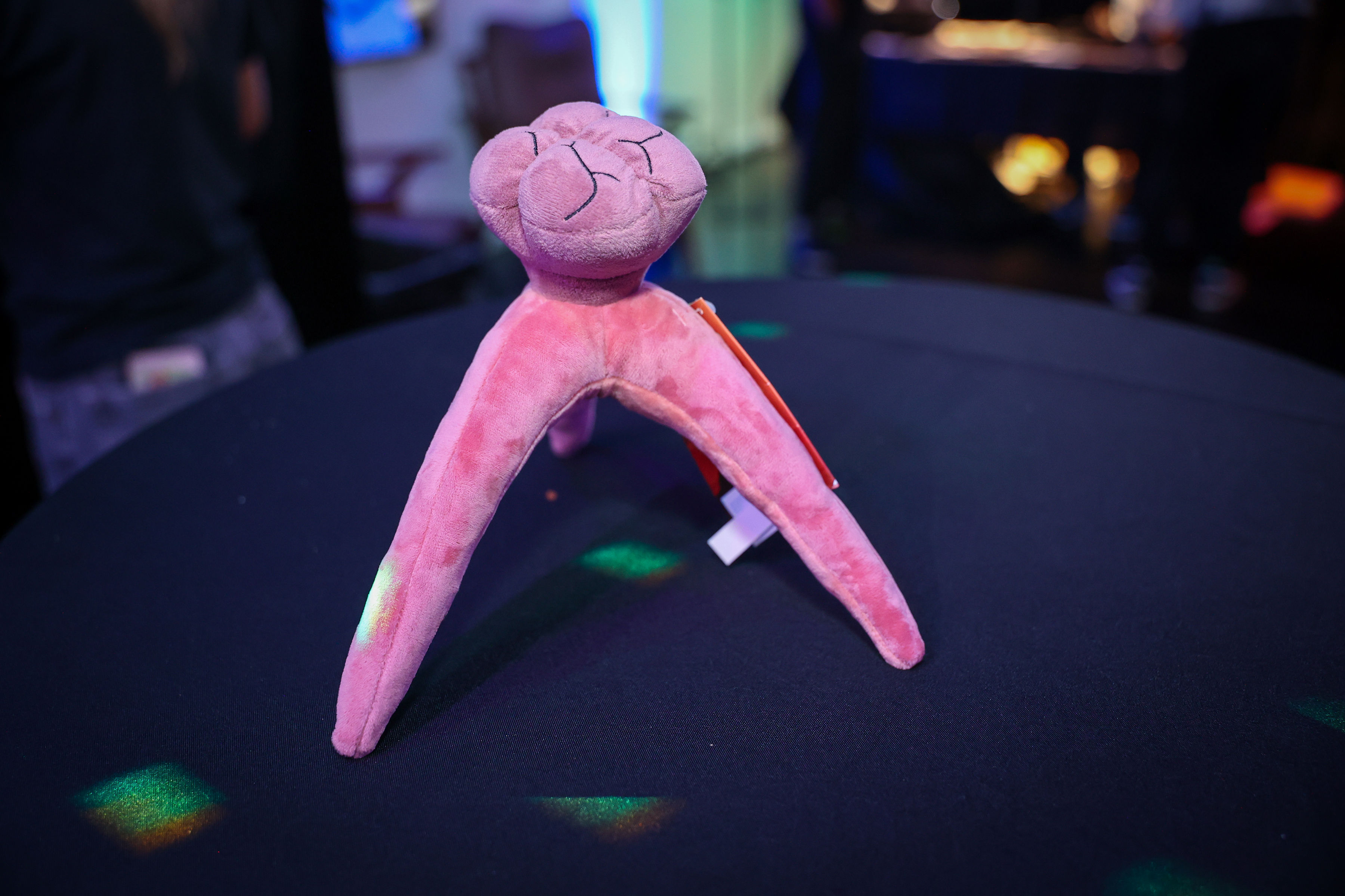
We gave attendees a three-legged Sequid plush, a playful little keepsake that carried the show’s offbeat creature design beyond the screening room.
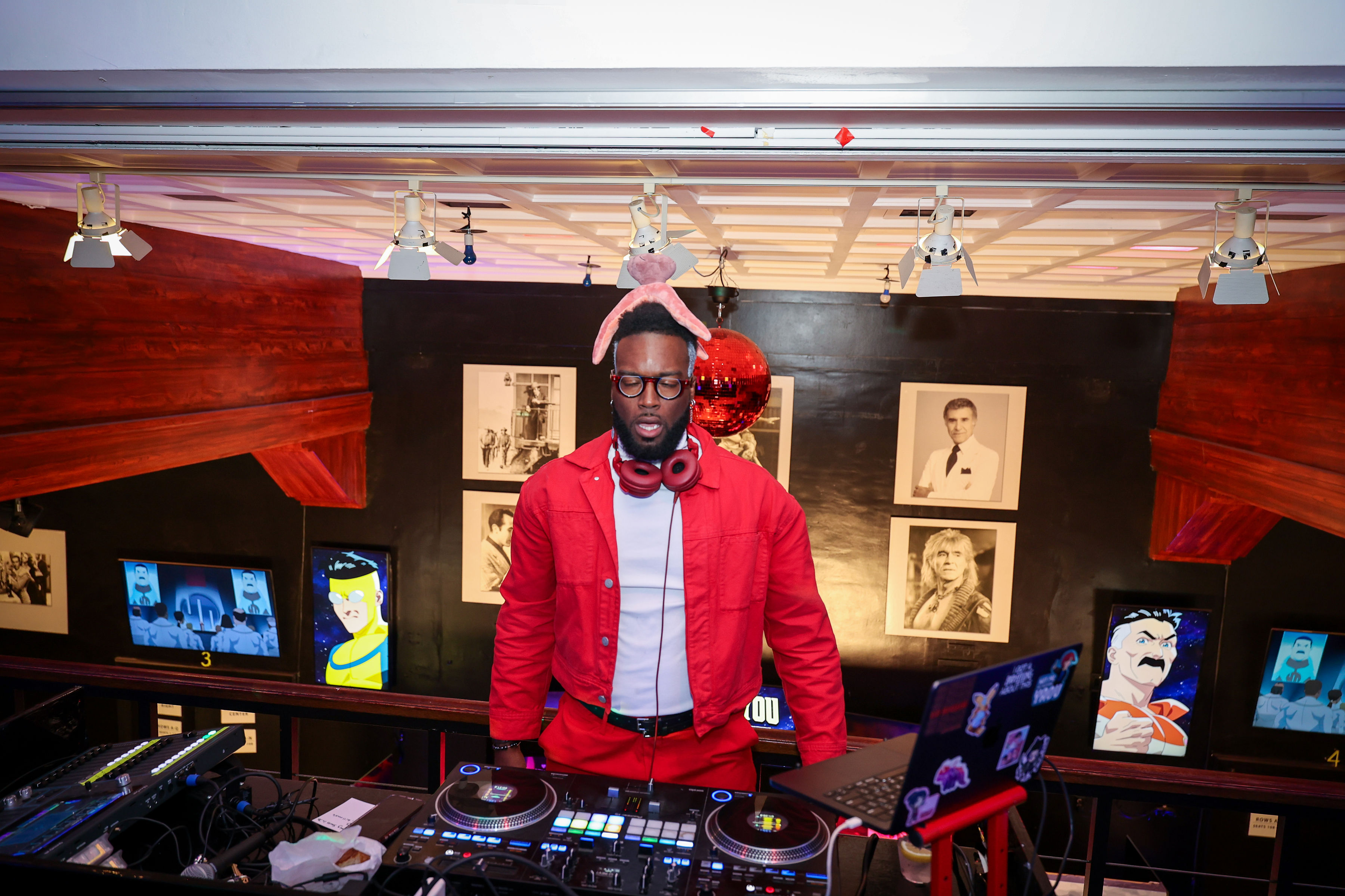
We brought Dimitri Beauchamp (@dimeeeach) in to host and DJ, setting the room’s energy before the Invincible Season 4 screening.
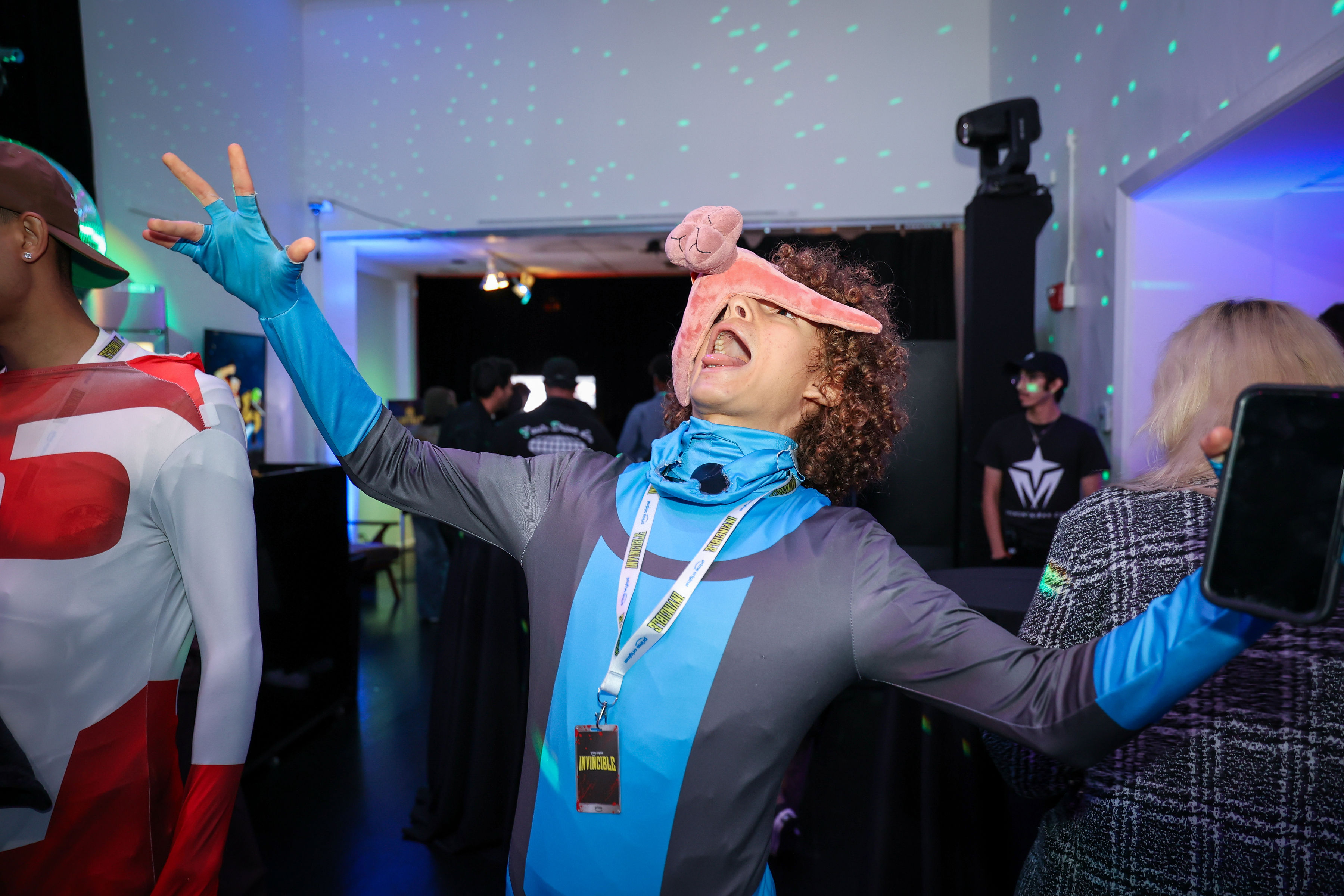
We made room for creators to get a little weird with Invincible, and @juicy.jacobb made the Sequid plush part of the performance.
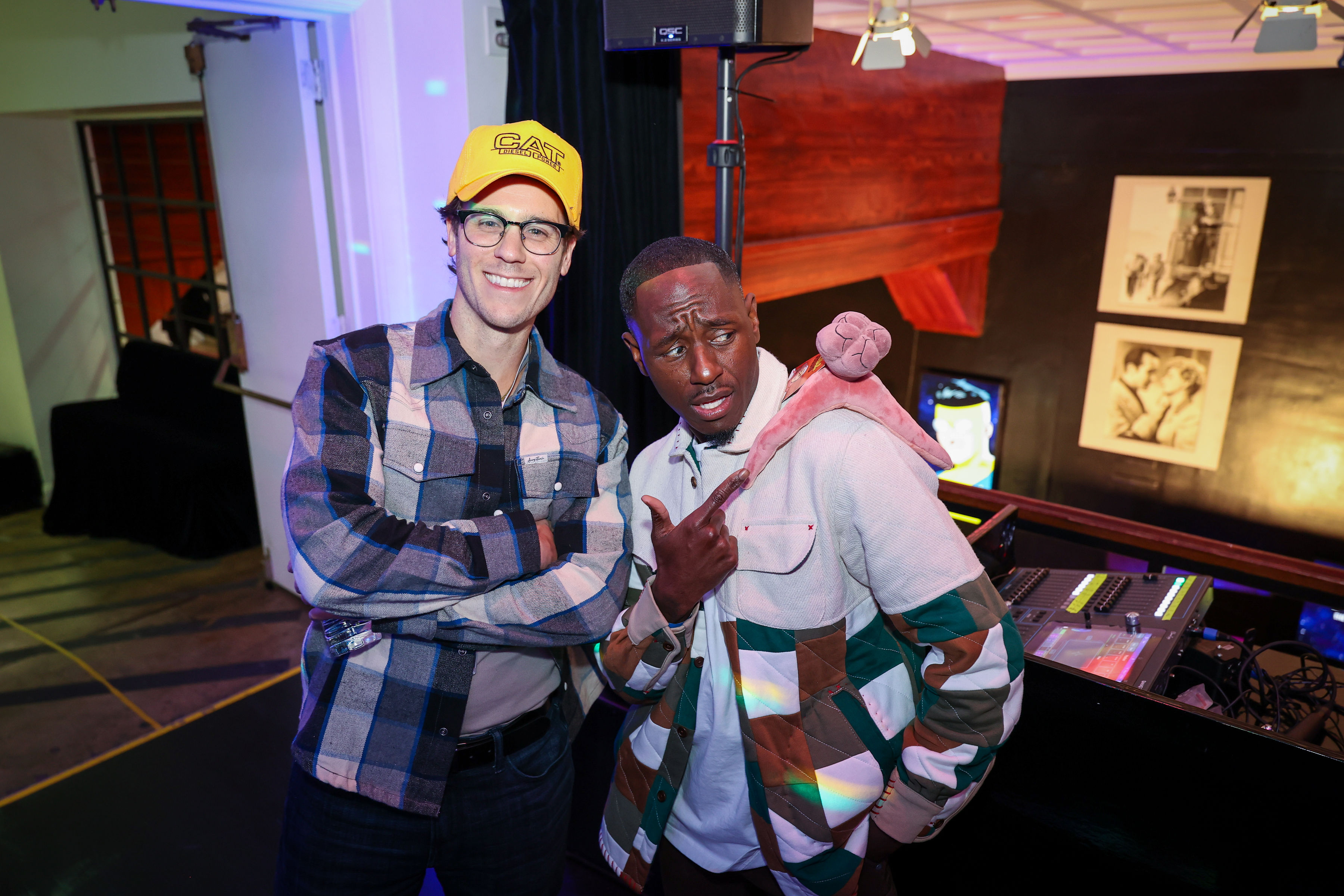
We made the plush sequid a loose, character-led photo moment, giving Wesley “@wuzgood” Armstrong and @raidersofthelostpodcast something playful to make their own at the creator screening.
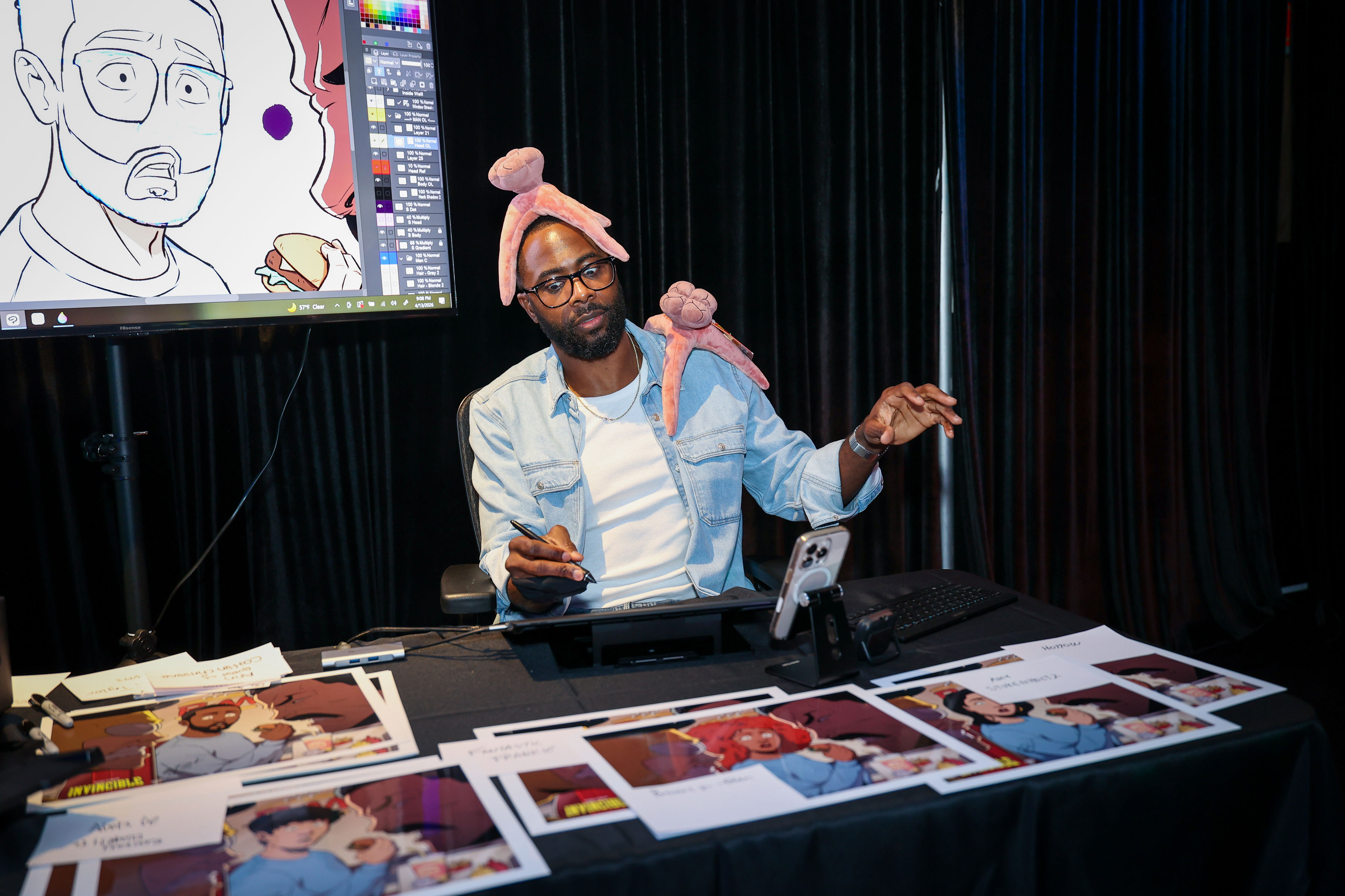
We made live illustration a creator-facing event moment, giving Obi Arisukwu room to bring Invincible’s comic-book energy into the screening experience in real time.

We designed this Grand Regent Thragg standee concept to give creators a quick, high-impact way to step into Invincible’s brutal superhero scale.
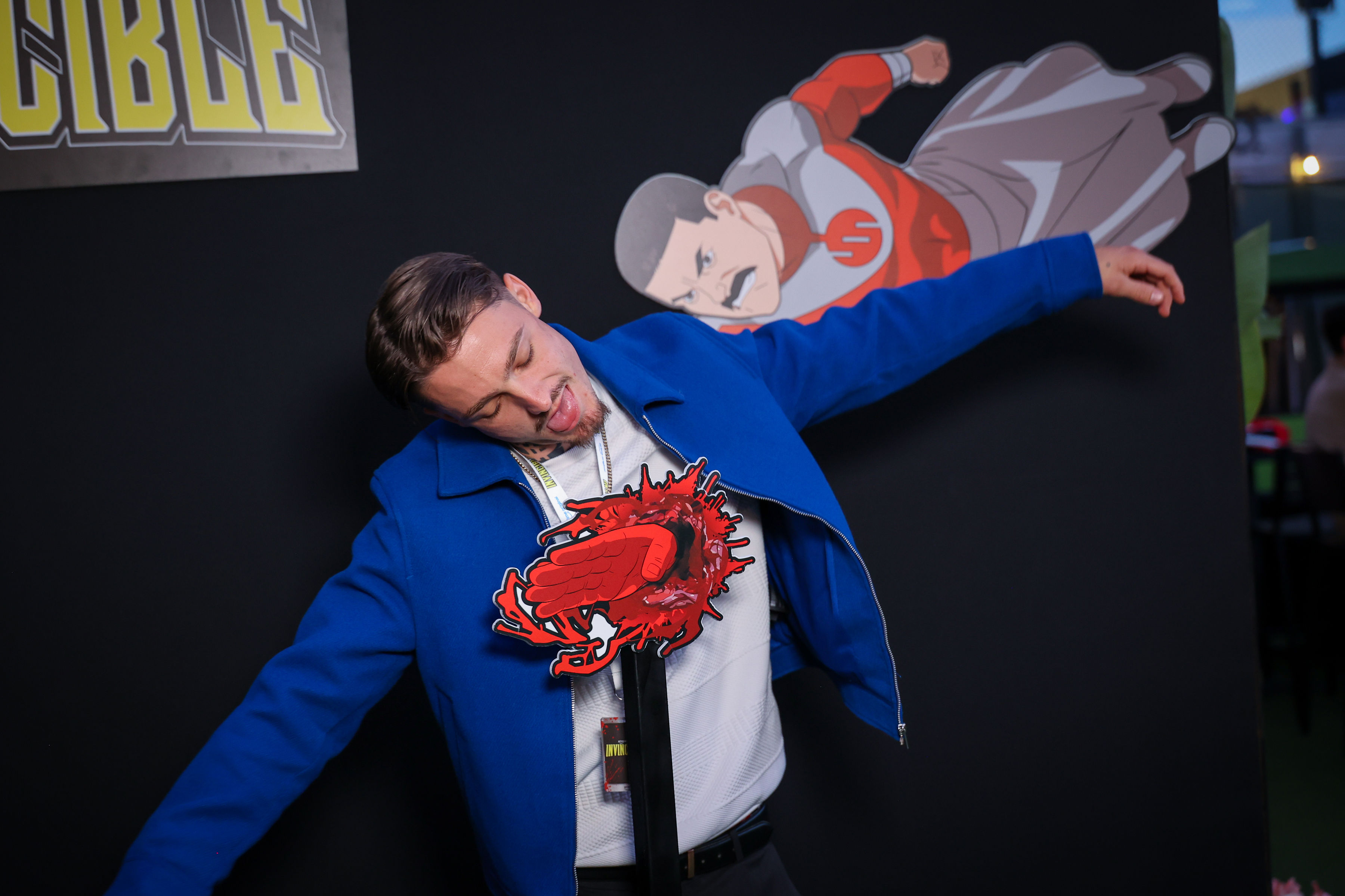
We gave Aleks Le a clean, physical way to play inside Invincible’s beautifully unhinged violence before the screening began.
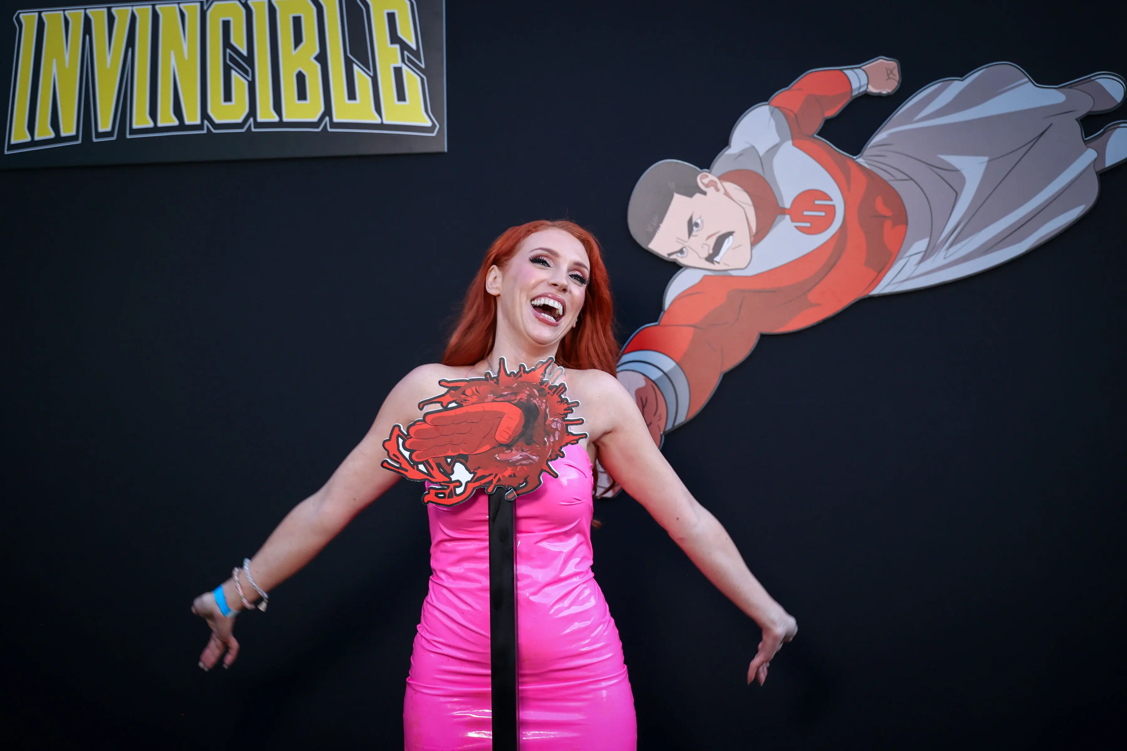
We gave creators a quick way to play inside Invincible’s sky-high chaos, using a flying character illustration and oversized impact prop to make the pose feel like a midair collision.
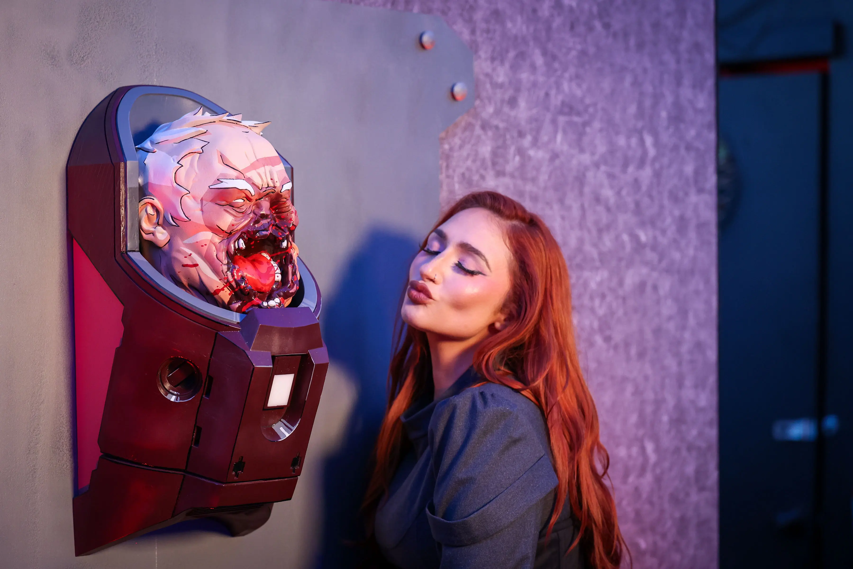
We made Conquest’s brutal battle damage a close-up creator photo moment, pairing the life-size 3D print with a GDA-style display built for guests to get right in the frame.
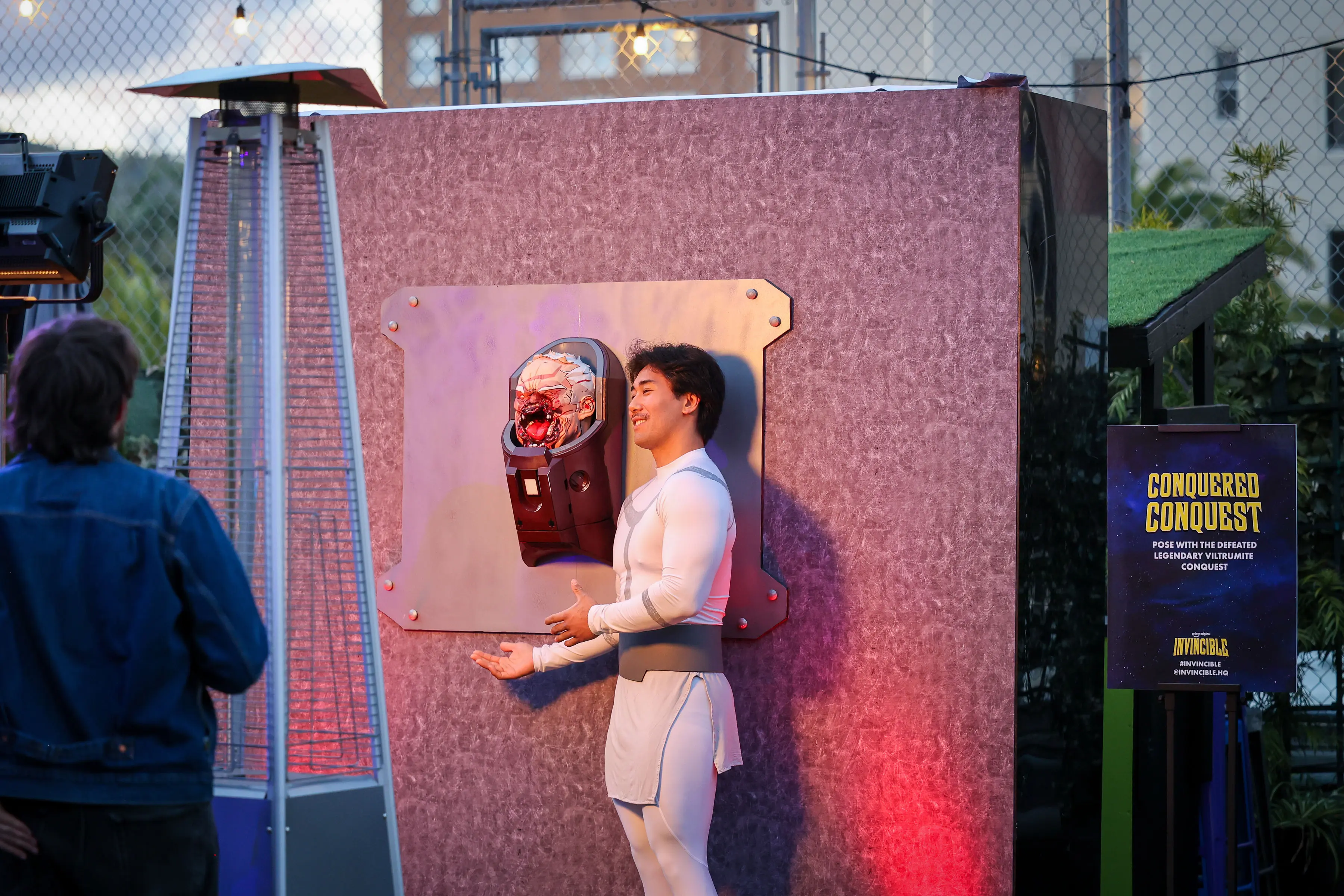
We made Conquered Conquest a hands-on photo moment, giving Justin Eseller (@justinsaiyann) a playful way to meet the aftermath of one of Invincible’s most brutal fights.
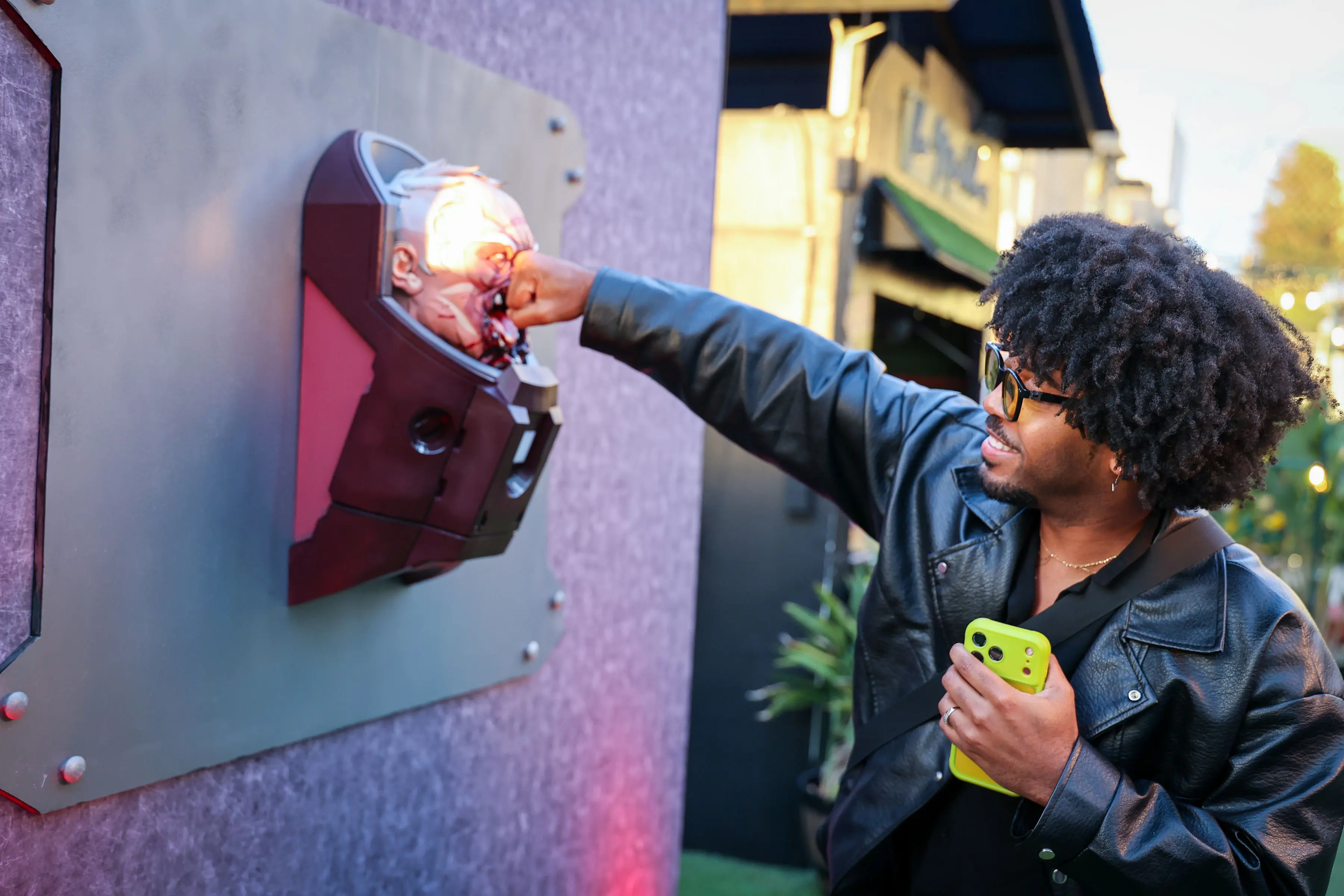
We made the Conquest bust a photo moment built for the instinctive satisfaction of throwing one last punch at a Viltrumite.
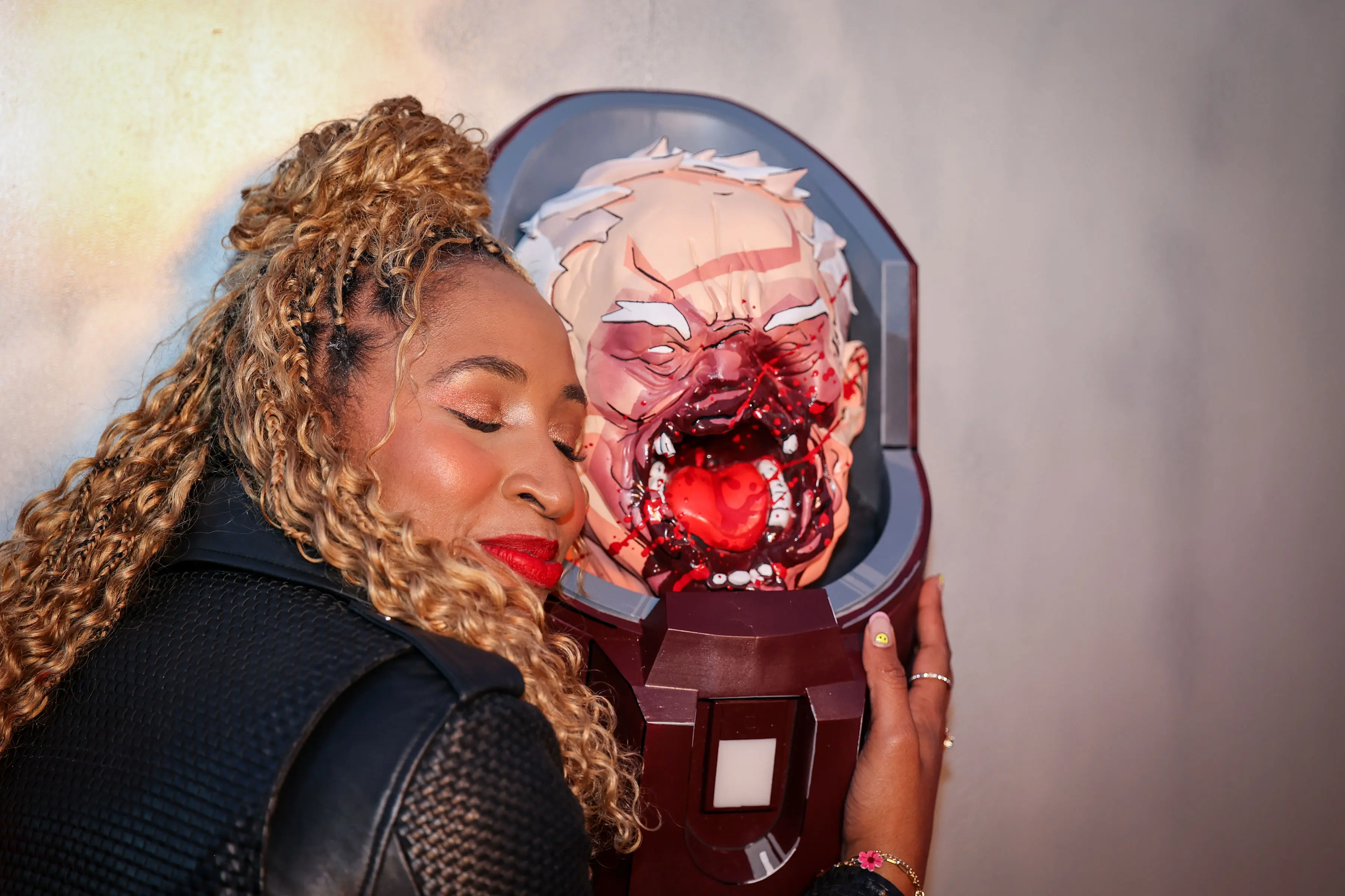
We tuned finish, edge treatment, and glossy blood highlights on the 3D-printed Conquered Conquest head so comic-book linework and wet textures read clearly on phones while staying tactile in the screening flow.
We captured the creator screening activation at the Montalbán, showing our environmental graphics, interactive photo moments, and in-theater creator reactions.

We dressed the theater entrance in Season 4’s yellow-and-blue, using oversized character panels, a stretched INVINCIBLE banner, and a staffed check-in table meant to read as a social-ready moment.
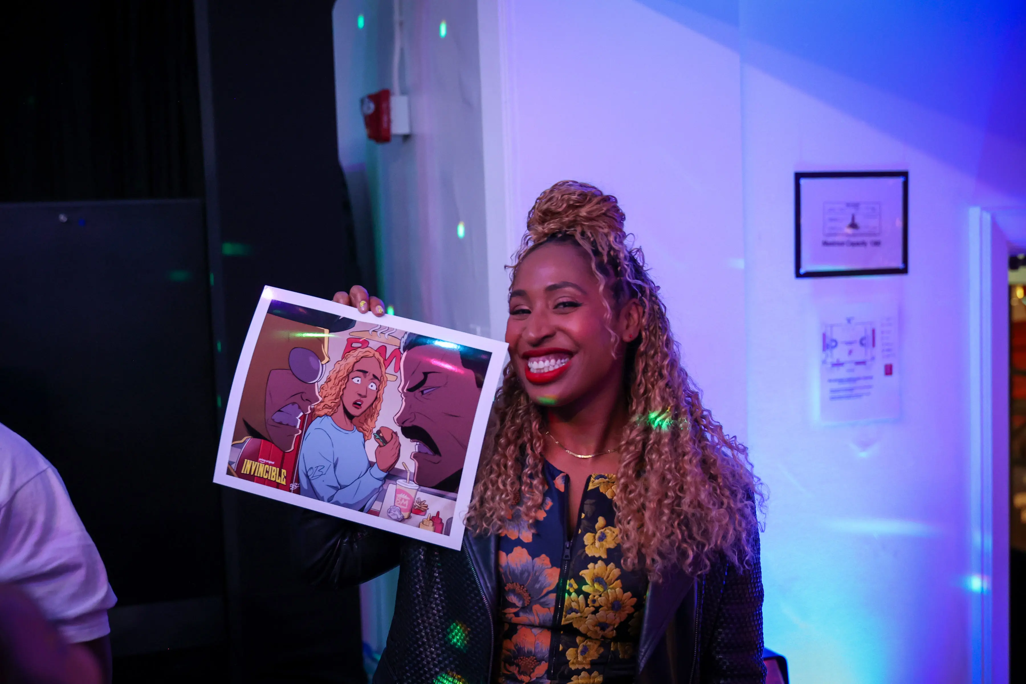
Custom artwork by @obiaris gave Frankey Smith (@fantasticfrankey) a personal, comic-book-scale keepsake from the Invincible Season 4 creator screening.

We built quick, social-first photo moments for the Season 4 creator screening, leaning on bold floor branding, purple-blue gels, and a compact bar set so expressions and costume details read on phones.
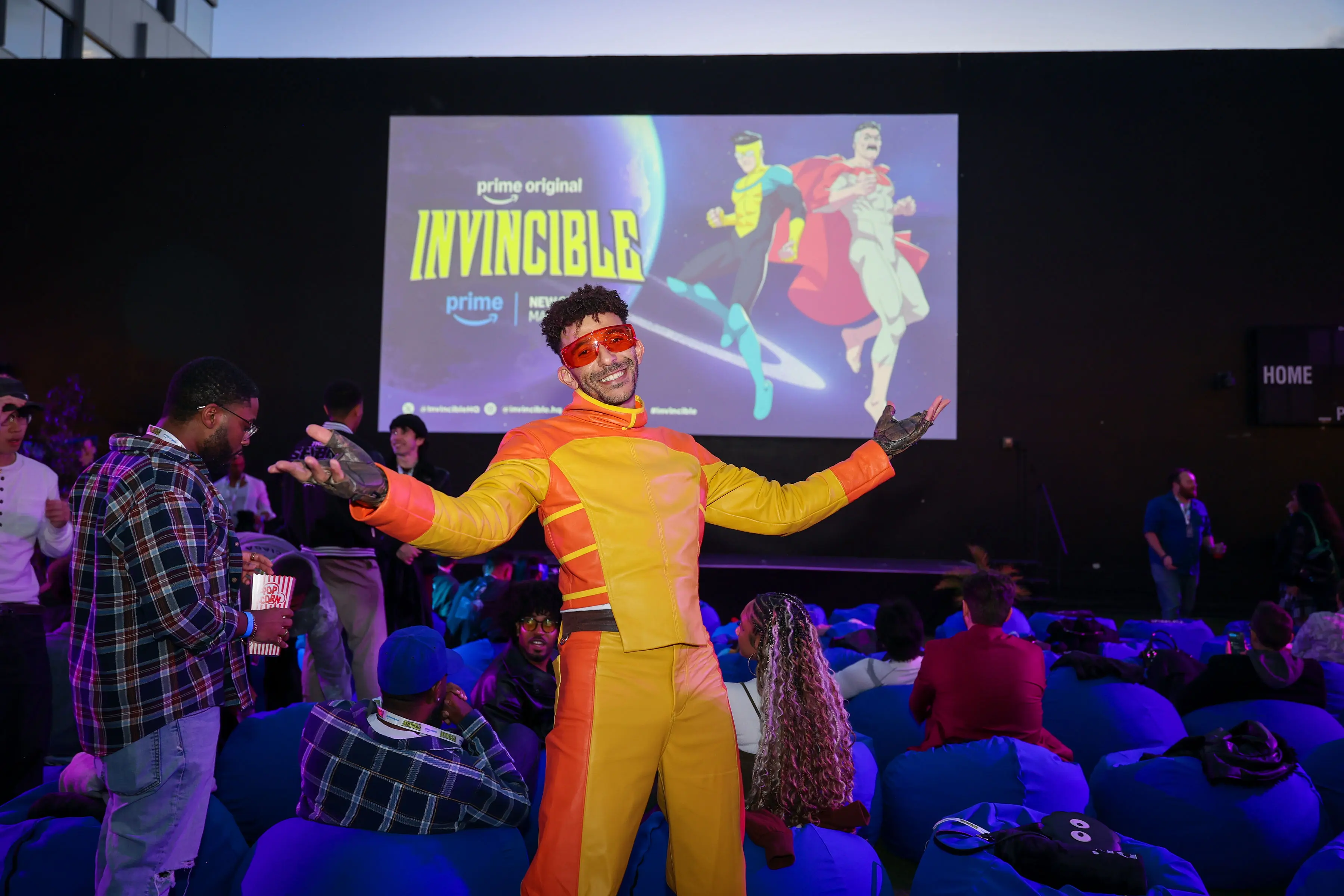
We made the creator screening feel like it belonged inside Invincible’s world, giving guests like Khleo Thomas as Rex Splode room to bring the show’s comic-book energy into the room.