
For an animated museum adventure built around characters from across time, we created a social system that made the world feel lively, funny, and easy to read on a phone. We carried a warm, weathered palette of gold marquees, framed portraits, textured type, and theatrical light across motion and static work, then adapted it for square, portrait, landscape, carousel, and Story formats. Character posters shifted between halftone and cel-shaded art, countdowns and short-form edits turned comic beats into quick viewing moments, and holiday pieces gave the campaign a seasonal voice. Interactive prompts, job-tip cards, quizzes, and cast spotlights invited audiences to spend more time with the ensemble while keeping the title and platform messaging clear.
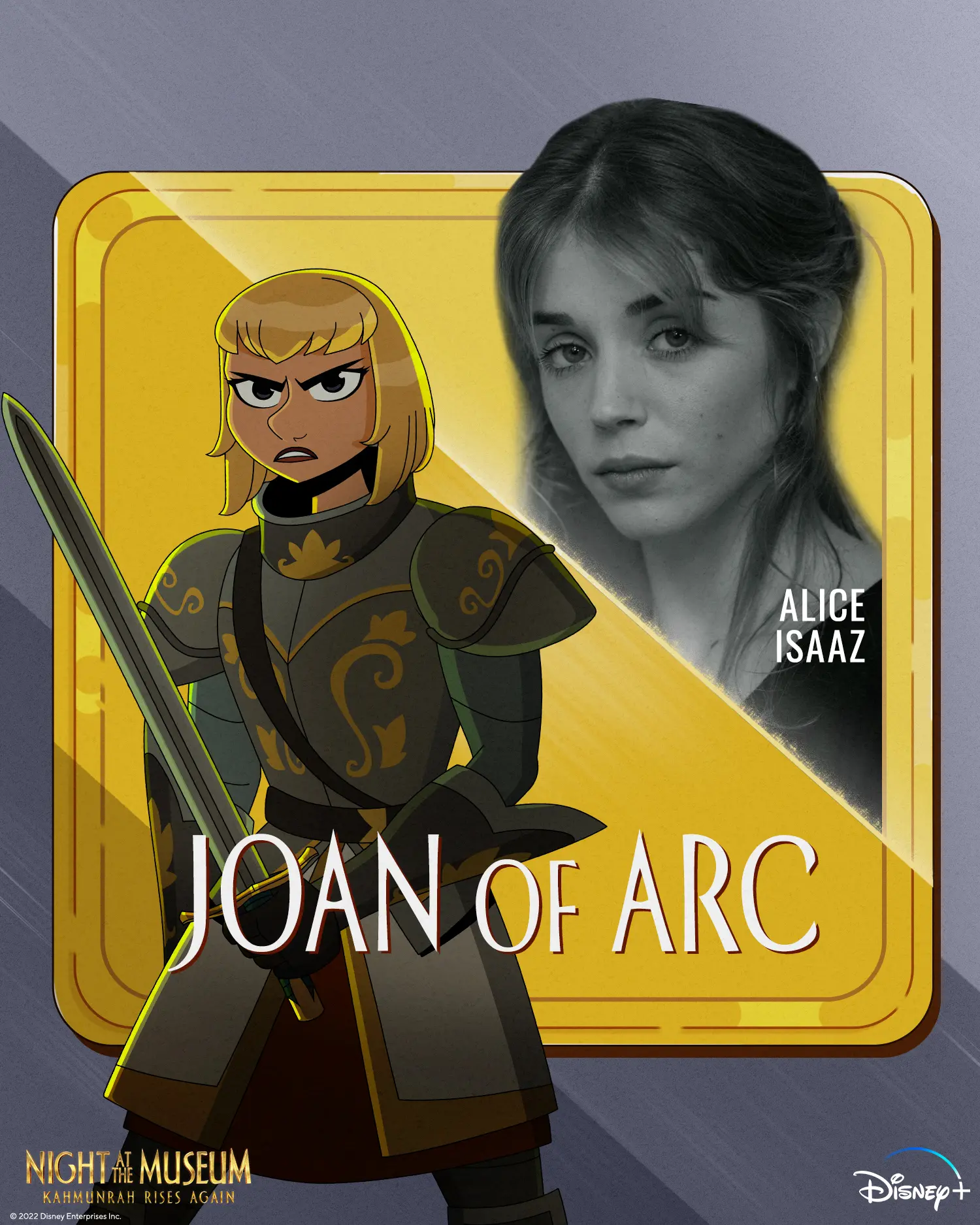
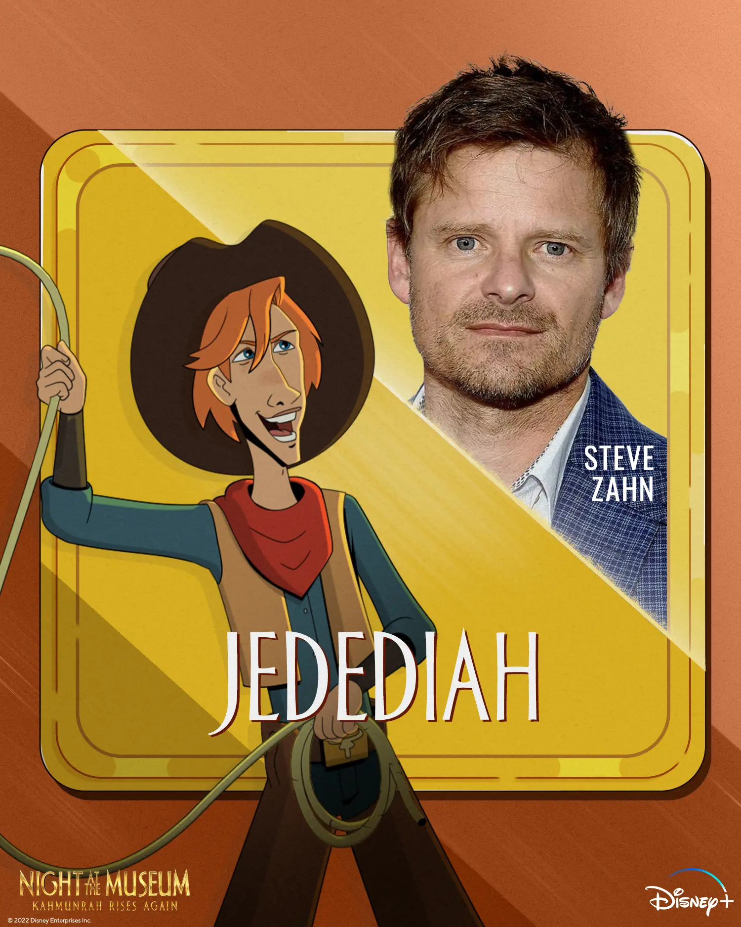
We treated each character card like a framed museum poster waking up. Portrait-format edits moved between textured halftone artwork and cleaner cel-shaded character frames, with diagonal gold sweeps, subtle expression shifts, and compositions that could open from a close portrait into a fuller reveal. Warm gold frames, lower-third names, and the film lockup gave the series a consistent collectible-poster feel.
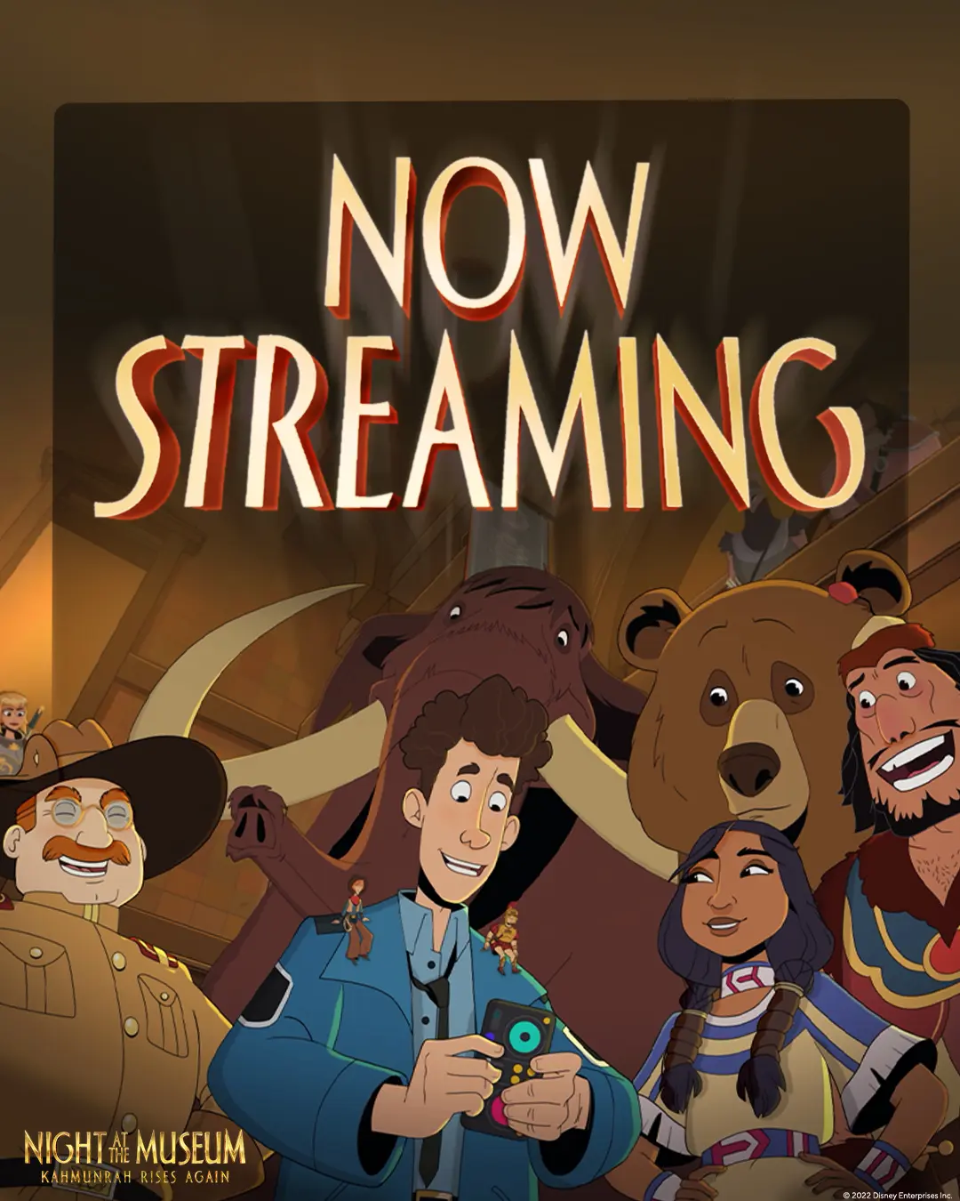
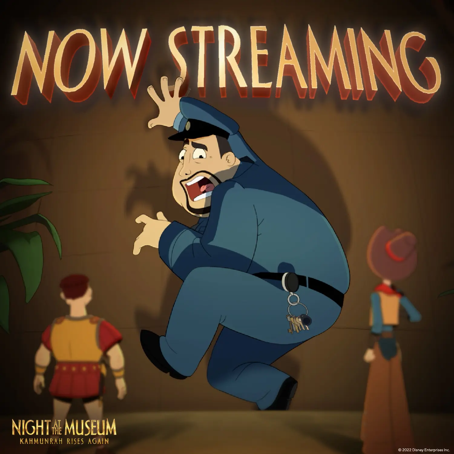
To make the streaming message land quickly, we paired bold NOW STREAMING type with large, readable visual gags and energetic museum scenes. Static artwork used simple silhouettes, warm gold accents, and 4×5 framing, while short videos moved through disco-lit party footage or a T. rex scare before resolving on title cards. Across formats, we kept headlines clear at small sizes without losing the film’s playful tone.
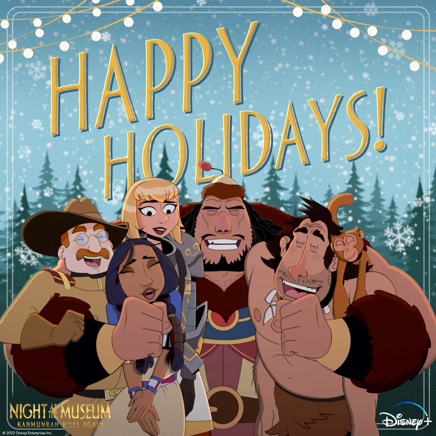
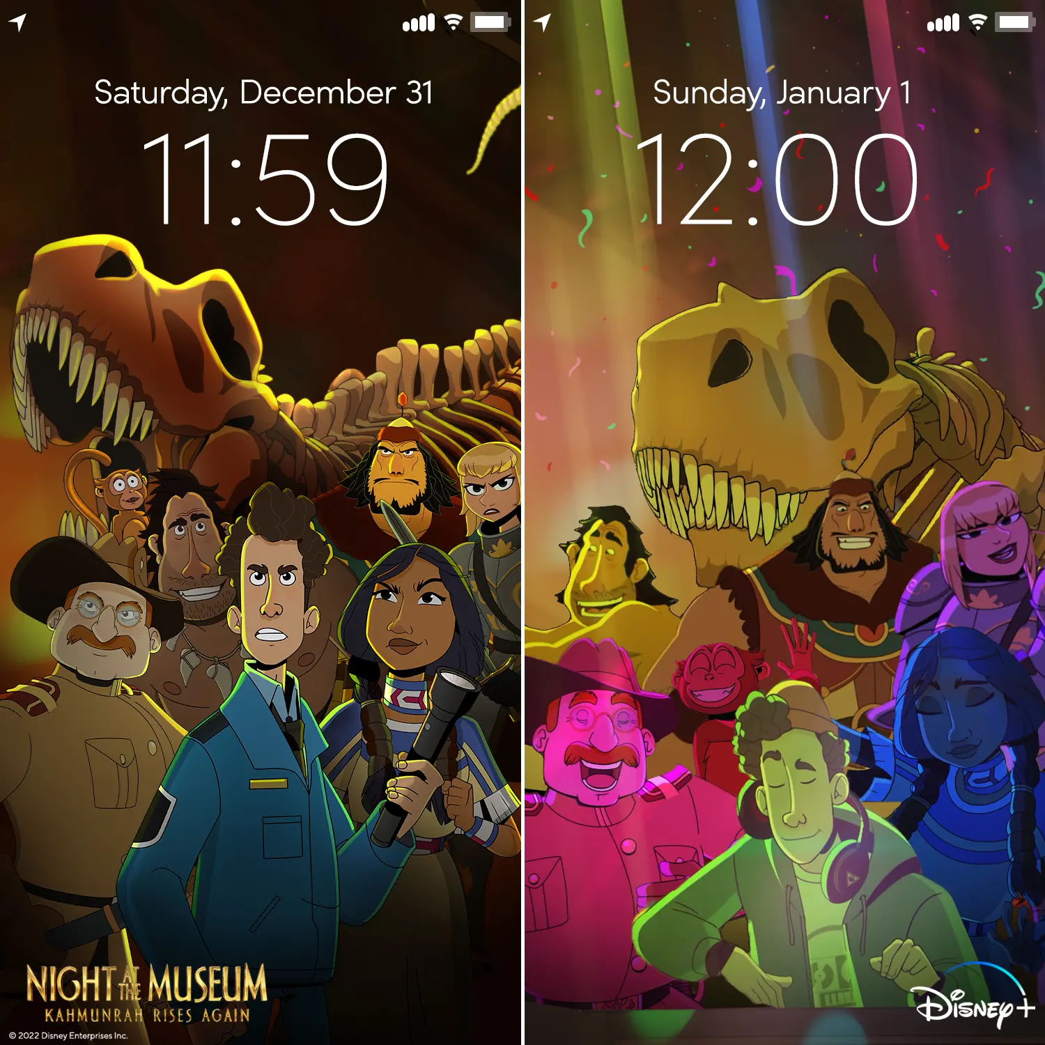
Holiday social gave the film’s ensemble a more seasonal, playful way to show up in feeds. We designed a snowy group card with sign-painted gold lettering and string lights, then cut vertical pieces around meme-style captions, tap-to-reveal gift prompts, and New Year’s phone-lock-screen imagery. Each format kept the warm museum palette and compact branding in place while letting the jokes carry the moment.
We used lyric-driven edits to turn seasonal music into a quick tour of the museum’s chaos and camaraderie. Square cuts paired animated action, creatures, and party scenes with oversized gold lyric lines timed to the beat. The typography stayed high-contrast and bottom-centered against busy imagery, then gave way to clear film and Disney+ end frames.
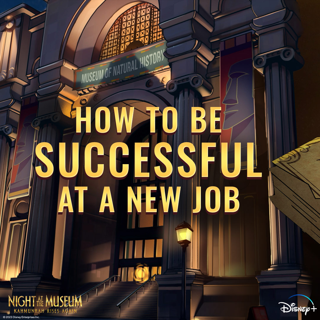
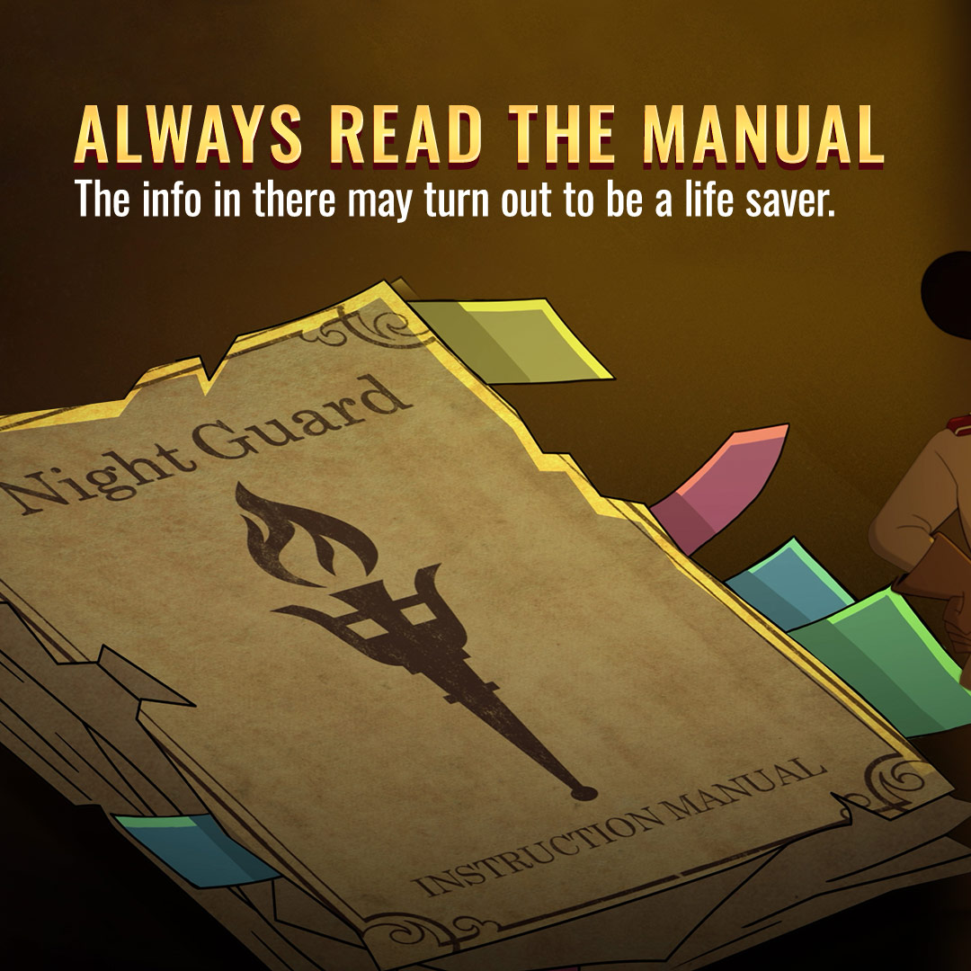
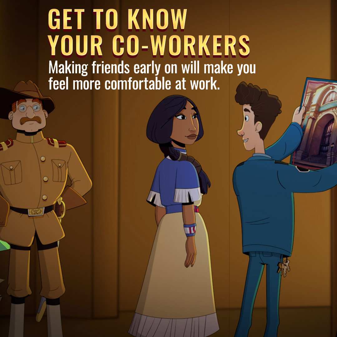
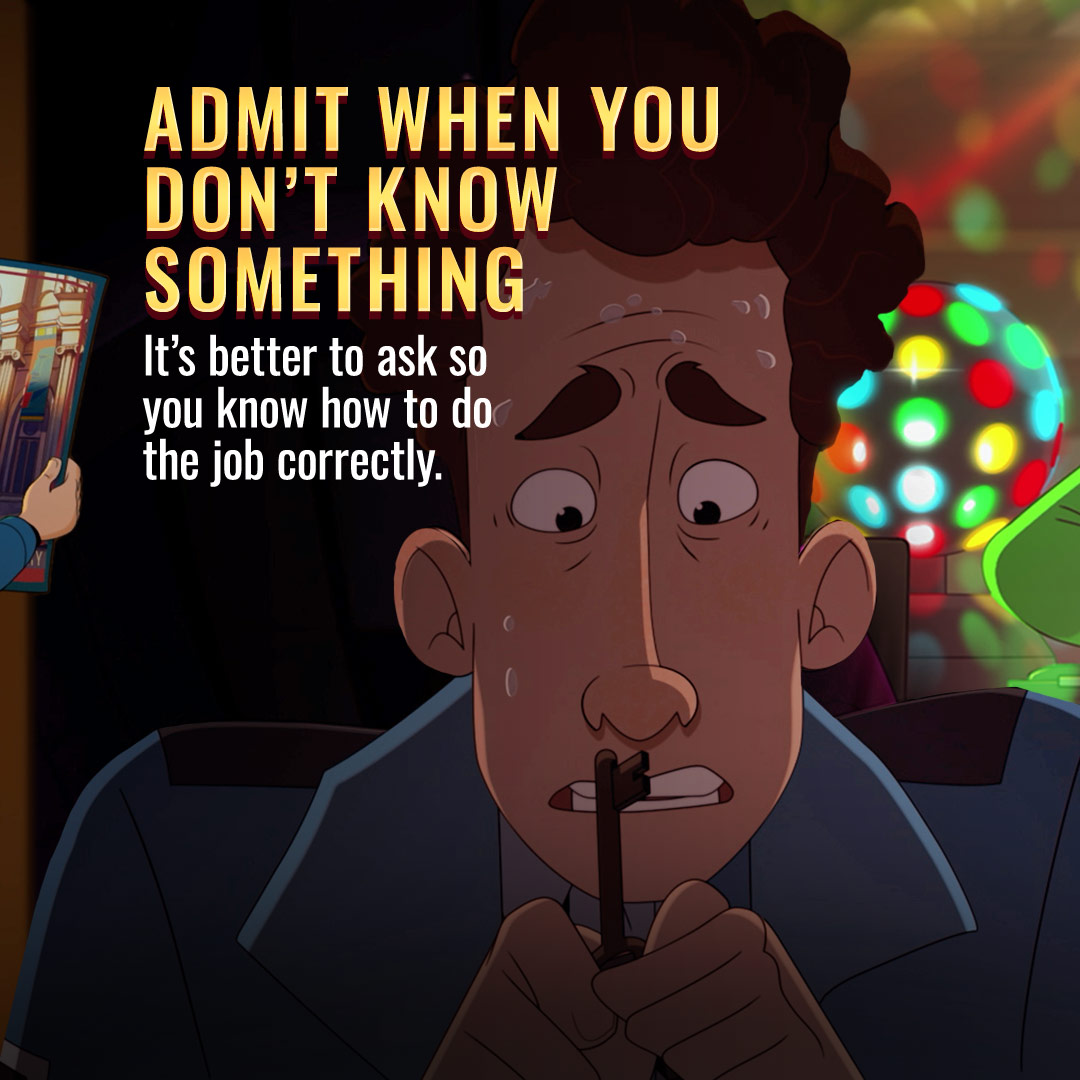
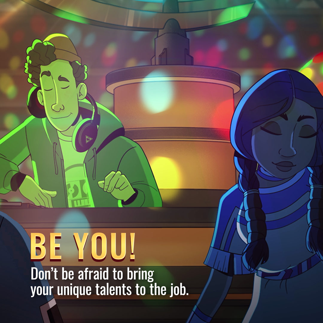
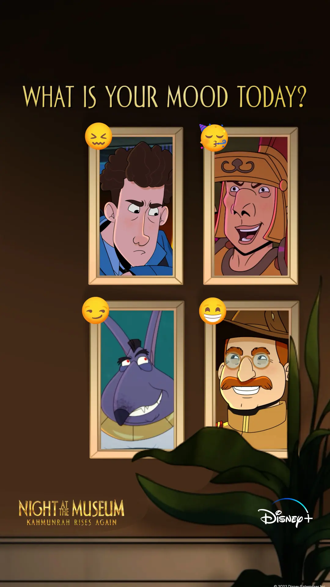
For Instagram, we translated the film’s world into prompts viewers could scan, swipe, and answer. A job-advice carousel used a night-guard manual and character vignettes to structure its jokes, while framed mood cards and a point-based Story quiz created simple participation cues. We relied on condensed gold headlines, warm texture, platform-safe margins, and carefully spaced copy to keep every card readable on phones.

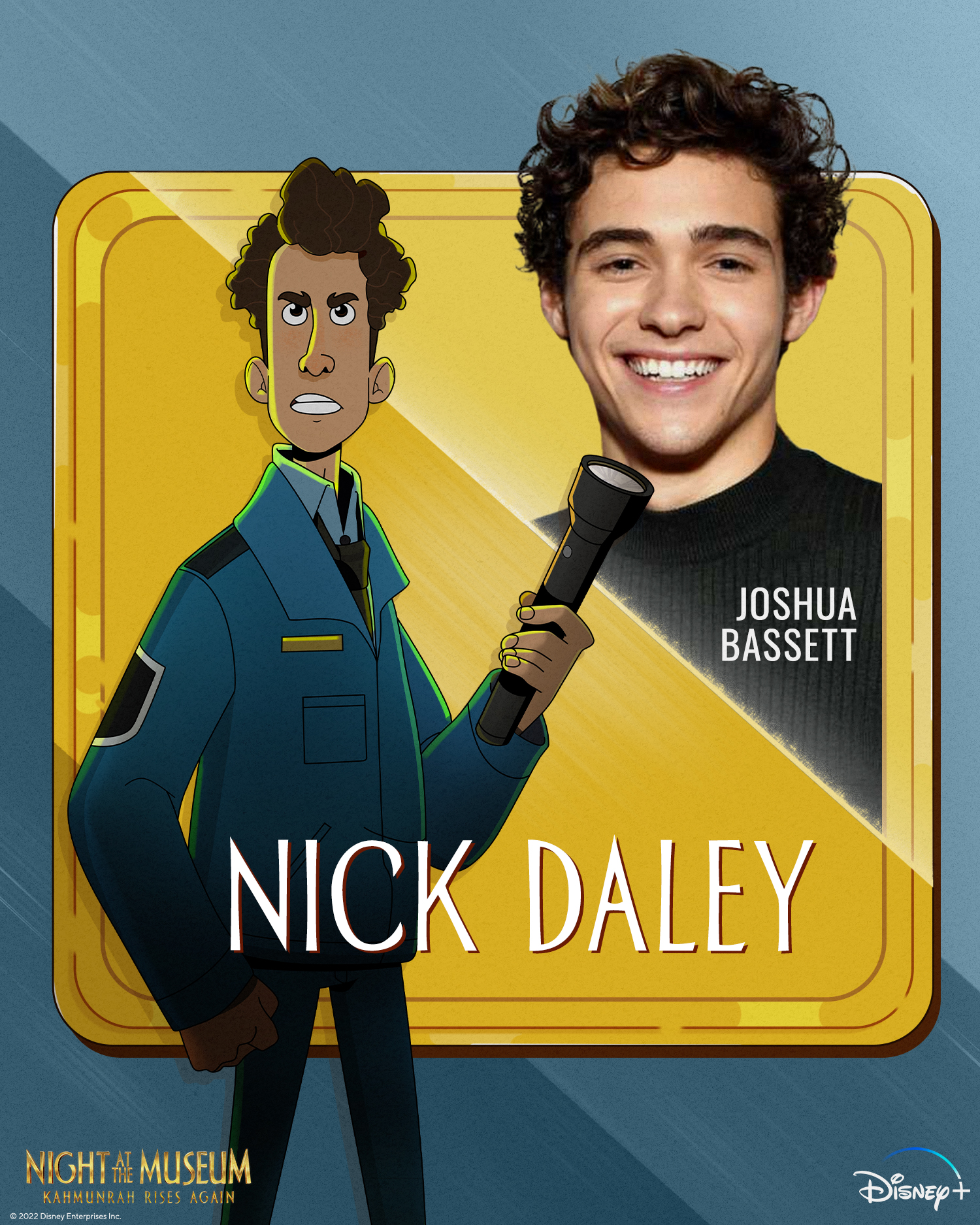
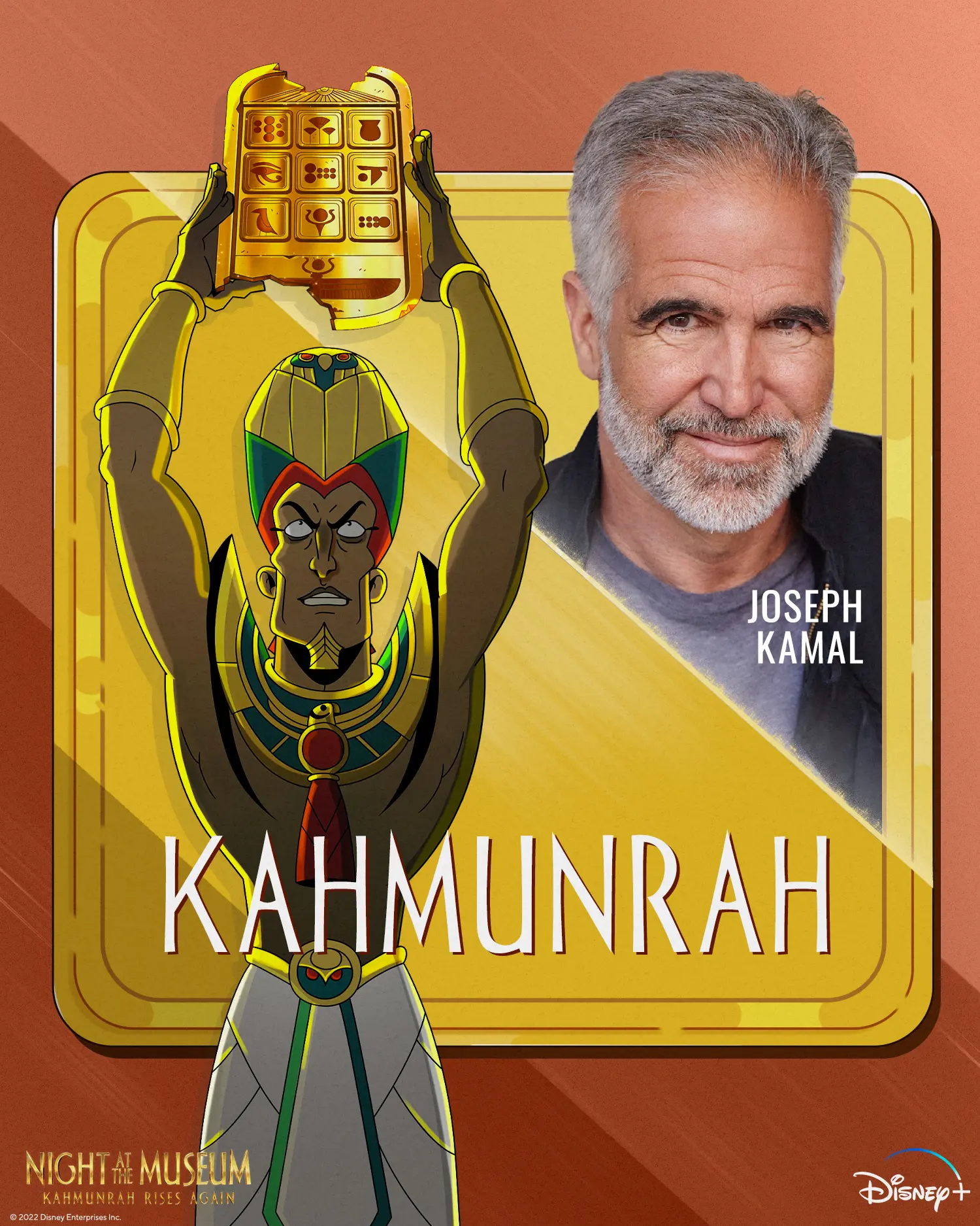
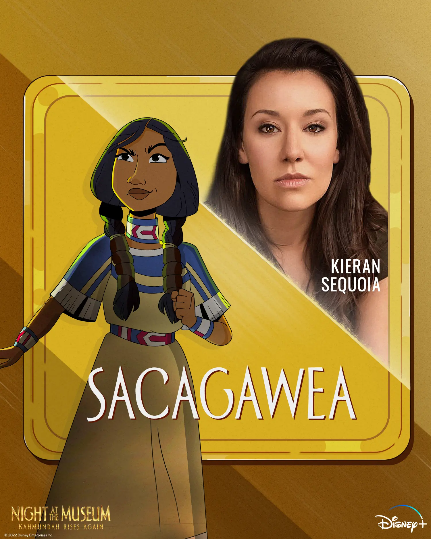
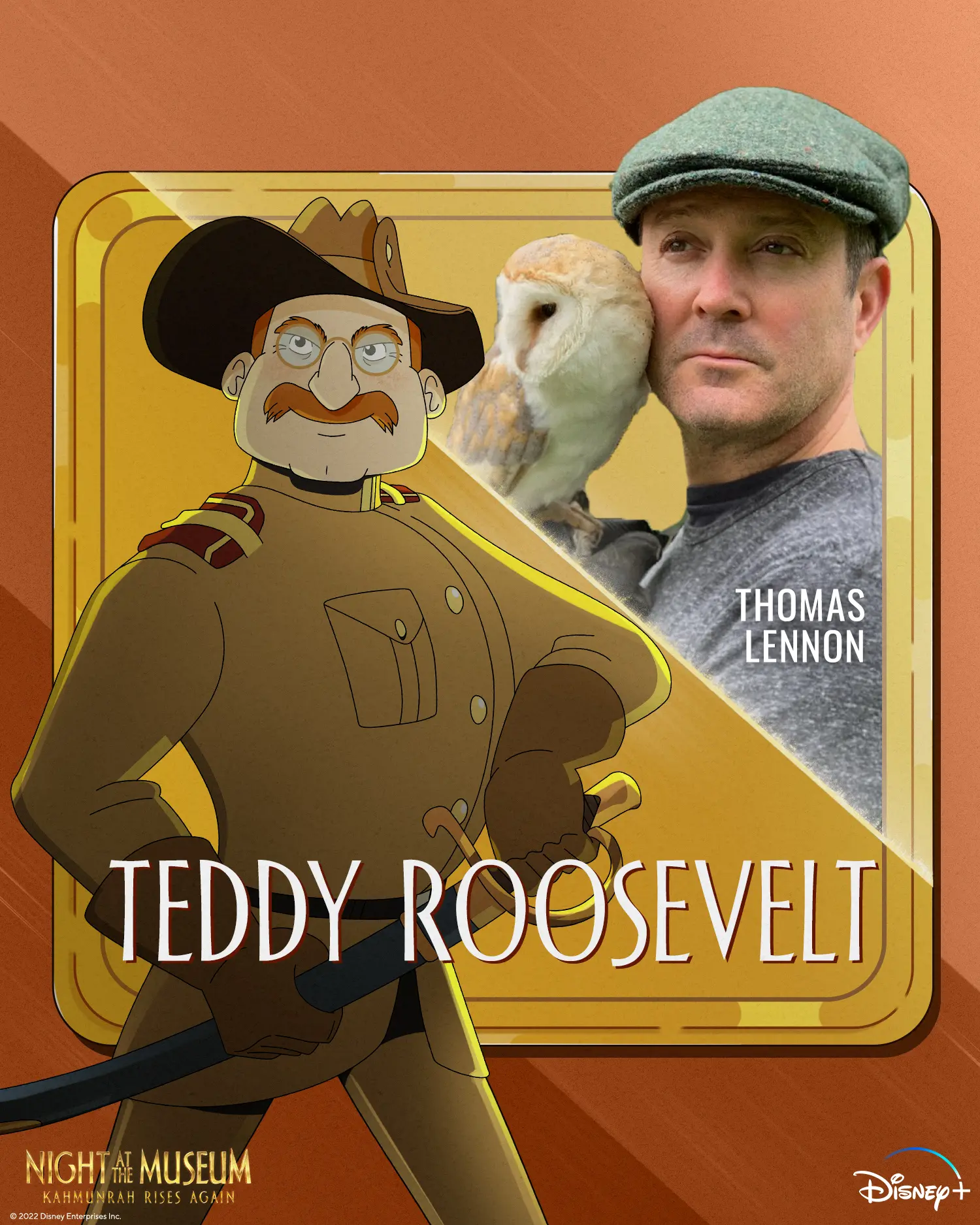
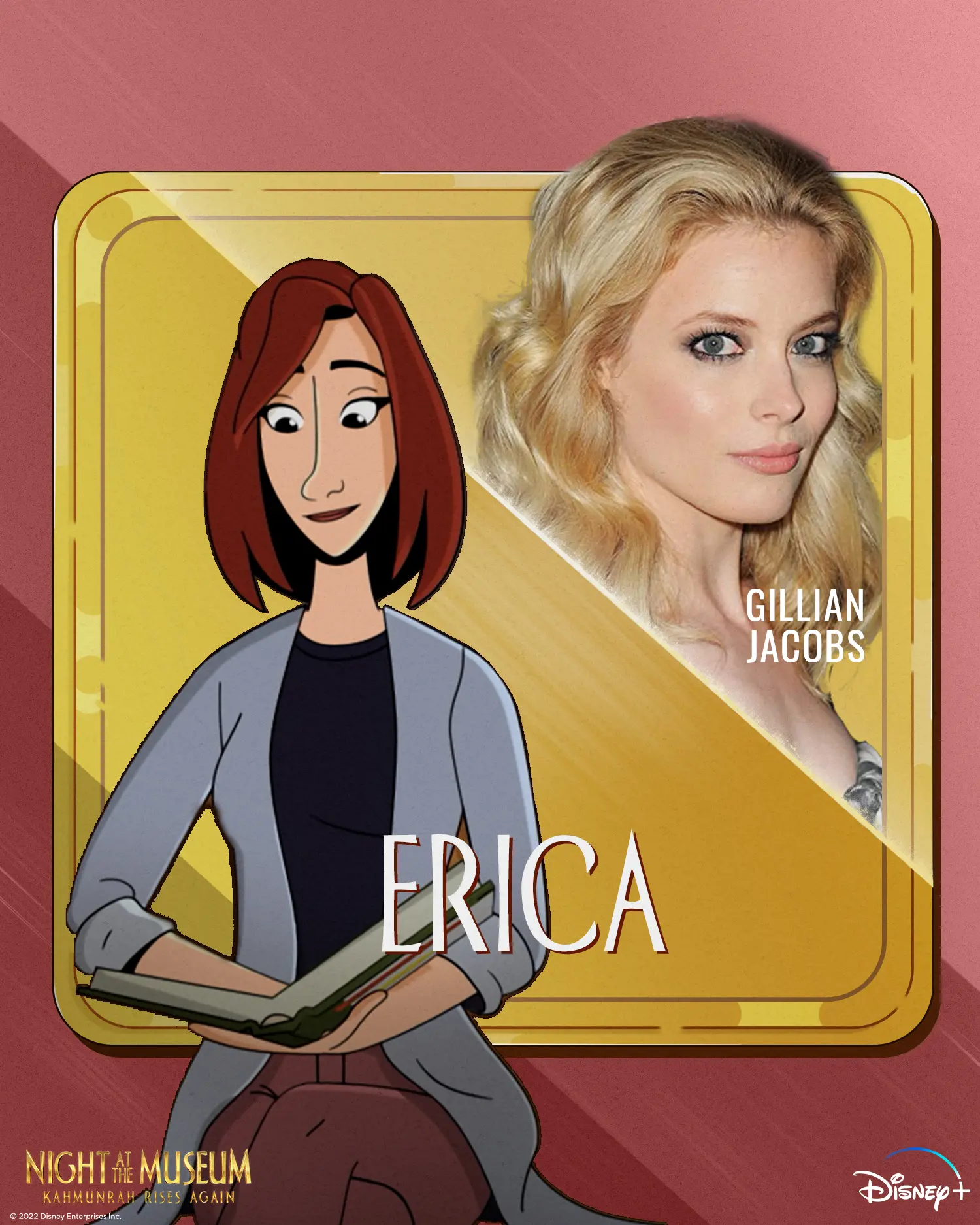
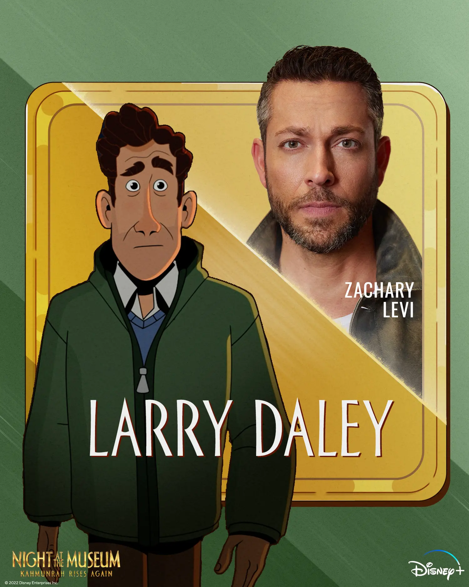
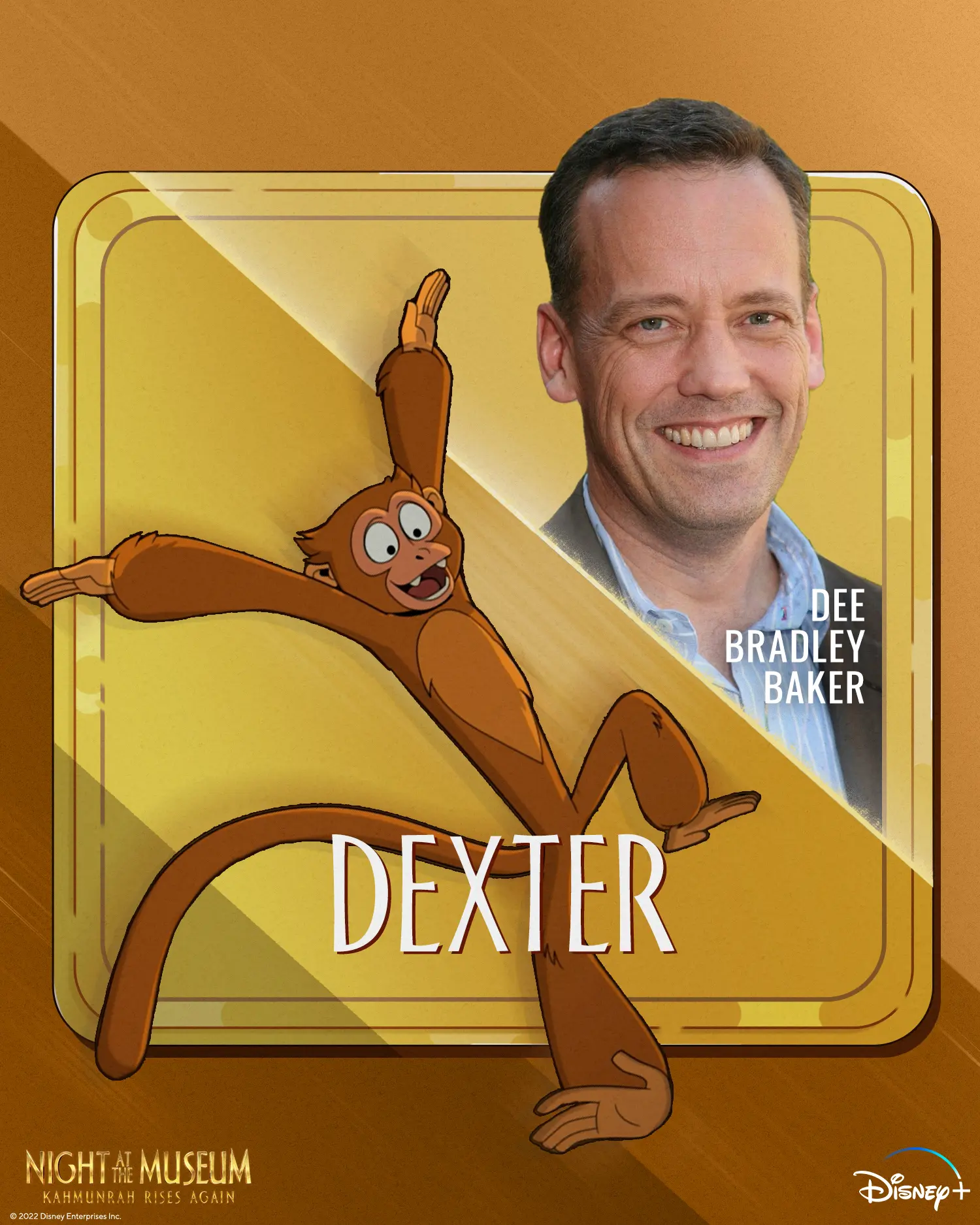
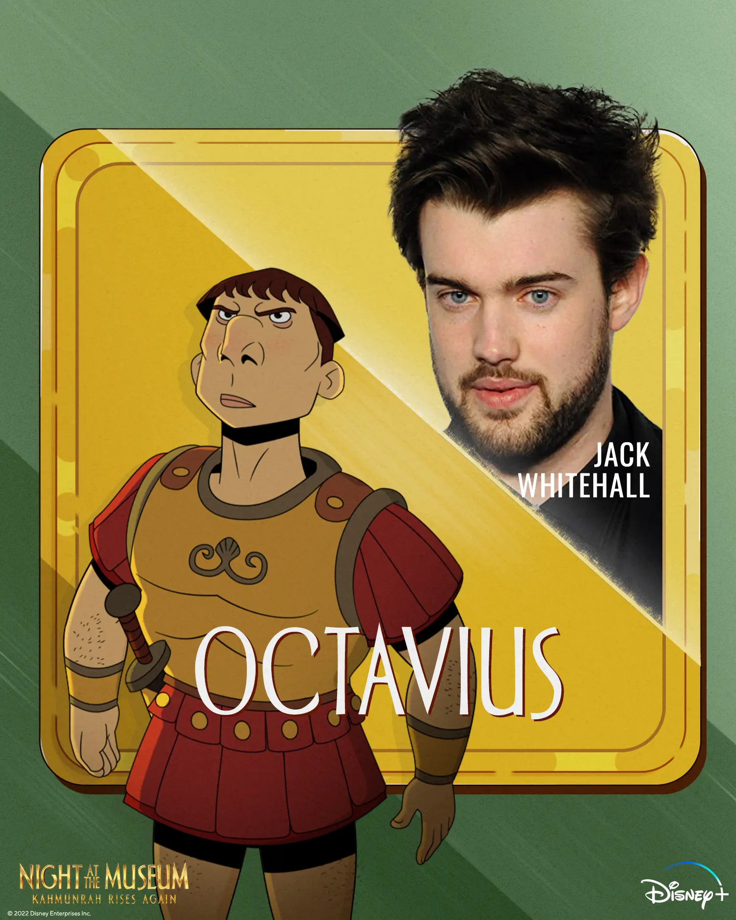
Cast spotlights were designed as a set of modern museum placards, pairing illustrated characters with diagonal photographic portraits. We used weathered gold panels, condensed name treatments, subtle shadows, and alternating color fields to give each square card its own presence while preserving a shared carousel rhythm. The film and Disney+ marks remained tucked into the corners so the cards stayed legible in social thumbnails.

We cut fast, vertical social videos from the film’s comic action, shaping each sequence around a clean setup, reaction, and punchline. Tight 9×16 crops, rounded subtitle bubbles, numeric overlays, and short edits helped dialogue and gags read on phones, from vending-machine chaos to character supercuts and slap-count compilations. Consistent logo placement and full-screen end cards kept the streaming message visible without interrupting the momentum.