
Jungle Cruise | Which Way?: Swing or Swim
We made this choose-your-own-adventure Story to put viewers in the middle of a Jungle Cruise escape, asking them to pick between swimming with the skipper or swinging with the doctor.
Creative development for websites, social platforms, streaming, display advertising, email, and other digital channels designed to engage audiences across screens.
We made this choose-your-own-adventure Story to put viewers in the middle of a Jungle Cruise escape, asking them to pick between swimming with the skipper or swinging with the doctor.
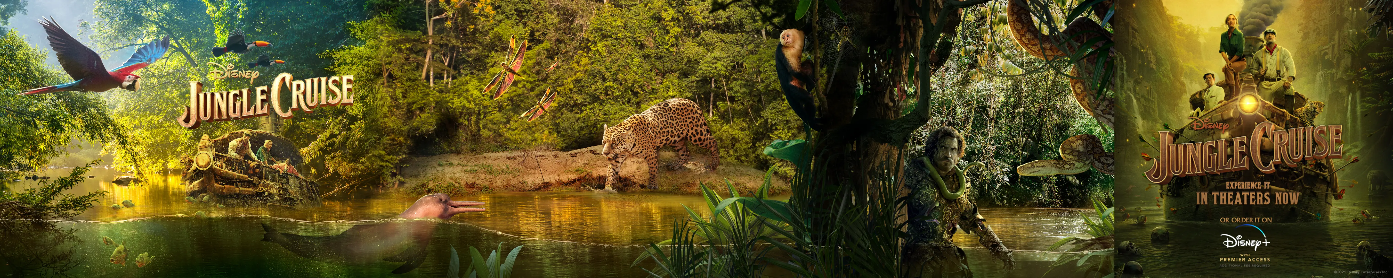
We shaped this carousel around the feeling of moving deeper into the jungle, using each card to hold a different piece of the expedition’s scale, mystery, and playful danger.
We made Proxima’s appetite a playful Instagram Story prompt, asking audiences to slide a steak her way before this very large jaguar gets any hungrier.
We made escape a quick audience decision, asking viewers to choose whether they’d outrun the danger or try to outsmart it.
We made this Which Way? Story video put viewers in the middle of a split-second jungle escape, asking them to choose whether to swim with the skipper or swing with the doctor.
We made the river journey playable, asking Instagram viewers to choose whether to follow the skipper or the doctor before the jungle showed them what came next.
We framed the jungle’s five threats as a playful survival guide, pairing supplied film footage with field-guide-style cards that keep the danger in step with Jungle Cruise’s sense of fun.
Screenshot
We let Shah’s screenplay unravel across the footage, turning a forgotten line into a self-aware glimpse of performance slipping into reality.
We gave Shah’s most awkward spirals the ranked-list treatment, letting the format carry the joke while the clips keep escalating.
We created this motion poster to carry the film’s Quantum Realm scale into a clear home-entertainment callout for Digital and Blu-ray.
We cut Scott Lang’s most outrageous moments into a quick, vertical reminder that his particular brand of superhero humor still lands at home.
We used the film’s scale-driven energy to make its Digital and Blu-ray release dates feel like the next big event for fans’ Marvel Studios collections.
We gave the physical release its own sense of scale, using the film’s size-changing language to make owning the Blu-ray feel like an addition to a Marvel collection.
We paired the film’s scale-driven action with a clear Digital and Blu-ray call to action, keeping the home-release message quick, cinematic, and easy to catch in a vertical feed.
We paired Kathryn Newton’s behind-the-scenes presence with Cassie Lang’s on-screen evolution, giving the home-entertainment campaign a talent-led way into the film’s family story.
We made the physical release feel true to Ant-Man’s size-changing world, using scale as the hook for a clean Blu-ray call to action.
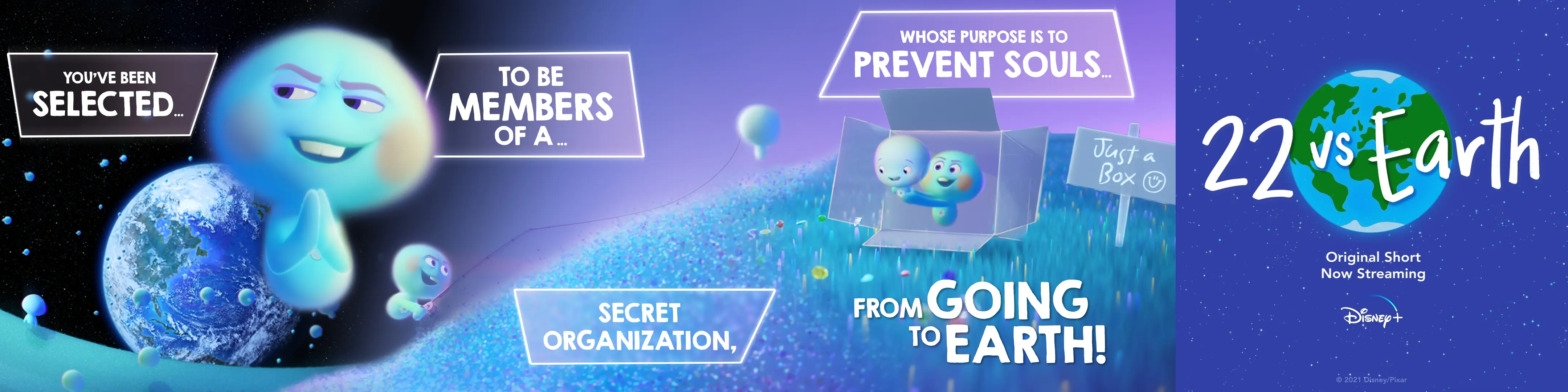
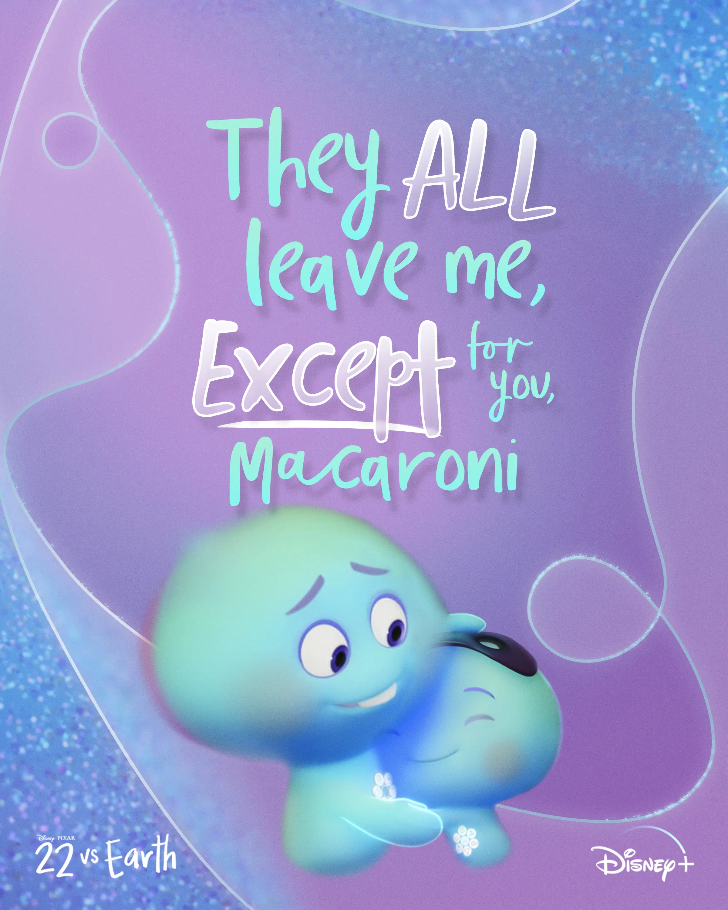
We designed a 4 part IG Carousel that leans into 22’s scheming voice, using Great Before color and staggered callouts to land the joke in a single scroll.
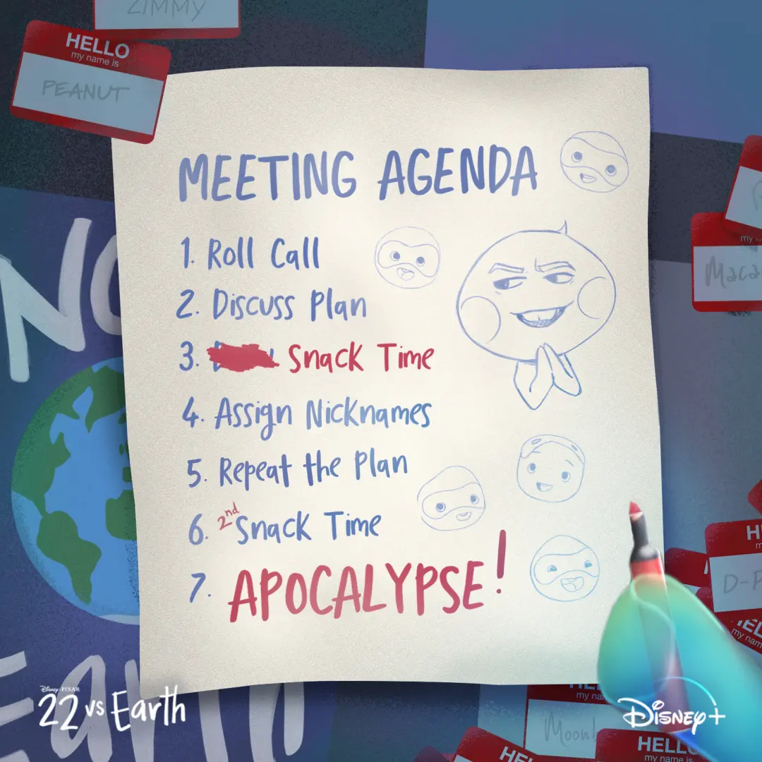
We made a faux 'team agenda' social tile that puts 22’s scheming front and center with hand-lettered copy and quick doodles.
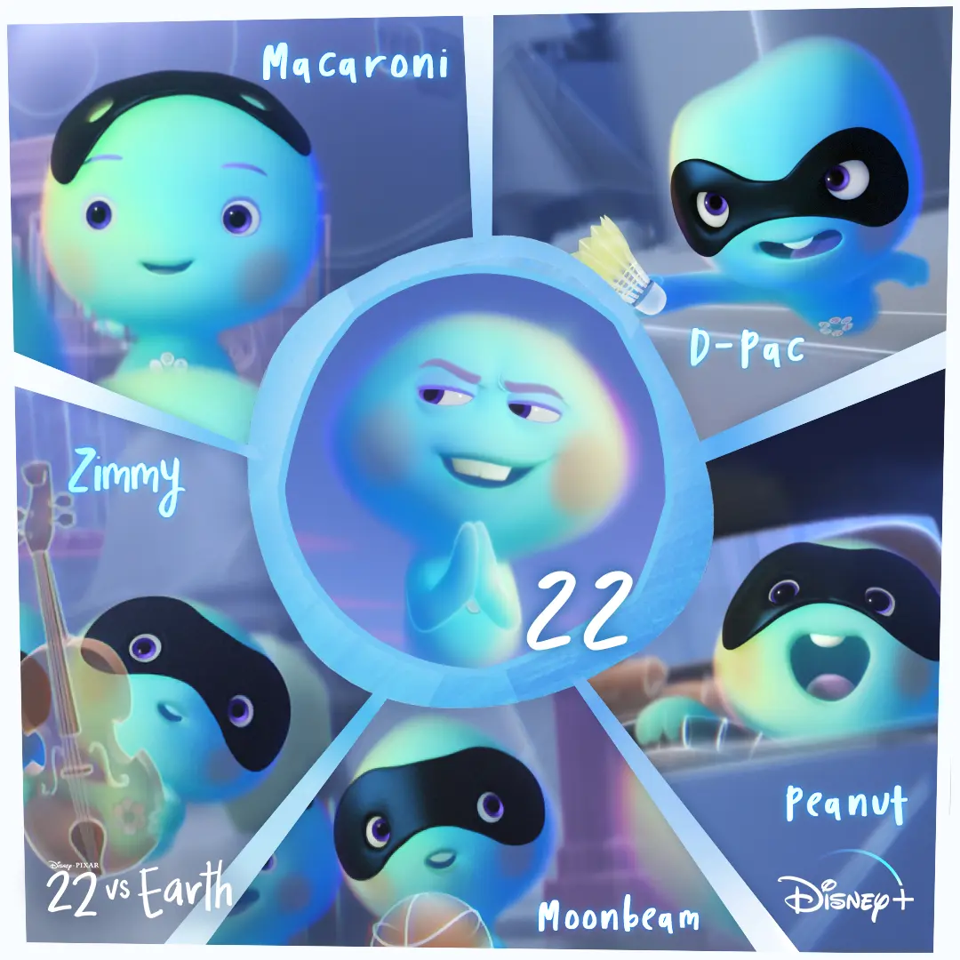
We made a square character grid that puts 22 in a central circular window with the five recruits named around her, so personality and names read fast on mobile.
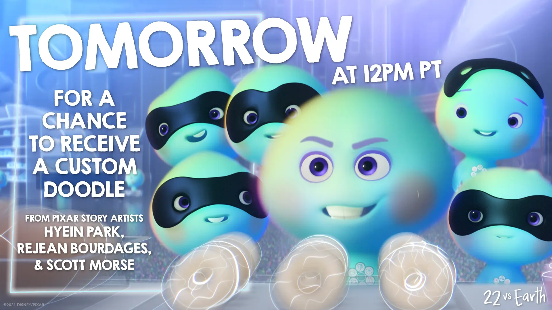
We built this Doodle on Demand promo tile to read fast on mobile, centering 22 and the new souls with oversized 'TOMORROW' type and story-artist credits to drive the timed giveaway.
We used 22’s blunt take on life’s biggest question to give the short’s Now Streaming message a quick, character-first laugh.
We treated 22’s rebellion like a tiny recruitment drive, cutting her crew’s anti-Earth energy into a quick tease that lands on a clear Disney+ Now Streaming invitation.
We framed 22’s refusal to go to Earth as the joke, then gave the short’s Disney+ arrival a clean, character-led sendoff.
We let 22’s rebellion set the tone, cutting her crew’s growing confidence into a quick reminder that the original short is now streaming on Disney+.
We framed the destruction through a live-stream interface, putting viewers inside the kind of unfolding emergency people would instinctively watch, comment on, and share in real time.
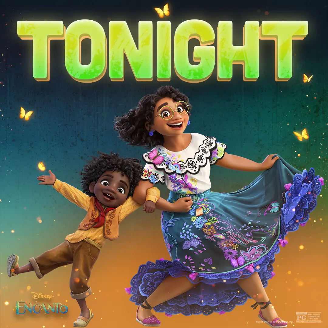
We paired Mirabel and Antonio beneath a bold 'TONIGHT' graphic to give the social countdown a warm, playful energy.
We gave Turning Red’s aunties a playful anatomy lesson, using their unmistakable style and confidence to turn a familiar family archetype into a quick social joke.
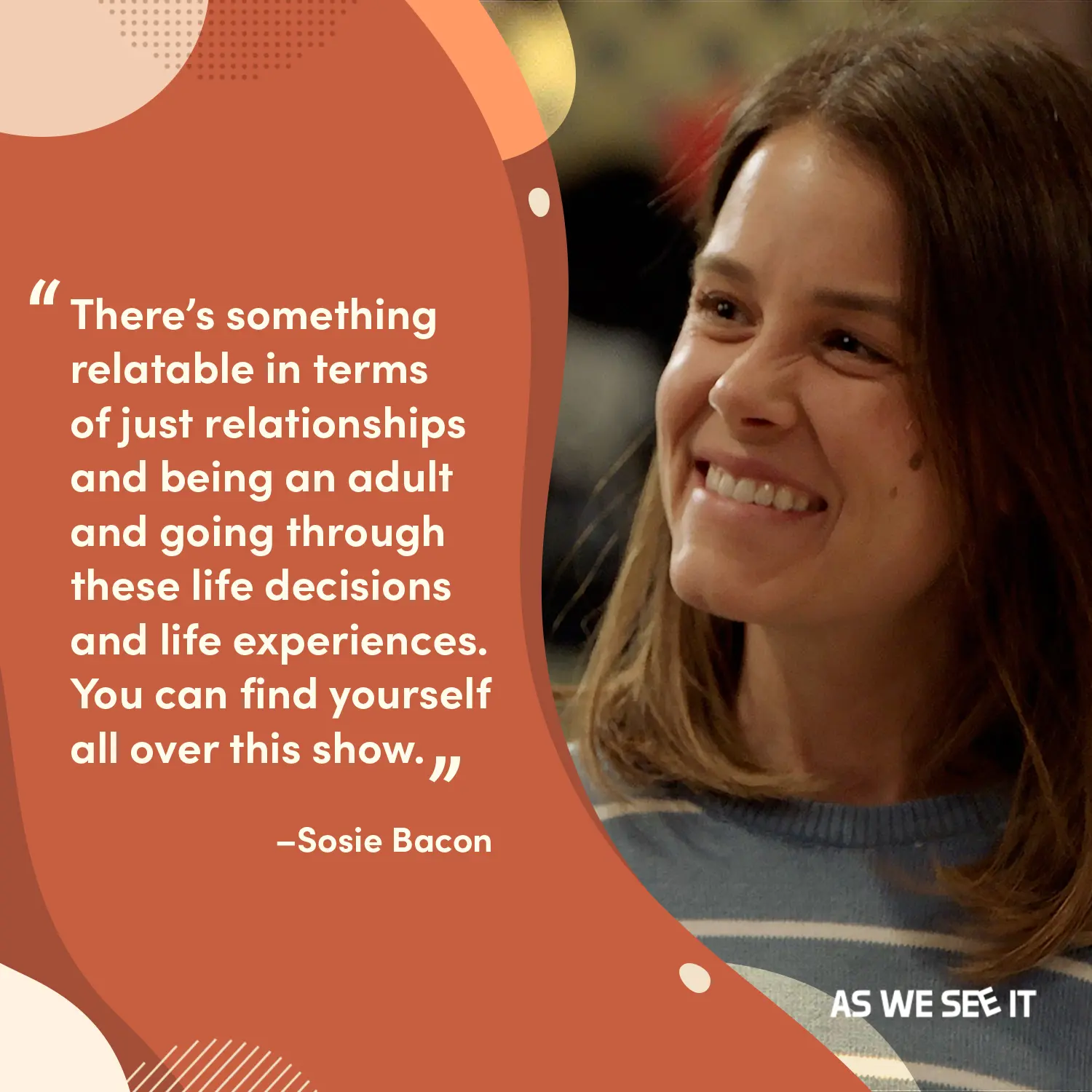
We paired a warm terracotta quote field with a candid, smiling portrait of Mandy so the line reads like someone you’d want to sit and listen to.
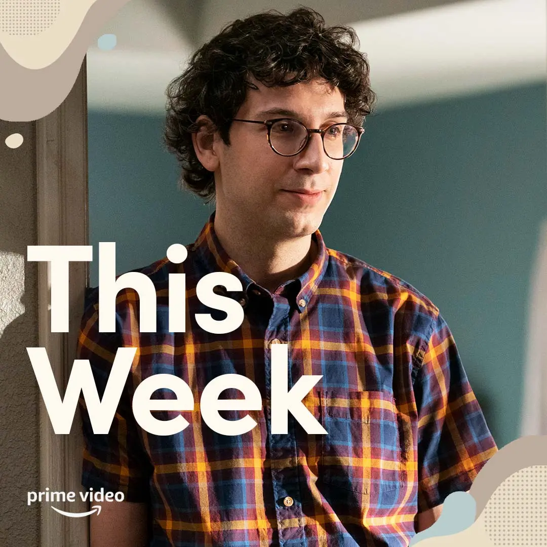
We layered a calm portrait of Jack with restrained type and soft, rounded graphics so the 'This Week' countdown reads clearly and comfortably in feeds.
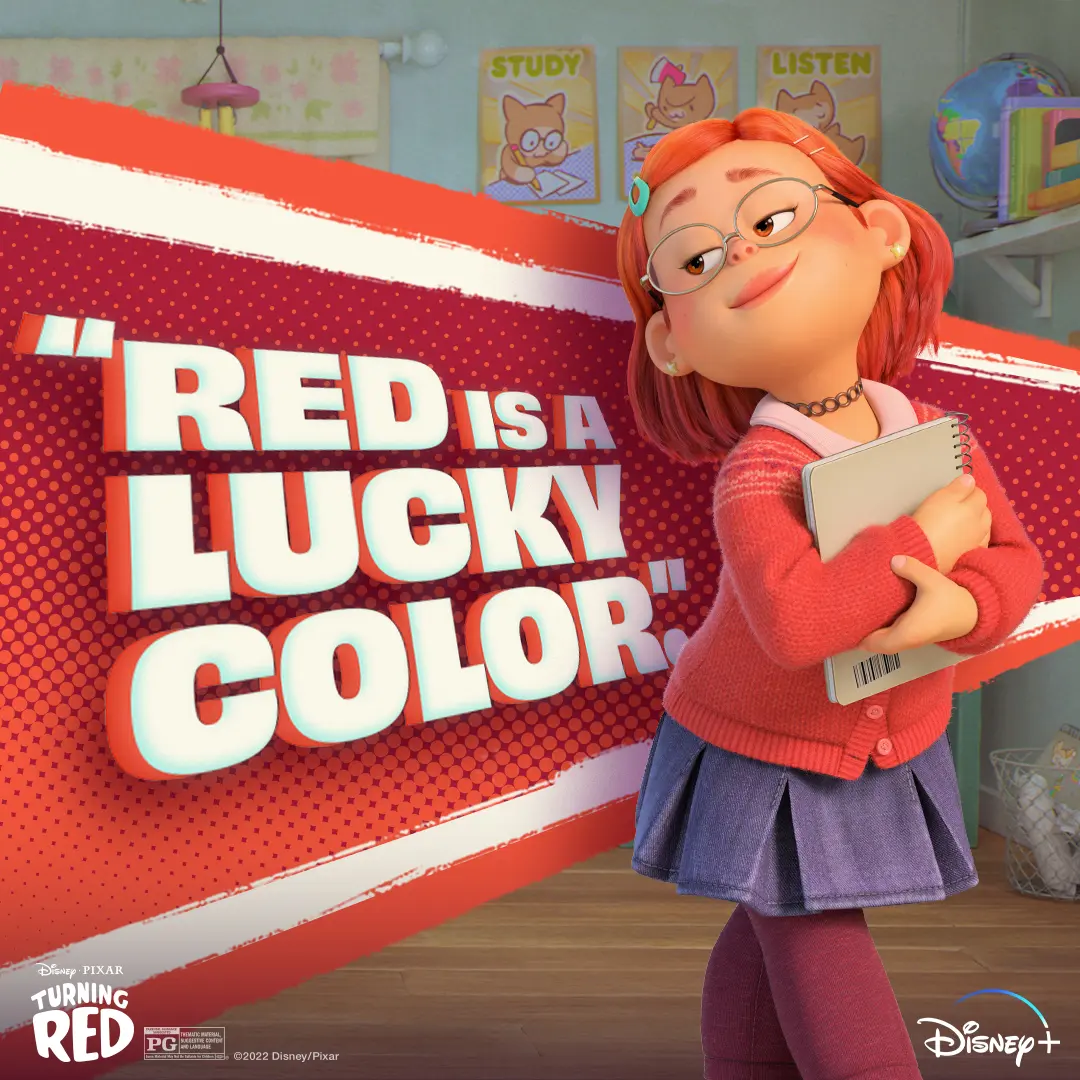
We paired Mei's cozy early-2000s look with a bold, comic-style 'Red is a Lucky Color' graphic to give fans a warm, confident social asset to study or chill with.
We brought obi Arisukwu into Invincible’s animated world through a live custom-illustration moment that gave the creator experience a personal, shareable payoff.
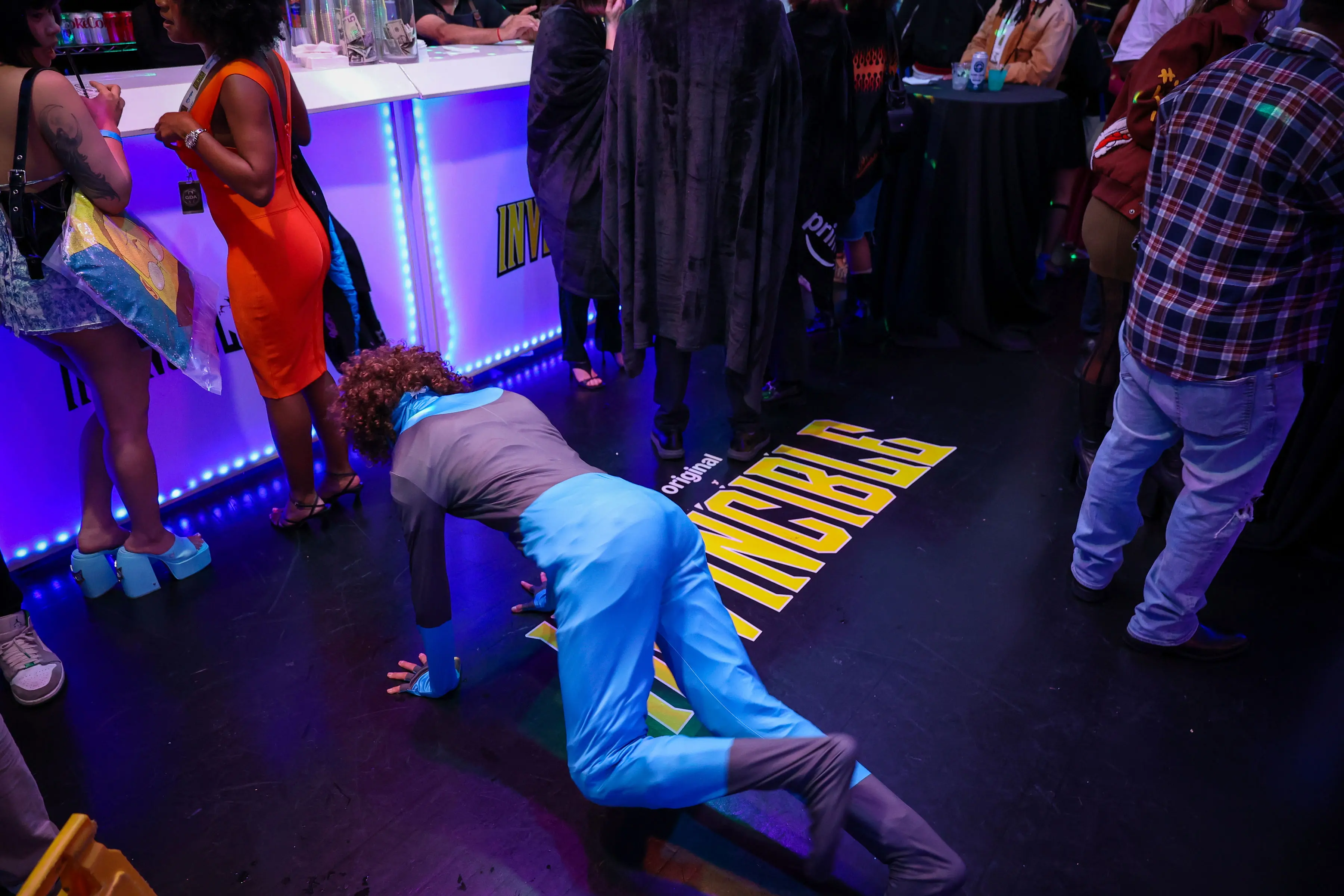
We placed a decal of the Invincible title treatment in front of the bar on the dance floor for a subtle branding moment and this creator understood the assignment.
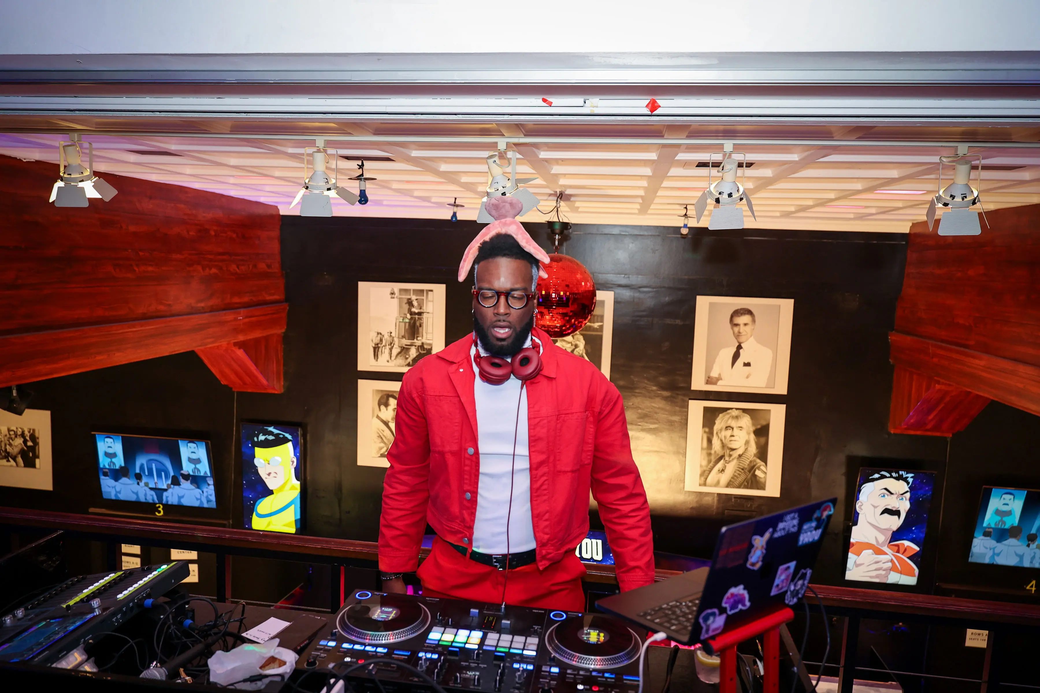
We built a mezzanine DJ booth dressed in show-forward red and framed it with animated character screens so creators had a high-energy photo moment between screenings.
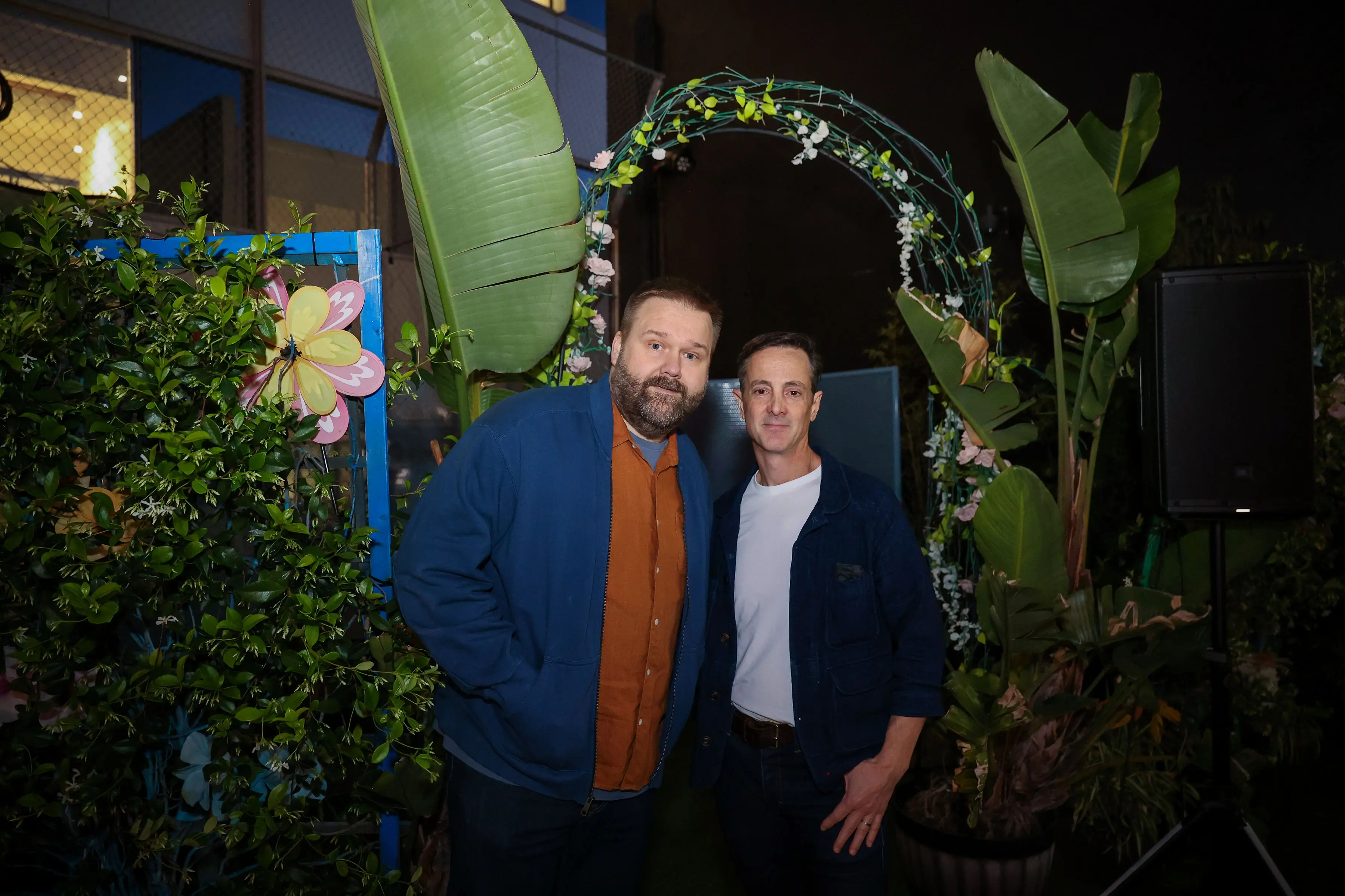
We designed the floral-arch photo moment so creators could grab a quick on-brand portrait framed by practical lighting and tropical foliage.
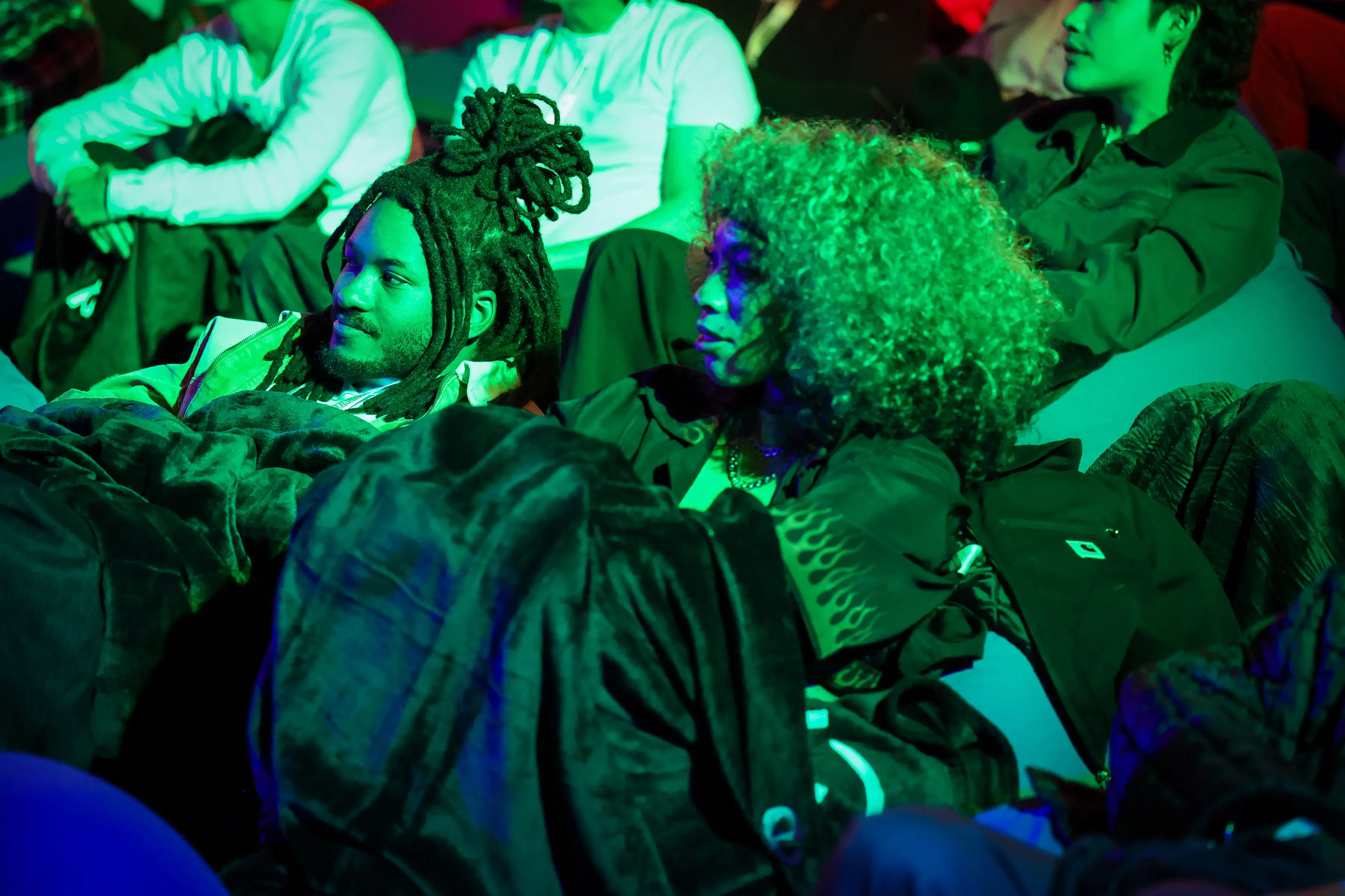
We kept the creator lounge low and tactile, with blankets, beanbags, and punchy color so creators could settle in, record reactions, and make quick content between screening beats.
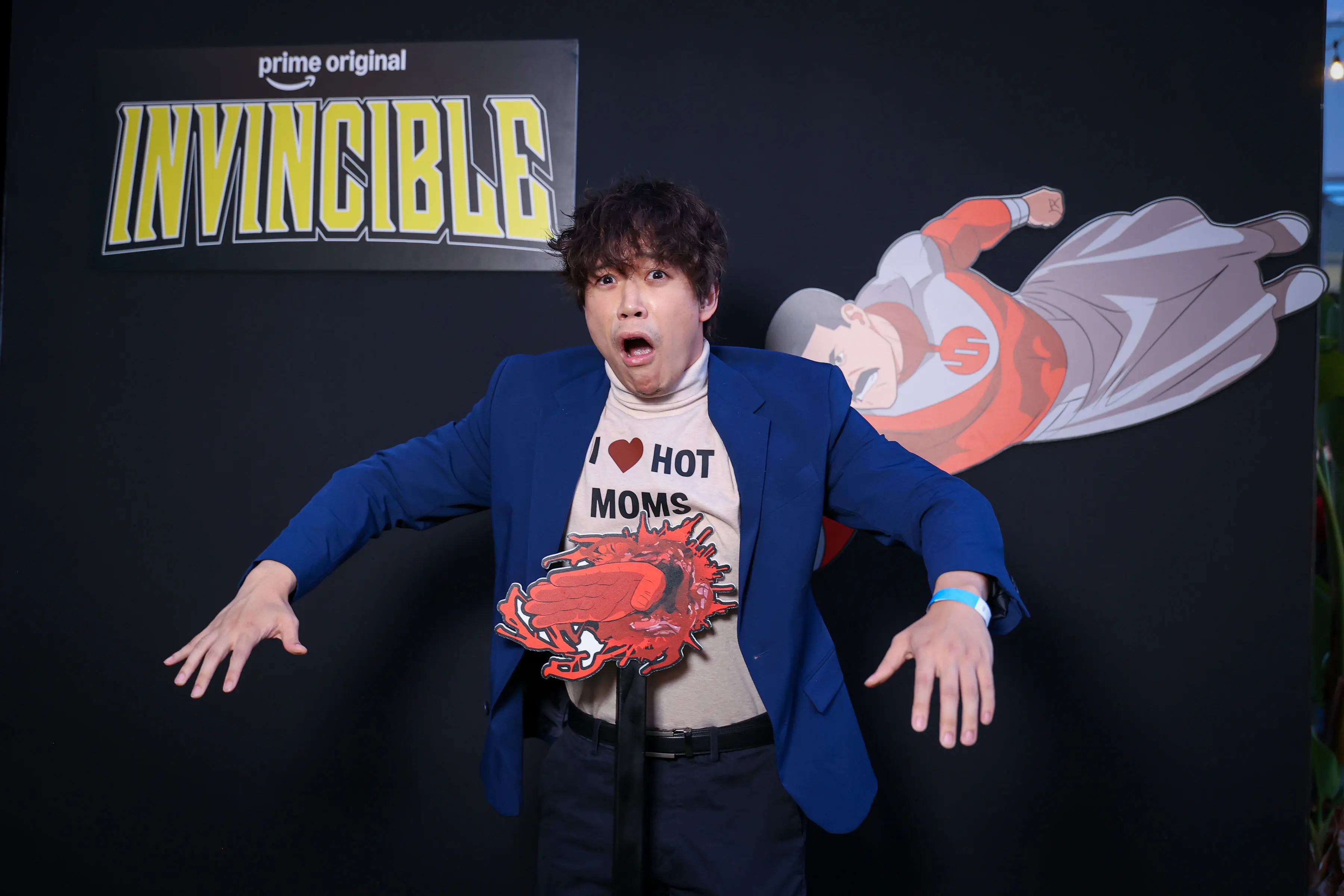
We ran an interactive photo moment at the Invincible screening, pairing the black branded wall with a blood-splatter prop so creators could lean into the show's violent spectacle.
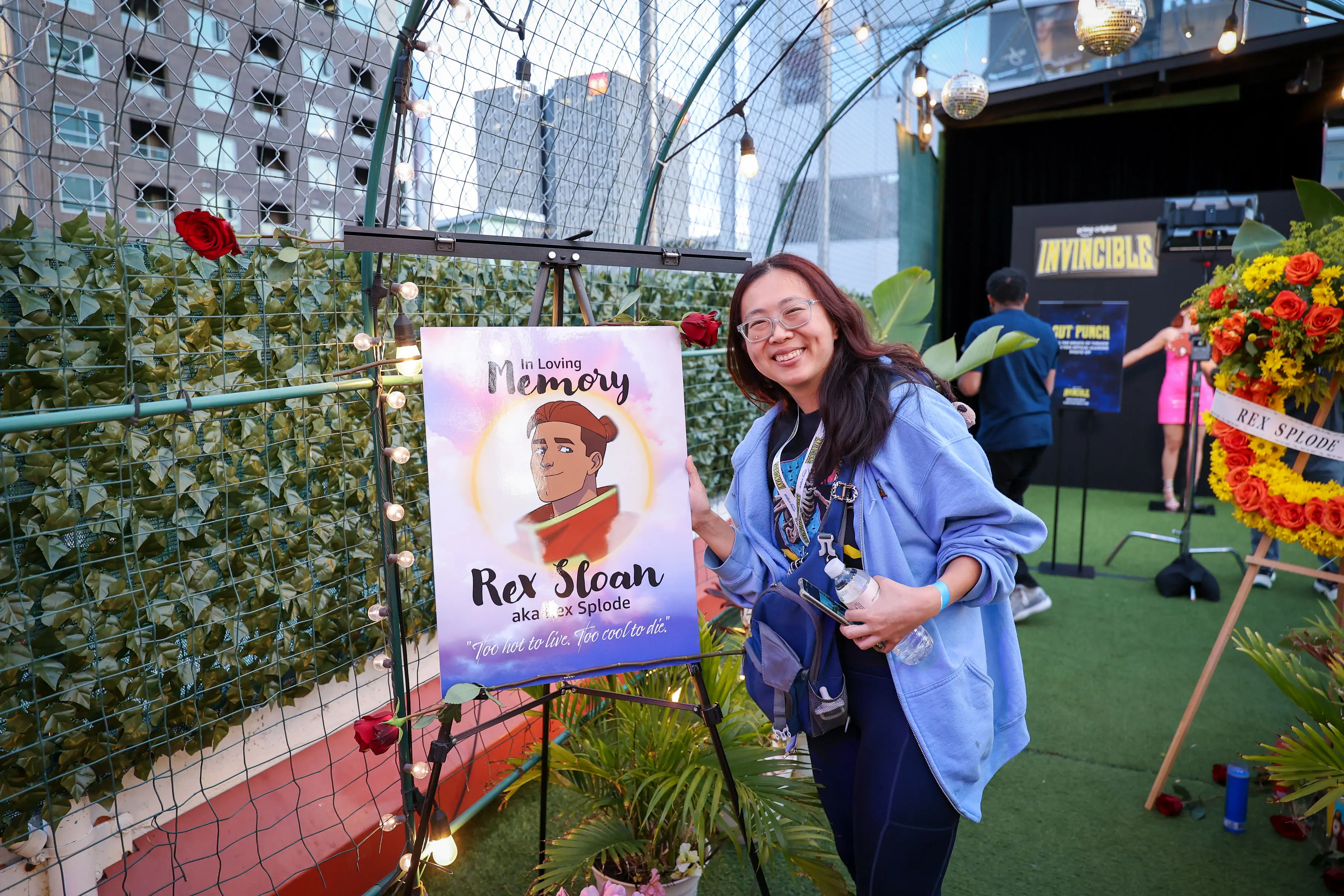
We built this memorial photo moment, with an illuminated easel, illustrated Rex Splode portrait, and wreath, to give creators a tactile, slightly ceremonial way into Season 4’s darker world.
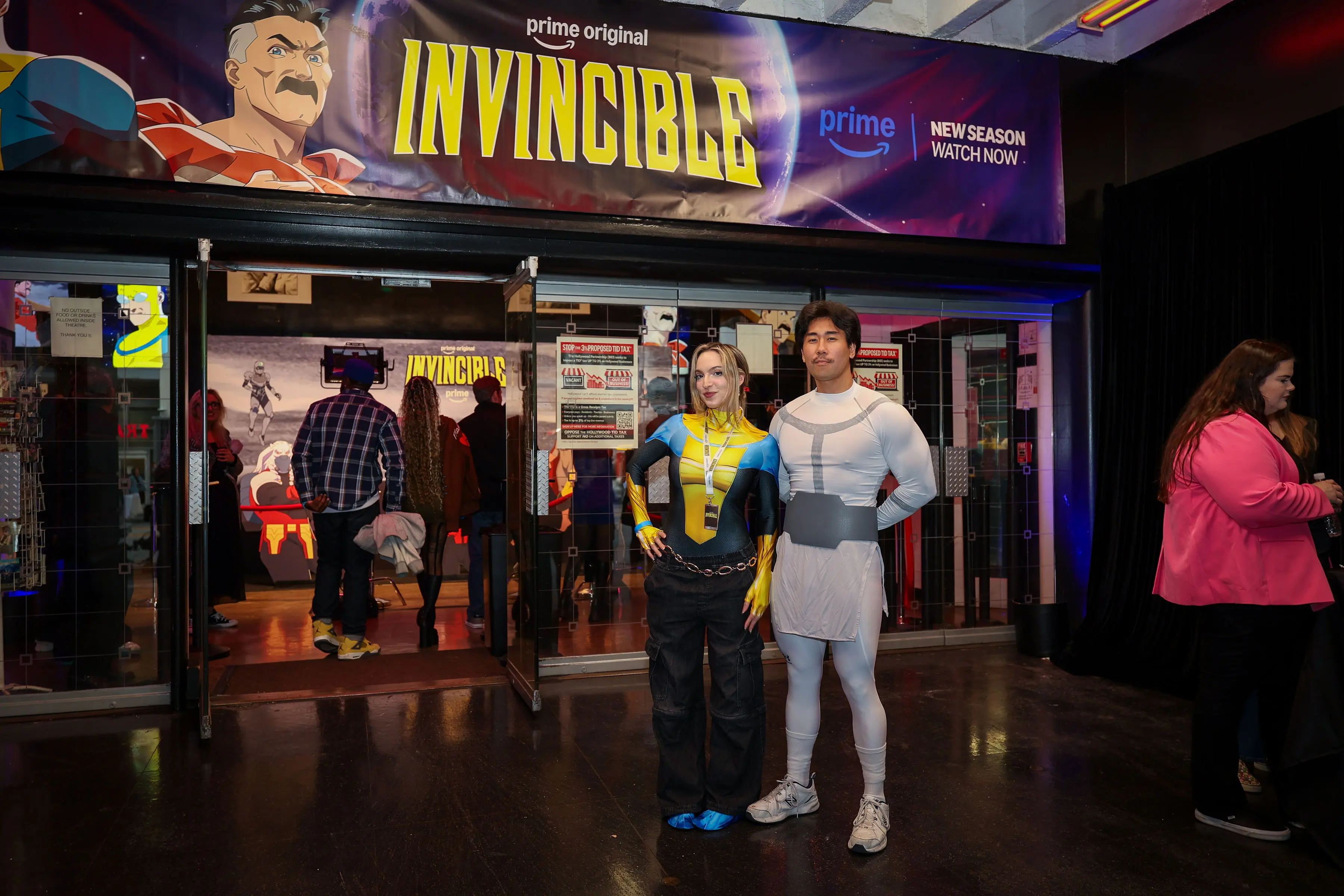
We treated the entrance as the first beat of the screening, using branded signage to bring creators into Invincible’s comic-book world before they stepped inside.
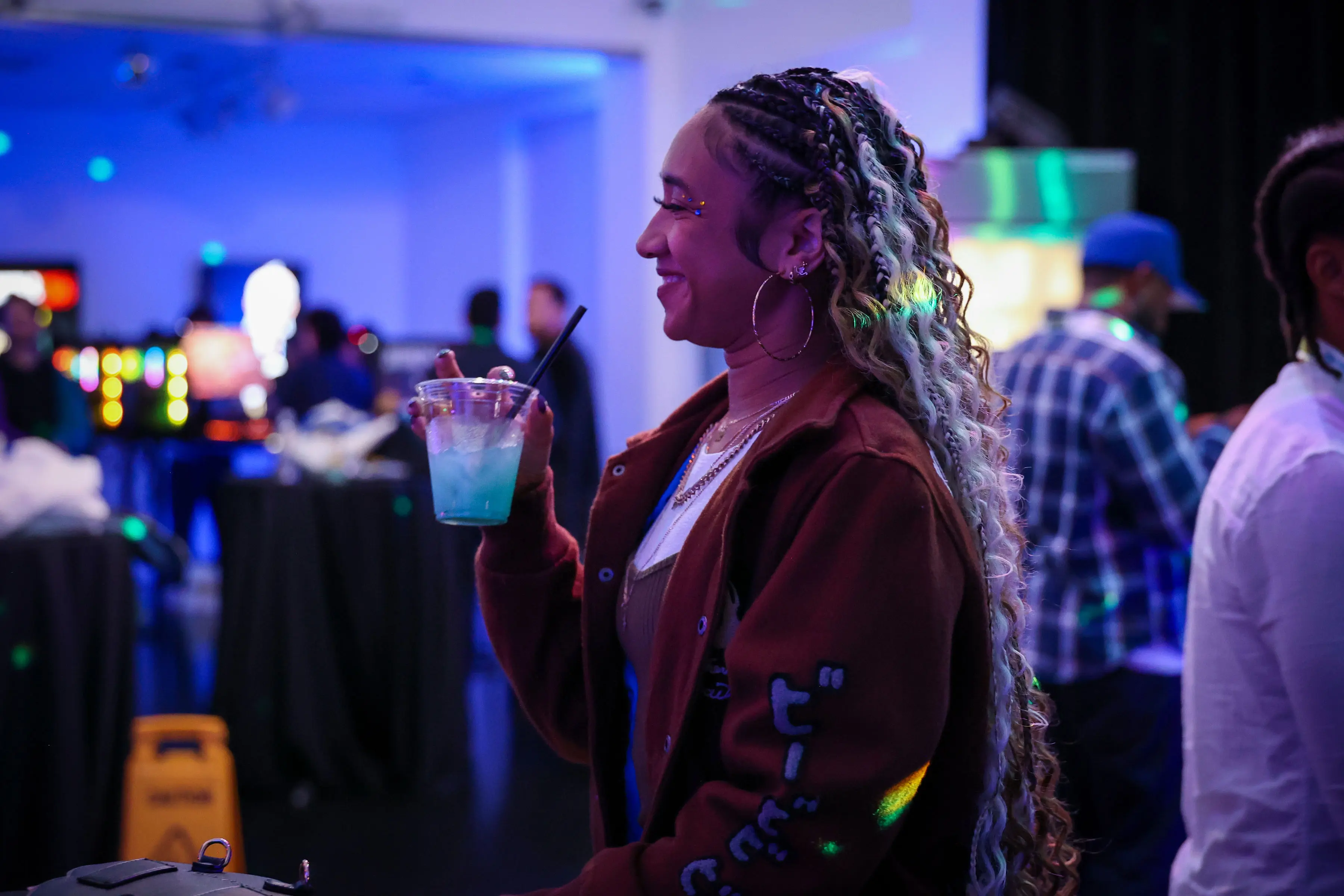
We made room for creators to settle into Invincible’s world together, letting the screening experience carry from the big set pieces into the social energy around the room.