
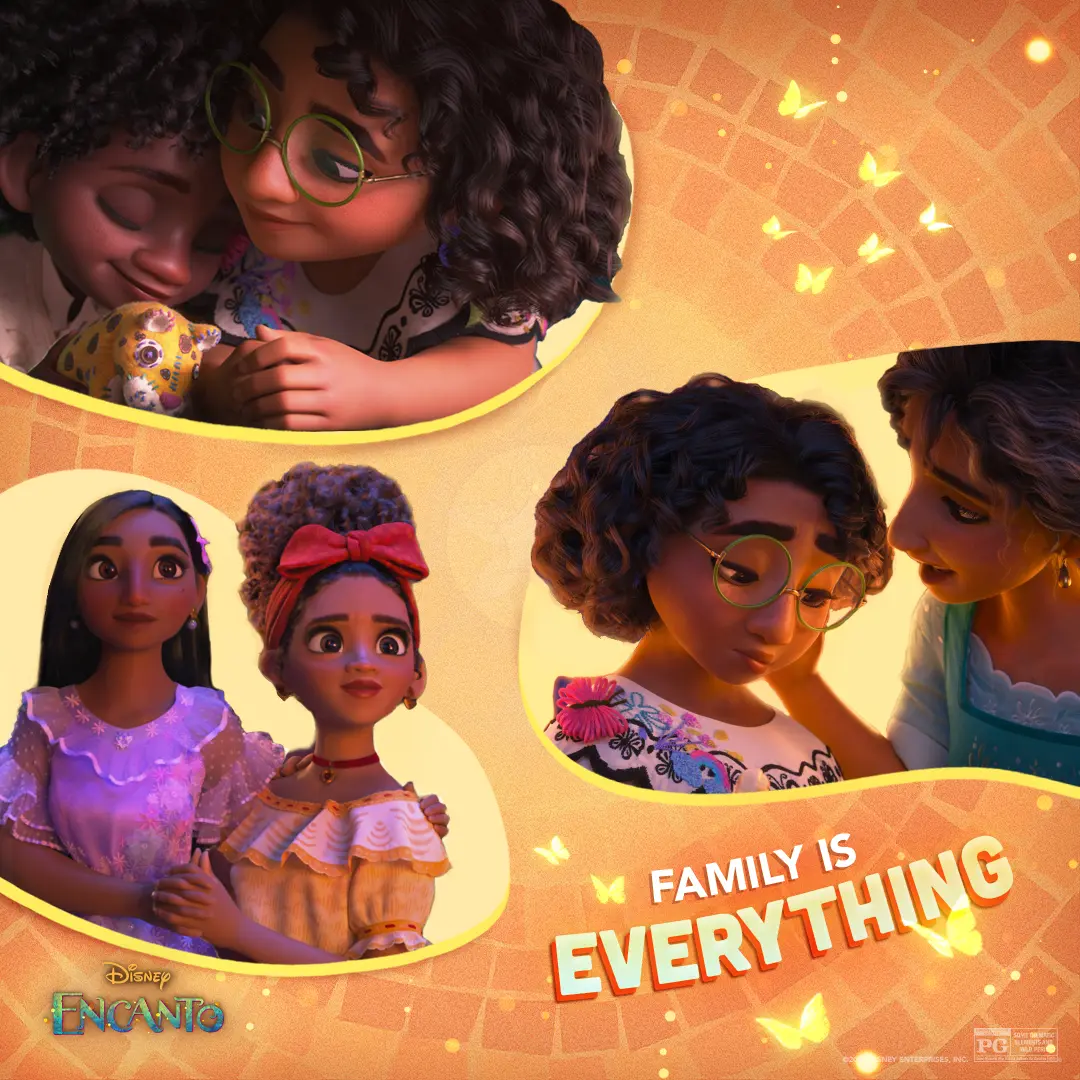
Encanto — Family Is Everything Collage A
We designed a warm, tile-backed collage that keeps Mirabel at the emotional center while threading small family moments and butterflies through the composition.
A comprehensive social media approach that connects strategy, creative, content production, community management, influencers, paid media, publishing, and analytics across every stage of a campaign.
We designed a warm, tile-backed collage that keeps Mirabel at the emotional center while threading small family moments and butterflies through the composition.

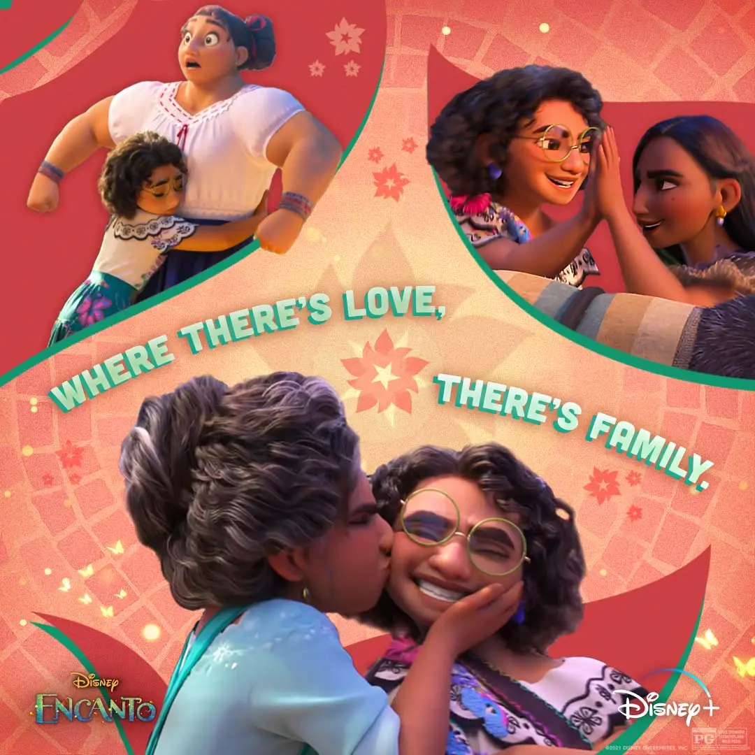
We pulled three intimate Madrigal moments into one social piece so the feed reads like a family album about care, pressure, and the small ways love holds you up.
We paired Mirabel and Antonio beneath a bold 'TONIGHT' graphic to give the social countdown a warm, playful energy.
We made a Spanish-language poster that places the Madrigal family beneath bold 'AHORA EN CINES' type, using butterflies, a tiny rain cloud, and bright color to signal the film's magical, family-forward world.
We shaped this cast-and-creator featurette around authenticity, pairing candid interviews with scenes and behind-the-scenes footage to keep the conversation rooted in the people making the series.
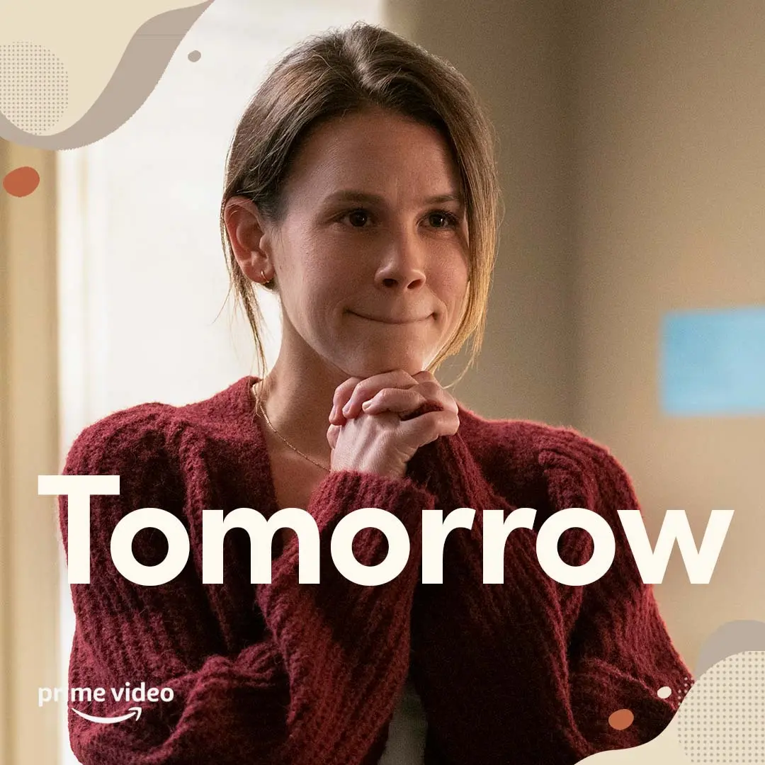
We paired a quiet close-up of Mandy with oversized, highly readable type and warm, low-clutter textures to create a calm countdown card for the campaign.
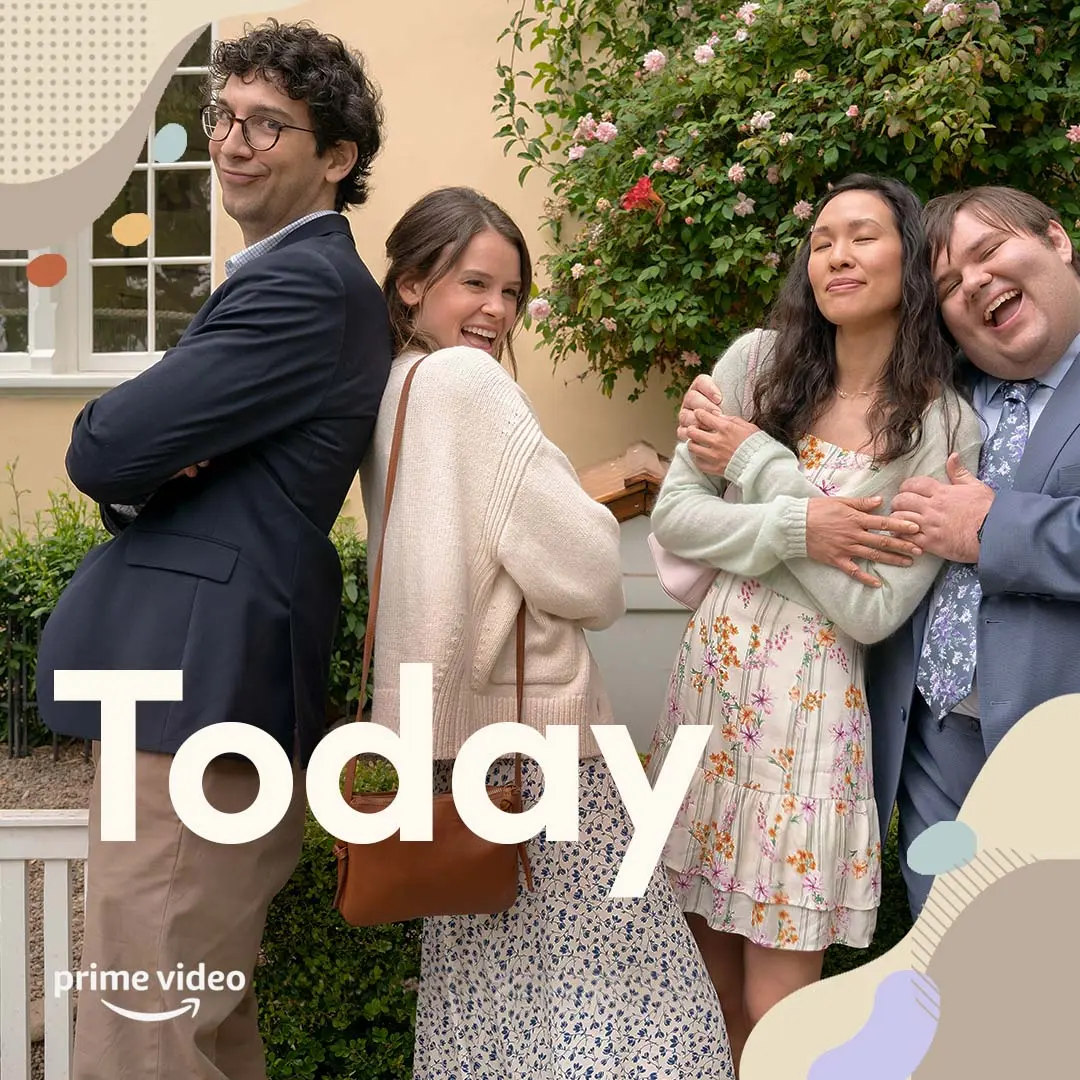
We paired a candid cast moment with roomy "Today" type and the Prime Video lockup so a countdown card reads fast and stays calm in busy feeds.
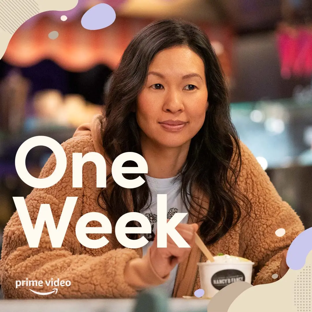
We paired a close, warm portrait of Violet with oversized, single-weight type reading "One Week" and soft graphic shapes so the countdown reads calmly and clearly in feeds.
We marked the one-month countdown with a warm, uncluttered social post that kept the series’ sense of friendship front and center.
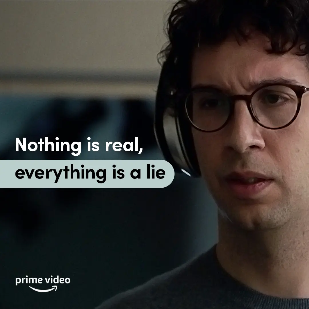
We paired a tight close-up of Jack with a muted teal callout and a single readable type voice so the line lands calm, legible, and feed-friendly.
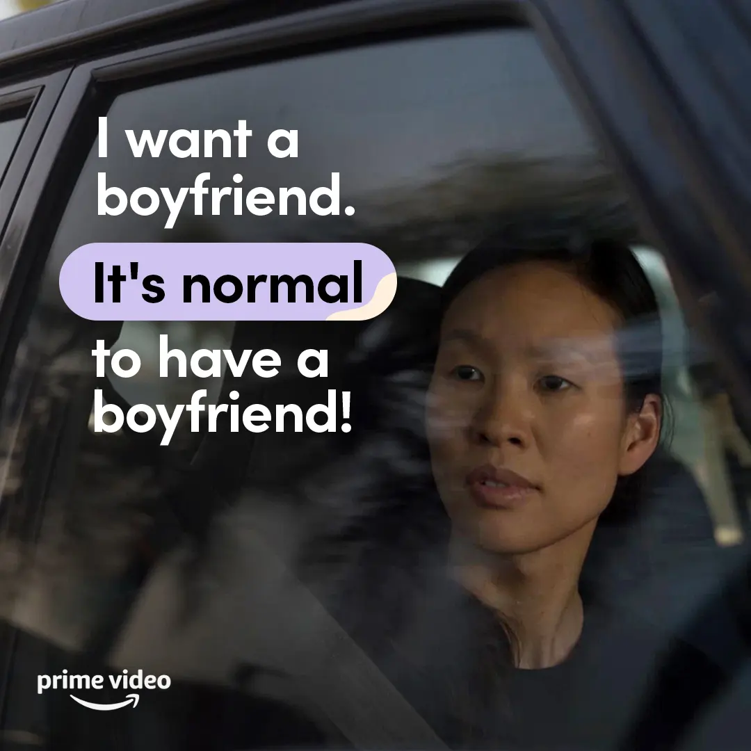
We made space for a direct, everyday desire, using clear type and a quiet character moment to affirm that dating belongs in the full picture of independence.
We made this illustrated recipe animation to give Violet’s point of view a playful, easy-to-follow social format, with each step paced clearly from pour to blend.
We used a simple illustrated head and personal-interest icons to make room for individuality within As We See It’s calm, accessible social language.
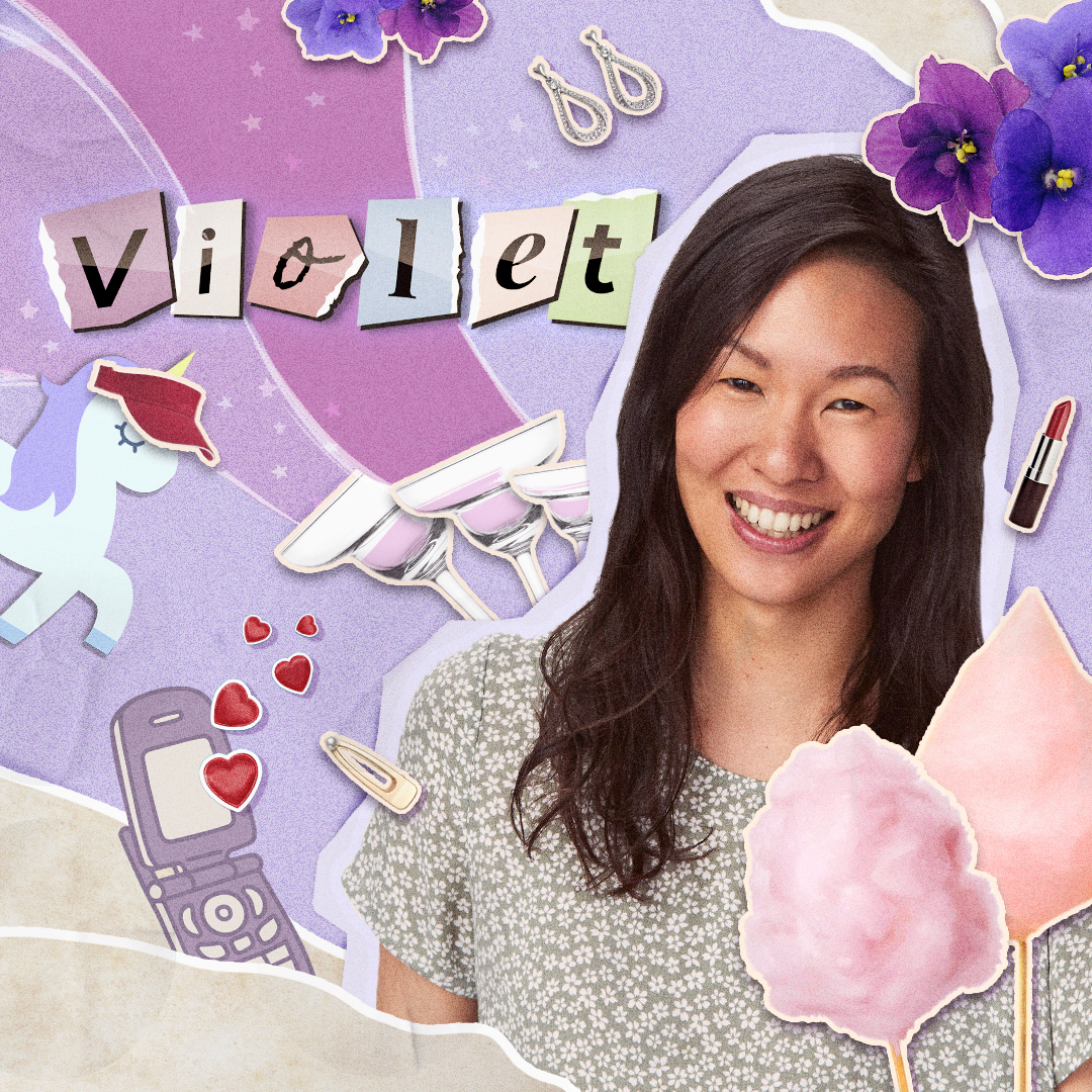
We introduced Violet through a hand-cut collage of personal details, keeping the character spotlight warm, specific, and easy to take in.
We framed Jack through a collage of personal details, giving audiences a character-led entry point that felt specific, open, and easy to take in.
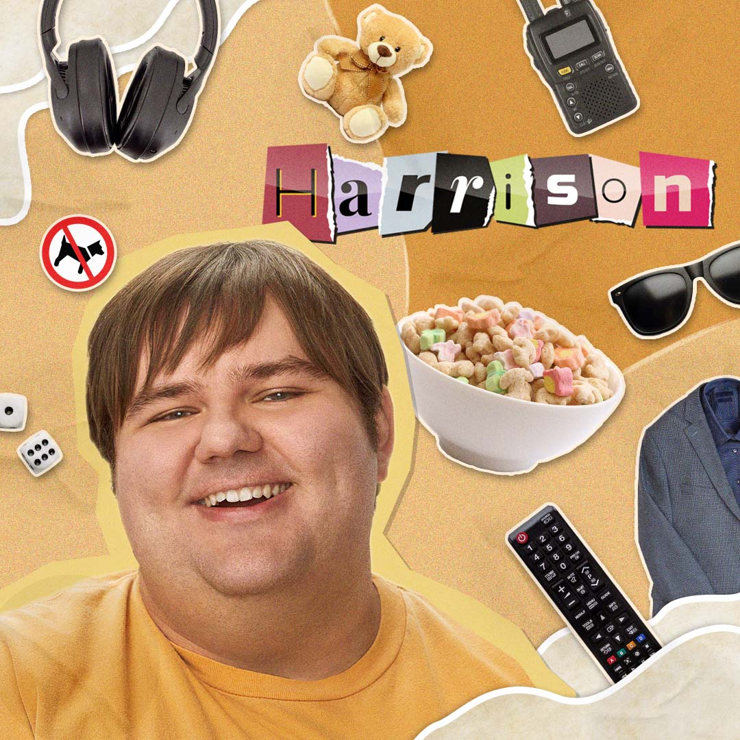
We introduced Harrison through a warm cut-paper collage that lets personality lead, keeping the character asset clear, playful, and easy to take in.
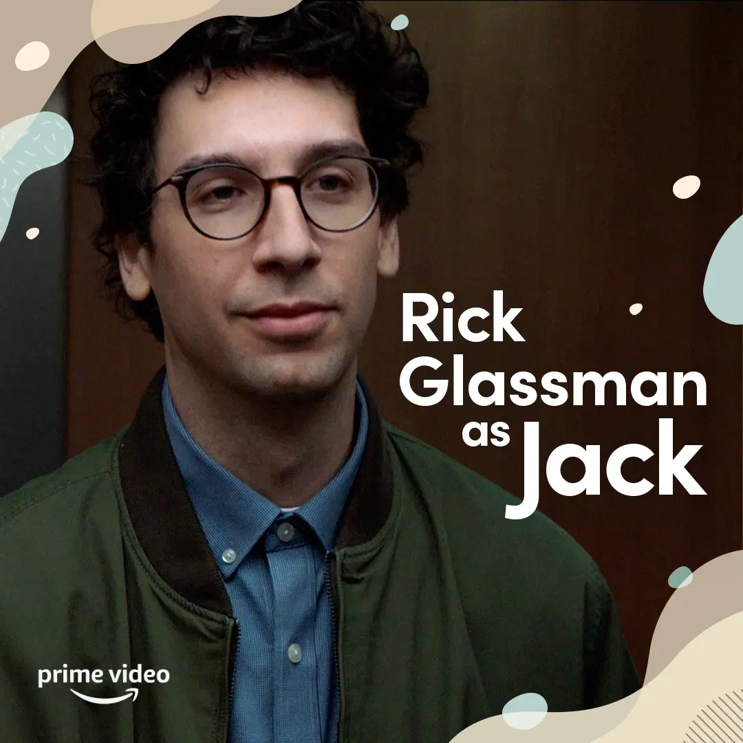
We introduced Rick Glassman as Jack with a clear, spacious cast card that kept the focus on character and made the information easy to take in.
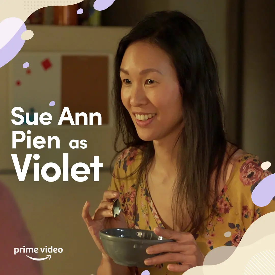
We introduced Violet through a warm, everyday moment and clear cast identification, keeping the social post easy to read and grounded in her life as a roommate.
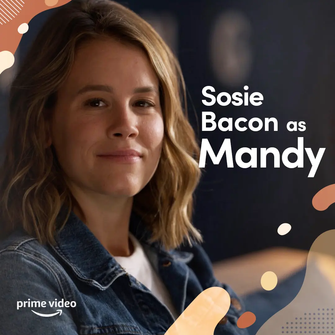
We introduced Sosie Bacon’s Mandy with a calm, direct portrait and clear type, extending the campaign’s welcoming visual language to an important part of the roommates’ support system.
We animated the series key art with a measured reveal that introduced Jack, Harrison, and Violet in the calm, welcoming visual language shaped alongside autistic and neurodivergent collaborators.
We framed the Madrigals together in front of Casita so the family and their gifts read instantly for social audiences.
We gave Mei’s red panda form a quick, squishy solo-dance moment built for the playful, repeatable energy of short-form social.
We gave Mei’s red panda energy a quick, playful solo moment built for the kind of scroll where a little chaos can carry the whole joke.
We gave Turning Red’s aunties a playful anatomy lesson, using their unmistakable style and confidence to turn a familiar family archetype into a quick social joke.
We gave an intimate exchange room to land, using progressive on-screen copy and a brief typing pause to let the scene’s emotional rhythm hold the scroll.
We used clear graphic captions to hold Violet’s hopeful read of a workplace exchange, letting the post stay close to the specificity of her point of view.
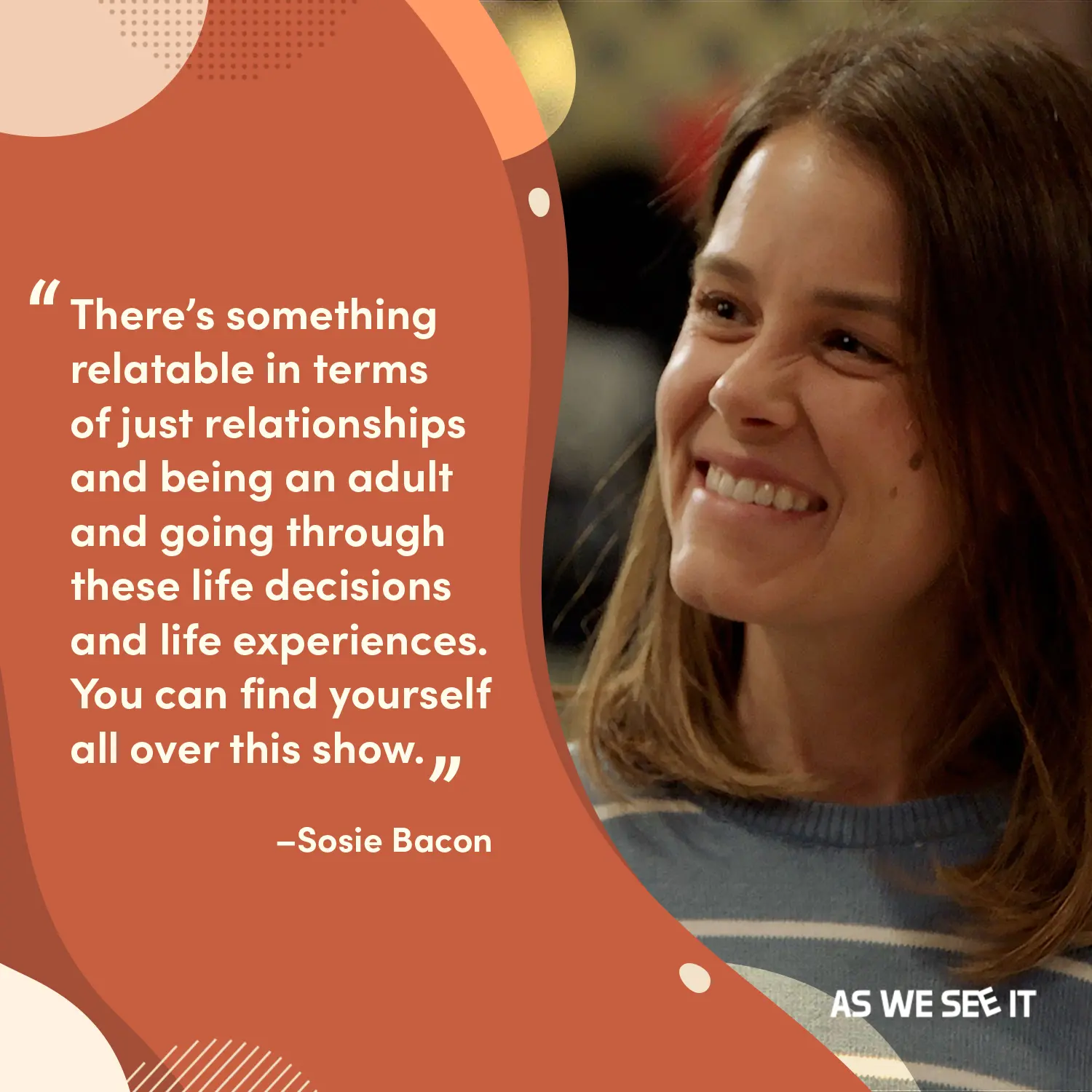
We paired a warm terracotta quote field with a candid, smiling portrait of Mandy so the line reads like someone you’d want to sit and listen to.